Magazine Current IssueMagazine Current Issue
The Everyday Architect
From our Mag
October 29, 2025

The Everyday Architect

Bangkok architect Chatchavan Suwansawat celebrates the bold, improvised colours and designs of everyday Thai streets. Through his books and practice, he champions “urban mess” as a source of creativity, showing how vibrant hues and street-level ingenuity can guide architecture toward community connection, cultural authenticity, and more human city-making.

Nestled in the heart of bustling Bangkok is a unique and unspoilt neighbourhood. The ancient structures of temples, mosques and churches punctuate rows of modest family homes. House fronts here are spaces to dry washing and cook meals amongst clustered collections of potted plants. It’s a scene that might seem busy or even untidy to some, but to architect Chatchavan Suwansawat, it is a scene of perfect harmony - and one where creativity and ingenuity surprises and delights him daily. 

Elizabeth Price
Writing:
Writing:
Elizabeth Price
Photography:
Photography:
No items found.
Magazine Current IssueMagazine Current Issue
The After shot of the Floorplan
Before
before
after
After
Top
Arrow UpArrow Up

“I was born and raised in this area. A funny thing that a lot of my friends don't know is that as a child, I was raised in a very sheltered way. My parents never let me go outside to play with other kids in our neighborhood.” 

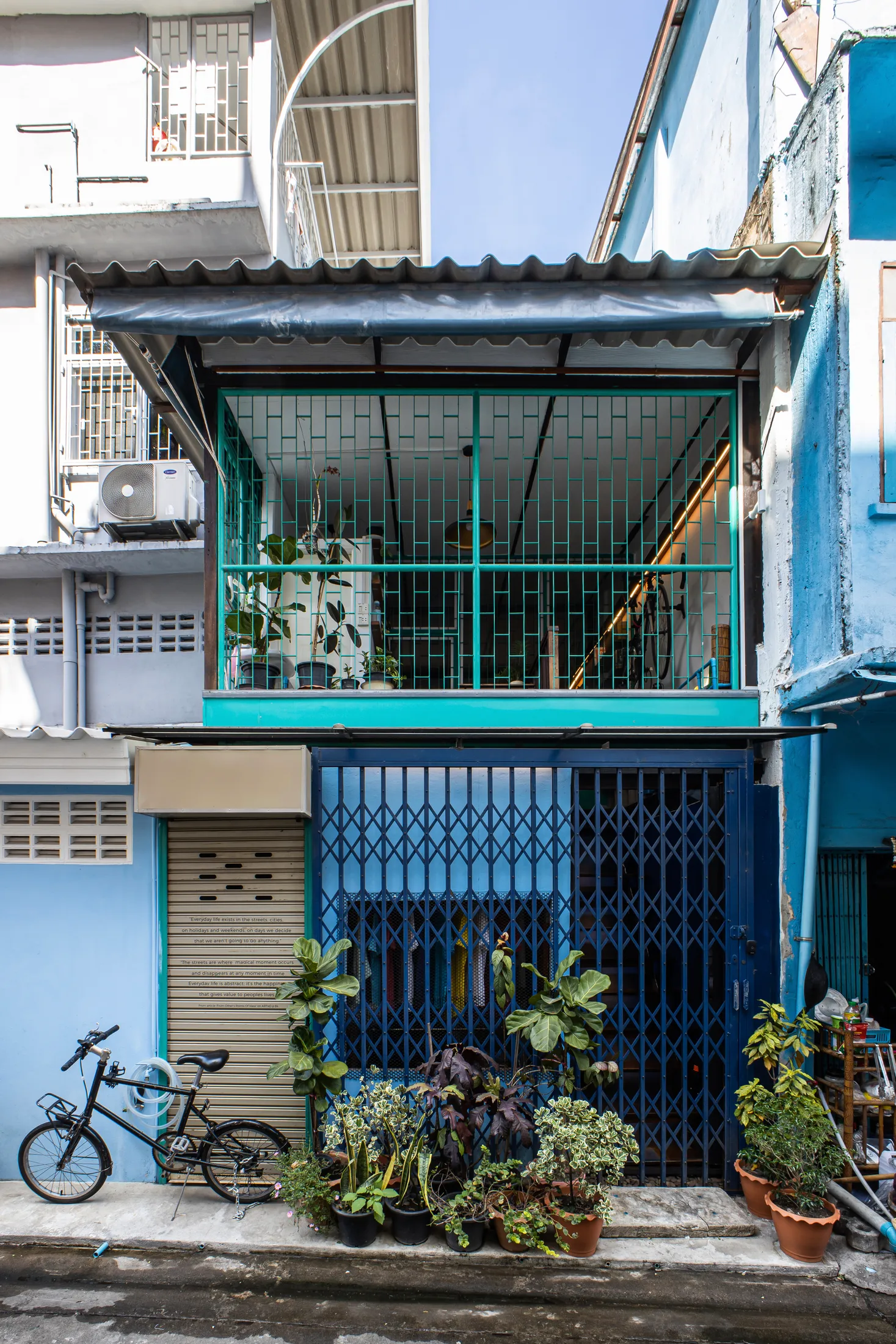
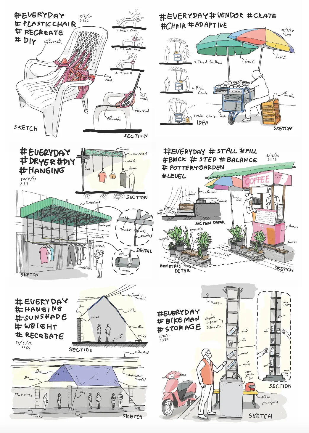
But the pull was strong. As Chatchavan grew up, exploring Bangkok – and especially his own neighbourhood of Somdej Chao Phraya – became his hobby and passion. His observations from these regular expeditions have fueled two books: Architect-Jer (the Thai word jer means ‘find’ or ‘come across’) and 365 Days of Thai Urban Mess Architecture and he has based his architectural practice here – the Everyday Architect Design Studio.  

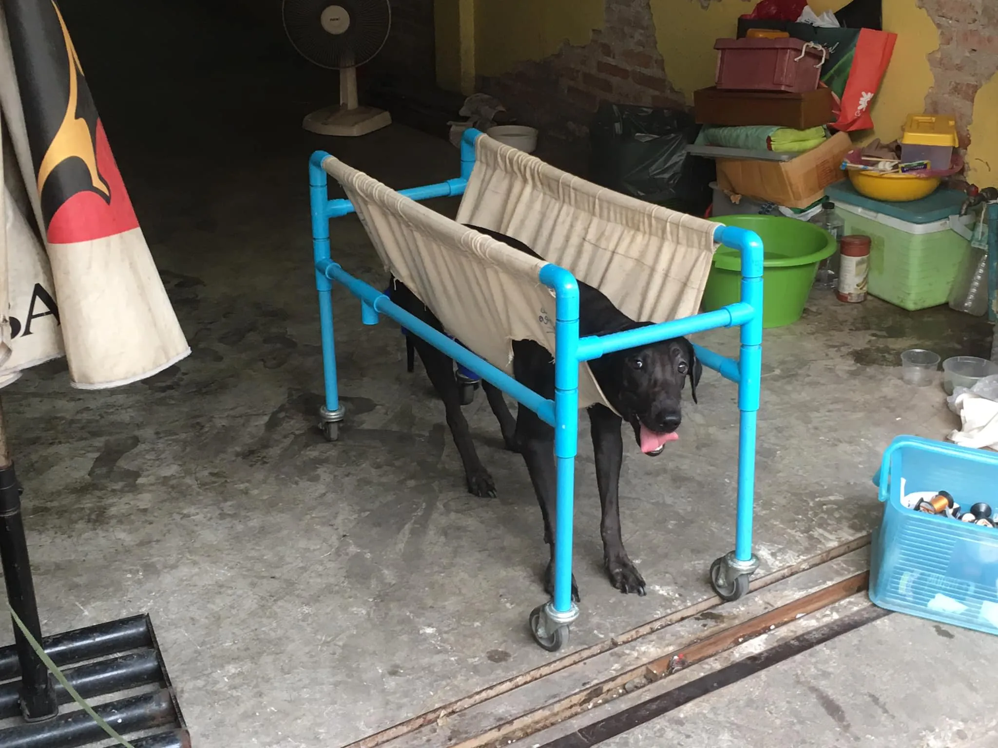
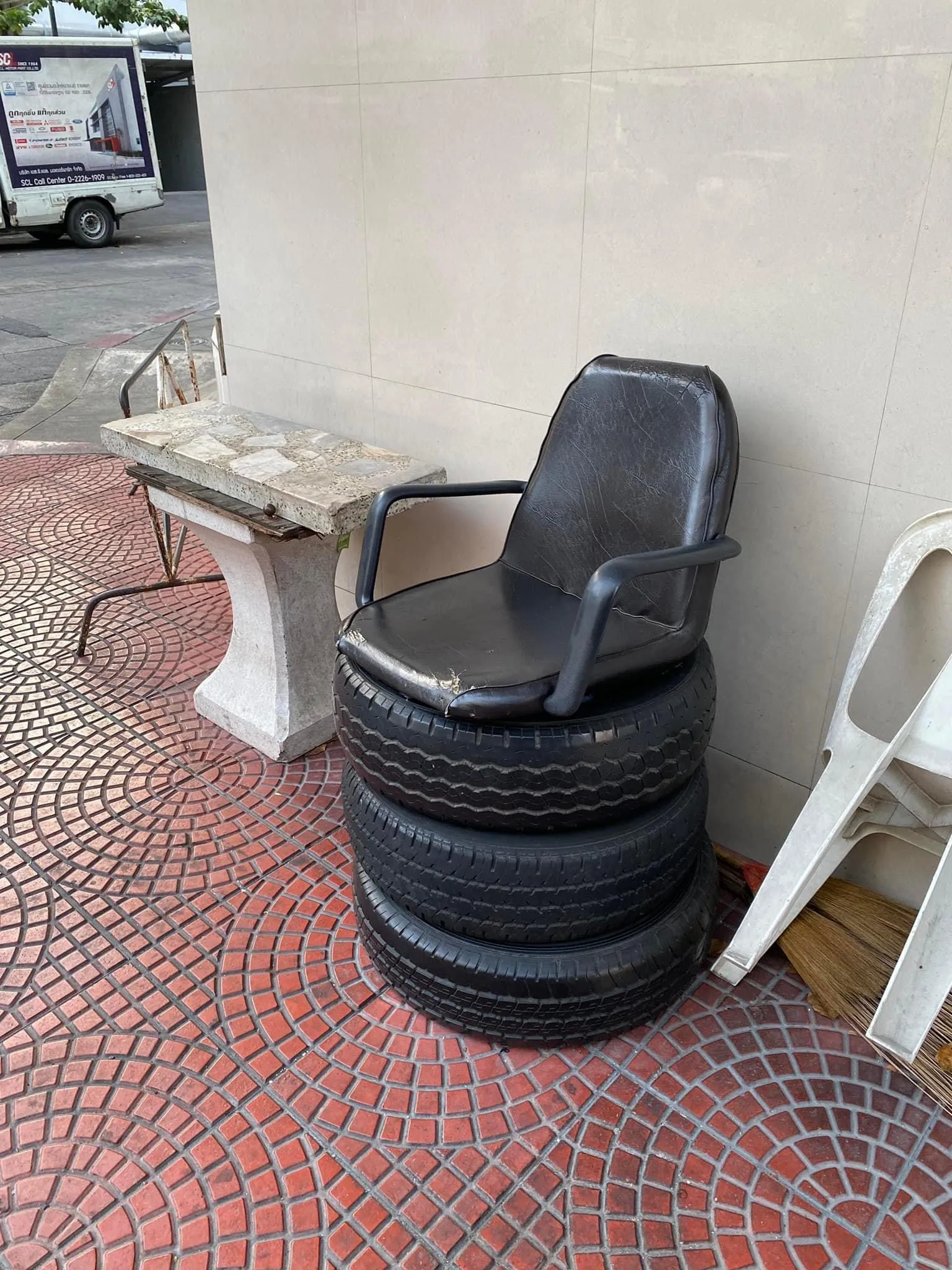
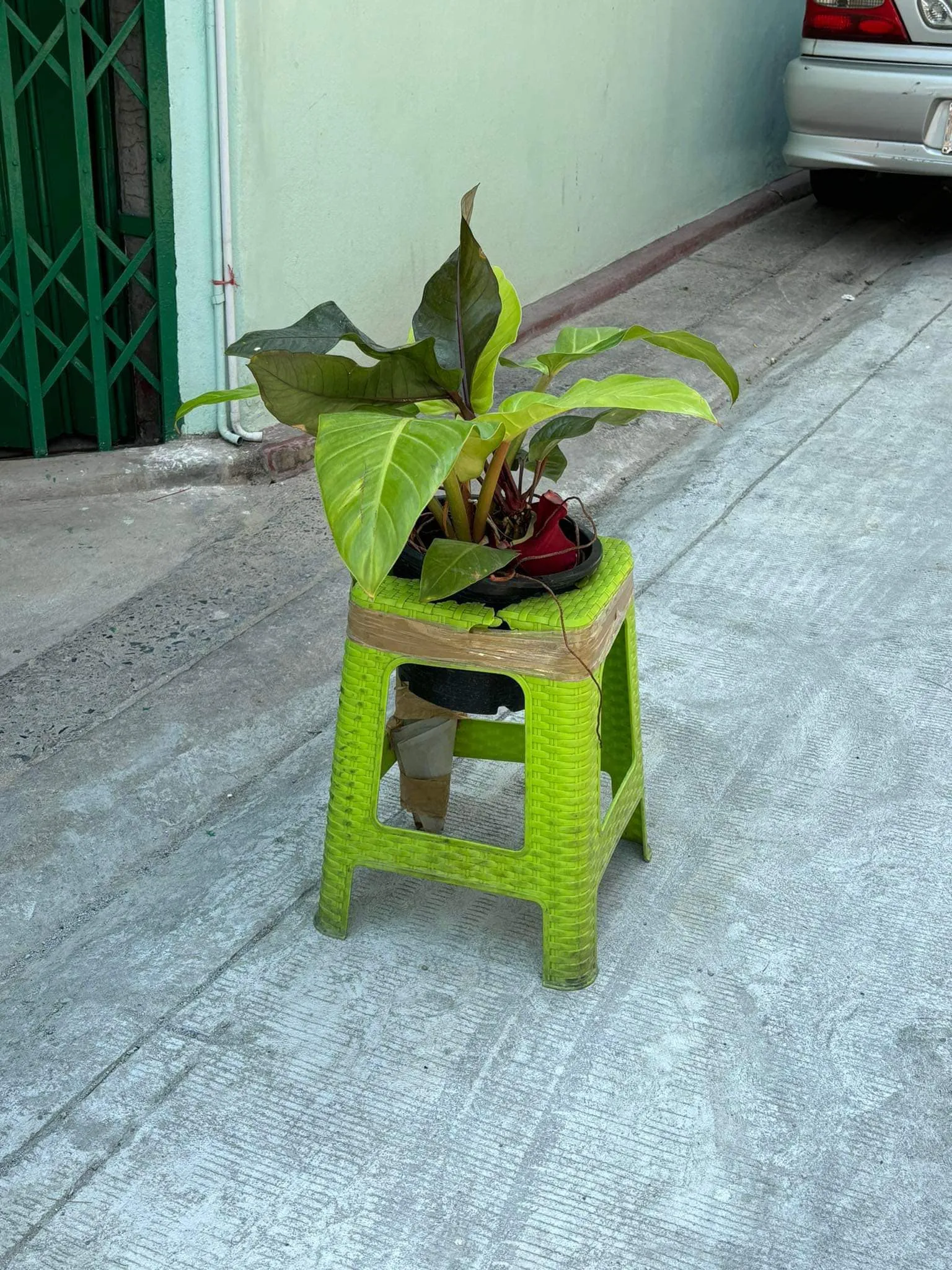
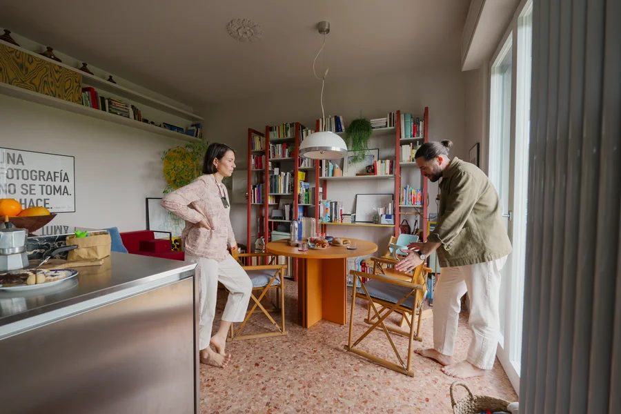
We meet Chatchavan to unpack the complexities of destigmatising colourful architecture in Thailand and to learn why “street-level creativity and resourcefulness” is where designers should look to solve the pressing challenges of urban life and planning. 

Let’s start with colour. What significance does colour hold in Thai culture? 

Most people in Thai society have a blend of beliefs between Buddhism and Hinduism. This hybrid belief system is also similar to neighbouring countries such as Myanmar, Laos and Cambodia, as these countries have a longstanding historical connection with Thailand. So most people in this region have beliefs related to stars, astronomy and astrology, which are part of the roots of Hinduism. For example, the names of the days of the week are derived from the names of celestial bodies, such as Monday (วันจันทร์ ) - Moon, Tuesday - (วันอังคาร) - Mars. Each celestial body is likened to a deity found in mythological beliefs, and each deity is associated with a specific colour.

As a result, those who still hold tightly to these traditional beliefs often try to align themselves with the corresponding colours for each day, particularly in choosing the colours of their clothing, to bring good luck each day. This concept of lucky colours may even extend to individual preferences; for instance, if you were born on a Thursday, you might be suited to the colour orange for your entire life. However, nowadays, people may be starting to believe less in these significant beliefs.

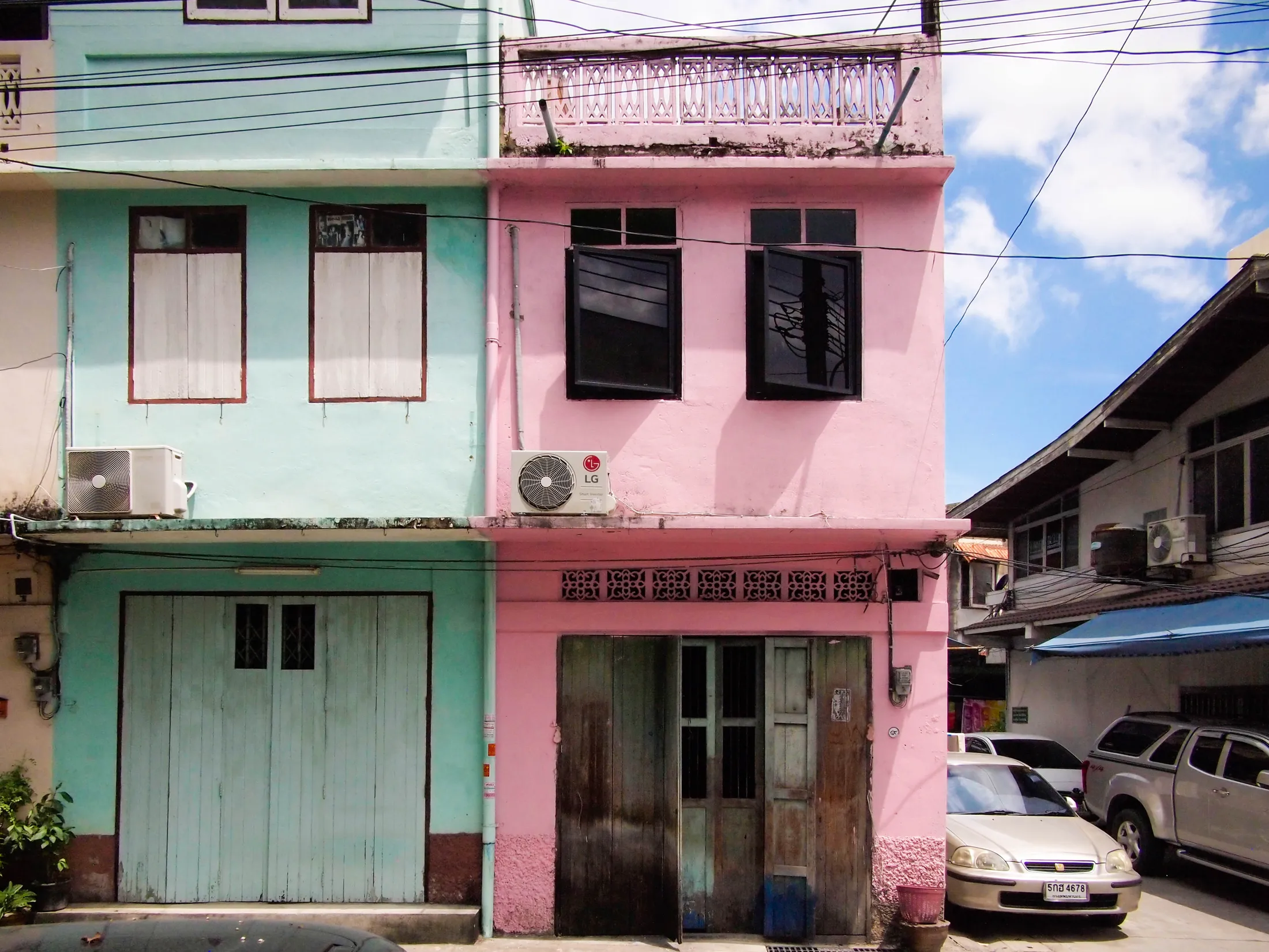
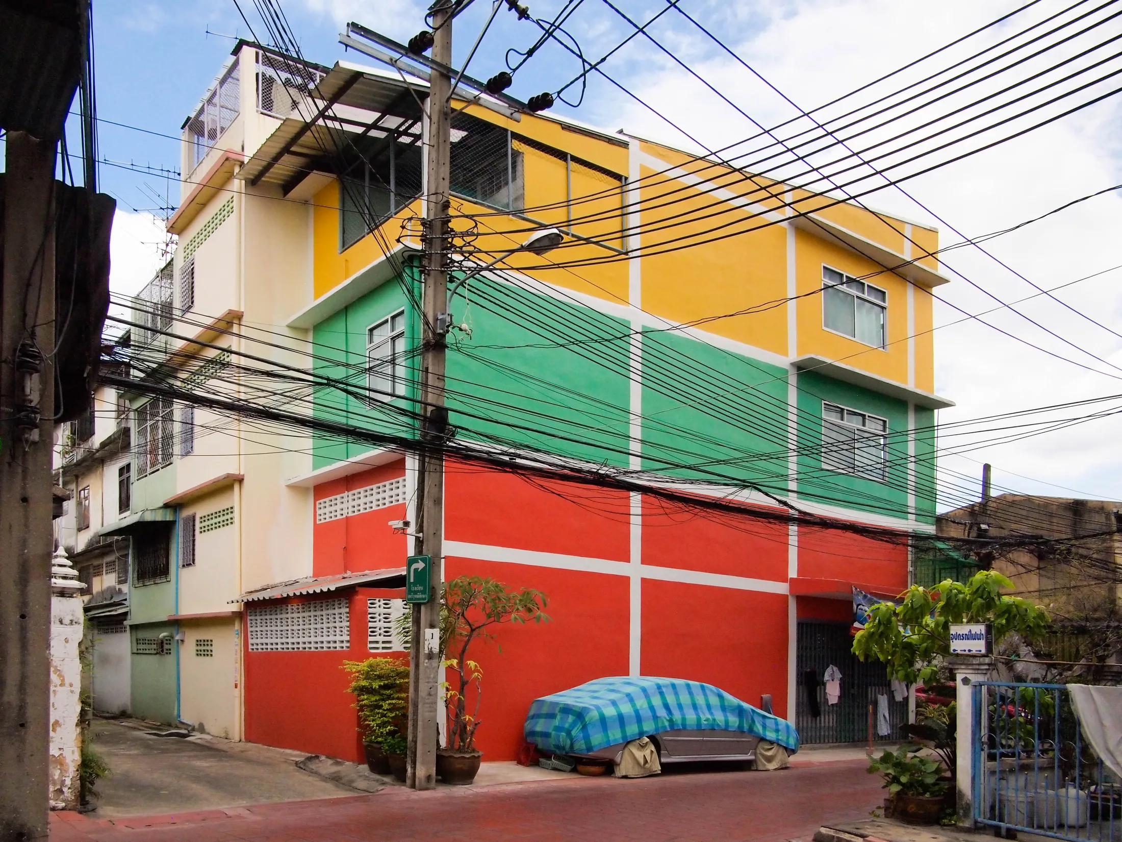
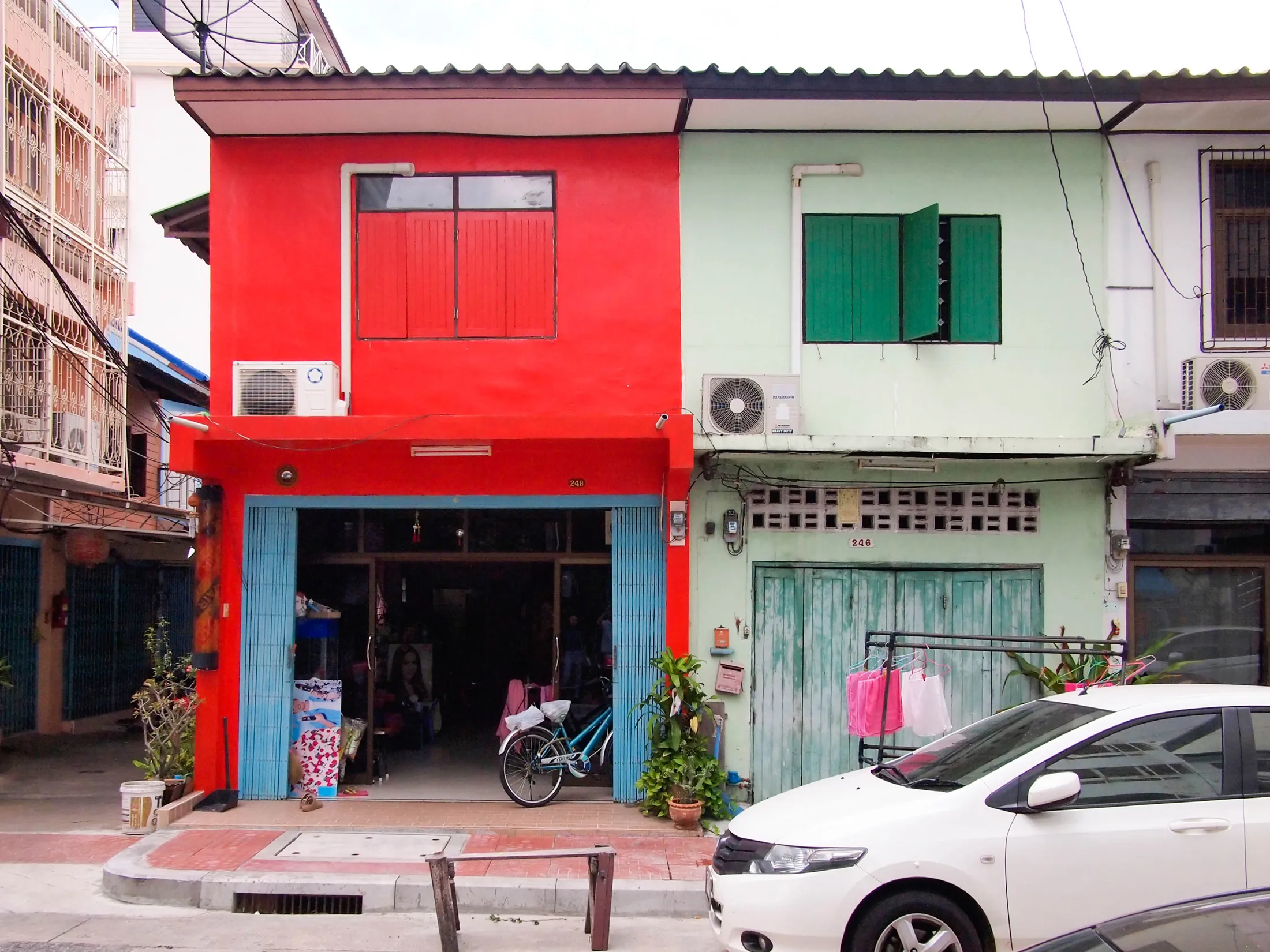
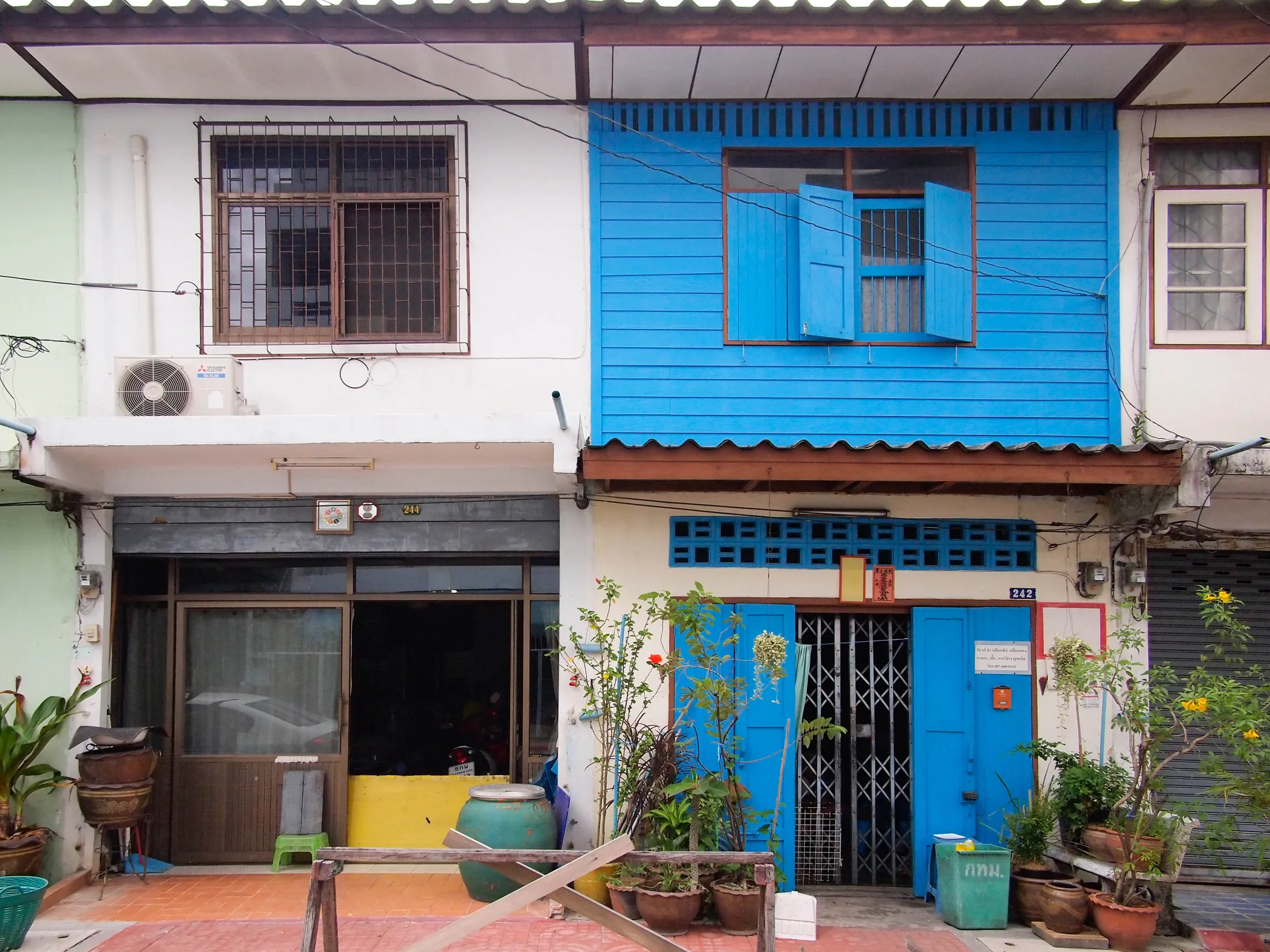
How has this cultural connection with colour played out in Thai architecture?

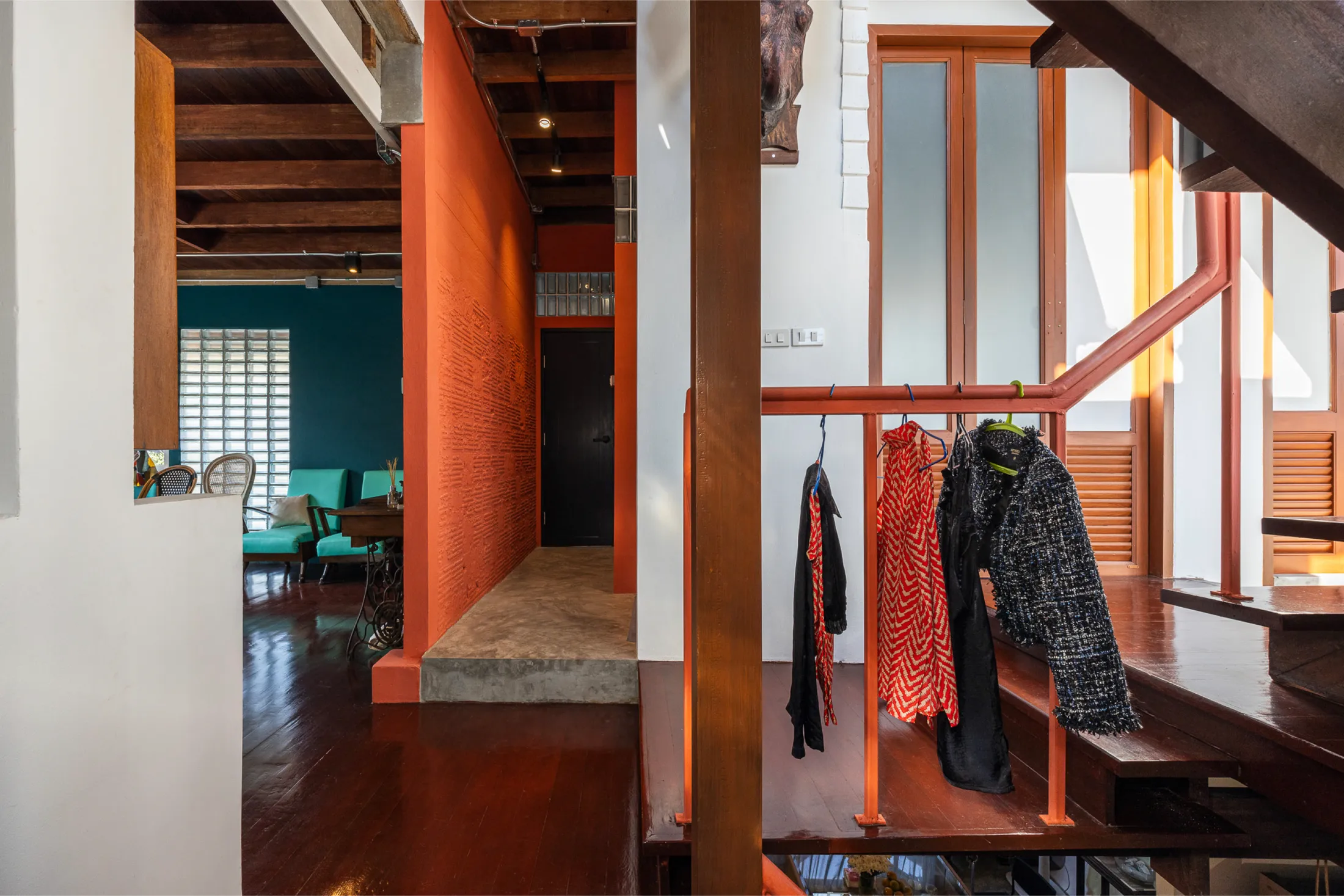
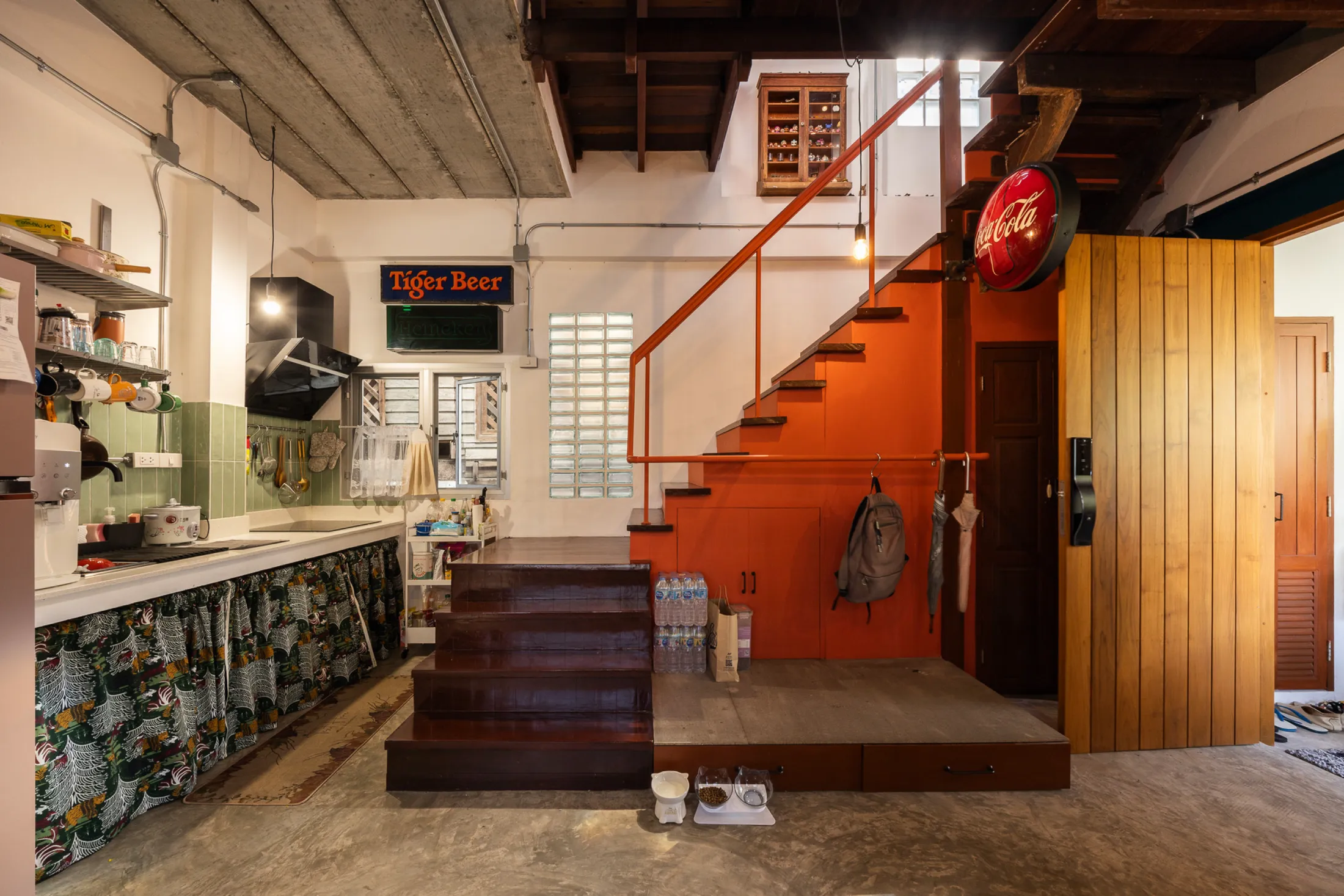
Historians have explored and noted that in ancient times, architecture in Thailand rarely used colours. The colours that appeared were often linked to details such as Chinese ceramics or gold lacquer applied to sculptures. As for actual paint products used for the architecture, they were likely influenced by Western architecture during the reign of King Rama IV (around 160 years ago) for the royal families' palaces and vacation houses. Pastel tones were dominant at that time, and the choice of colours in architecture continued to be adjusted and selected according to the preferences of the king and the upper class.

As urban construction began to expand, colour regulations were only enforced in the early stages. Since then, paint products have become easily accessible to the people, reflecting the characteristics of a capitalist era. These days, there are not many laws regulating building colours in Thailand (except for some regulations in old towns). This has led to a frequent display of brightly coloured and striking buildings everywhere, especially in rural areas, where we often find homes painted in extremely vibrant colours, such as a green railing contrasting with a pink house, or a blue staircase alongside a green house with yellow pillars against a pink beam. These bright and vivid colours reflect the tastes of ordinary people in Thai society.

What are your theories about where this attraction to such bold and clashing colours comes from? Does it relate back to the celestial bodies or is there something else at play? 

I have playfully analysed the reasons why ordinary Thai people tend to prefer such bright and striking colours and I identified three main reasons:

- We did not grow up with an understanding of colour shades or tone control. When it comes to blue, there is no light blue or dark blue; there is only one bright blue paint available in the local store.

- Thailand is a hot country and year-round sunlight can easily fade house paint colours. Choosing to paint in the brightest and most vivid colours is a way to save costs on repainting the house.

- Lastly, it is still related to beliefs about luck. Since we are painting it ourselves, we must choose colours that align with our individual preferences (and beliefs) because the house is meant to last a lifetime.

But there’s some tension here about these choices not being fashionable, right? 

Currently, there is a tendency – especially among architects and designers – to view the use of bright and vibrant colours in new architecture as a reflection of poor taste. Instead, they often choose colours based on internet trends, whether it be Western tonal shades or warm Japanese tones. Every time I open a design magazine in Thai, I find it contradicts the overall scenes of society. Whenever a house conceived by a designer appears in a community or neighbourhood, it often looks out of place and different from the surroundings, even if that house is painted in a monotone.

As an architect who is interested in everyday culture, I have come to realise that using vibrant colours in newly designed architecture is the answer to integrating new elements with our urban fabric and traditional communities. It is friendly and reduces disparities in architecture, and preserves the uniqueness and freedom of spirit of the people.

Why are you so passionate about this ‘everyday culture’?

It originates from the writing of my two books. If you have ever visited Bangkok, you would have encountered the chaos that comes with the diversity and vibrancy of the people in this big city. I was born and have spent my entire life in Bangkok. My interests and inspirations in my work over the years are directly and inseparably connected to this city. I often choose to walk on weekends with excitement to explore the scenes of the city and its people, as well as to observe urban vernacular design from the locals who strive to continue living in a city that people both love and hate.

What do you do with these observations? Does this relate to your ‘Thai Urban Mess’ project?

Yes. The Thai Urban Mess Architecture project is a collection of 365 sketches that document small objects and architectural designs created by everyday people on the streets of Bangkok from late 2019 to late 2020. These sketches capture the street-level creativity and resourcefulness that often goes unnoticed by most Thai citizens. Many people fail to recognise the potential of these informal designs to inspire improvements in urban life and city planning. Through the process of sketching these designs for more than a year, I began to understand the hidden conditions and challenges of the city – issues that are also often overlooked. The solutions I encountered were marked by surprising creativity and ingenuity, consistently challenging the conventional thinking and perspectives of designers.

Three years after completing the collection, I spent time arranging and analysing the relationships between all the images, which eventually evolved into 13 articles. This body of work became the book 365 Days of Thai Urban Mess Architecture.

How did this project feed into the concepts and design for your recent renovation project, Din Daeng House?

The Din Daeng House is a 180-square-metre renovation project completed at the end of 2024 with a colour scheme of bold green and vibrant red (I gave my client complete freedom to choose these colours). The project was inspired by observing street vendors and stall owners utilising air-hanging techniques. They creatively repurposed pipes to hang items, maximising the use of limited space. This concept was integrated into the staircase handrails throughout the house, allowing the homeowner to organise belongings or hang clothes on any of the rails as needed. This hanging system takes up minimal space but is highly efficient, offering a more practical alternative to traditional built-in cabinets.

So clever. Can you tell us more about how you empower your clients when it comes to colour and rehabilitate their relationship with these vibrant hues?

To me, colour reflects the evolving tastes of society at any given time. It is also a universally understandable creative element, whether you are a designer, a street vendor or a local. On a deeper level, colour serves as one of the most powerful mediums for freedom of expression in architecture. It empowers individuals to make choices that reflect their personal beliefs or unique identity at an affordable cost. Because of this, I always give clients as much freedom as possible when it comes to colour in every architectural project. I help them find colours that represent themselves. At the same time, I aim to harmonise the colours with the surroundings, trying to enhance a sense of connection and unity within the community.

everydayarchitectdesignstudio.com

-

As featured in Issue 4 of our magazine!

Purchase a copy of Issue 4 https://www.nts-store.com

Subscribe to our NTS Sub Club https://www.nevertoosmall.com/magazine

Writing:
Writing:
Elizabeth Price
Photography:
Photography:
Back to Top
Arrow UpArrow Up
Top
Arrow UpArrow Up
Businesses featured in this project
No items found.
Products featured in this project
No items found.
Magazine Current IssueMagazine Current Issue
Writing:
Writing:
Elizabeth Price
Photography:
Photography:
Back to Top
Arrow UpArrow Up