Magazine Current IssueMagazine Current Issue
Small Home: appartement rhin
From our Mag
November 26, 2025

Small Home: appartement rhin

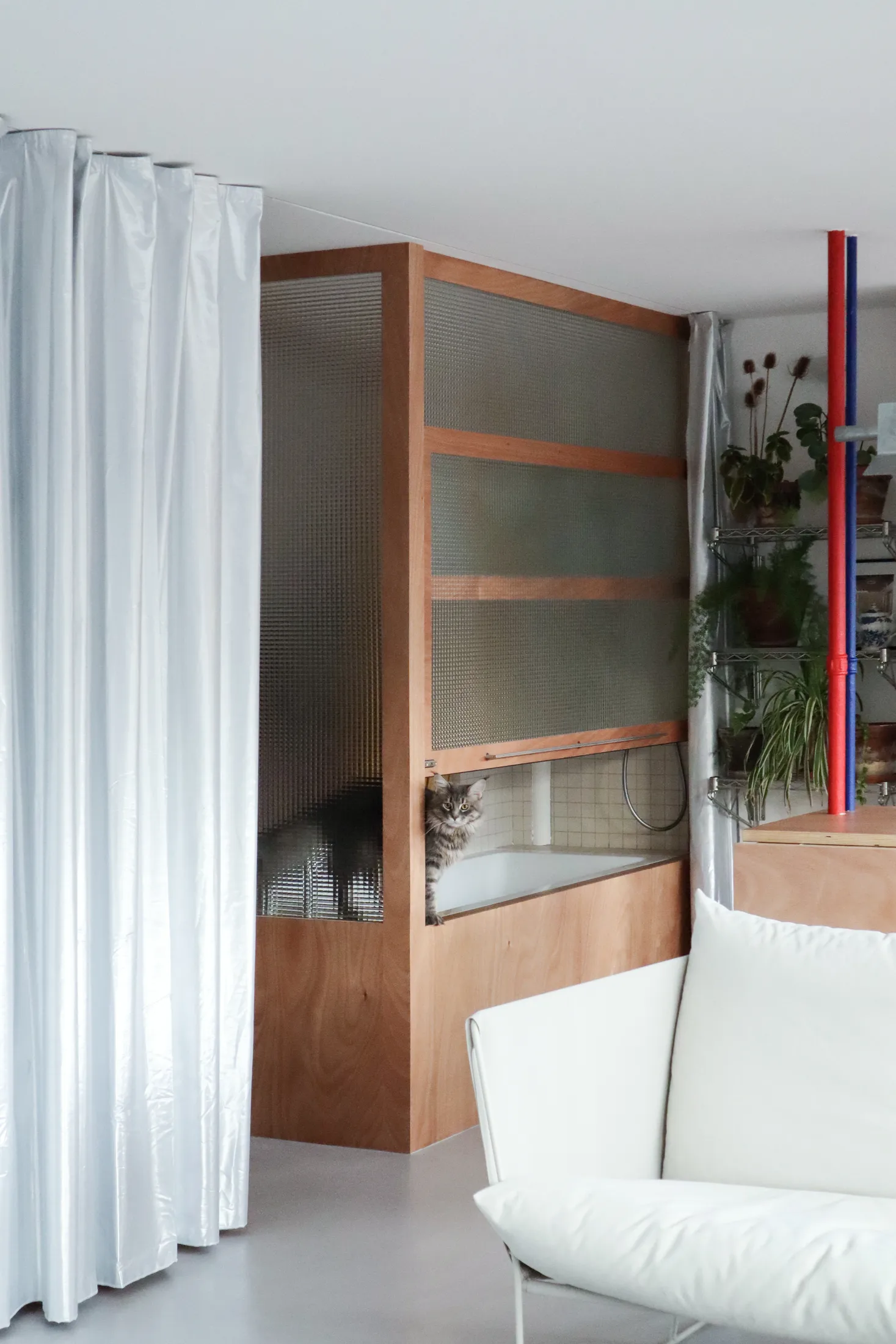
In this 43sqm/467sqft Paris apartment, minuit architectes strip everything back to essentials, revealing a sweeping wall of glazing and a home shaped by light, intimacy and ritual. A glazed bathroom “cabin” with a sash window becomes the project’s quietly radical centrepiece, turning bathing into a serene and (when desired) social experience.

A desire to exploit the expansive glazing of appartement rhin’s single aspect is what drove the decision to remove all of its existing walls, but it was a love of outdoor bathing that determined the placement of its new walls. Less walls and more an encasement in fact; embellished by textured glass and an elegant sash ‘window’ to facilitate privacy, or indeed, social interaction depending on the mood and desires of the bather. This is a mode of design that keenly interests the team at minuit architectes – extraction of all that is superfluous in order to focus on necessity. This way, what is essential is all that remains. And who’s to say a bath is not essential in the small home of someone who dearly loves to bathe?  

Elizabeth Price
Writing:
Minuit Architectes
Writing:
Elizabeth Price
Photography:
Photography:
Minuit Architectes
Magazine Current IssueMagazine Current Issue
The After shot of the Floorplan
Before
before
after
After
Top
Arrow UpArrow Up

Where in Paris is the apartment?

The apartment is located in the north of Paris, in the 19th arrondissement. Positioned between the Parc des Buttes-Chaumont and the Canal de l’Ourcq, it benefits from a richly contrasting urban and natural landscape. Despite these varied surroundings, the 19th remains one of the most densely populated and lively districts in the city.

Tell us about your client and their brief.

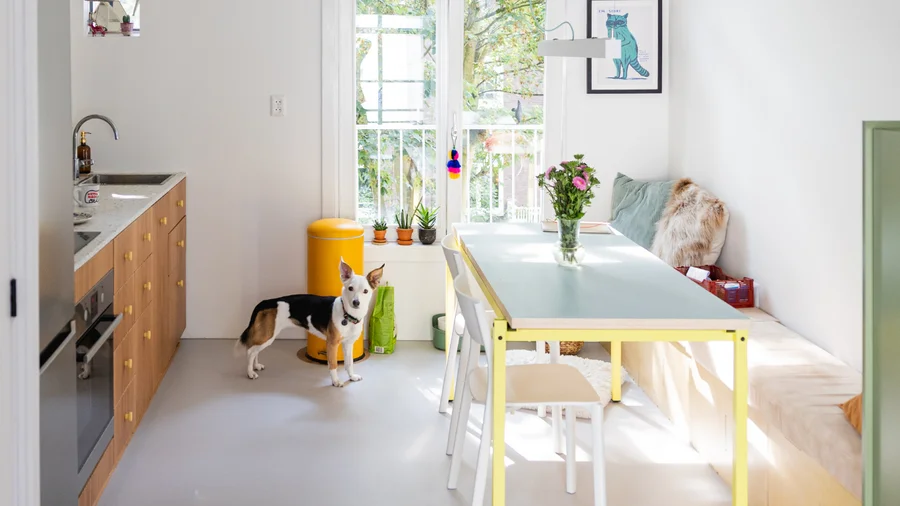
The client, an architect–designer, was seeking a compact retreat for himself and his partner – a kind of quiet capsule, shielded from the bustle of the street. One of his key desires was to take full advantage of the long glazed facade to heighten the sensation of space. With the apartment being relatively small, the main challenge was to craft a layout that would maximise both the living and sleeping areas in a fluid, functional way.

What was the apartment like when you first saw it? Any major challenges or advantages to be exploited?

When we first visited, the apartment was in fairly good condition. It followed a conventional layout: a closed bedroom, toilet, bathroom and a separate kitchen. At the rear, a pantry completed the floor plan. One of the main challenges was to create a well-ventilated living environment – especially for the humid areas – in spite of the apartment’s single orientation, which made cross-ventilation impossible.

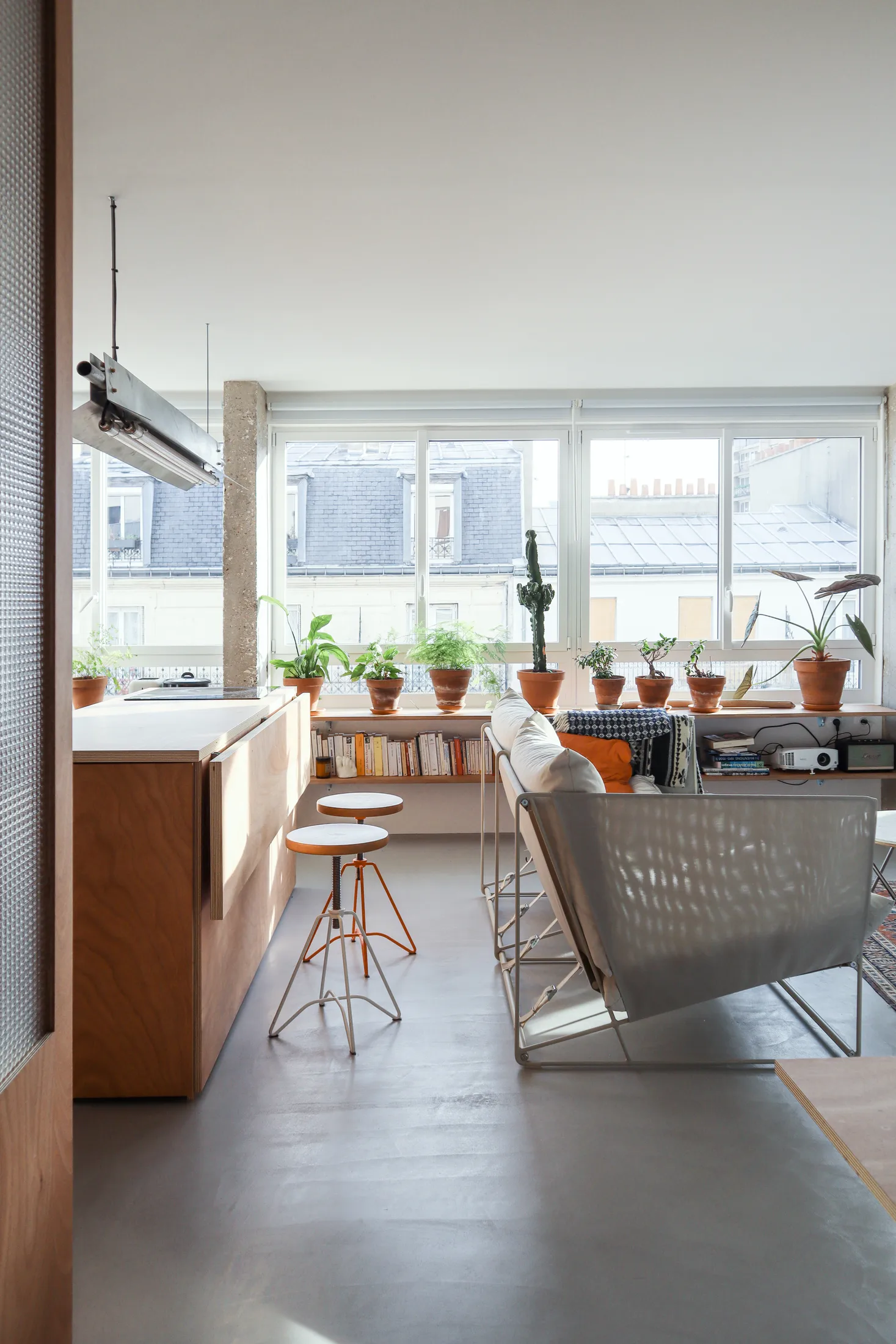
A significant opportunity lay in restoring the continuous strip window – typical of 1960s architecture – faithfully and entirely, maintaining its original proportions and rhythm across the full length of the facade.

How did you proceed?

Our initial response was to open up the space as much as possible, questioning whether any zones really needed to be closed off – and if so, which ones. Ultimately, we made a radical choice to leave everything open, enclosing only the bathroom.

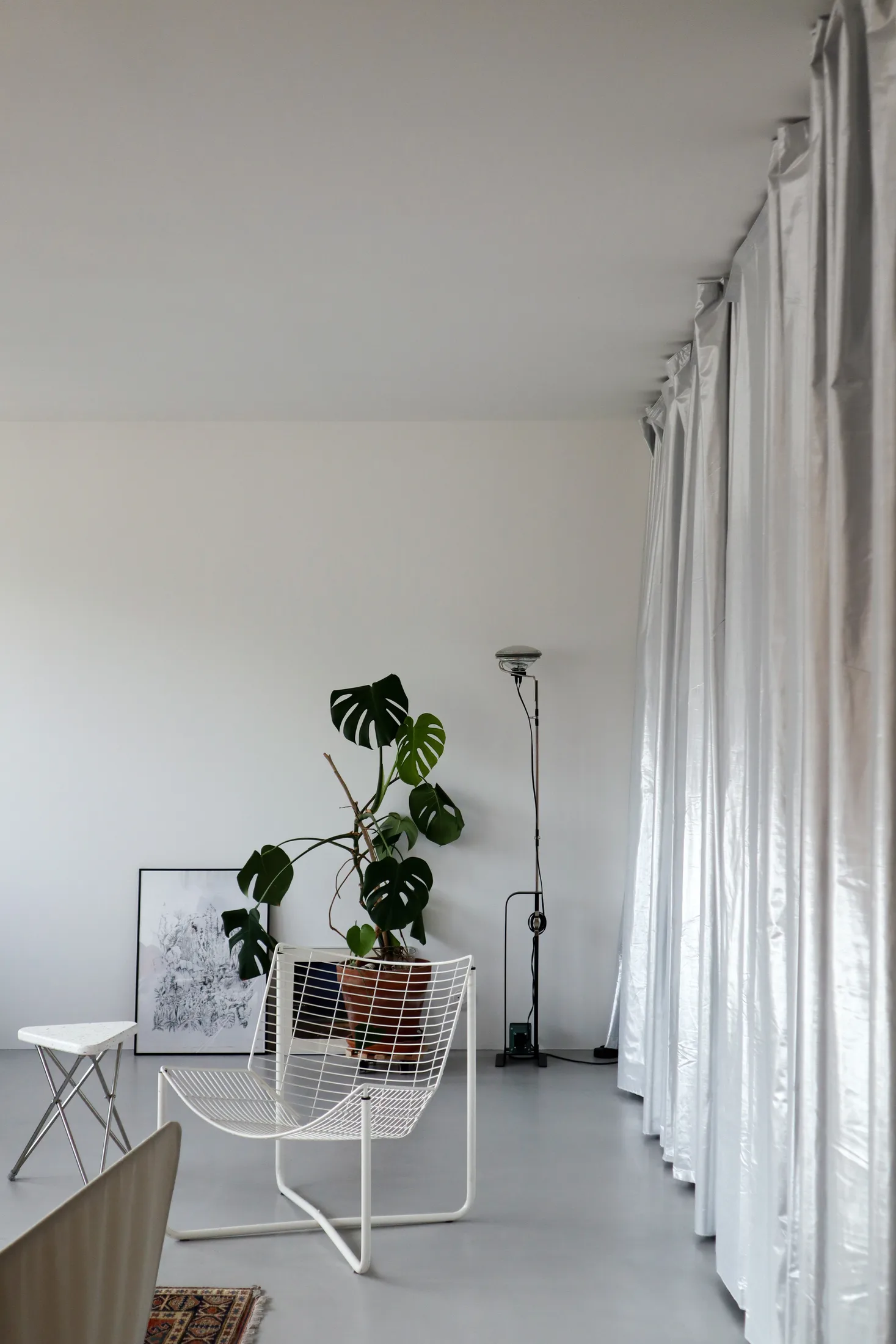
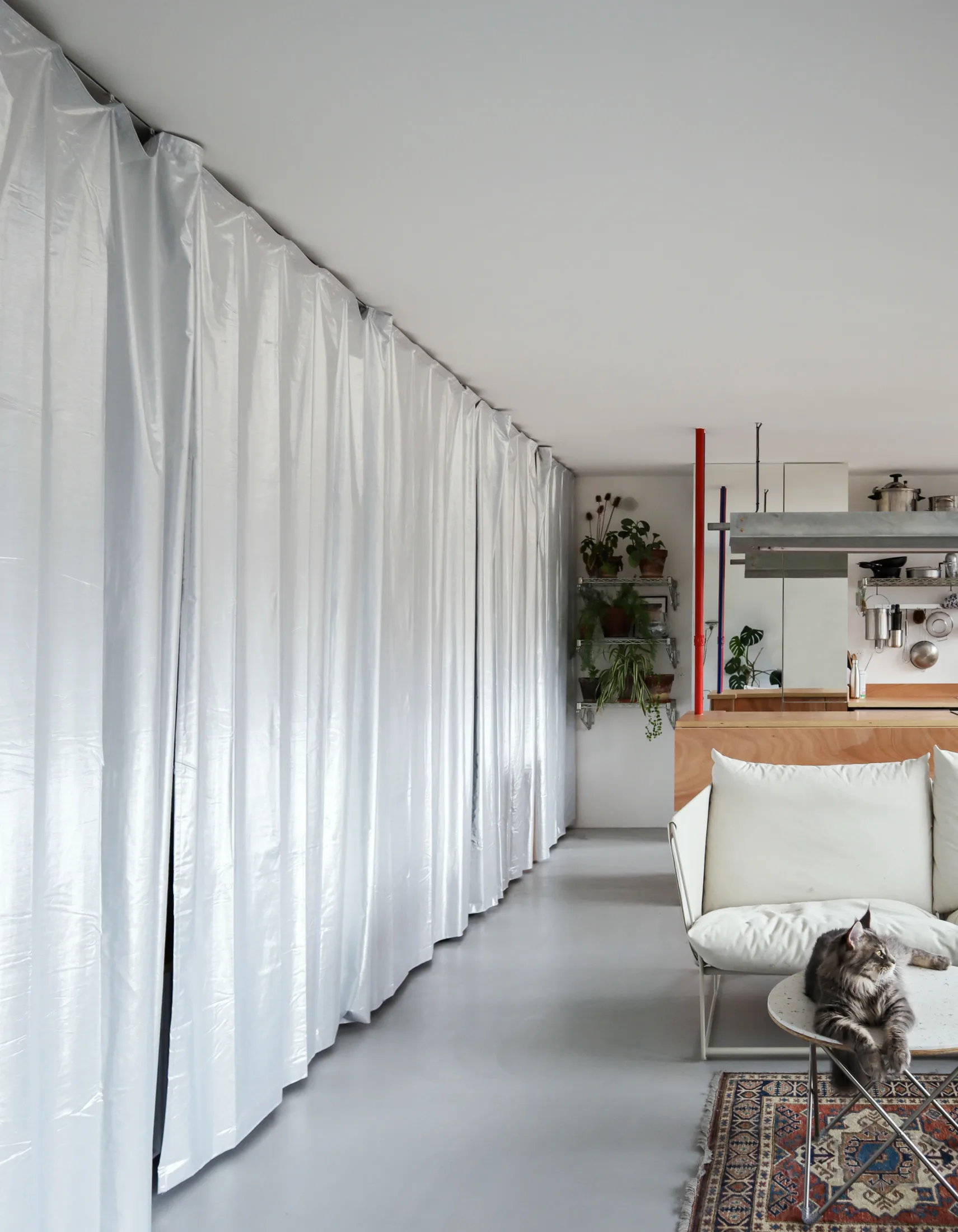
Rather than creating a distinct bedroom, we focused on the bed as a functional element – ephemeral and compact – and placed it where the pantry once was. It now sits like a cocoon, or a small cabin, at the same level as the window ledge. A long curtain track clearly defines the sequence of spaces: storage, sleeping area, entry and bathroom, forming a kind of visual backdrop that houses all the apartment’s service functions.

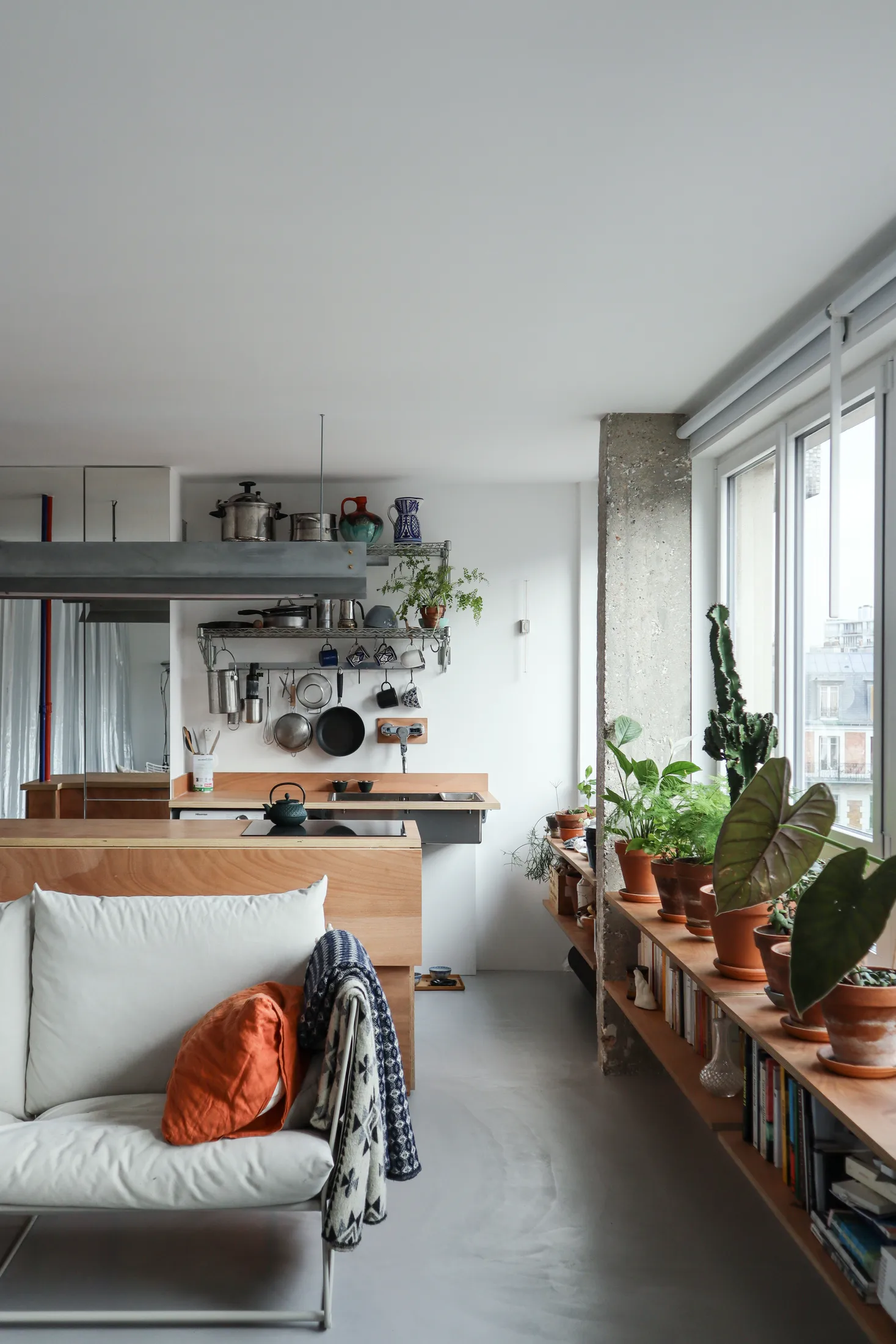
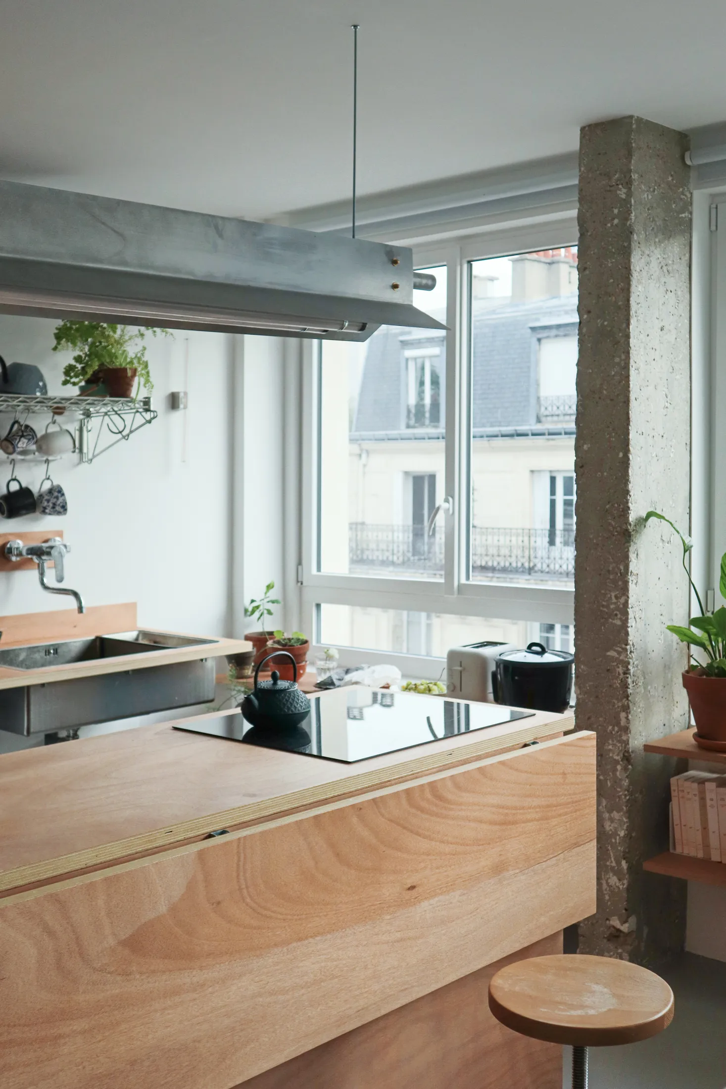
By clearing the entire space of internal partitions, we were able to fully reveal the continuous strip window – which had been obscured by the previous layout. Stripping the apartment also allowed us to expose the original concrete structural columns, which we chose to leave bare as part of the overall aesthetic.

Was the design process a close collaboration with your client or were you given plenty of freedom to realise your own vision for the space?

We took time to reconsider the relationship between the user and the spaces – not in terms of surface area, but in terms of function, usage and even objects. The client gave us complete creative freedom to explore and refine these ideas. It was a trusting and open collaboration from start to finish.

What were the most important things to your client in the design?

Striking the right balance between the formal austerity of an open-plan layout and the warmth of a lived-in space. Wood – specifically okoume plywood – played a key role in achieving this equilibrium, creating a striking contrast with the neutral concrete floor, the expansive glazing, and the metallic curtains.

Was the bath sash window your idea or theirs? Was the bathing experience something they especially wanted to be elevated in the design?

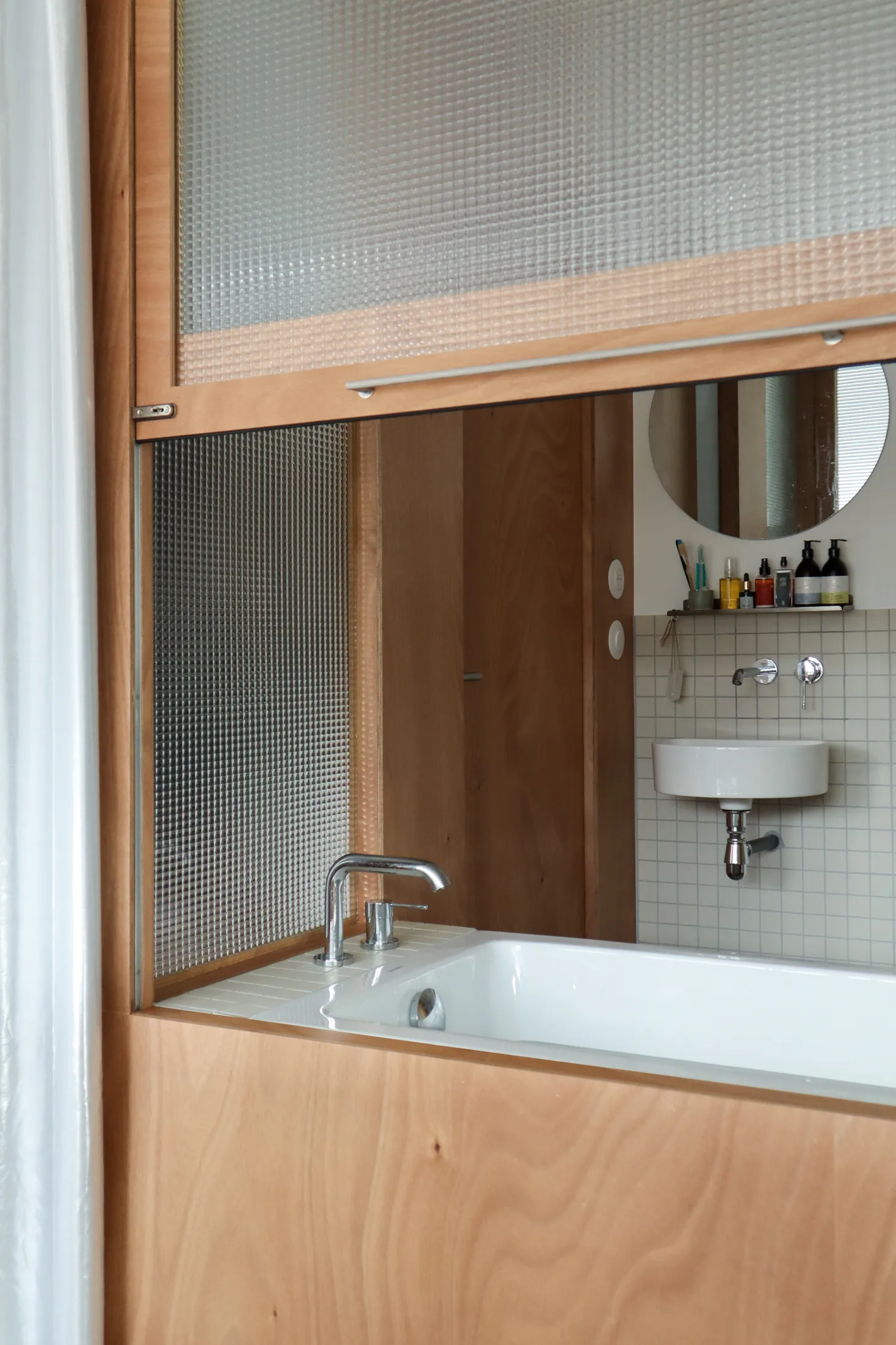
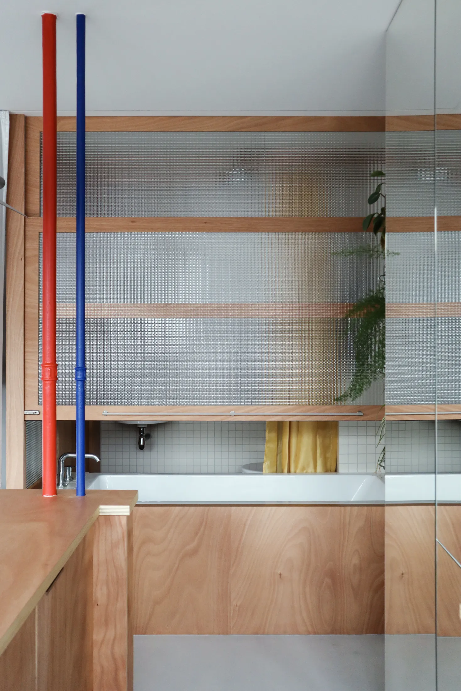
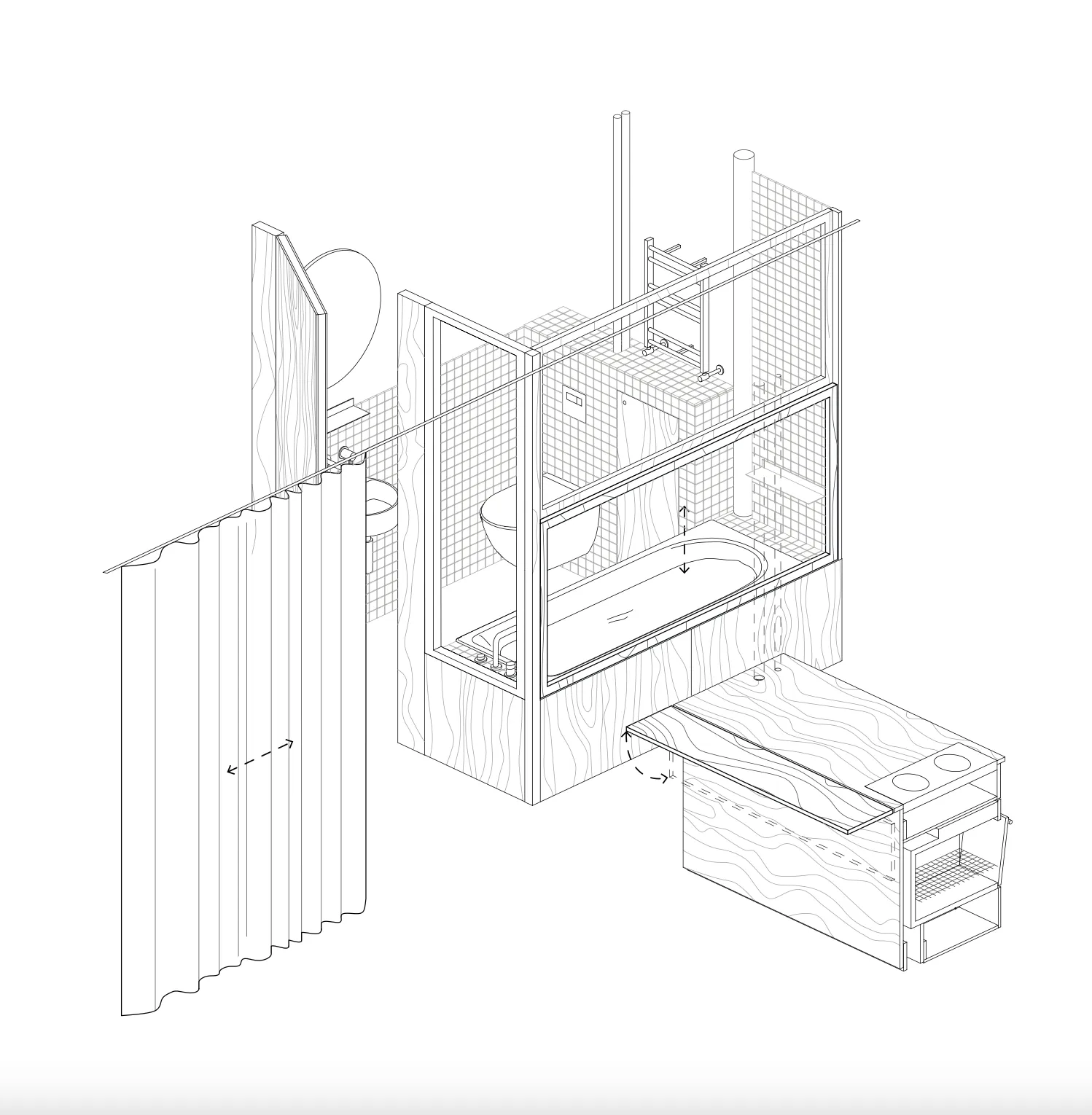
The idea emerged through conversation with the client. When he shared his love for outdoor bathtubs and the comfort they bring, we proposed bringing that sensation indoors. The large sash window helps create the illusion that the tub is detached from the bathroom – a delicate object seemingly placed within the living space.

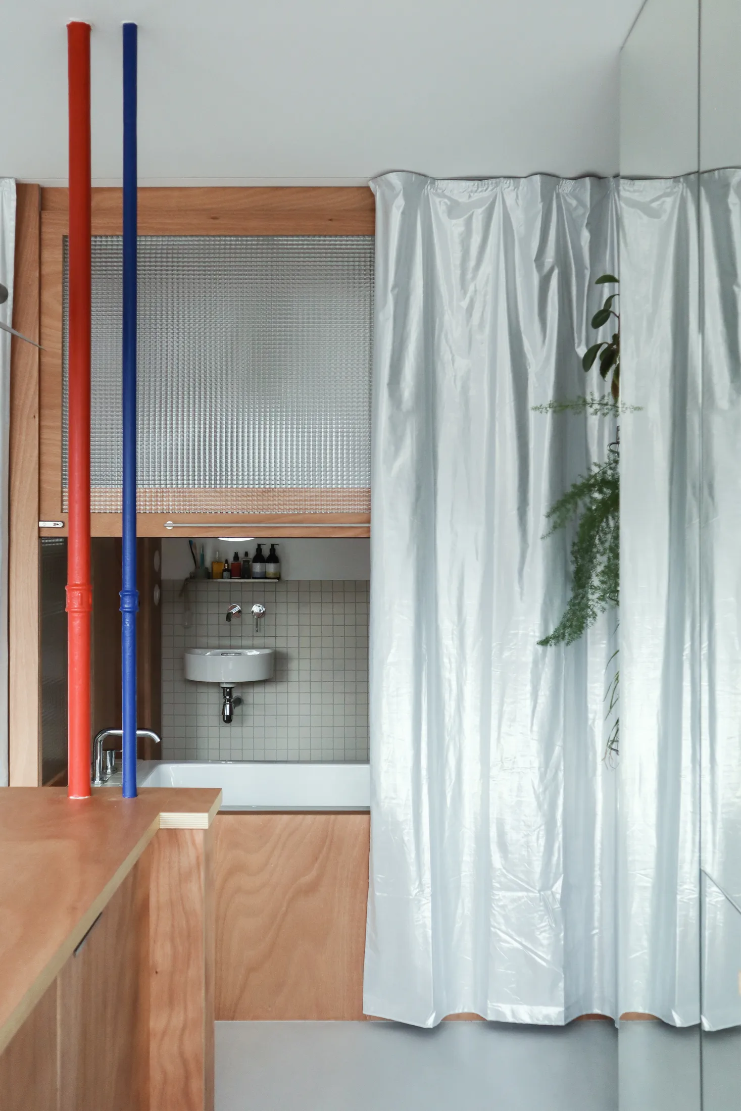
As the design evolved, the ability to enjoy a bath while chatting with someone cooking nearby or relaxing in the living room became one of the apartment’s standout, unconventional features. Being the only enclosed space, the bathroom was treated with great care – designed as a glazed cabin, with textured glass that transforms it into a glowing lantern by night.

Talk us through your choices of materials throughout and why these choices were made. 

Our material palette aimed to strike a balance between industrial clarity and domestic warmth. Metallic elements – curtains, shelving, lighting – were paired with warm wood finishes and textured glass to create a tactile, contrasting harmony. It’s a dialogue between raw functionality and soft intimacy.

Where did the idea for the silver curtain come from? 

The curtain was designed to define the sleeping, storage, entry and bathroom areas. It provides privacy when needed, conceals clothing and offers full blackout for restful sleep. We quickly gravitated towards a metallic solution – something that wouldn’t darken the space and would help reinforce the feeling of openness. The reflective quality of the metallic finish enhances the room’s brightness by bouncing light throughout the space. In reality too, the curtain is a basic thermal liner – an affordable, technical and lightweight solution that suited our needs perfectly.

And please enlighten us about the lovely blue and red pipes and the elegant recessed runner for the curtain. How did these details come about?

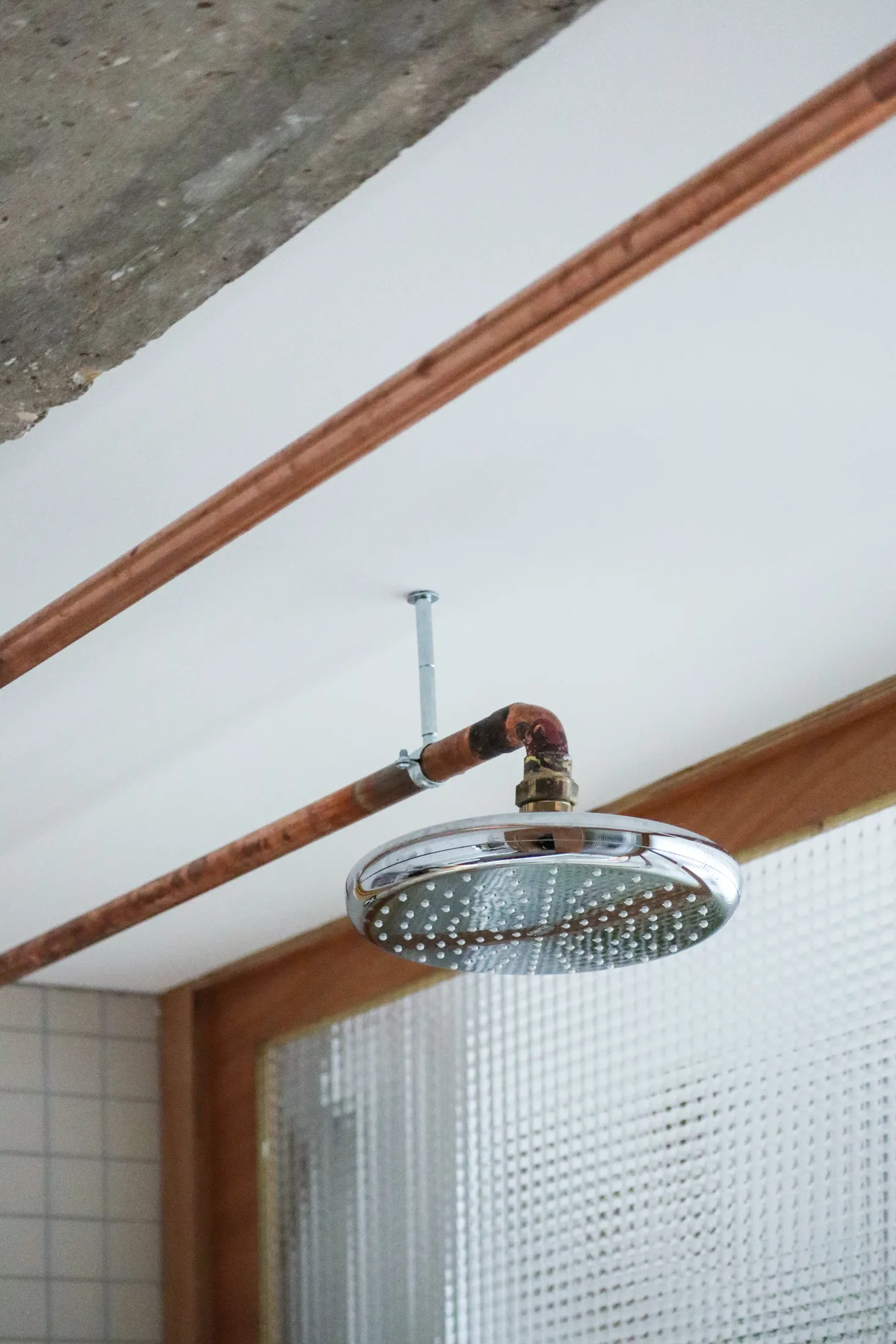
The red and blue pipes are part of the building’s central heating system. Originally concealed within a wall lining, they were the only elements that couldn’t be moved or removed. We chose to embrace them by painting the cold and hot water pipes in blue and red respectively. As for the recessed runner: we completely insulated the apartment from the inside, mainly due to the poor acoustic insulation of the building’s floors. This internal lining provided the opportunity to embed the rail.

This is not the first time you’ve worked with a small space. How does your approach to working with small spaces like this apartment differ from your larger projects?

We began our practice working on small-scale projects. They raise very direct questions of use, ergonomics, and what is essential or superfluous. These questions now guide all our work, even at larger scales. Small spaces force you to interrogate what’s truly needed to create a memorable and comfortable environment. This notion of necessity remains central to our process. It encourages us to invent technical and functional solutions through design and to create devices that improve daily life.

What kind of life is lived within these walls?

A peaceful, serene life – minimal, orderly and intentional.

And what is your favourite detail in the apartment and why? 

The bathroom window remains our favourite element – because of its size, elegance and beautifully simple mechanism.

-

As featured in Issue 5 of our magazine!

Purchase a copy of Issue 5 https://www.nts-store.com

Subscribe to our NTS Sub Club https://www.nevertoosmall.com/magazine

Writing:
Minuit Architectes
Writing:
Elizabeth Price
Photography:
Photography:
Minuit Architectes
Back to Top
Arrow UpArrow Up
Top
Arrow UpArrow Up
The After shot of the Floorplan
Before
before
after
After
Businesses featured in this project
No items found.
Products featured in this project
No items found.
Magazine Current IssueMagazine Current Issue
Writing:
Minuit Architectes
Writing:
Elizabeth Price
Photography:
Photography:
Minuit Architectes
Back to Top
Arrow UpArrow Up