Magazine Current IssueMagazine Current Issue
Brand Singapore
Brand Singapore
From our Mag
August 1, 2026

Brand Singapore

How do you turn a postage-stamp-sized island with no natural resources into a global powerhouse? From Merlions to dragon playgrounds, we trace Singapore’s journey from top-down nation branding to something much more grassroots.

How do you turn a tiny, resource-poor island into a global icon and GDP powerhouse? From Merlions to masterplans, here’s how Singapore officially became a ‘Nation By Design’.

James Shackell
Writing:
Writing:
James Shackell
Photography:
Photography:
The After shot of the Floorplan
Before
before
after
After
Top
Arrow UpArrow Up

In 1964, the Singapore Tourism Board gave British zoologist Alec Fraser-Brunner a challenging brief: to come up with a distinctive national icon for the young sort-of nation. It was a weird time for the country – caught halfway between post-war self-government and still being technically part of Malaysia. Singapore wouldn't achieve actual independence until August the following year. At this stage, in global circles, it wasn't really known for anything much. If it was known at all.

So Fraser-Brunner got to work.

He started with a lion head, from the old Singapura (translation: "Lion City"¹) then added a fish body to represent Singapore's origins as a sea-based trade town. He called his creature the Merlion. Mer meaning sea and Lion meaning lion. You get it.

Over the next few decades, the Merlion became the most globally well-known image of Singapore; a weird zoological fusion that felt vaguely kind of ancient, but was actually designed by a young nation inventing tradition on the fly. Tourists could buy Merlion mugs and Merlion tea towels and novelty ceramic Merlion figurines. In 1972, local craftsman Lim Nang Seng built an 8.6-metre concrete Merlion statue in what is now known as Merlion Park. It's still there today, shooting an endless stream of water from its jaws into Marina Bay, the estuarine mouth of the Singapore River.

And the irony was that the Merlion – half fish thing, half weird British invention – perfectly mirrored the nascent Singapore itself. And not just in the symbolic way Fraser-Brunner intended. The Merlion wasn't ancient, although it borrowed old scraps from legend and story. It was deliberately constructed, rather than something that grew organically. And (being designed by the curator of the London Zoo) it was still slightly, inevitably, tethered to the old colonial empire.

It was also quite heavily controlled. Not really folklore, more government IP. From the 1960s to the 90s, commercial use of the Merlion required the formal approval of the Singapore government. It couldn't be altered or parodied, and strict guidelines covered its scale, pose, texture and tone. It became a symbol of the country, sure, but never really a symbol of the people.

"The problem with the Merlion was that no Singaporean actually had a Merlion in their home," says local design writer and author, Justin Zhuang. "It's always been such a heavily protected symbol. For as long as I can remember, it's been something that foreigners think Singapore is, rather than something locals associate with."

Justin is actually putting his finger on one of the biggest and thorniest challenges of 'nation branding' – the art of marketing an entire country through language, image and symbols – and that challenge is: who are you actually selling this stuff to?

In the case of Singapore in 1964, with independence right around the corner, the Merlion quickly became an outward-facing symbol. Something for travellers and tourists and international investors, rather than locals. And when we're talking about Brand Singapore, the Merlion is a good place to start, because it tackles a tension the Singaporean government is still wrangling with today. Namely: how do you brand a brand new country in a way that feels real and authentic and resonates with everyone. Inside and outside. Residents and tourists. Young and old and in-between. What, in fact, does Singapore stand for? What does it mean? And who gets to make those kinds of decisions?

"It's only been in the last 15 or 20 years that we've seen a more ground-up effort from artists and local creatives to capture the essence of Singapore," Justin says. "The new generation has more interest in playing with the national image, the national brand, because they see design as a way of expressing culture.

"In the past, design was just there to support business, but now we're asking: how can we use design to express ourselves?"

You can learn a lot about a country from its branding. America has the stars and stripes. The bald eagle. Japan has the rising sun and the cherry blossom. Australia has the Qantas kangaroo². Branding is basically how a country talks to itself. And it isn't limited to just marketing; it can influence social policy too.

For the young Singapore, nation branding was an even more crucial tool, because they were starting from scratch. Singapore measures roughly 735 square kilometres or 284 square miles (although it's growing all the time, thanks to land reclamation). In international circles, that's a postage stamp. Australia has bigger cattle farms. The country had very few natural resources, and it was surrounded on all sides by industrial and population powerhouses: China, Malaysia, Japan and Indonesia.

So right from the beginning, Singapore couldn't afford any mistakes. Literally couldn't afford them. The government knew they had to invest in human capital, rather than coal or uranium or timber, and they couldn't really look to the past, because Singapore (as a sovereign nation) didn't have one.

So the country became all about the future. Brand Singapore represented convenience, innovation, efficiency and (eventually) good design.

"When Singapore first became independent, the challenges were brutally basic and fundamental," says Pann Lim, founder and director of creative agency, Kinetic Singapore. "Housing. Water. Jobs. Our Identity. We were resource-poor. We were (and still are) relatively small. And we had no inherited mythology to lean on. Everything had to be 'designed'."

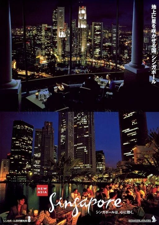
Singapore's first attempt to sell itself to the world was 'Instant Asia' – a Singapore Tourism Promotion Board campaign that ran from the 1960s to the 70s. The message was that Singapore was Asia… but easy. English-speaking, orderly and safe, but still appropriately 'exotic' (whatever that meant). A handy, Western-friendly gateway to the entire region. By the 1980s, that message had shifted to 'New Asia' – a tech-savvy, globally-connected city-state, focussed on finance and higher education, with regional business HQs recruiting top commercial talent.

The really interesting bit, however, was how the Singapore government used branding internally during this time. While they were out selling Singapore to the world as a land of forward-thinking innovation and opportunity, the message at home was very different. Survival. Discipline. Scarcity. Cleanliness. Basically do what you're told.

In the 1970s, for example, in an effort to curb rapid population growth, the Singapore Family Planning and Population Board (SFPPB) launched the infamous 'Stop At Two' campaign, promoting the idea that small, two-child families ensured a better quality of life for everyone. This wasn't just comms, either. It was backed by serious financial and legislative disincentives – like reduced maternity leave for the third child onwards, or higher hospital birthing fees for each additional child³.

There followed similarly prescriptive national campaigns on everything from productivity and cleanliness to speaking Mandarin (one of the four official languages of Singapore). In 1982, the country's internal mascot was literally a productivity bee called 'Teamy' – quietly and anonymously buzzing away for the good of the hive.

"In those early post-independence days, we were probably best known for being a former British colony. But by the eighties and nineties, the narrative had shifted," says Dawn Lim, Executive Director of the DesignSingapore Council. "Singapore became synonymous with efficiency and order, known perhaps for our strict laws.

"To borrow from the memoir of Singapore's first Prime Minister, Mr Lee Kuan Yew, we went from 'third world to first' in a generation. Singapore evolved from a trading port into a global city that punches well above its weight."

This rapid rise and national struggle for survival meant that, by and large, Brand Singapore was something that was constructed from the top down. The government set the tone and determined the policy, and it wasn't looking for a whole lot of input or community feedback. It was up to the population to follow and be productive (see: Teamy) and basically pull together to help Singapore keep its head above water.

"In Singapore, there's always been this tension between what the government says and what Singaporeans really think," says Regine Abos, the Program Coordinator for RMIT's Singapore-based design school. "There's always going to be the government-led narrative, but there's also people out doing their own thing. And the big question is: which of those counts as 'Brand Singapore'?"

Along with her PhD colleagues at RMIT, Regine has dug deep into the history of Singapore's national identity. And the one common thread, through all the campaigns and slogans and birth-related policy changes, has been direction. Orientation. More than maybe any other country on earth, Singapore has always had one question on its mind: what's next?

"It's always been forward-facing. Everything in the country is about planning for tomorrow," Regine says. "Even the national anthem, Majulah Singapore, means 'Onward Singapore'."

Singapore's current slogan, or at least one of its slogans, is 'Nation By Design'. The words are drawn from a great quote from former Prime Minister Lee Hsien Loong: "Singapore is a nation by design," he said once. "Nothing we have today is natural, or happened by itself. Not our economic growth, not our international standing, not our multiracial harmony, not even our nationhood."

And it's true, too. This is Singapore's biggest limitation, but also its secret superpower.

It’s like being allowed to design a country from scratch in a video game. How can you plan for the future to maximise equality, prosperity, health and wealth for the maximum number of people?

Because when you think about it, what Singapore is – really – is a design problem. Take a very small landmass with nothing to sell and somehow turn it into a modern, commercial powerhouse.

That journey hasn't always been smooth, and some might argue that the price Singaporeans have paid for their country's success is an unacceptable level of government control, but the results speak for themselves. Singapore has the 28th largest GDP in the world. When you plug in per capita metrics, that number jumps to ninth. Close to 80 per cent of Singaporeans live in public housing, with home ownership hovering at a staggering 90 per cent. According to the 2023 Legatum Prosperity Index, Singapore ranks first among 104 countries for general health (which includes stuff like mortality and liveability outcomes, but also things like access to quality healthcare).

It shows the power of design thinking and branding when you apply them conscientiously on a national scale. Singapore is – and always was – a nation by design. For worse and for better.

"Good design is good business, good government and good for citizens," says Dawn Lim. "In business, it shows up as great products and services that are worth paying for. In government, it shows up as translating strategic vision into clear, coherent action. For citizens, it shows up as thoughtful systems and services that make everyday life better."

Pann Lim agrees. "We've always been pragmatic as a people," he says. "That's born out of our survival thinking. Design in Singapore was never simply about aesthetics, but rather a problem-solving tool."

As a problem-solving tool, Brand Singapore has evolved a lot since the days of the Merlion. The overall message is still carefully controlled by the government, but how that message gets articulated is much more collaborative and open, and there's room for national symbols to grow organically without a single inch of red tape.

Example? How about Singapore's now-iconic dragon playgrounds.

Originally designed in 1979 by Khor Ean Ghee for the Housing & Development Board (HDB), these geometric dragon-themed playground sets were rolled out in HDB projects all over Singapore for decades. A certain generation of Singaporeans literally grew up on them. In the 1990s and 2000s, however, most of the dragon playgrounds were bulldozed to make way for more generic, cost-effective, Western models.

"There were only about four of the original dragons left," Justin Zhuang says. "Then in the 2010s, these playgrounds ended up becoming icons of my generation. Designers started using them to create souvenirs, or symbols of Singapore. People put them on t-shirts and mugs. During SG50⁴, the state actually recognised the dragon as one of the 50 Icons of Singapore." He laughs. "Ironically, of course, it was the state themselves who demolished most of the dragon playgrounds in the 1990s and 2000s."

Of course, like all symbols, what the dragon playground actually represents to Singaporeans is quite nebulous and hard to pin down. "The younger generation don't understand at all," Justin admits. "When I showed some design students, they were like, 'What are you talking about? This is not cool.'"

But you know what? It doesn't really matter if the image of a smiling dragon head resonates with every Singaporean. It doesn't need to. It actually represents a more significant shift in the history of Brand Singapore, which is that symbols are now starting to flow from the bottom up, rather than the top down.

The people, as well as the government, are getting to decide what Singapore looks like, what it means, and how the country expresses itself. The grassroots are starting to grow.

As a Singapore-based creative, Pann Lim feels this shift big time. It's why he and the team at Kinetic, as part of Singapore Design Week 2025, transformed the atrium of the National Design Centre into something new (and kind of weird): the Unnatural History Museum of Singapore.

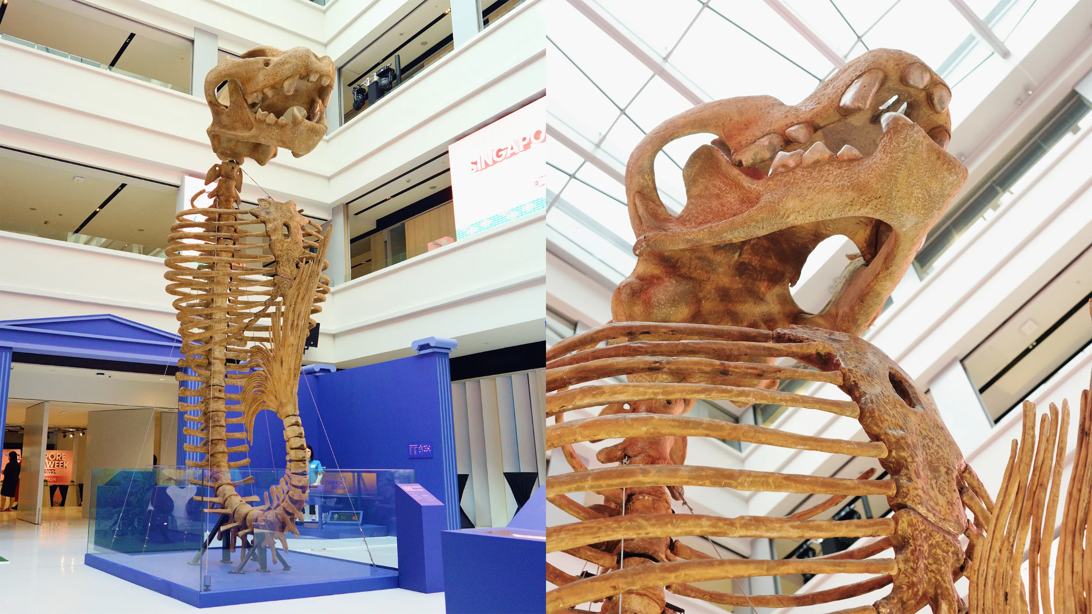
Featuring everything from a six-metre-tall Merlion 'skeleton' to cyborg cockroaches and autonomous nano drones⁵, the Unnatural History Museum was Pann's attempt to a) subvert Singapore's rigid, top-down national identity, and b) show off some of the legitimately amazing stuff local designers and tech companies have been working on. This was the best of Singapore – the real Singapore – kooky and playful and pushing boundaries. It didn't need to ask for permission. It just needed to exist.

"Expectations are higher now," Pann says. "Messages need to feel authentic. People are also more savvy, and you can't simply shove a certain narrative or belief down their throats. It has to be honest, and it has to mean something to them."

Nothing sums up this meaning-shift better than the Museum's giant Merlion 'fossil' – towering over the crowds like a mythical T-Rex. A post-colonial relic of the past. An image of what Singapore thought it needed to look like, now dug up and deconstructed for a new generation, who get to bring and attach whatever the heck meaning they want. Brand Singapore has officially come full circle and, to be honest, no-one quite knows what's next.

That's the exciting bit.

"If the current landscape suggests anything, it's that the future will be challenging," Pann says. "That's already the case. But Singapore has shown, time and again, that we can respond to crises with ingenuity. If we can continue to meet constraints with creativity, I think we're in for an exciting time."

¹ It should be noted that Singapore has no native lions. No lions at all. Fresh outta lions. The name is based on a 13th-century legend, where Sumatran Prince Sang Nila Utama landed on the island (then known as 'Temasek') and spotted a creature he believed to be a lion (again, definitely not an actual lion). In Sanskrit: simha (lion) plus pura (city) equals Singapura. You can guess the rest.

² Not quite the beloved national logo it used to be, but still recognised all over the world as a symbol of red-dirt adventure and generous corporate severance packages.

³ This program was slightly too successful. In 1987, in an effort to boost flagging birth rates, the government changed the campaign to 'Have Three Or More (If You Can Afford It)'. Catchy.

⁴ Singapore's 50th anniversary of independence, which took place in 2015.

⁵ Designed by Singapore agri-tech company, Polybee, the idea is that these tiny drones could, one day, supplement the pollinating efforts of Singapore's local bee population. Basically robo bees.

Writing:
Writing:
James Shackell
Photography:
Photography:
Back to Top
Arrow UpArrow Up
Top
Arrow UpArrow Up
The After shot of the Floorplan
Before
before
after
After
Businesses featured in this project
No items found.
Products featured in this project
No items found.
Magazine Current IssueMagazine Current Issue
Writing:
Writing:
James Shackell
Photography:
Photography:
Back to Top
Arrow UpArrow Up