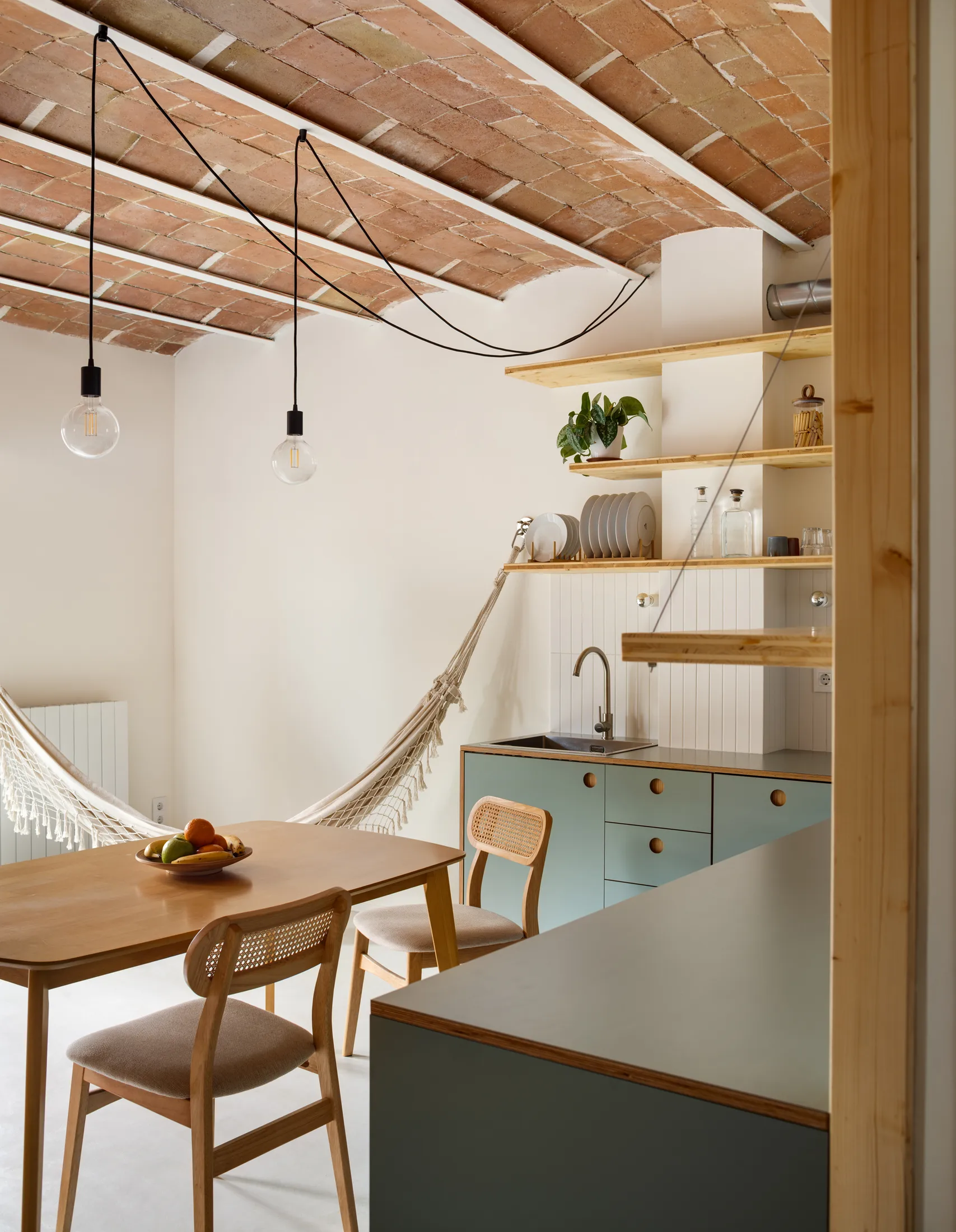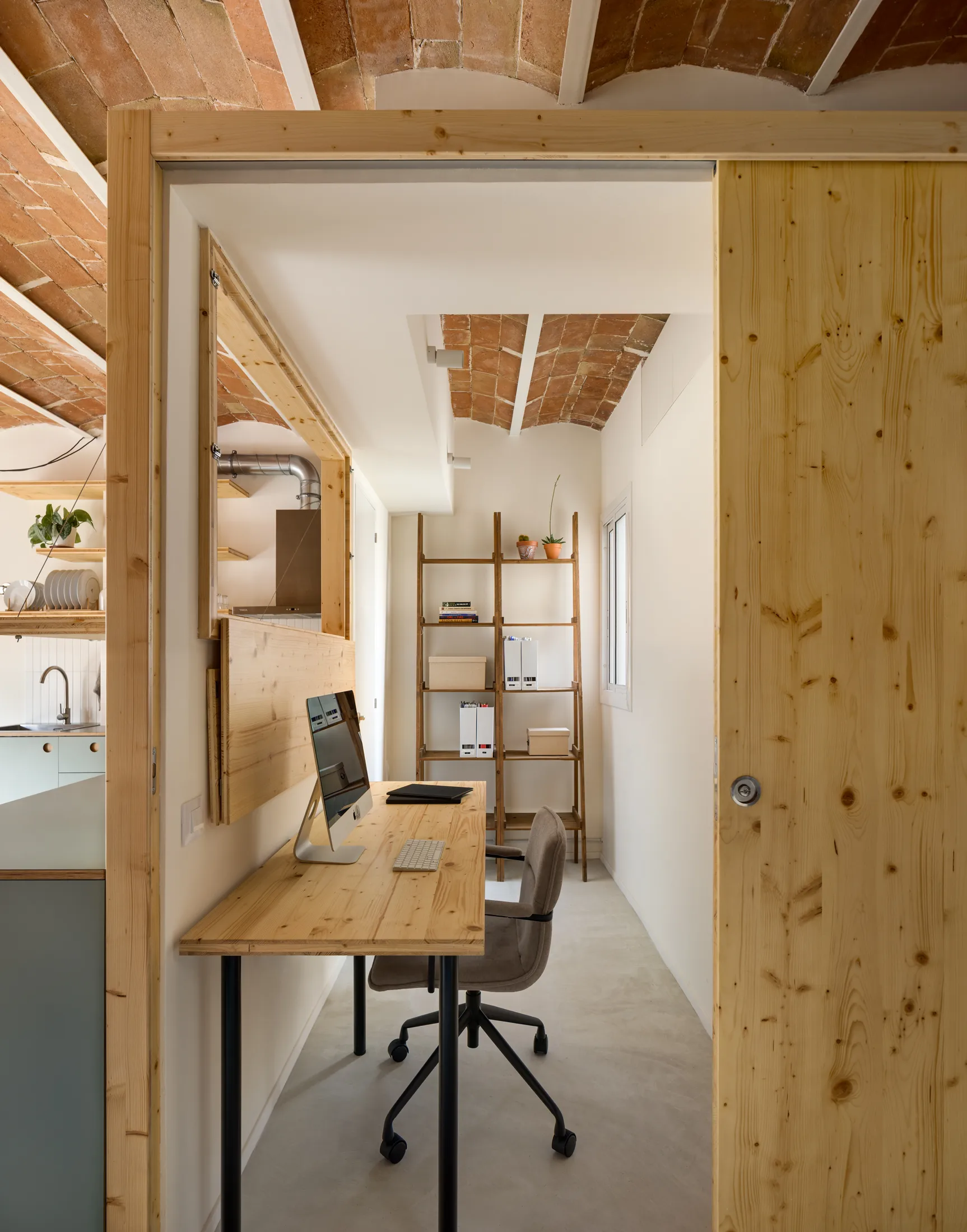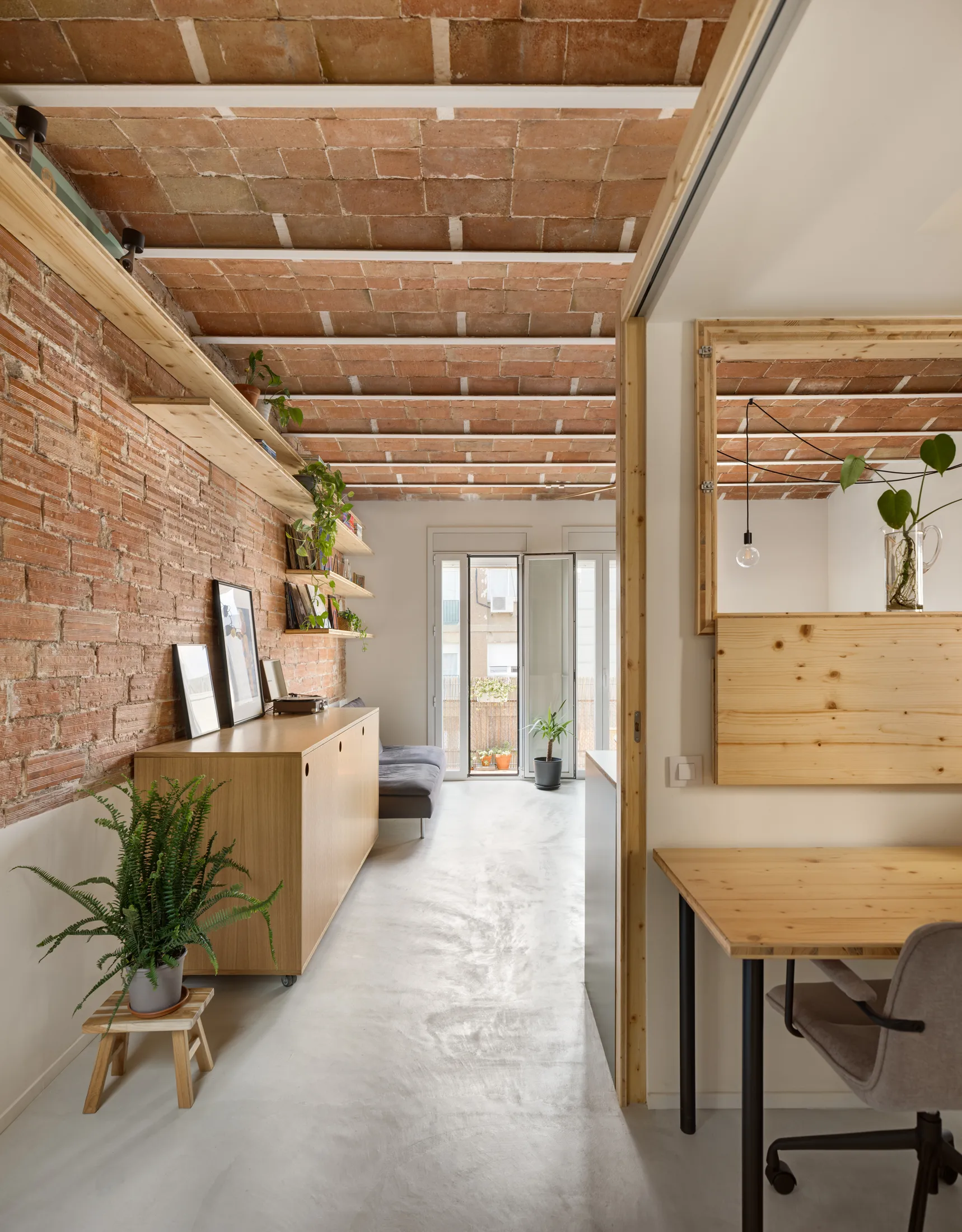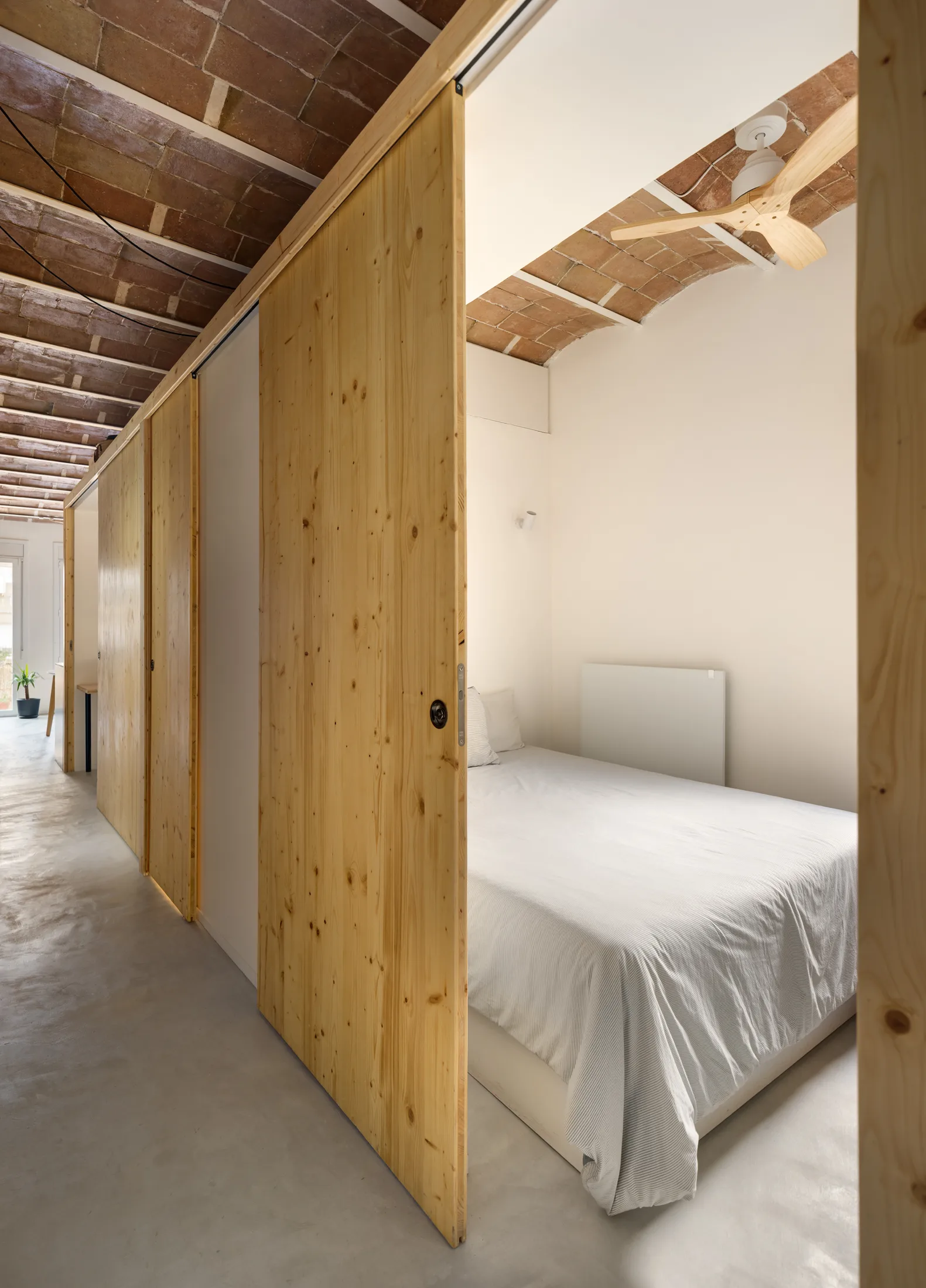


Designed around a brief that prioritised light, openness, and flexibility, Cristina Porta Díaz and Patrick Boehner of atelier pbo reimagined this once dark and cramped 45sqm/484sqft apartment in Barcelona. Rather than dividing the plan into separate rooms, they built a compact central “box” for the bedroom, bathroom, and office, leaving the rest of the space open as a bright, shared living area beneath restored Catalan vaulted ceilings. A home of this size relies on smart, subtle decisions. Here are five details that show how the architects made the space unique and full of light.
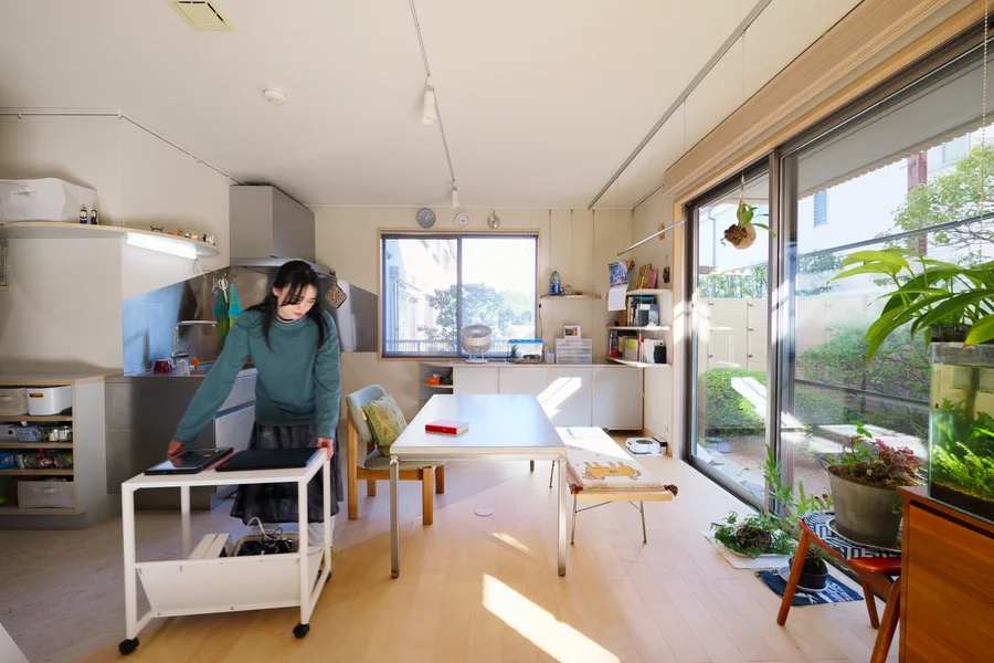
1. A Movable Kitchen Cabinet That Reconfigures the Room
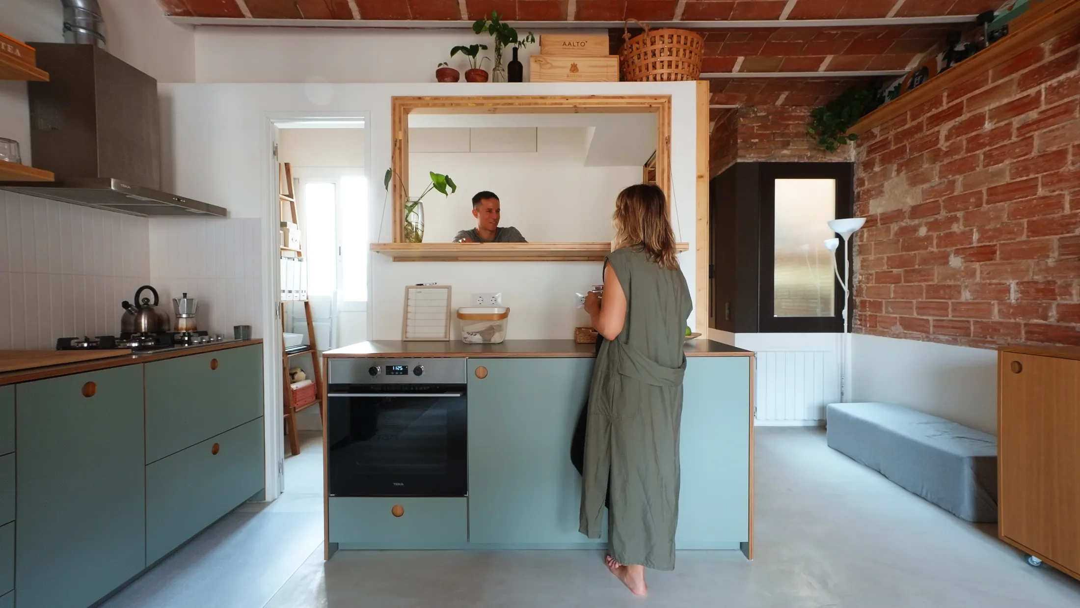
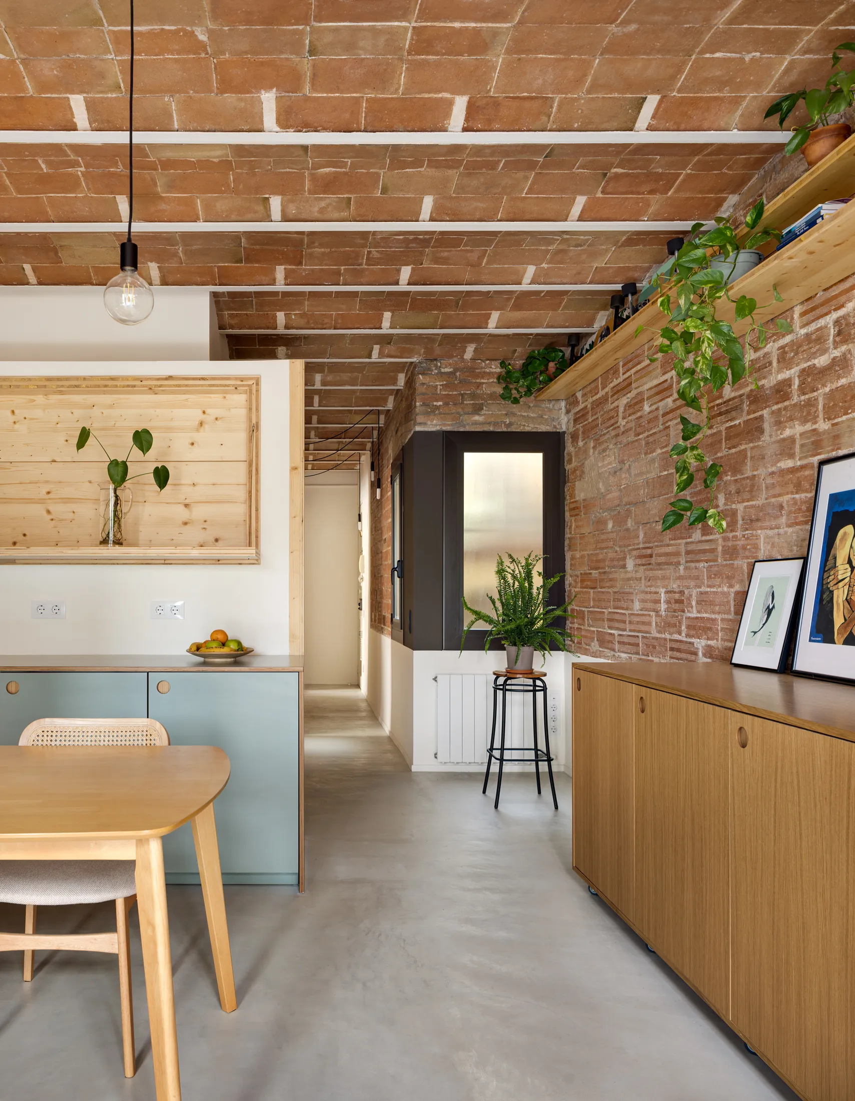
2. A Latch Window That Connects the Office and the Social Space
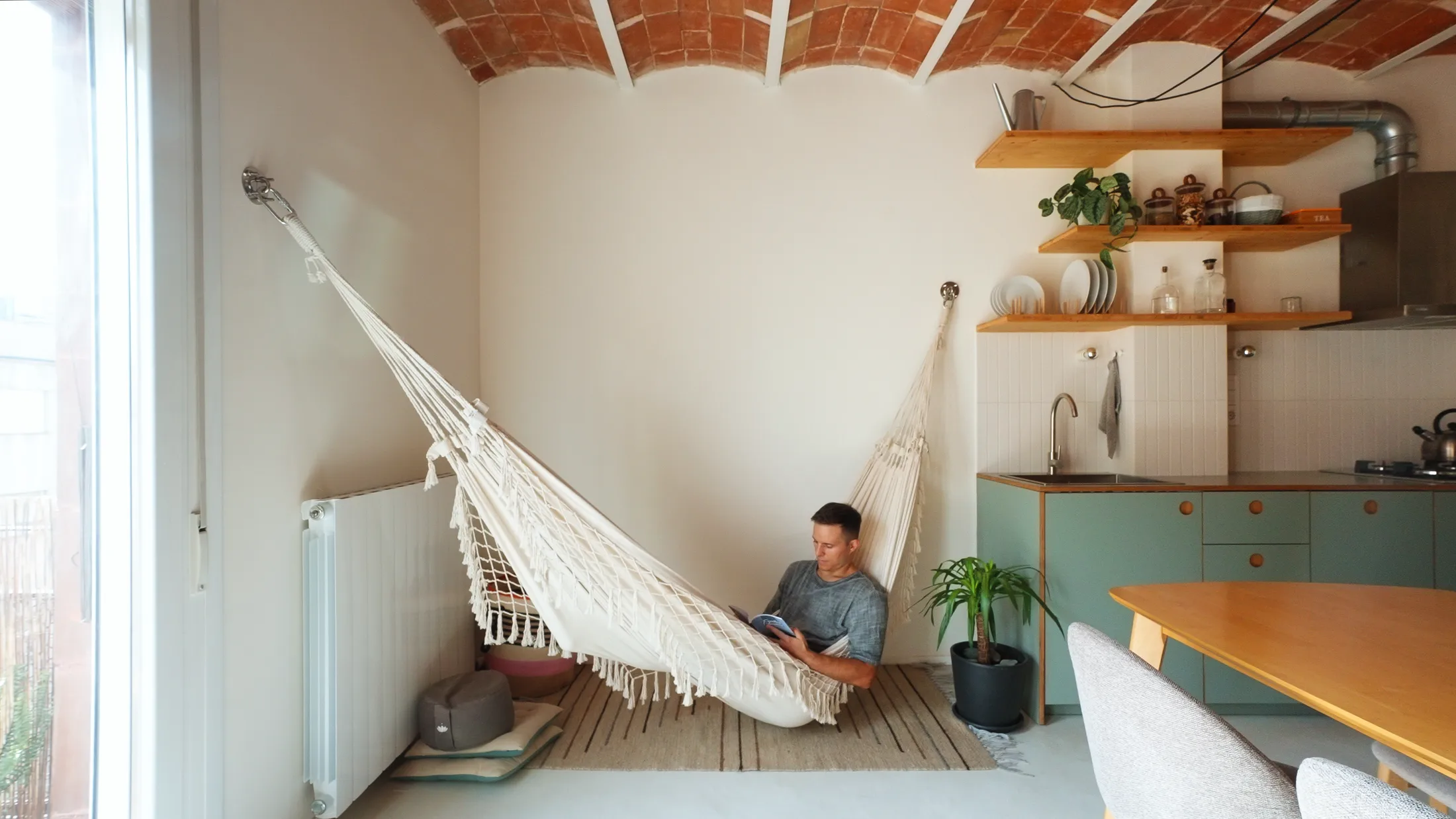
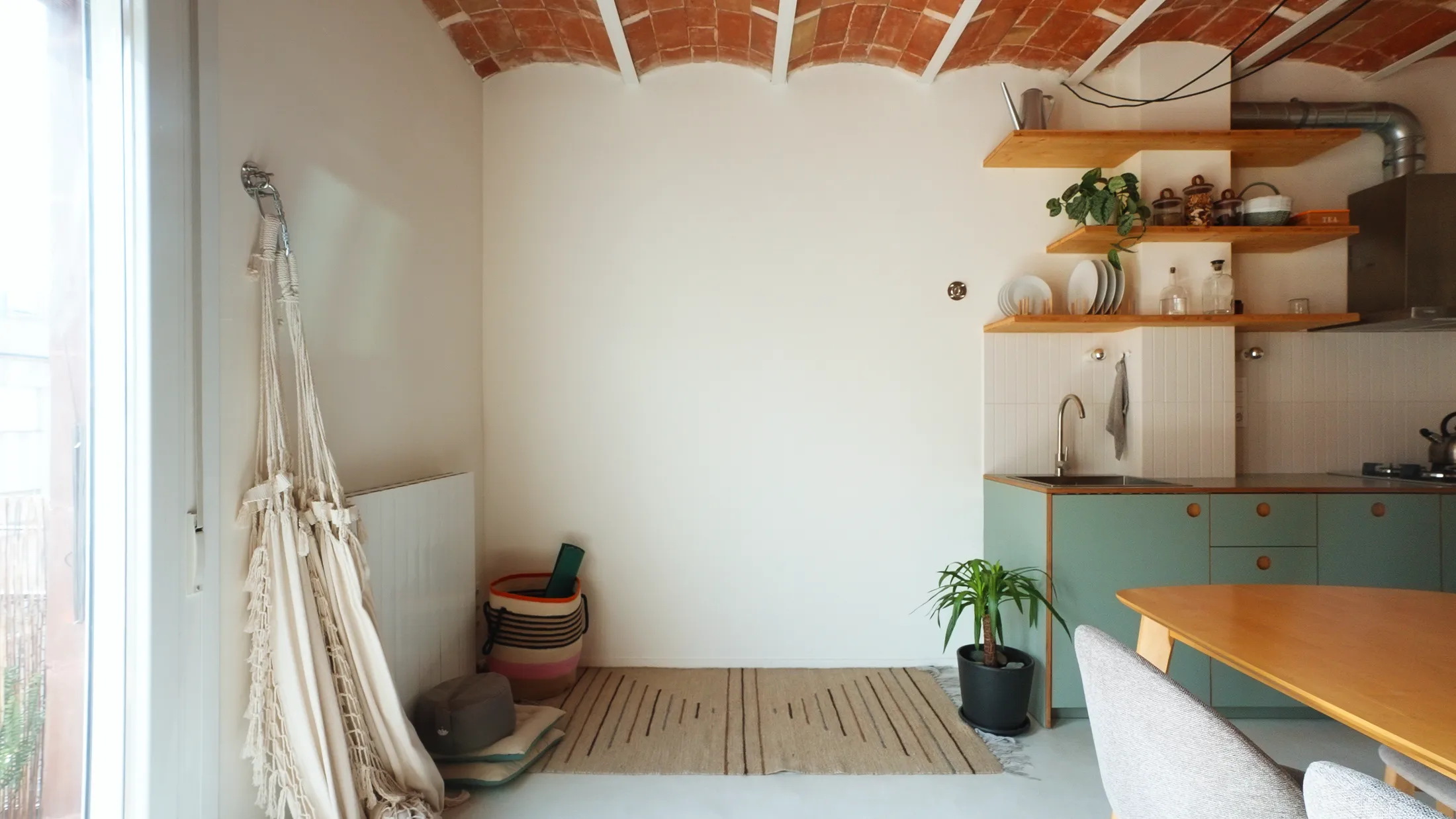
3. A Hammock That Creates a Flexible Chill-Out Zone
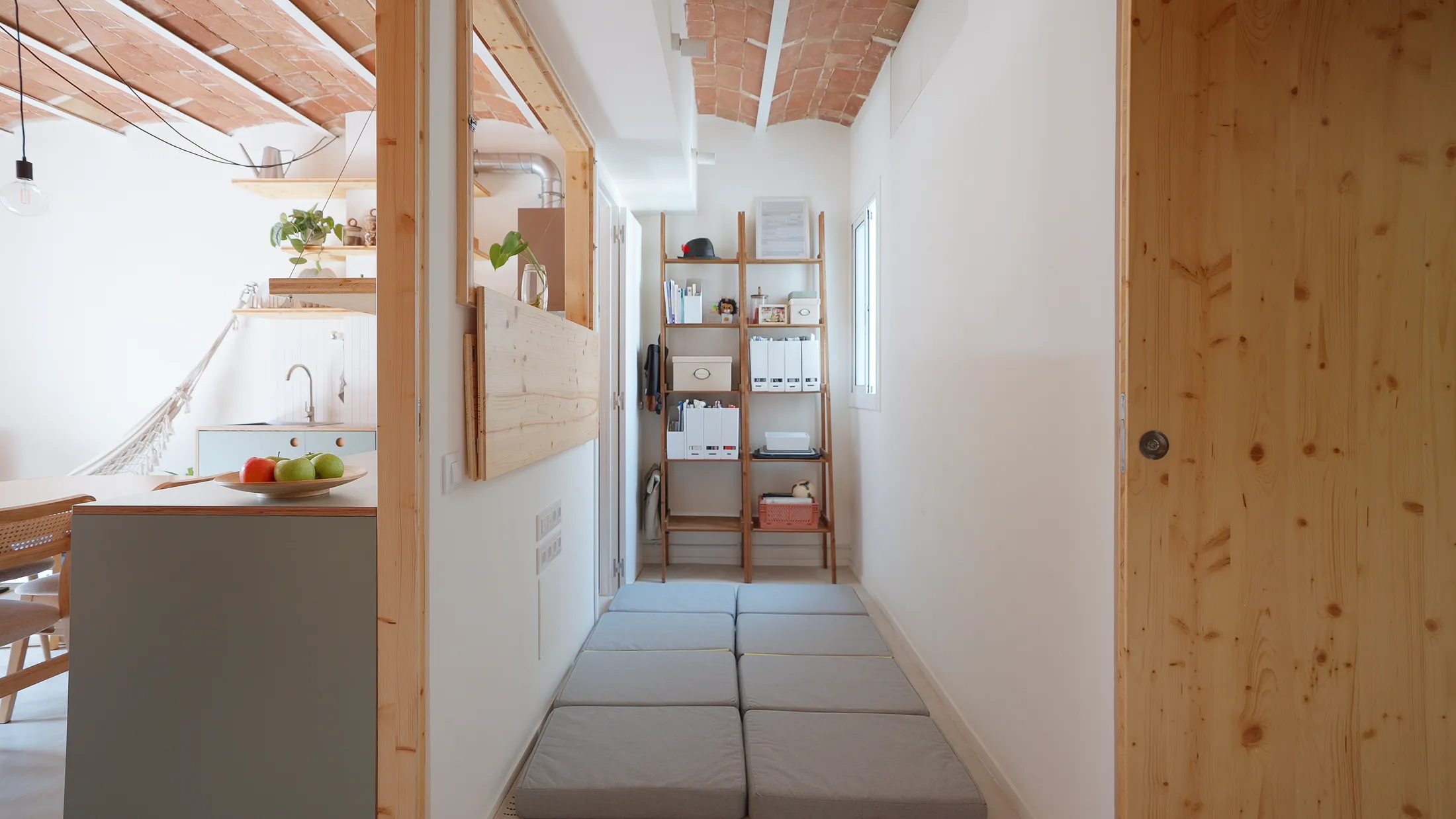
4. Hidden Storage Tucked Above the Bathroom
5. A Half Wall That Hides the Toilet Tank and Doubles as a Shower Shelf
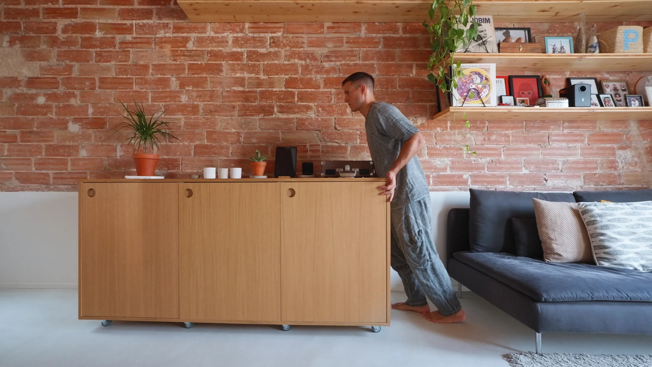
1. A Movable Kitchen Cabinet That Reconfigures the Room
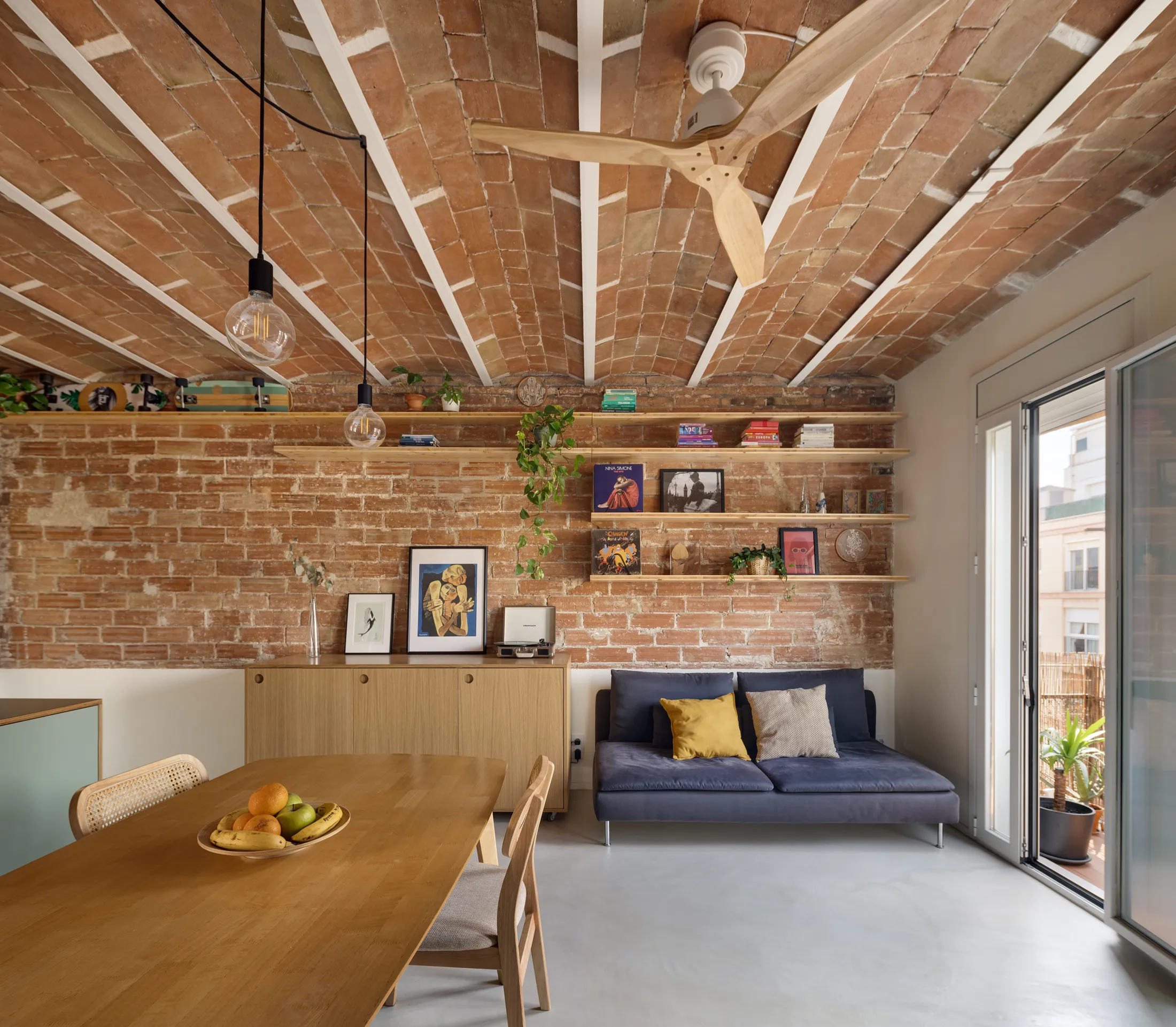
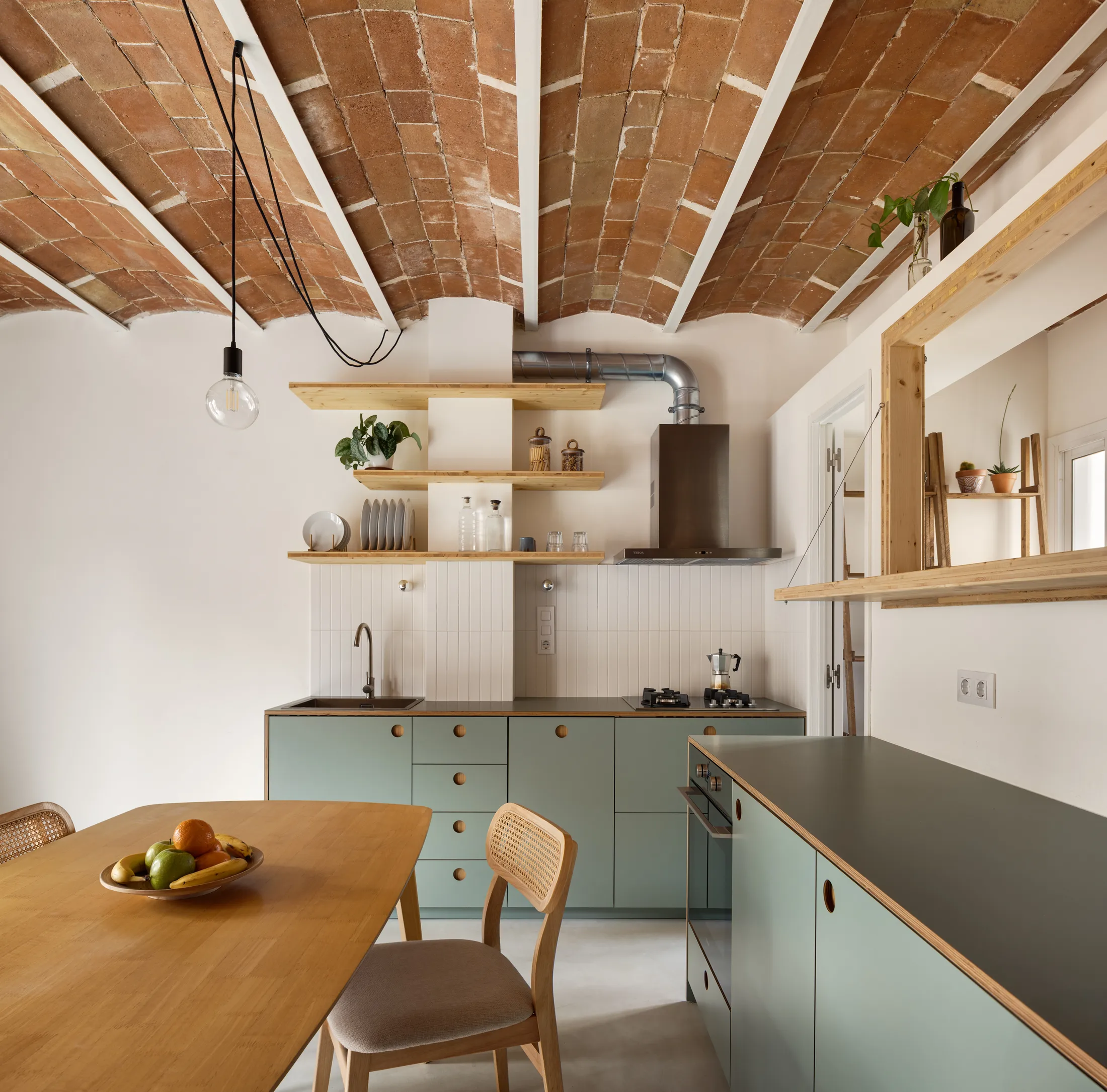
The kitchen was designed by Porta Díaz and Boehner as three lower units rather than a single fixed block, allowing the social area to shift depending on the day.Built withIKEA carcasses and customised high-pressure laminate fronts by CUBRO, the pieces sit low to keep sight lines clear and the space feeling open and airy. One unit, finished in a warm wood veneer so it reads more like living-room furniture than a kitchen element, sits on discreet casters. Most days, it stores dishware, pantry items, and a well-used bar, but when the couple hosts friends, it becomes a serving counter, a music table, or is simply rolled aside to clear room for a dance floor. Because it shares the same height as the other cabinetry, it naturally extends the worktop when needed, yet reads more like a piece of living-room furniture than part of the kitchen.