

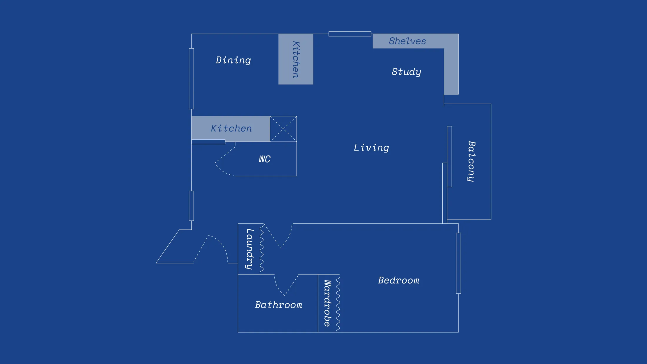
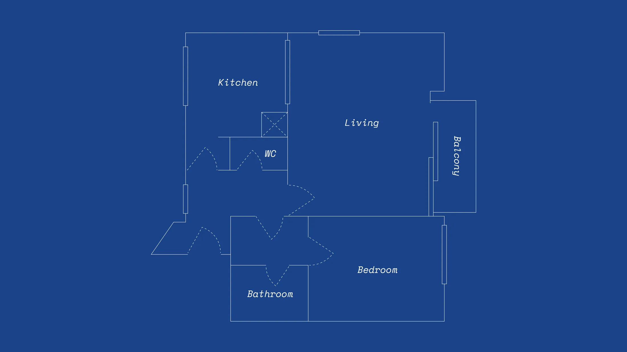
Built in 1975, the corner apartment’s original layout was bright but overly compartmentalised, with six separating doors and a makeshift partition dividing the kitchen and living room. By removing internal barriers and opening sightlines, Berck improved circulation and cross-ventilation without touching load-bearing walls. The renovation focused less on structural transformation and more on atmosphere: honouring the building’s 70s roots while keeping the design contemporary. Raw concrete, earth plaster and bold yet controlled colour sit alongside modular shelving and practical DIY solutions. Each intervention balances spatial clarity with personal expression. Below, we highlight the design details that make Pasteur feel larger, more fluid and uniquely lived-in.
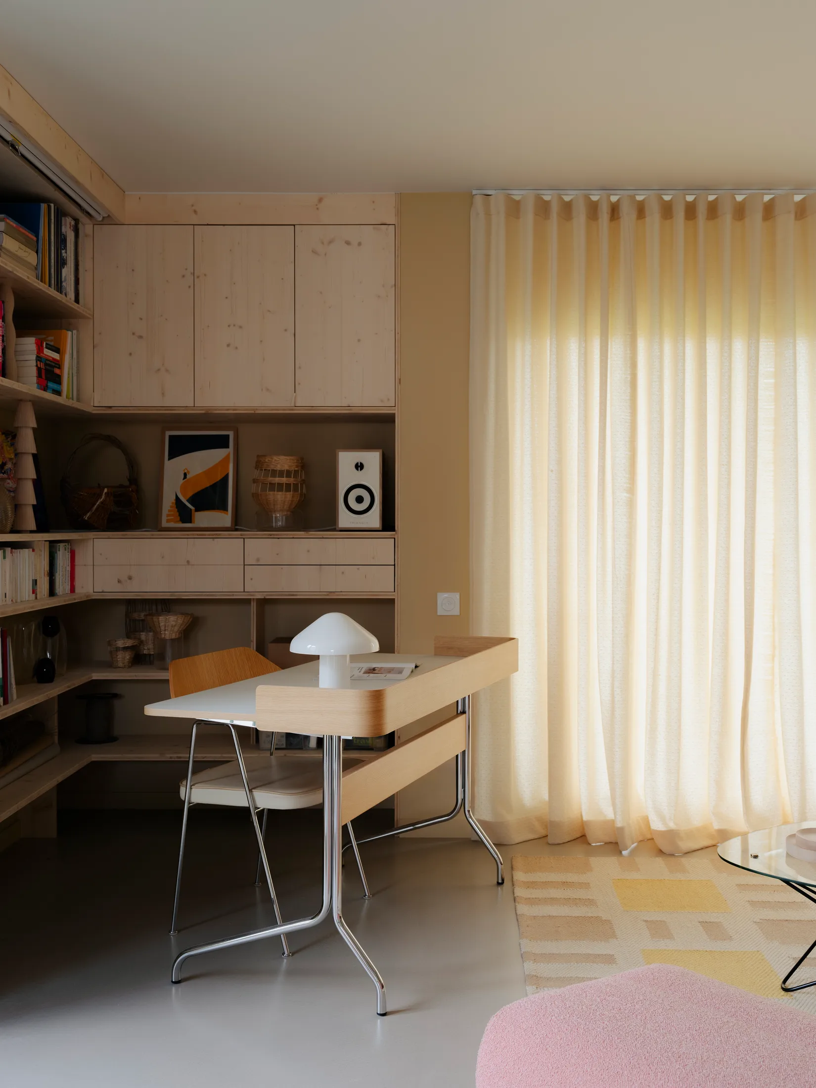
1. A corner bookshelf turned study nook
2. Lighting for a 2.5m ceiling: look up, not down
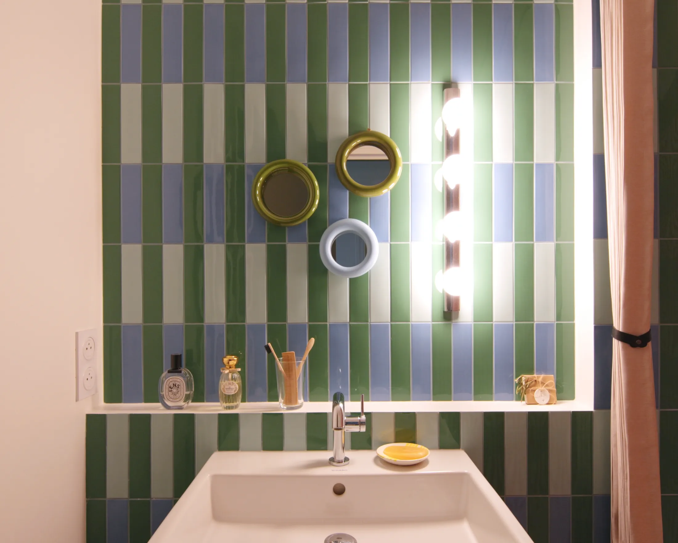
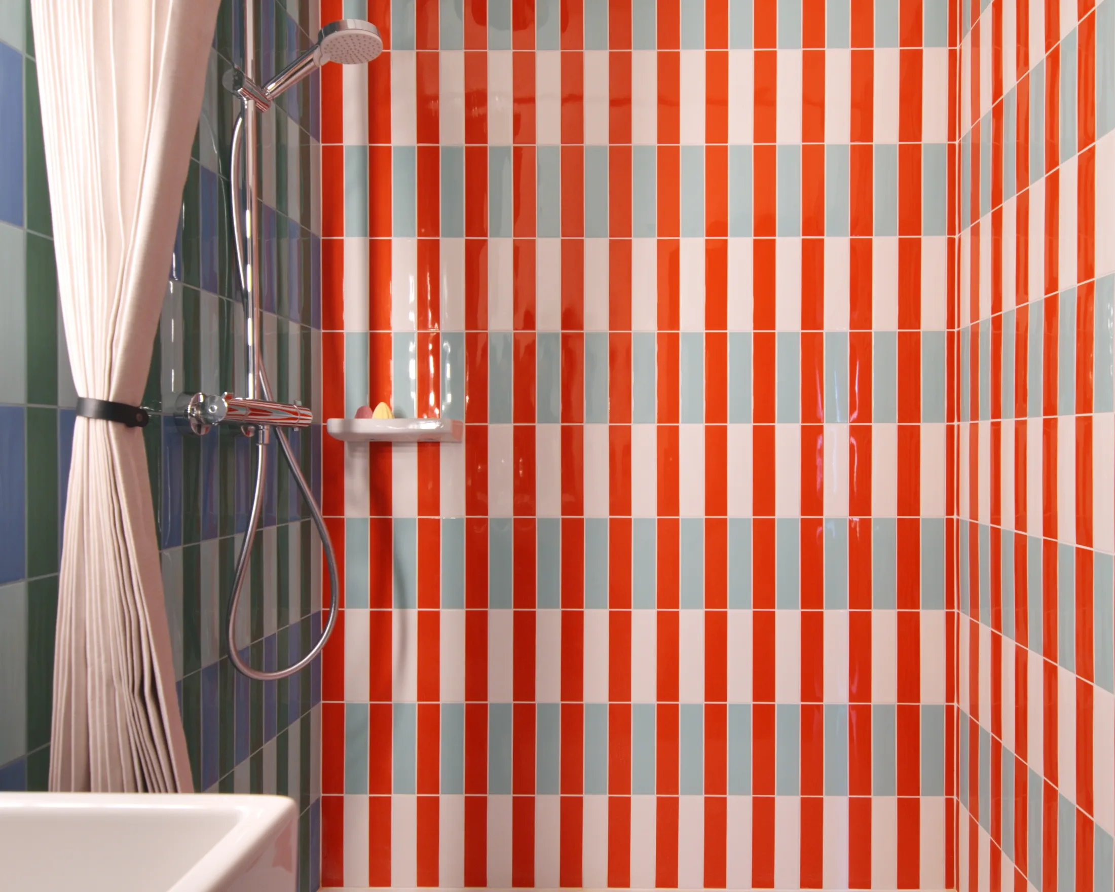
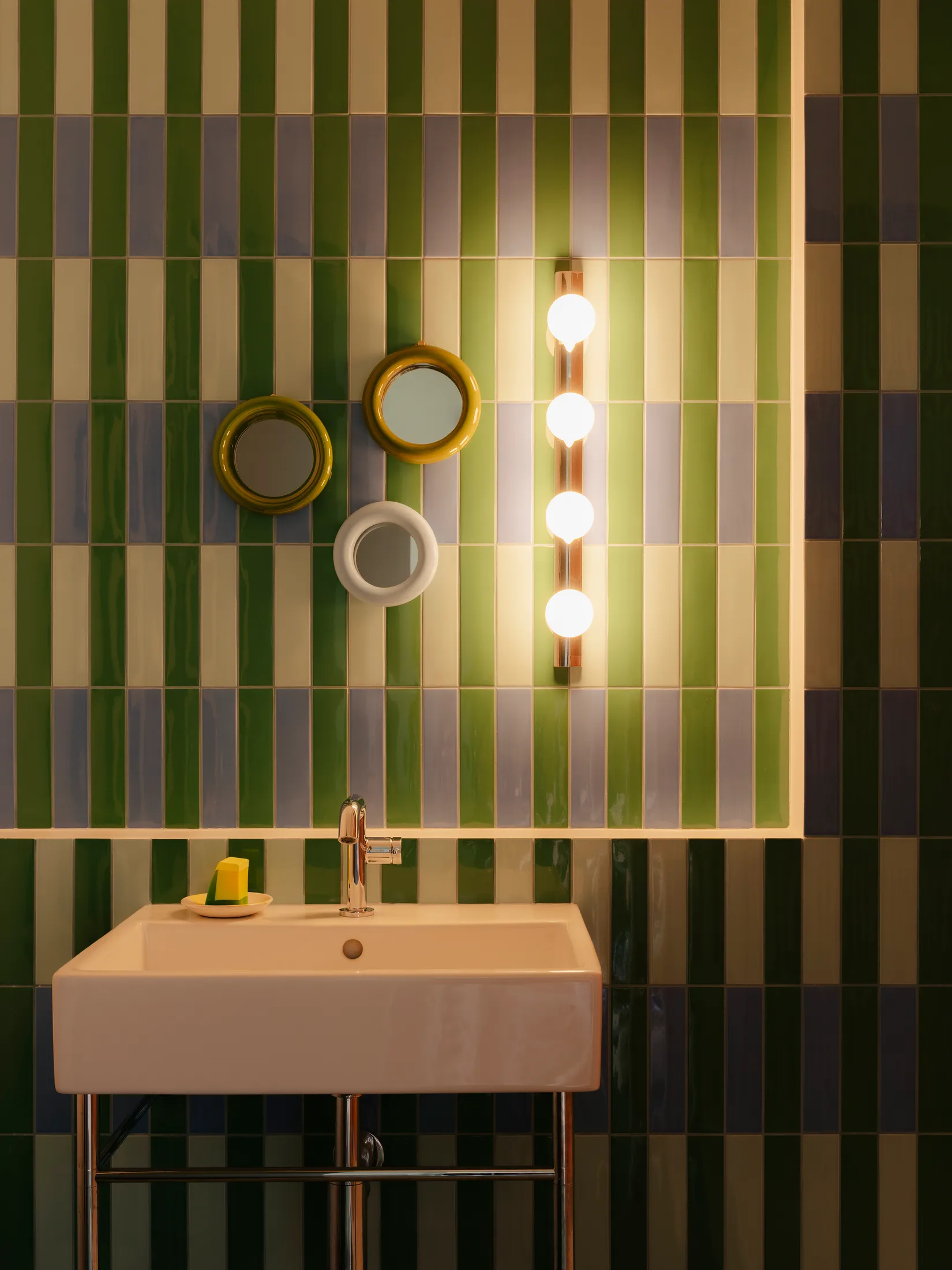
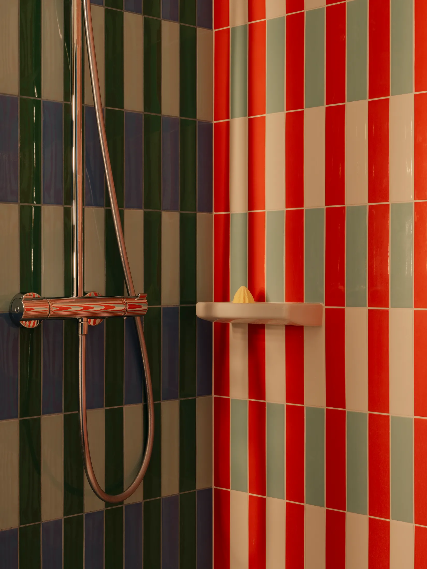
3. Vertical bathroom tiles that elongate space
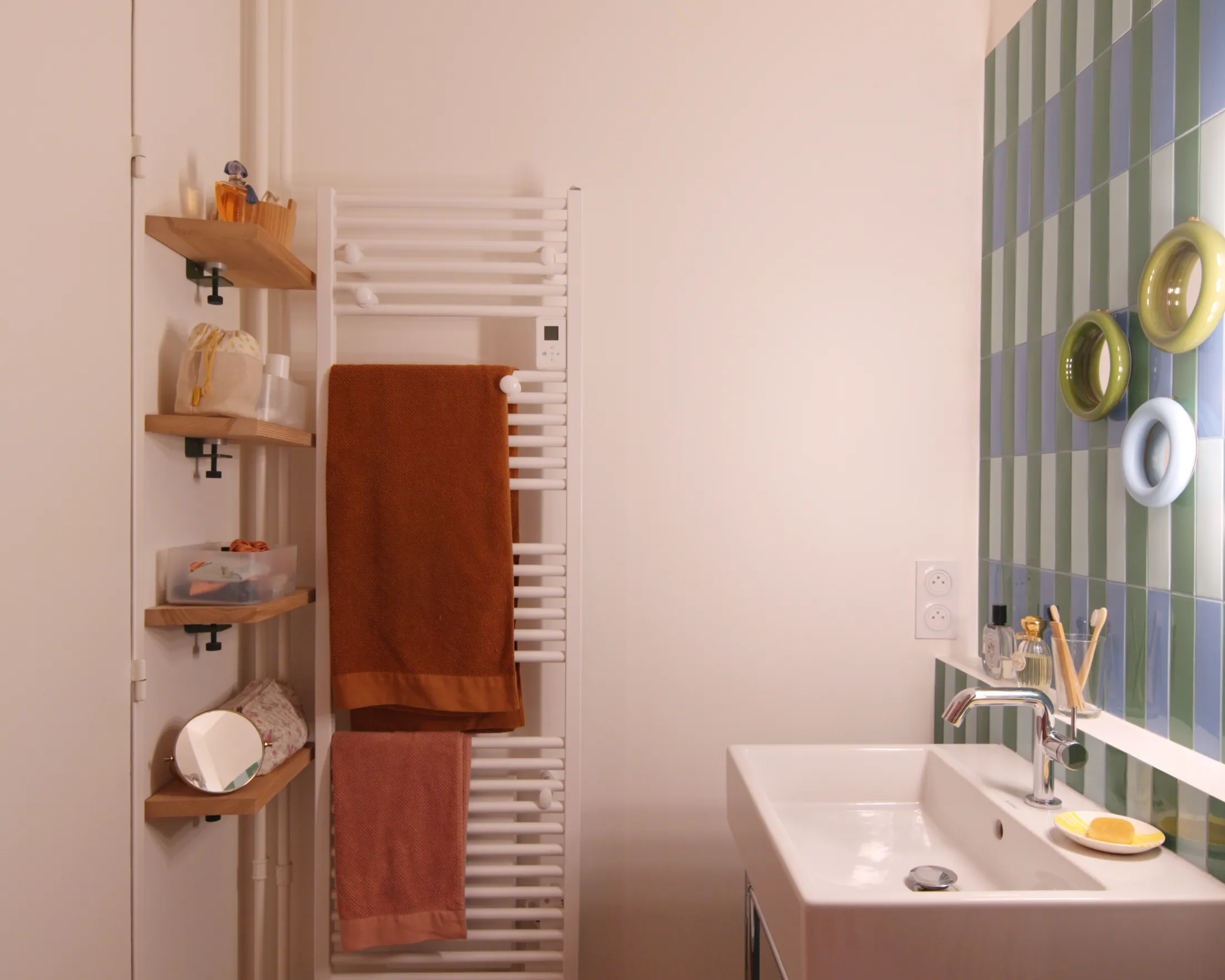
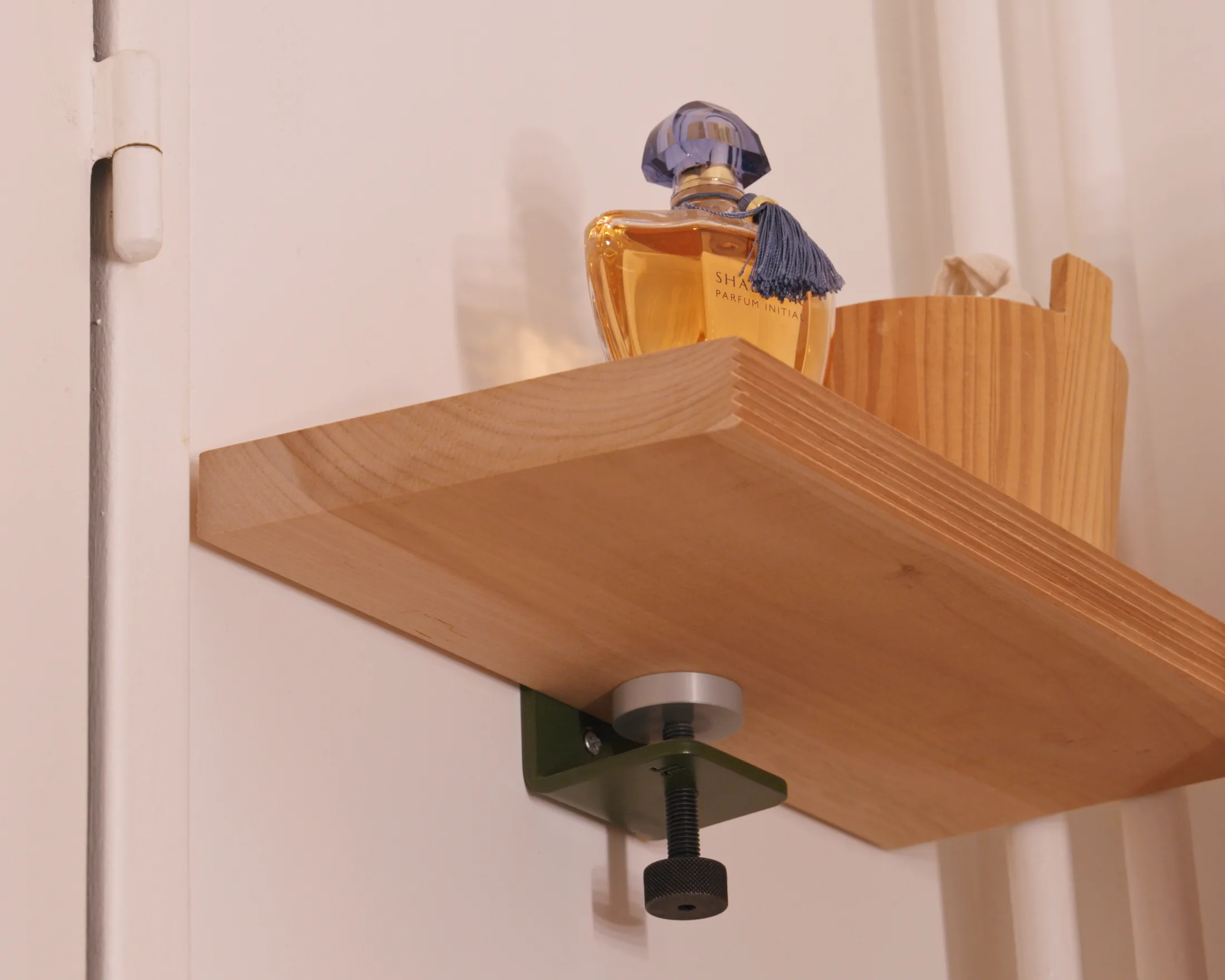
4. TipToe shelves: flexible, removable, practical
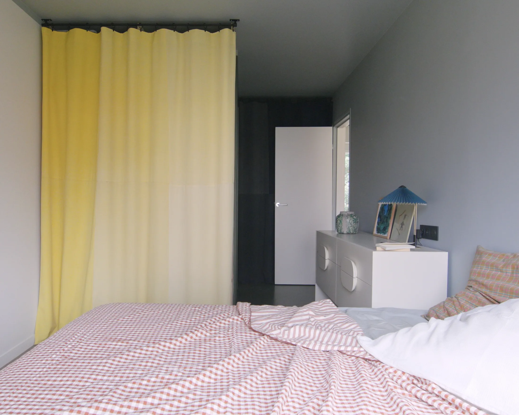
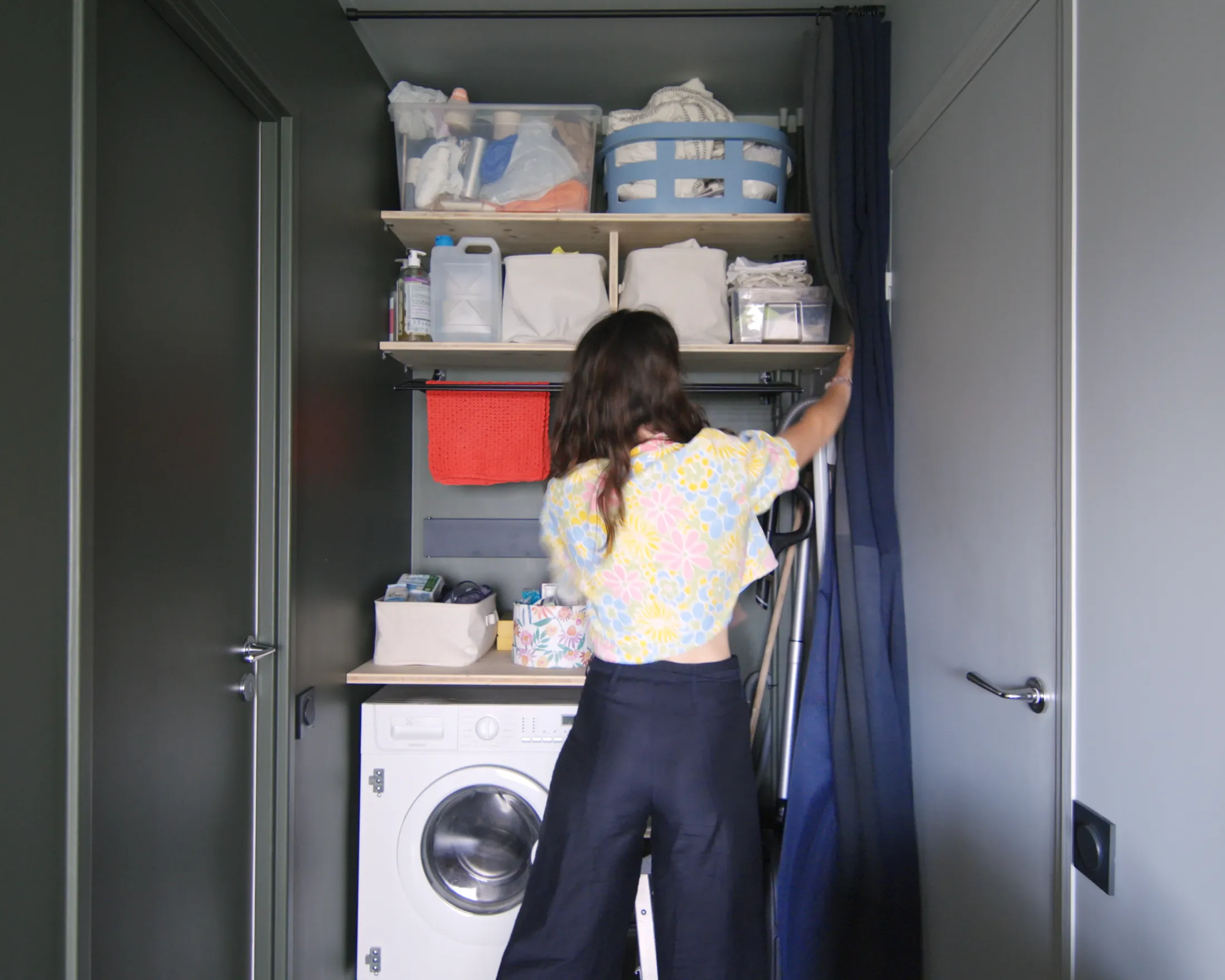
5. Curtains for doors: soft, affordable, adaptable
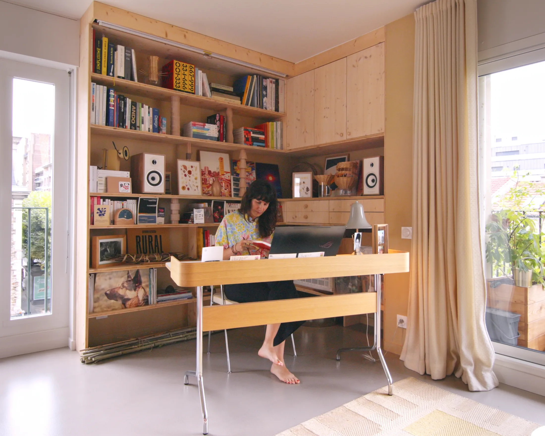
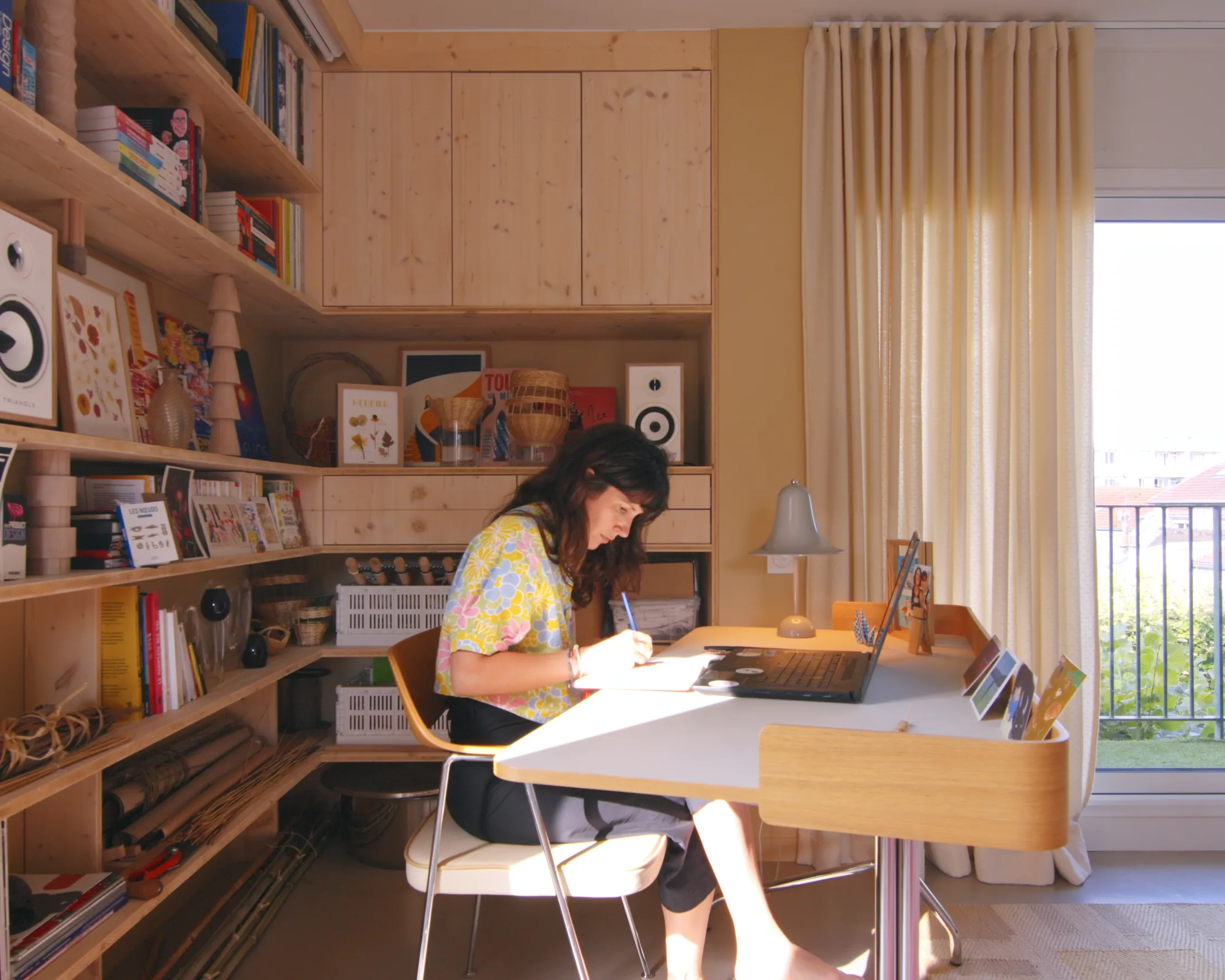
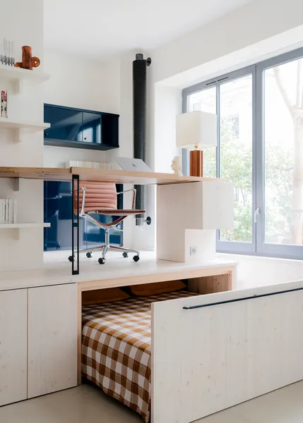
1. A corner bookshelf turned study nook
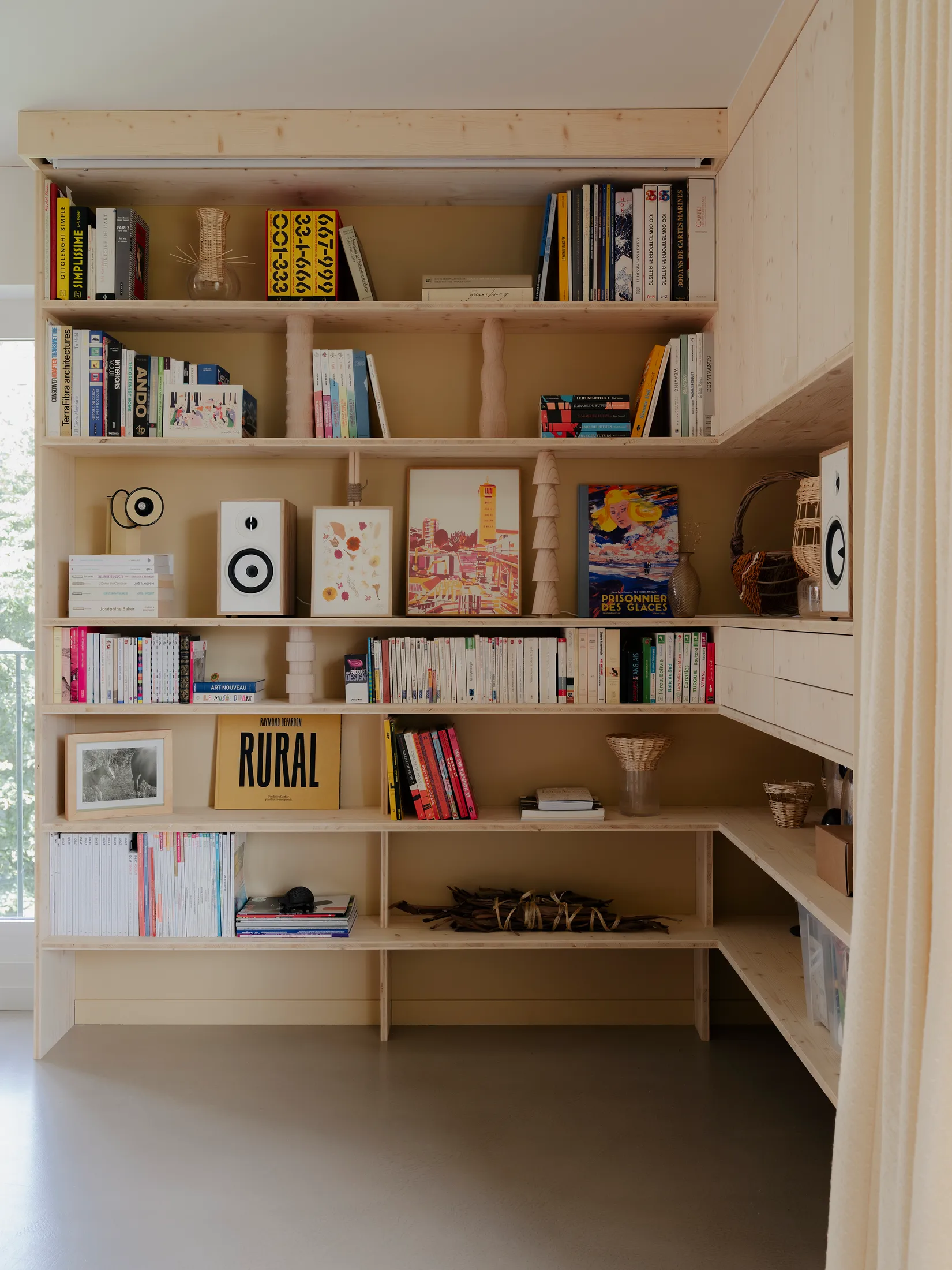
A recessed wall in the living room became the perfect opportunity for a built-in bookshelf and naturally evolved into a compact office nook. Rather than facing a wall, the desk is positioned outwards, maintaining visual connection to the living space and windows beyond and keeps the work zone feeling integrated rather than isolated. Custom joinery wraps the nook, with a combination of drawers and shelves creating a practical working circle where tools, books and materials are within arm’s reach. The combination of open and closed elements allows for the display of personal objects, whilst keeping the space organised and clutter-free. Above, a pull-down projector screen transforms the niche into a cinema corner by night. Defined by joinery rather than walls, the study nook becomes both a productive workspace and an eye-catching architectural feature.