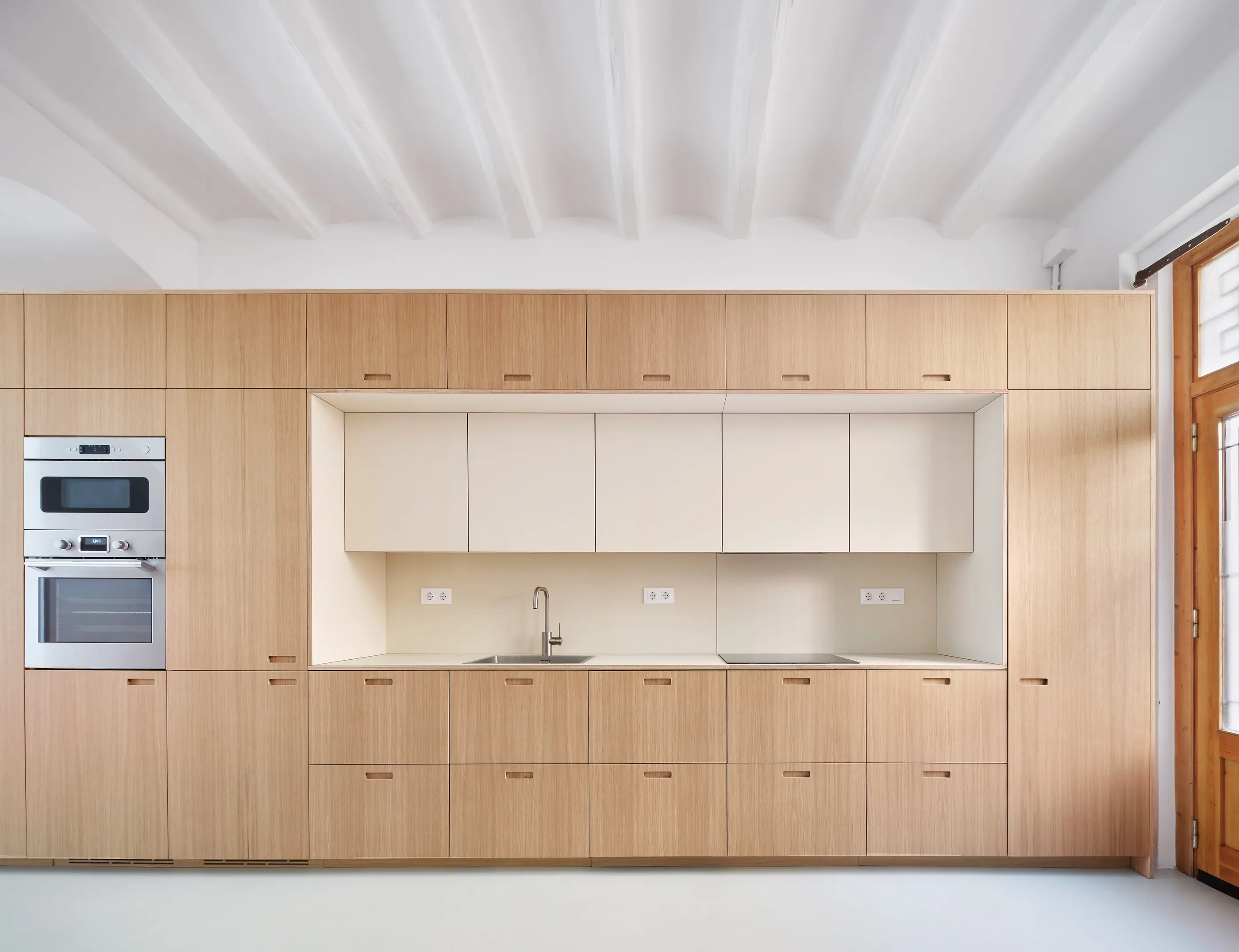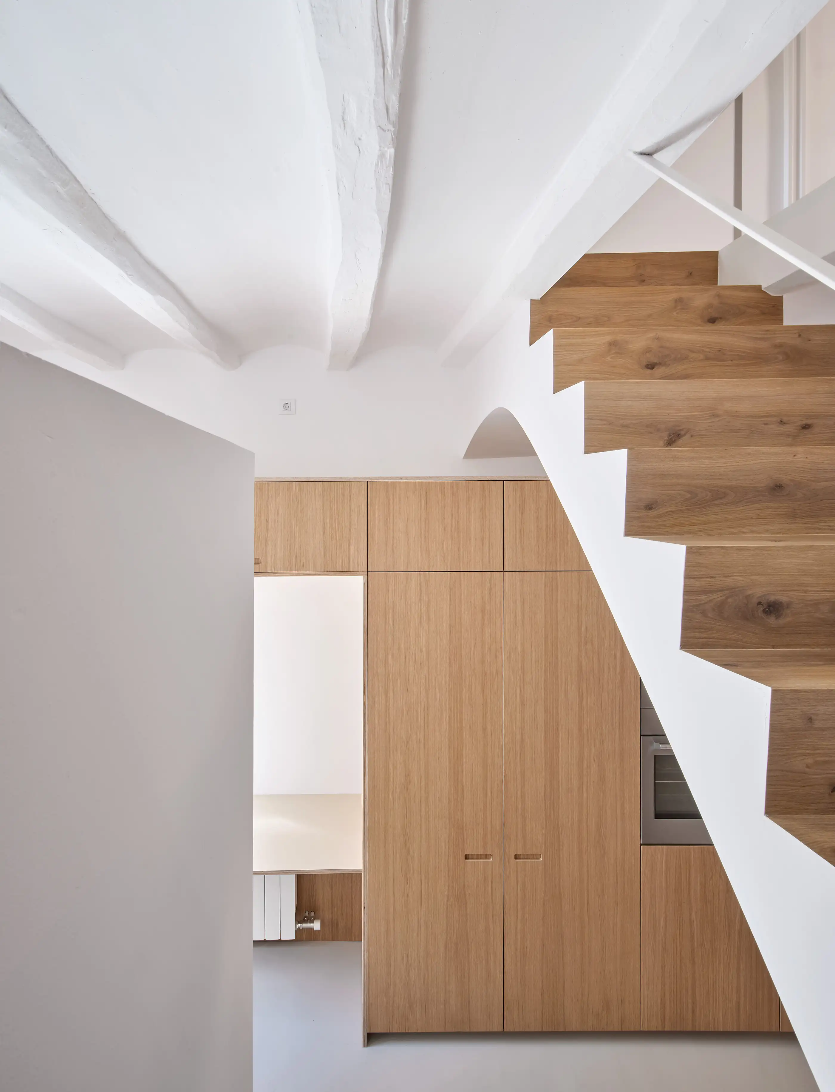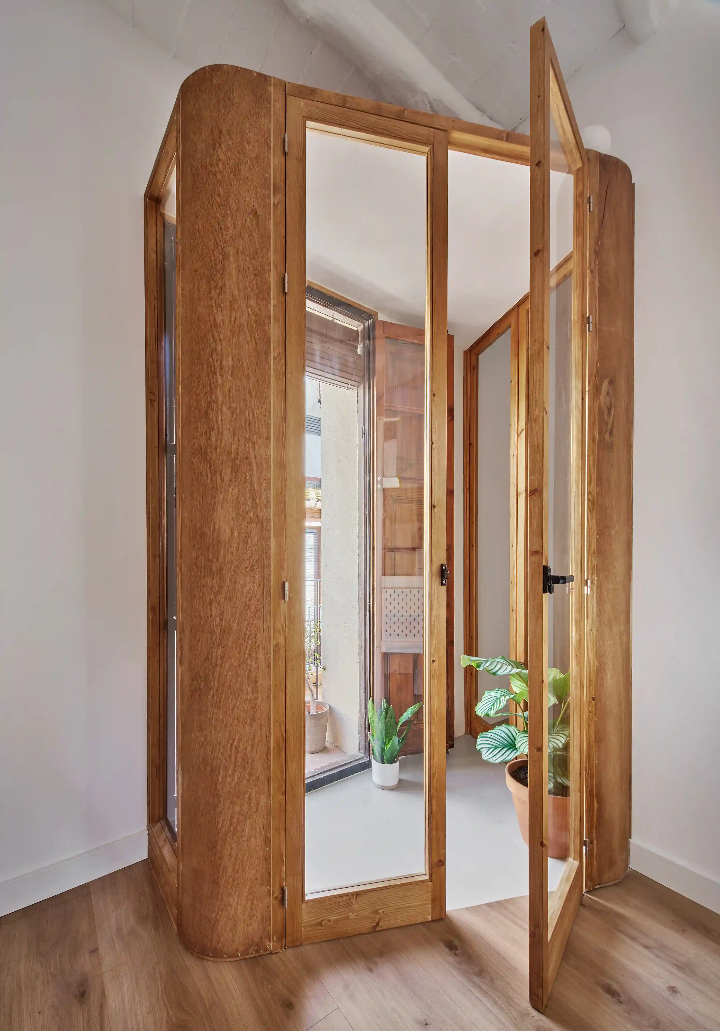


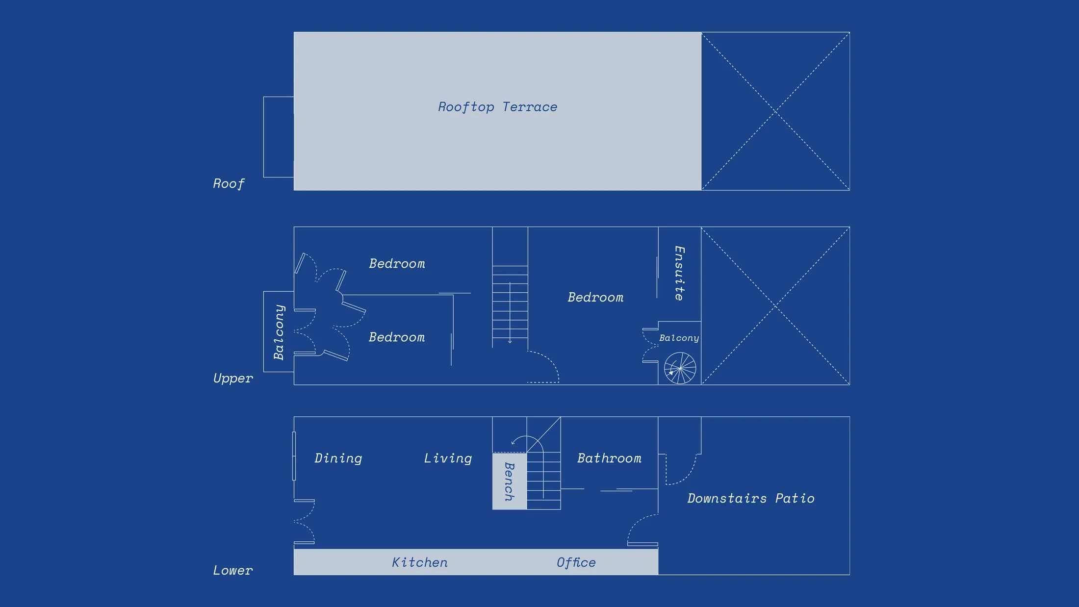
Located in an old part of L'Hospitalet de Llobregat, a city next to Barcelona, within an early 20th-century protected home, Xipreret rethinks how a compact footprint can adapt to a growing family. When the current owners first purchased it before they had children, the house was heavily compartmentalised. The ground floor felt cramped, with a separate living room and kitchen, while upstairs was divided into two enclosed bedrooms. Working within the constraints of the existing heritage structure, the architects reimagined how space could flow without dramatic structural change. Walls were opened up, volumes rebalanced and storage carefully integrated to create a more fluid sequence between living, working and resting zones. A restrained palette of light microcement and clean-lined joinery now ties the levels together, allowing light to travel more freely through the long, narrow plan.
Below, we highlight five design details that reveal how thoughtful interventions — rather than major reconstruction — transformed the house into a brighter, more flexible family home.
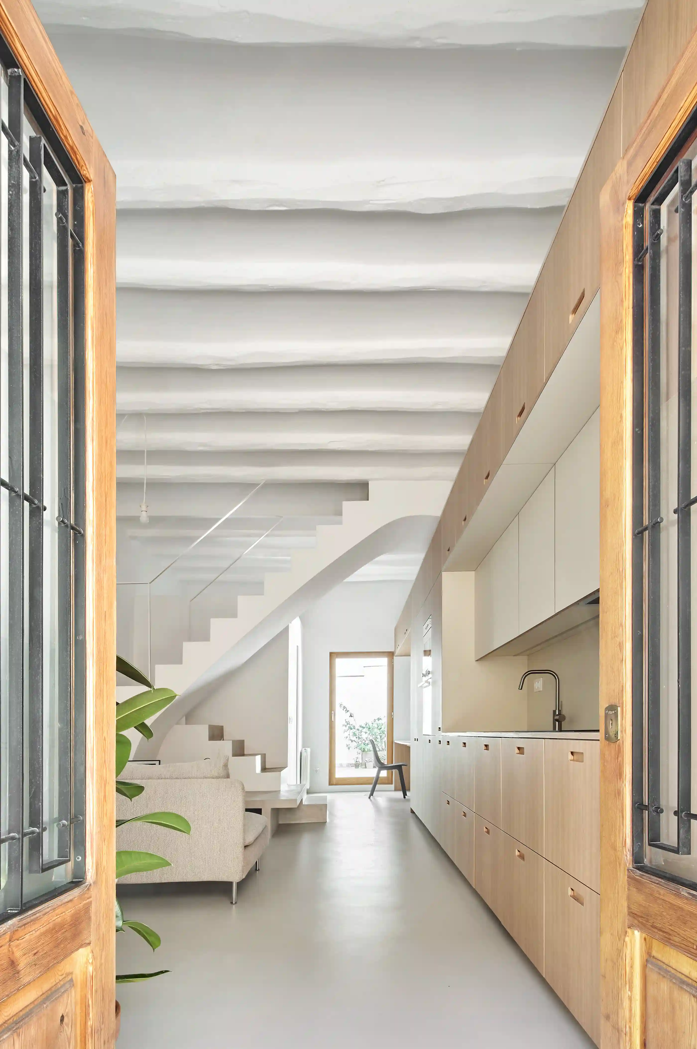
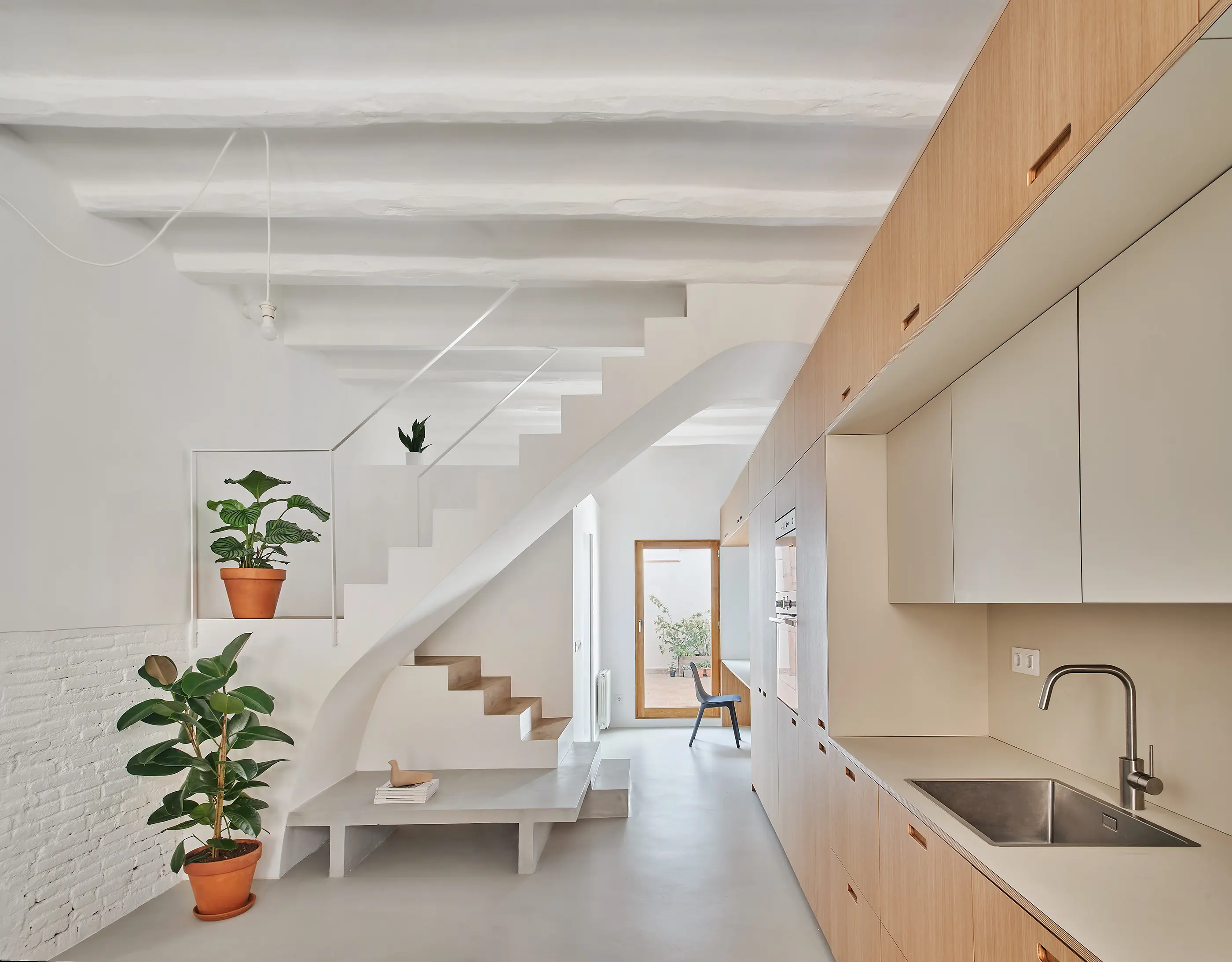
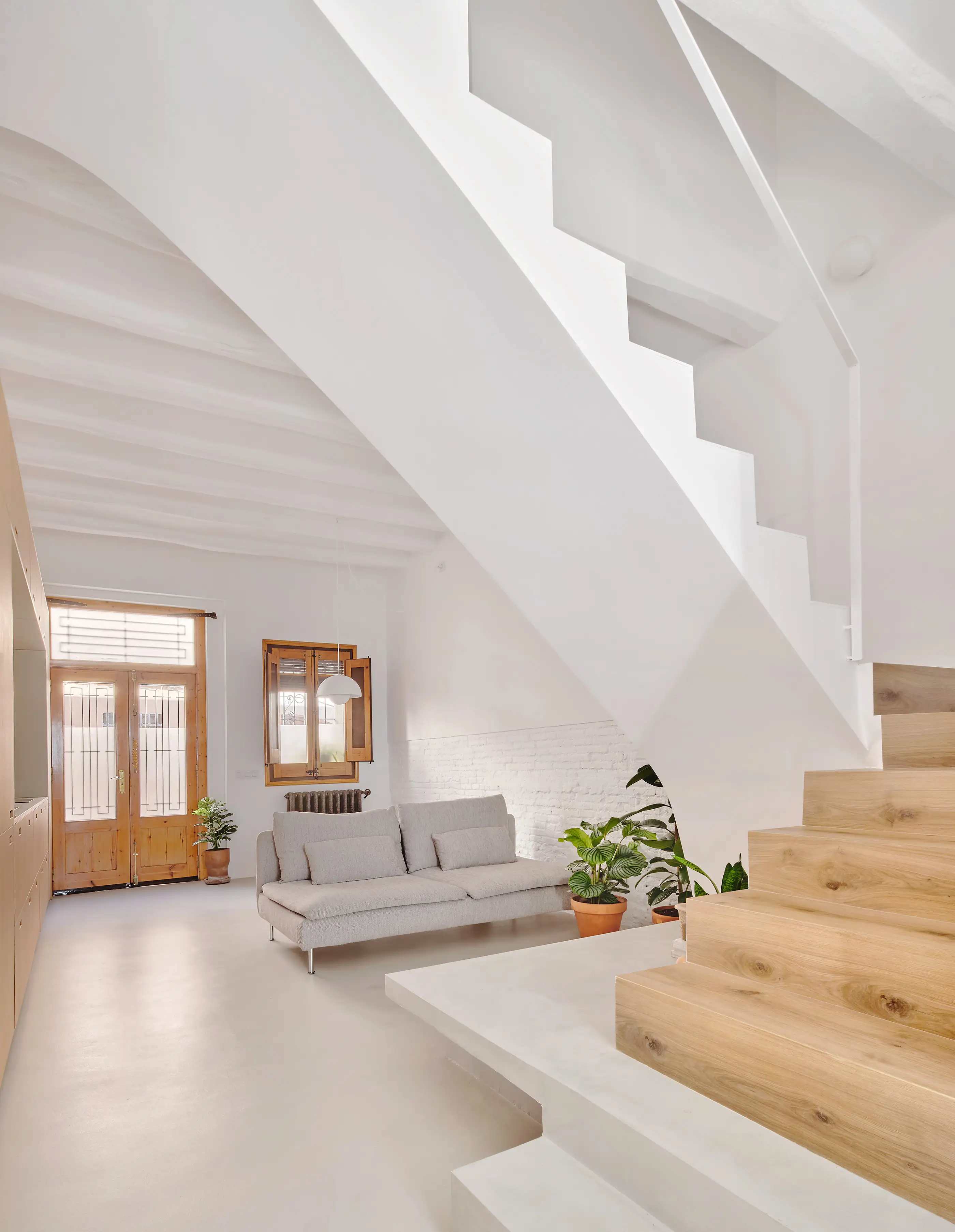
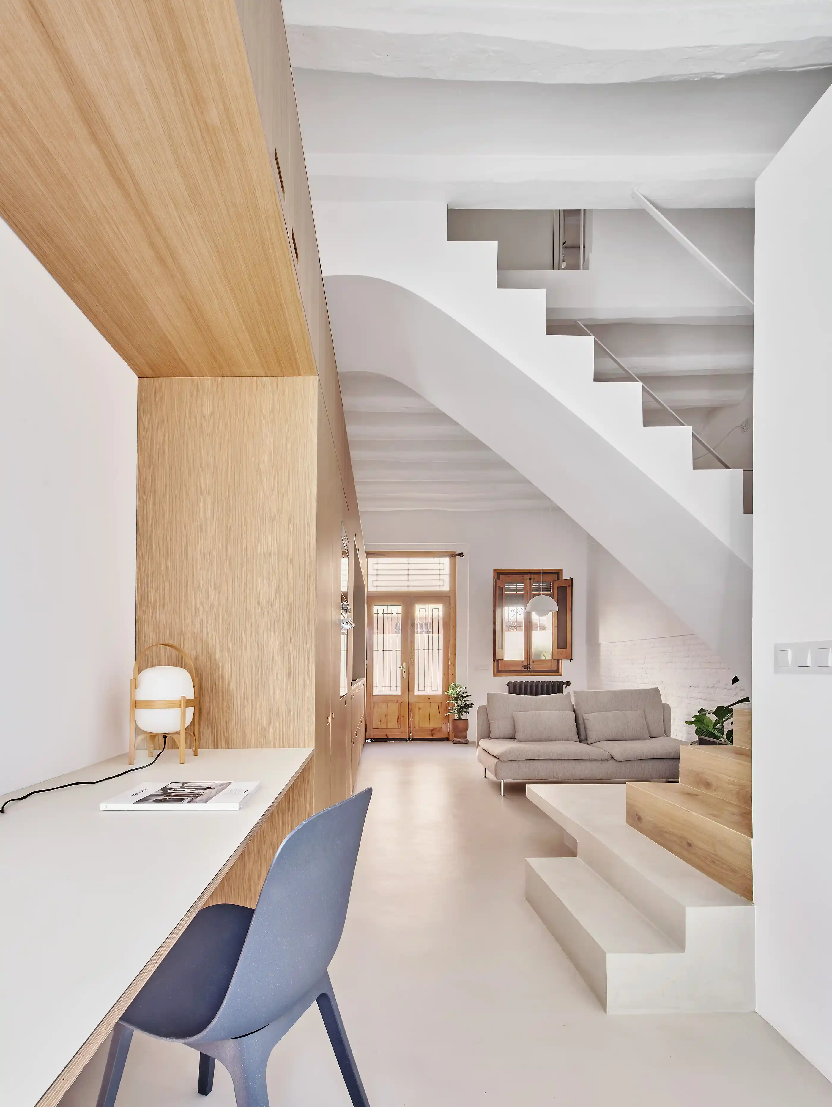
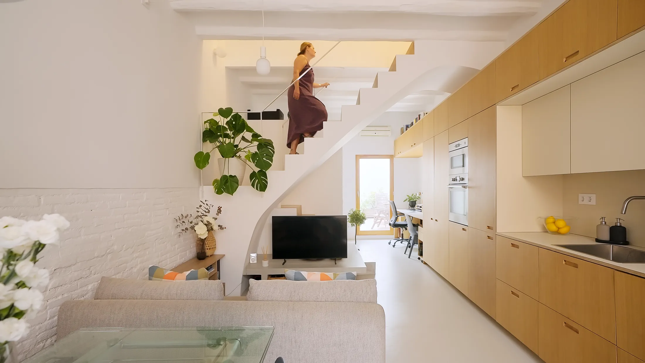
1. A Staircase That Does More Than Just Climb
2. Light Microcement That Amplifies Brightness
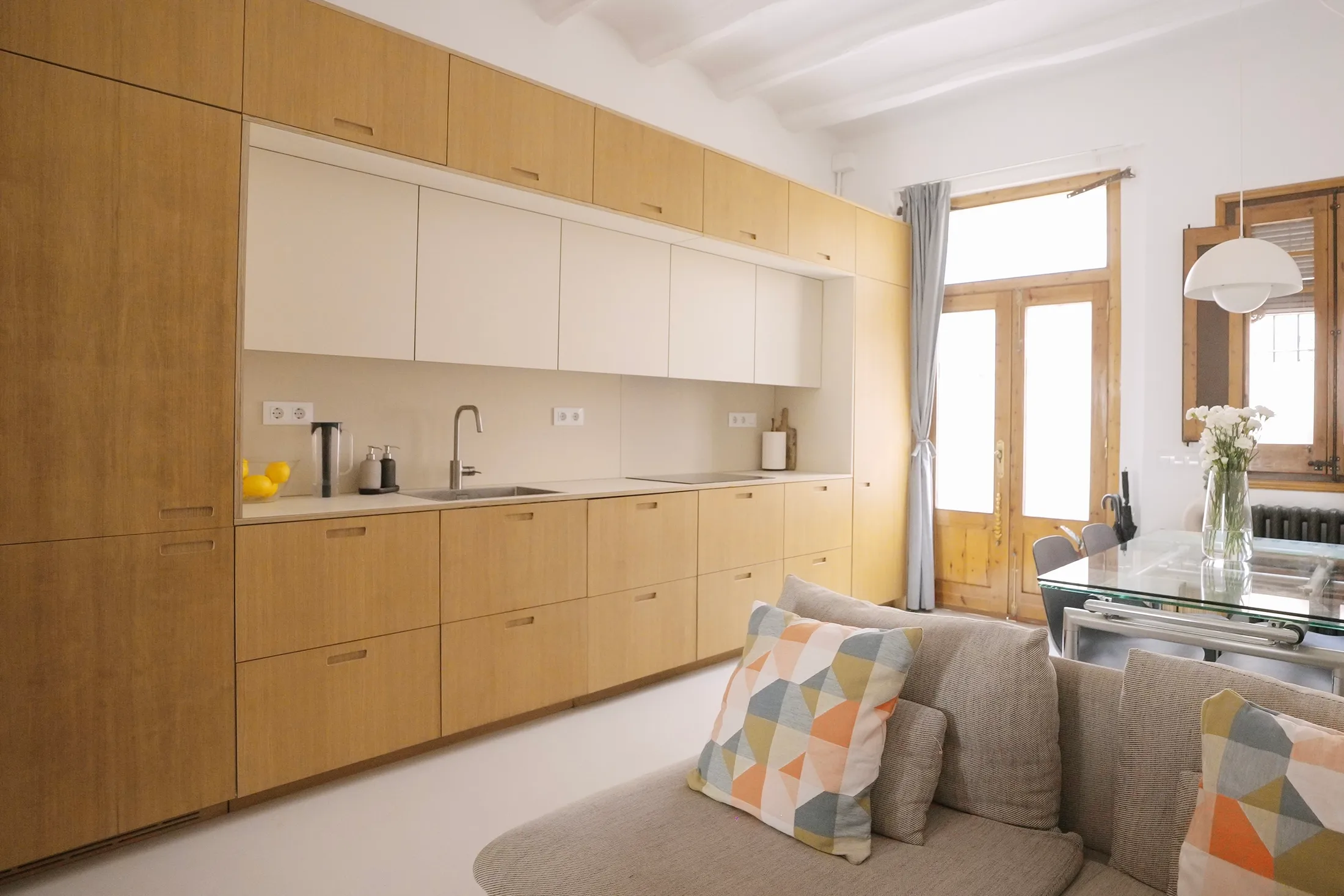
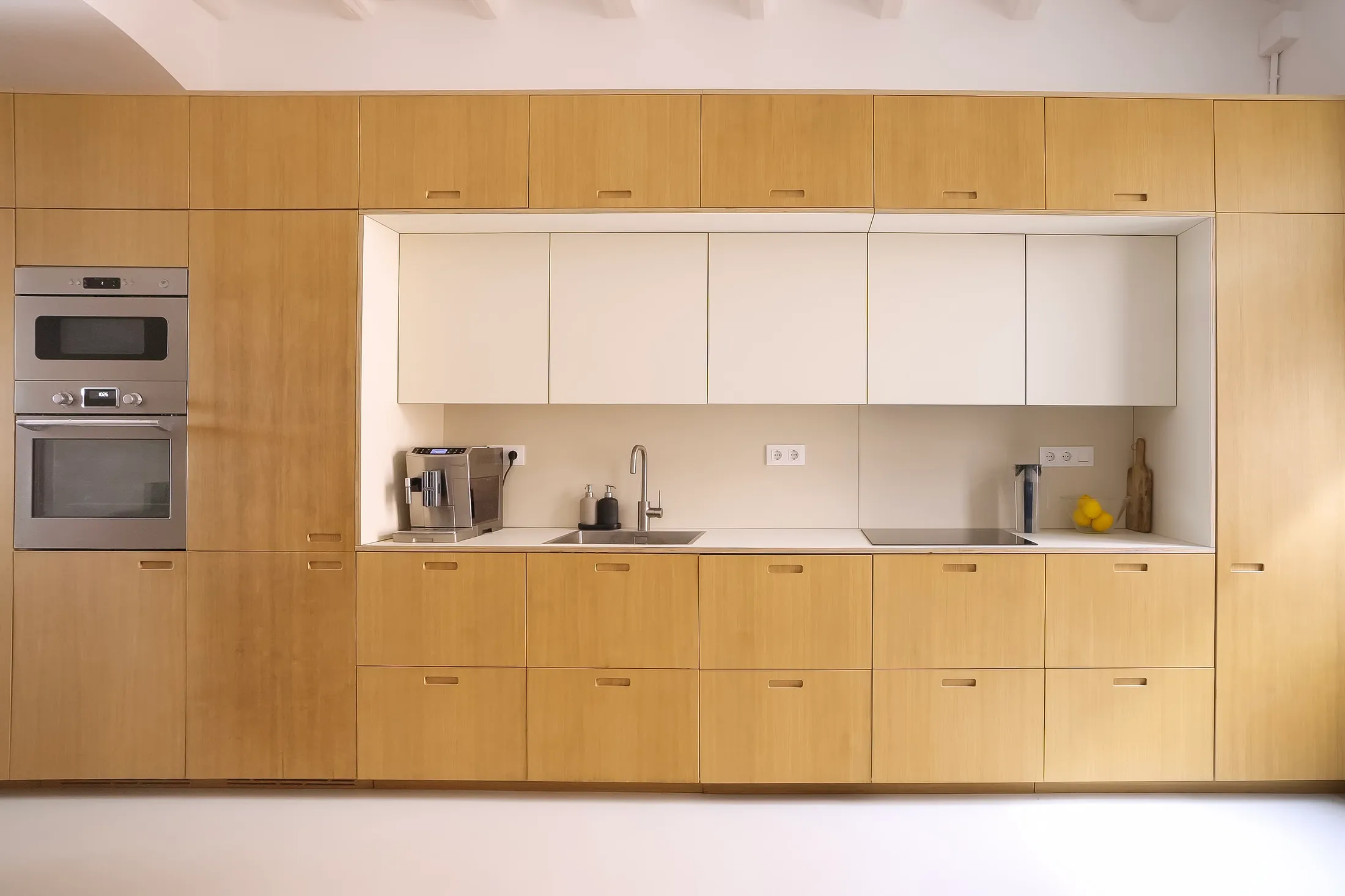
3. An Extending Kitchen Wall
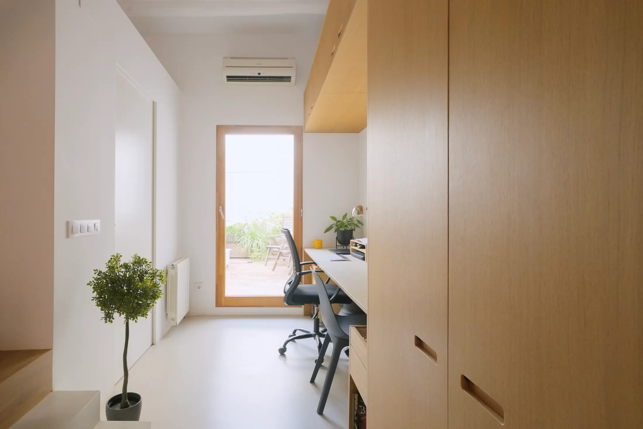
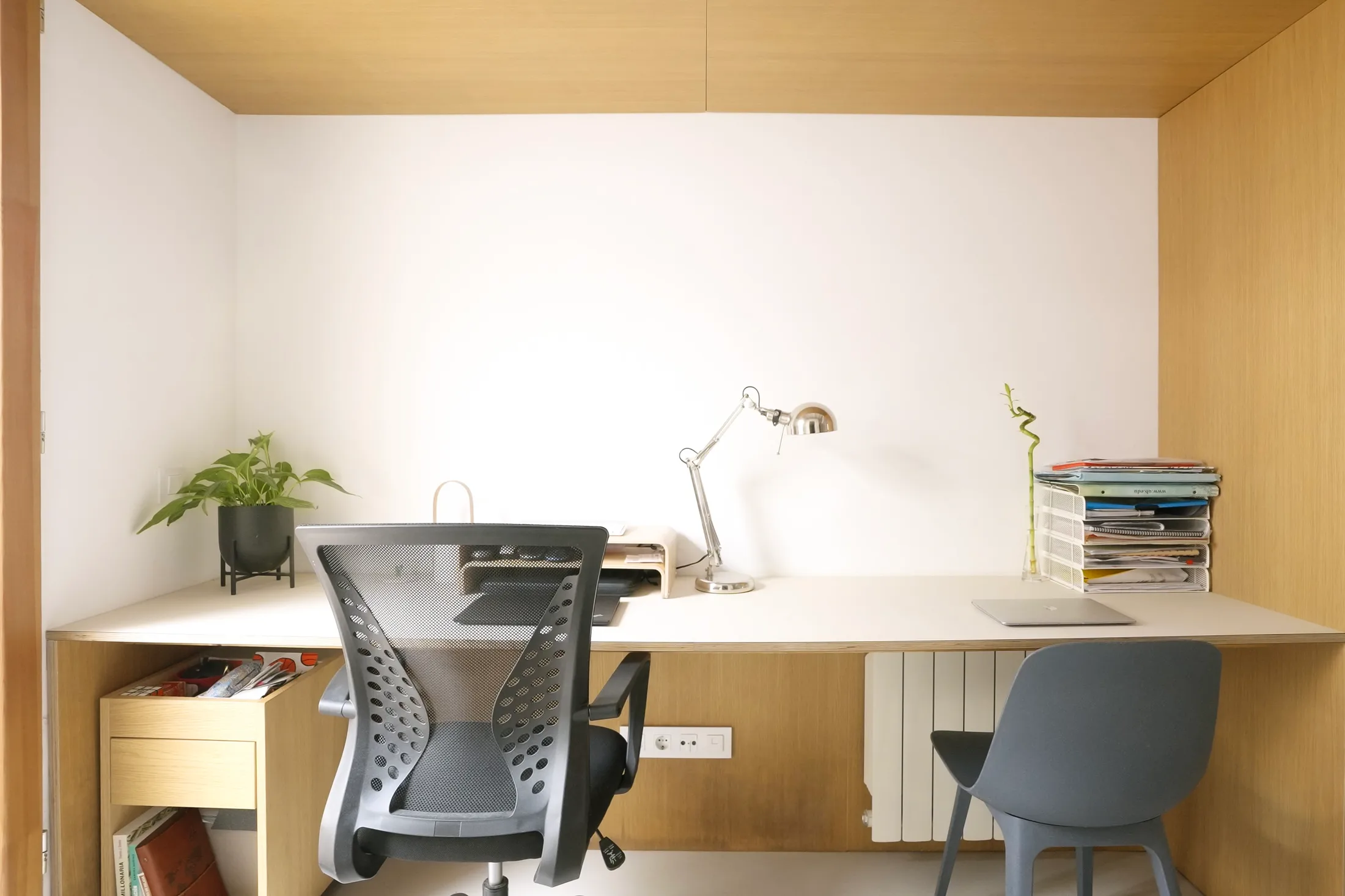
4. A Seamlessly Integrated Double Desk
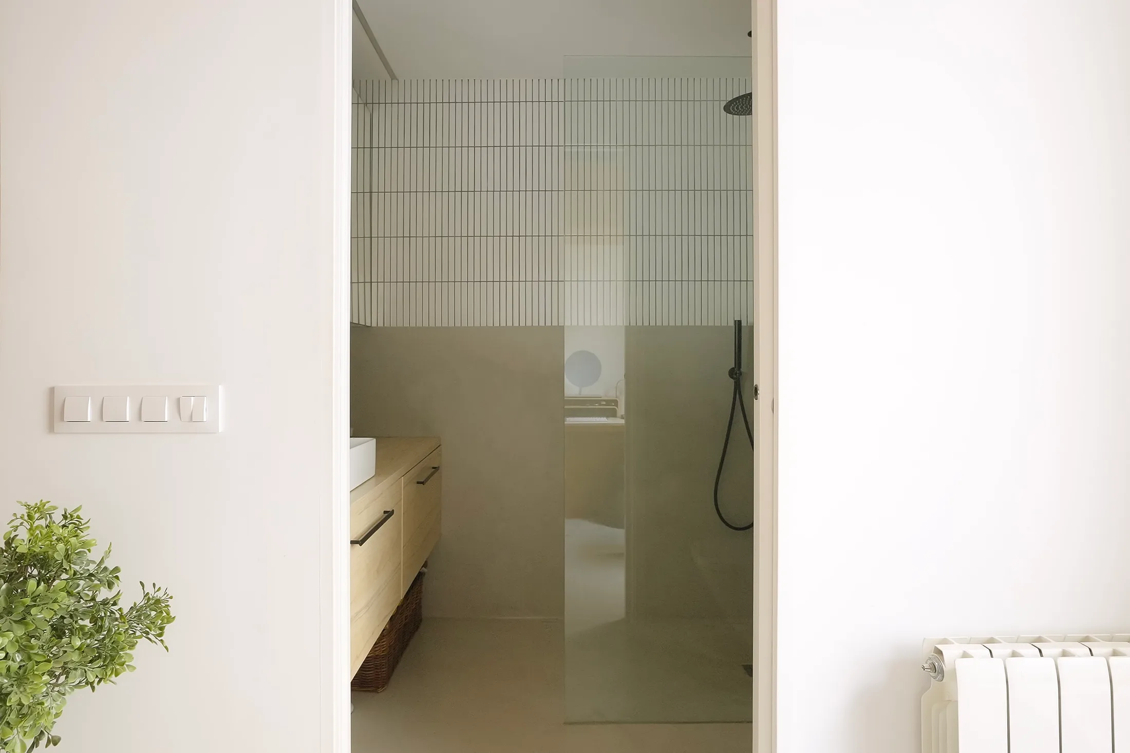
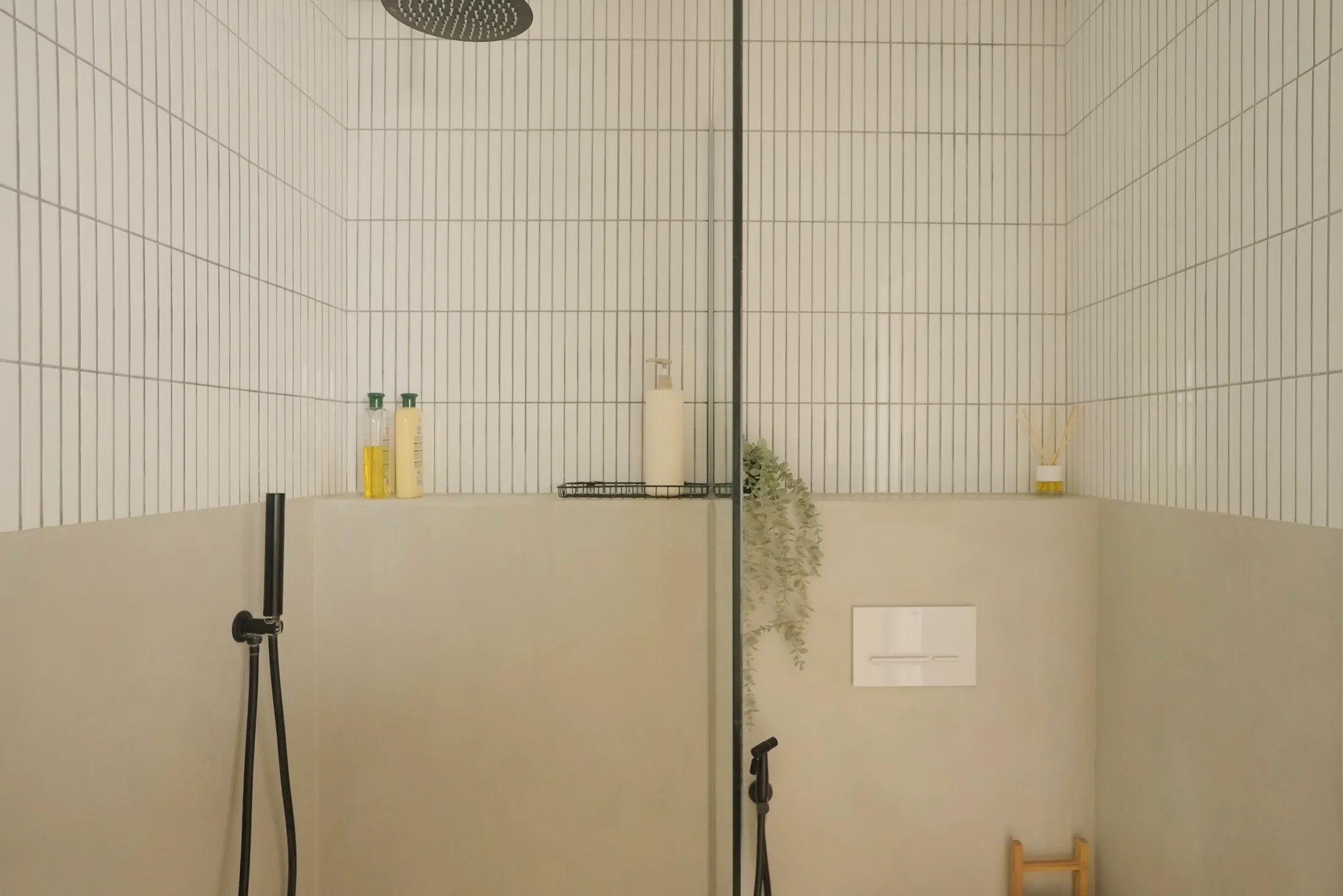
5. Space-Stretching Bathroom Tiles
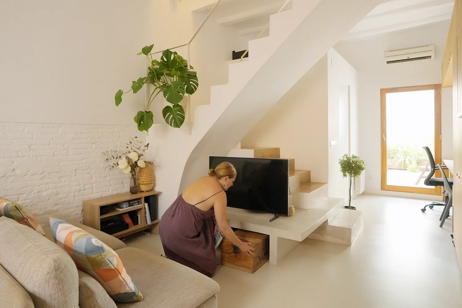
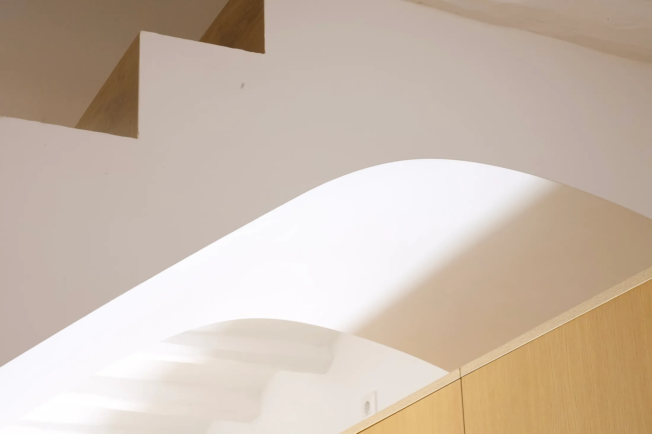
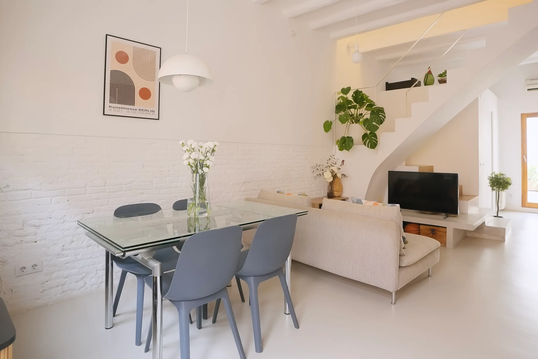
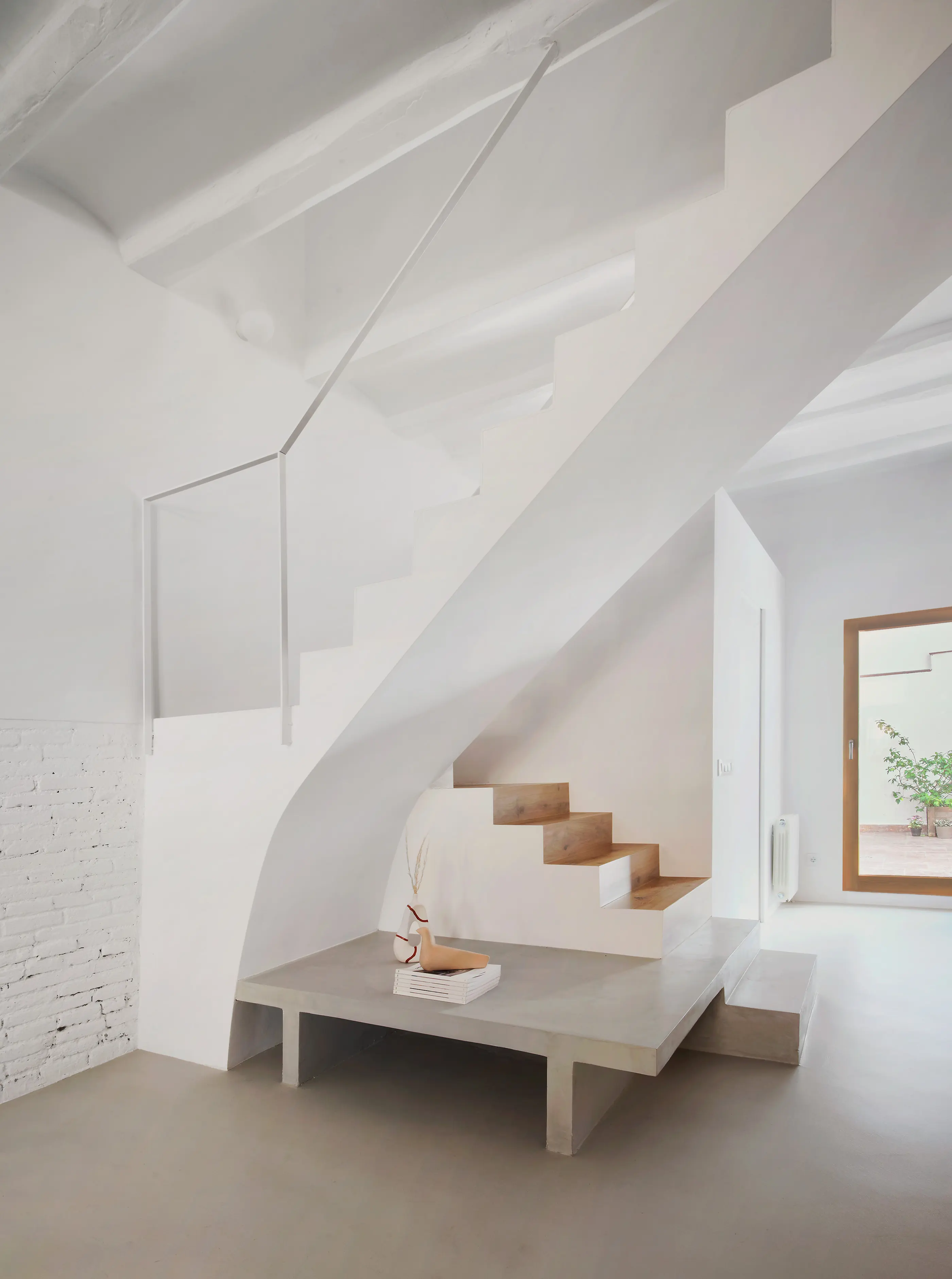
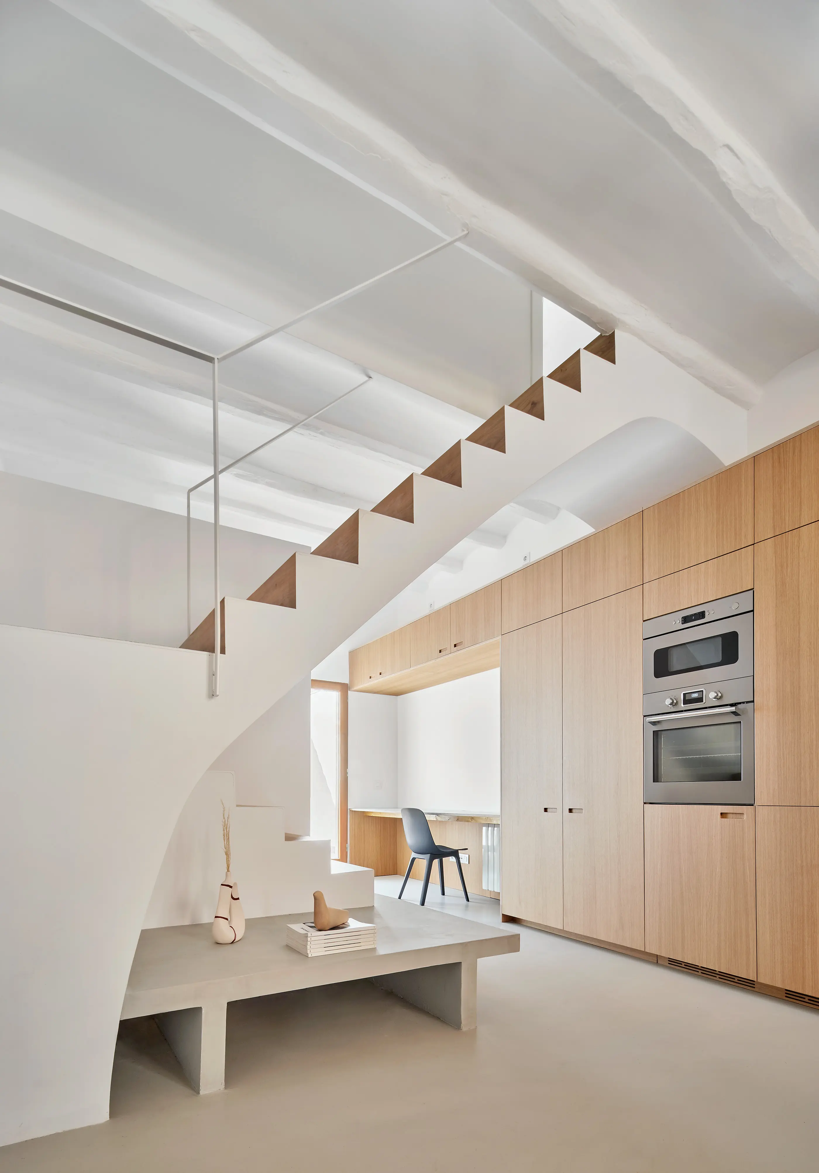
1. A Staircase That Does More Than Just Climb
In Xipreret’s narrow footprint, the staircase offers more than just circulation. On the ground floor, one of the lower flights extends outward to form a built-in TV console, transforming the step into an integrated media wall rather than a separate piece of furniture. Beneath the rising steps, concealed cabinetry absorbs everyday clutter, while the shift in volume naturally creates a small nook — a sheltered pocket that adds depth and a sense of intimacy to the otherwise linear ground floor. The staircase itself curves gently as it rises, softening the tight layout of the house and giving the interior a more smooth and continuous feel. A slim, minimalist railing keeps the composition light, allowing the staircase to read as airy and elegant rather than heavy. More than a way to move between levels, the stair becomes the home’s backbone — storage, display, seating and circulation wrapped into one cohesive architectural gesture.