Magazine Current IssueMagazine Current Issue
The Two Lost Kids Apartment
From our Mag
April 21, 2026

The Two Lost Kids Apartment

Designed as both a home and creative studio, Gabi and Thali’s compact apartment balances playful colour and theatrical details with calm, functional living to realise in a space that feels unmistakably ‘Two Lost Kids’.

Gabi and Thali’s apartment* looks exactly like you’d expect it to, somehow. Bright colours, iconic furniture, curved walls and joinery. A mirror with wobbly edges, a recess in a partition wall painted with pointy tomatoes. A wall-mounted red lacquer telephone with a coiled cord set on dusty pink formica cabinetry; a custom-made lamp like a string of colourful beads hanging from the ceiling. The overall effect is somehow modern and retro all at once, functional and theatrical, cosy and homey... But also, really just looks like their work.

Kirsten Drysdale
Writing:
Writing:
Kirsten Drysdale
Photography:
Photography:
Eduardo Macarios
Magazine Current IssueMagazine Current Issue
The After shot of the Floorplan
Before
before
after
After
Top
Arrow UpArrow Up

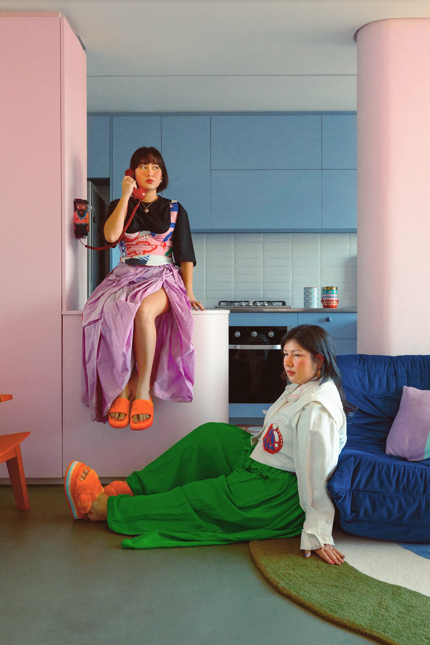
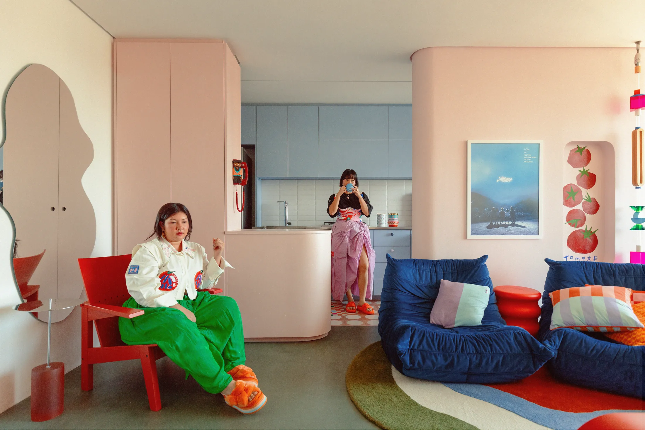
Turns out, that was very much the brief given to Moca Arquitetura, the Brazilian firm that designed the space for the pair: The girls needed a film set and a sanctuary.

THALI: “In the pandemic, we were here 24/7 and it was crowded and we didn’t have any space. It’s a really small apartment. We recorded here in this room, everything, just the two of us. We had to build all our scenarios here. So we were like, ‘okay, we have to do something that is both visually Two Lost Kids, but also a place where we could live’.”

*The pair used to live here together, but Gabi has since moved out to her own place.

Clever storage was a must. They were running out of places to put all the ‘stuff’ brands were sending them. And they were very wary of making choices that were too loud.

THALI: “That’s why it’s a mix of not just a place that is visually nice, but also, ‘I’m  living here’. We couldn’t do everything really crazy, because I had to live here after.”

GABI: “It would be so easy if it was like a huge place, but that was why we struggled so much with the colours – because we wanted something crazy, but all the time we’re thinking ‘imagine living here every day with a very bright blue in your face’. So that was challenging, to reconcile the wellbeing of the person who’s living in the apartment, and what’s aesthetically cool.”

In the end, they struck just the right balance. Pops of strong colour – bold reds and greens and blue – set against smooth finishings in pastels and creams. Appliances and electronics all neatly disguised or tucked away. Togo armchairs in a soft velvet set on a thick pile rug, drawer handles that look like fluffy little clouds.

-

As featured in Issue 7 of our magazine!

Purchase a copy of Issue 7 https://www.nts-store.com

Subscribe to our NTS Sub Club https://www.nts-store.com/collections/subscribe

Writing:
Writing:
Kirsten Drysdale
Photography:
Photography:
Eduardo Macarios
Back to Top
Arrow UpArrow Up
Top
Arrow UpArrow Up
The After shot of the Floorplan
Before
before
after
After
Businesses featured in this project
No items found.
Products featured in this project
No items found.
Magazine Current IssueMagazine Current Issue
Writing:
Eduardo Macarios
Writing:
Kirsten Drysdale
Photography:
Photography:
Eduardo Macarios
Back to Top
Arrow UpArrow Up