Magazine Current IssueMagazine Current Issue
Small Home: Poerio
Small Home: Poerio
From our Mag
January 8, 2025

Small Home: Poerio

Architects Giuseppe Punzo and Julie Nebout transform a 70-square-meter Naples apartment into a bold, color-rich cabinet de curiosités that seamlessly transitions between medical practice and living space.

Project: Poerio/cabinet de curiosités

Design: La Fotosintesi

Size: 70 sqm/753 sqft

Location: Naples, Italy

A passion for antique collecting and the colour brown are things that, in the wrong hands, could make a home feel quite drab and antiquated. But tucked away on a narrow cobblestone street in Naples' Chiaia district, is an apartment where both are harmoniously combined and contrasted to create an elegant, characterful cabinet de curiosités of a home. With a striking colour palette inspired by the city's rich history – from its royal past, to its surrounding natural beauty and the sea; the rooms in Poerio communicate with one another through the pairing and contrast of intense and cooler colours, each with its own soul that harmonises with the carefully selected furnishings and finishes. The complete redesign of this apartment was a close collaboration between architects Giuseppe Punzo and Julie Nebout – co-founders of La Fotosintesi – and their clients; with the final result being a unique, bold and light-filled Neapolitan home.

Writing:
Eloïse Lachicorée
Writing:
Photography:
Photography:
Carlo Oriente
No items found.
Magazine Current IssueMagazine Current Issue
The After shot of the Floorplan
Before
before
after
After
Top
Arrow UpArrow Up

Tell us a bit about your clients … clearly some interesting characters live here …

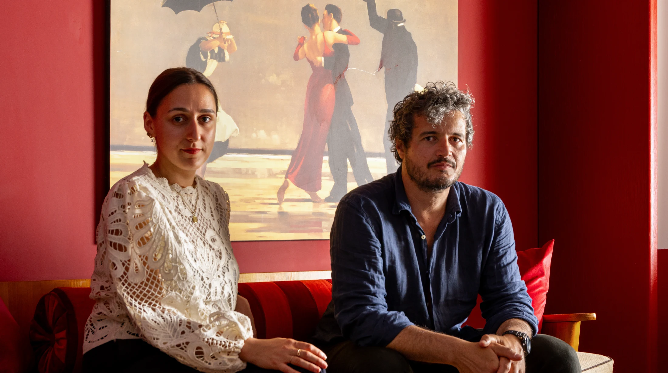
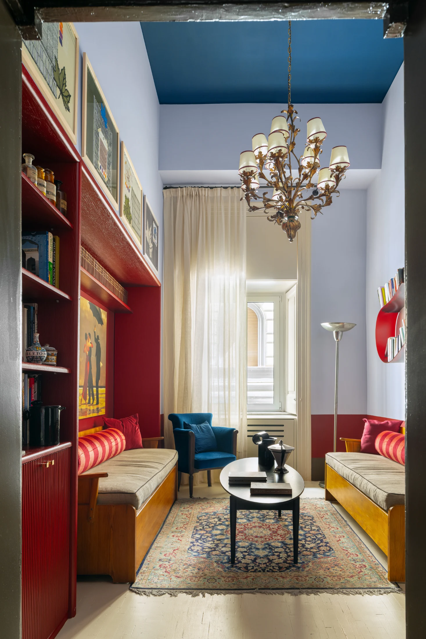
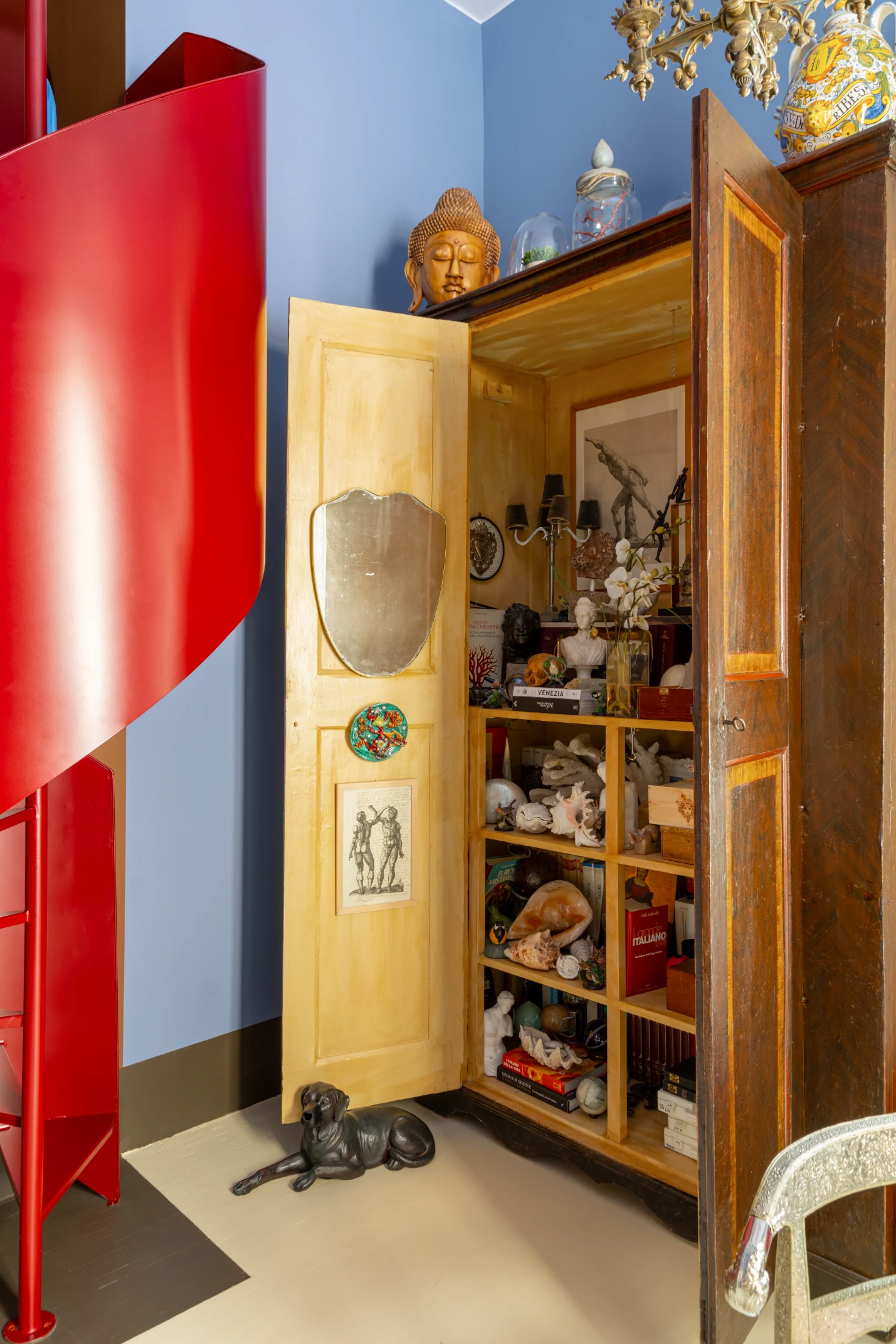
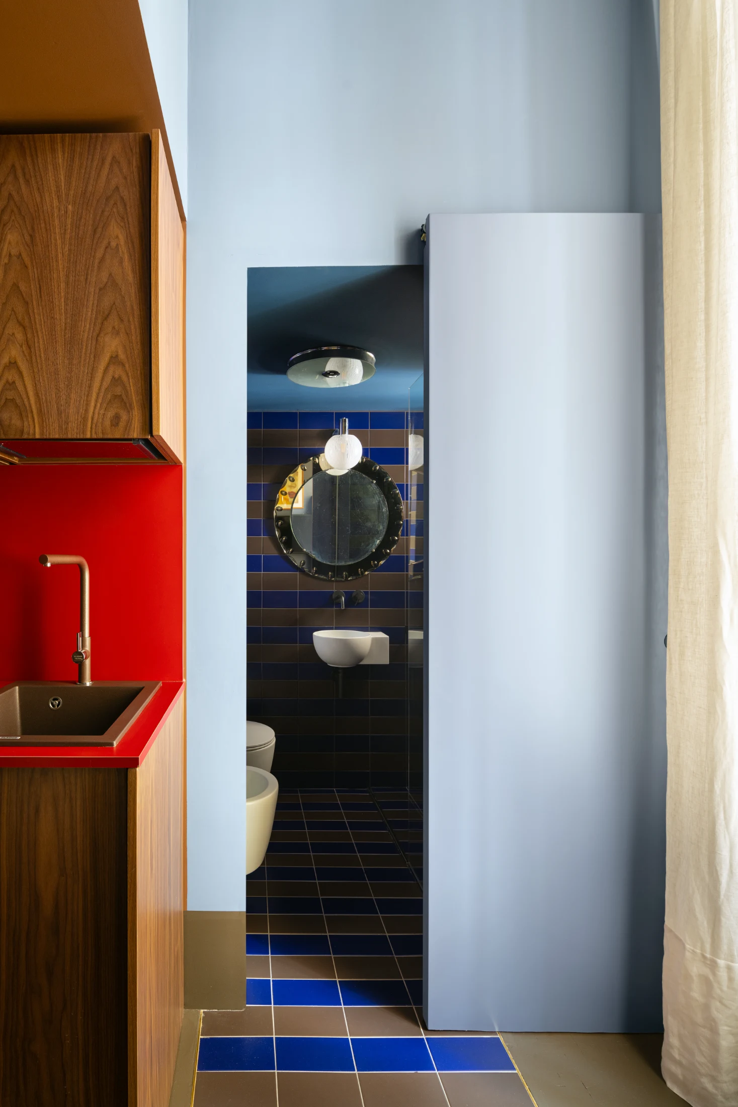
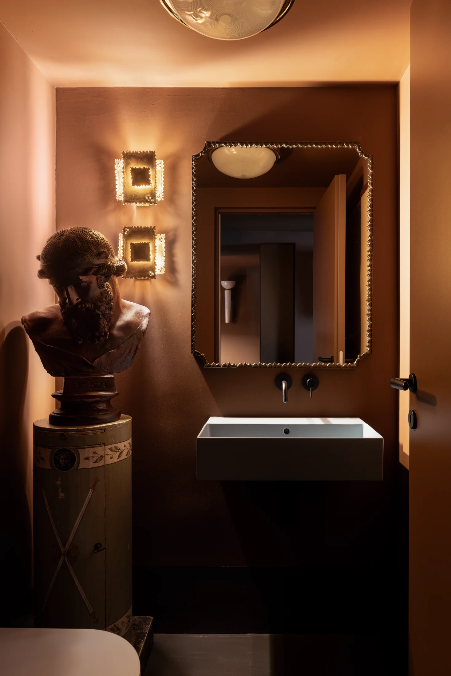
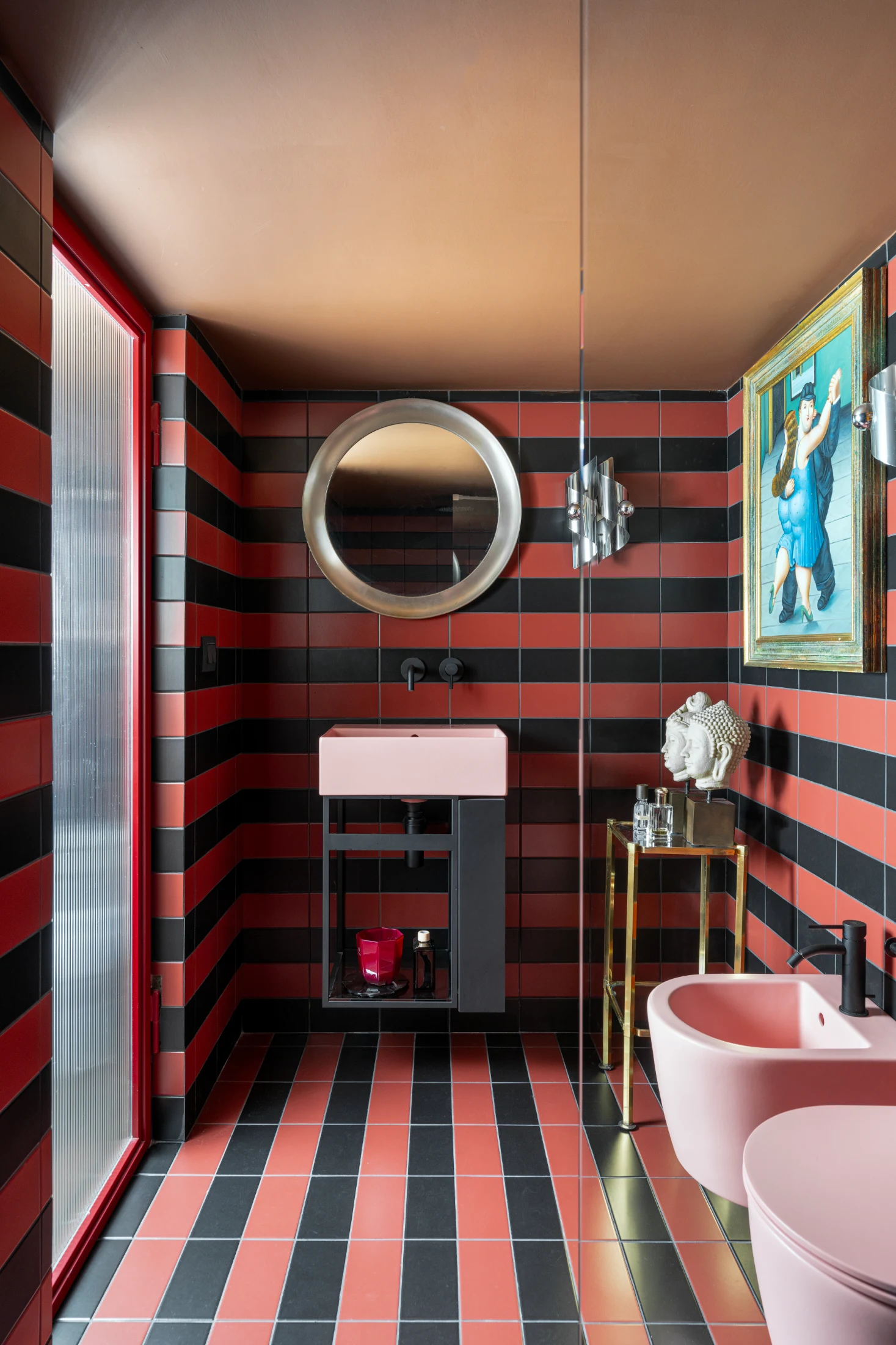
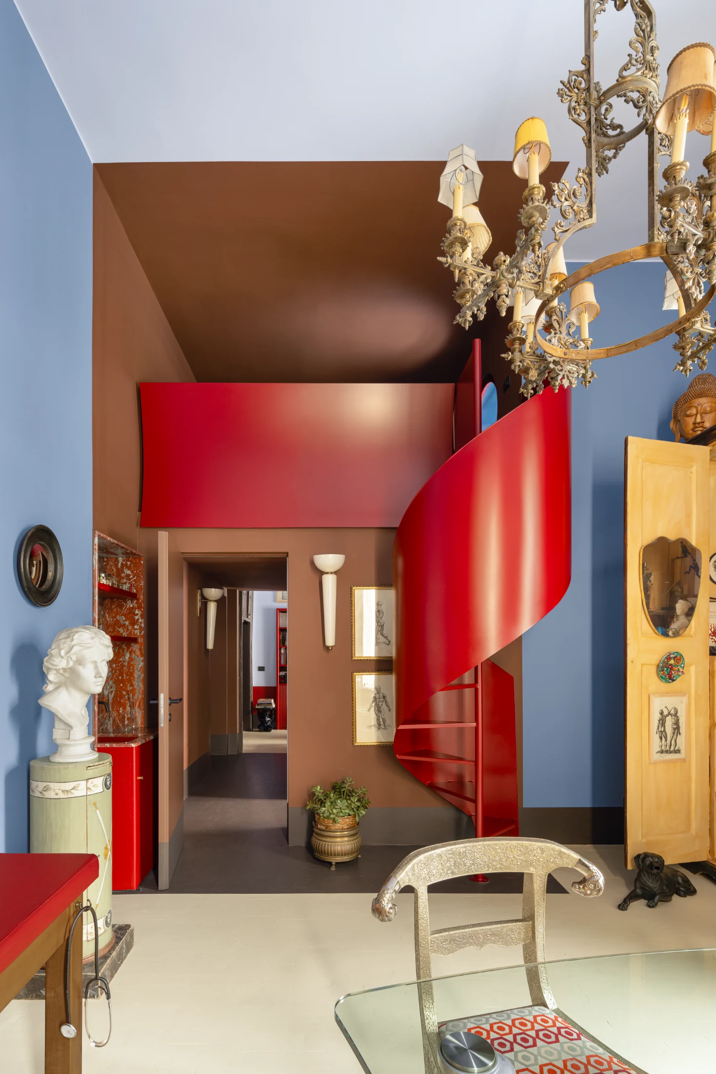
Nicola and Chicco are a creative, open-minded couple who are both passionate about refined Italian and Swedish design from the 1940s, 50s and 60s. This is actually the second project we have worked on with them so we knew they had a preference for darker spaces, that brown was Nicola's favourite colour and that they preferred interiors with significant character. Their tastes played a large role in the design of the space, which we definitely learnt a lot about!

How did the desire to use the space for both living and working shape your vision for the project?

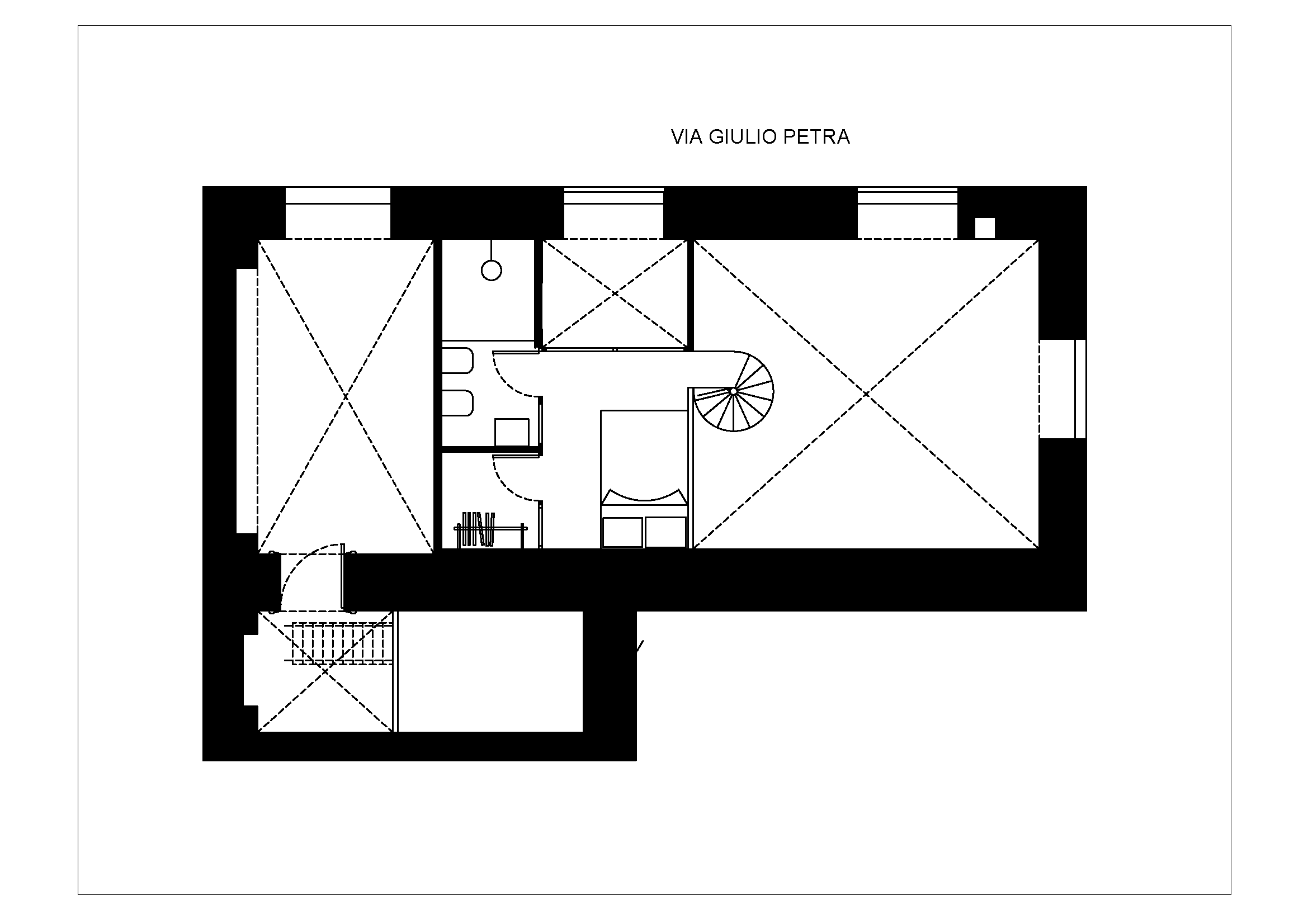
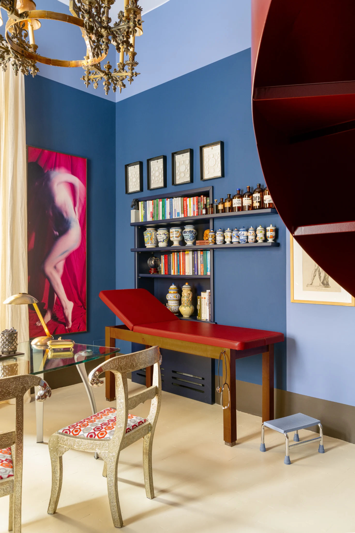
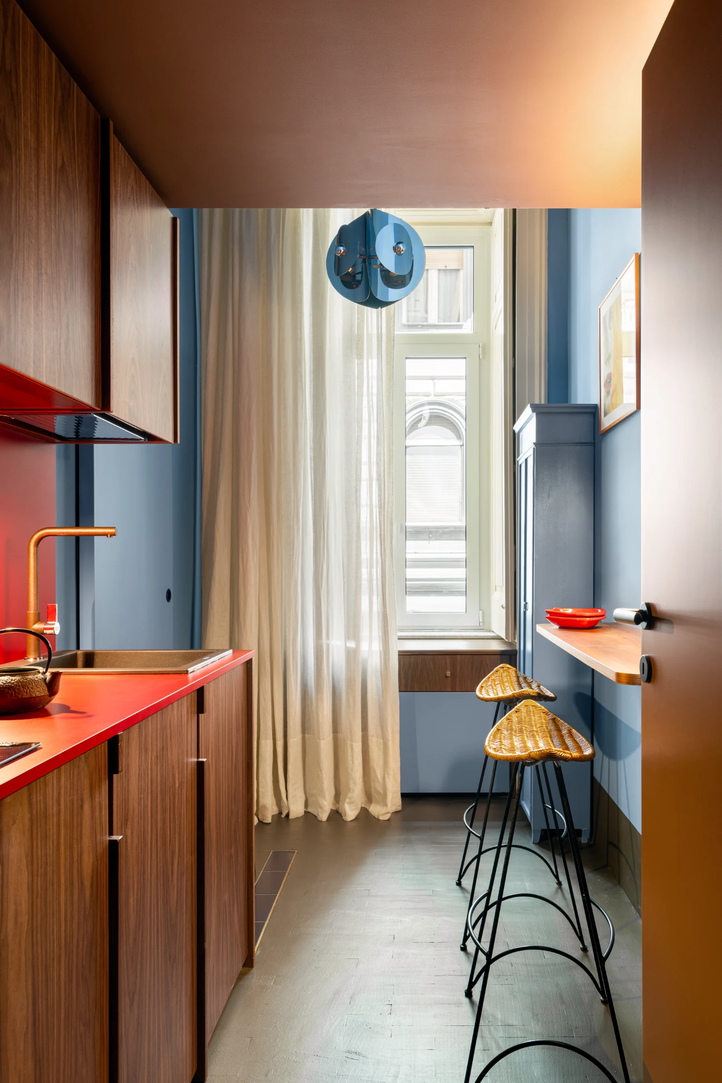
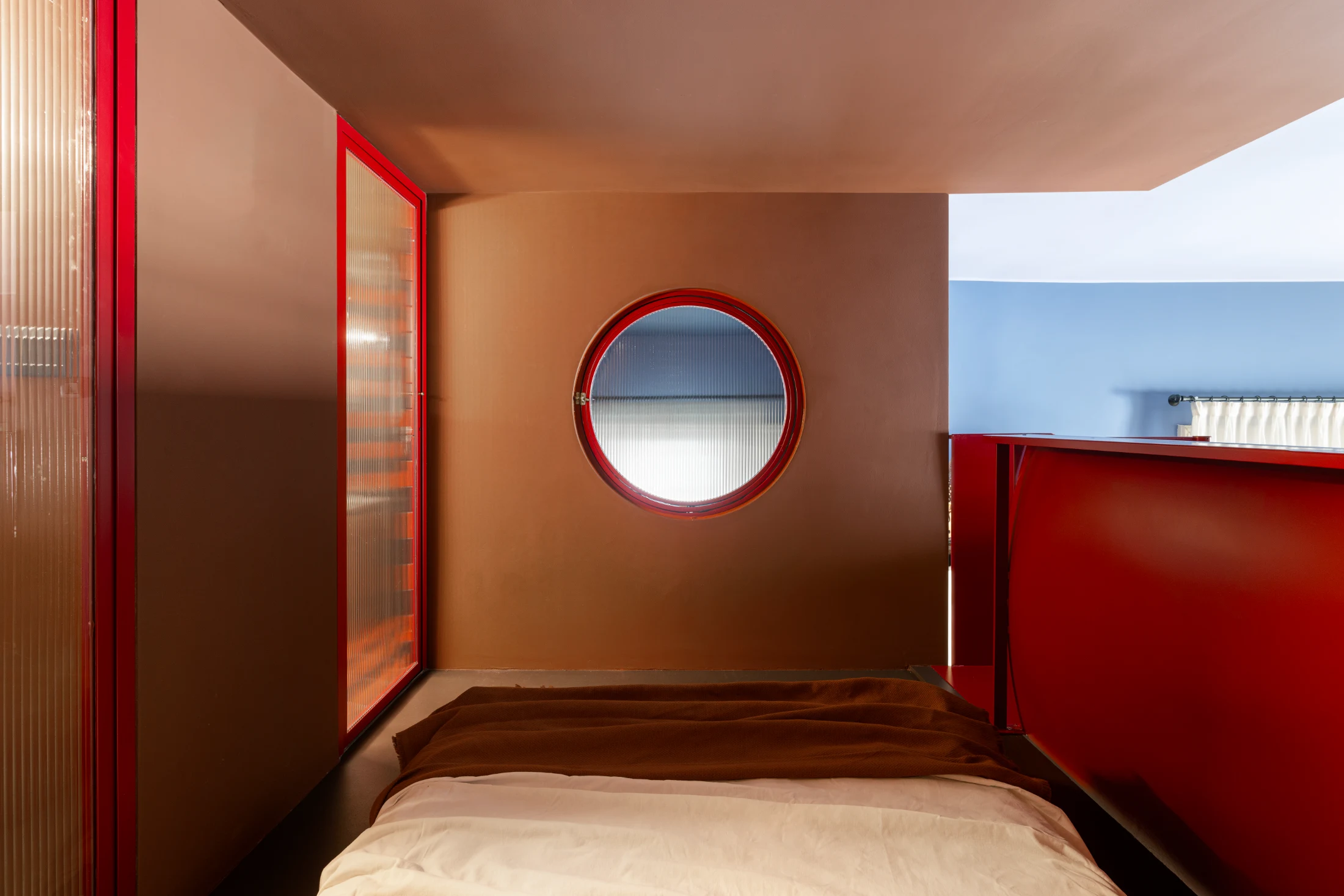
Nicola, who's a doctor, wanted to use the space as both a medical practice and a private living space, which definitely influenced the design and ultimately shaped our vision for the project. It gave us additional opportunities to create more varied environments within the same design though, making the project more intricate and diverse. Poerio also isn't the clients' permanent residence either, so we had to design a space equipped with the necessary living essentials of a home without treating it too much like a main residence.

Talk us through the design phase of the project. Were you given a lot of creative freedom? Was it a close collaboration?

The preliminary project was carried out in several steps: first, we needed to understand the tastes and the vision of our clients. Following various interesting meetings where we discussed the project, and art and design more generally, we were able to interpret their way of envisioning the space. From there, it was a very close collaboration throughout all the phases of design and construction – even down to the painting of every single piece of furniture. The only real constraint we faced on this project was around the set-up and structure of the medical practice.

In which ways is this project different from the others you've worked on?

This project was different because it was a real journey with two clients who were very involved in the process and had a clear vision for the design right from the beginning, whilst also giving us the freedom to use our imagination. It was also an exchange as well as a journey, in the sense that they taught us so much about vintage Italian and Swedish design.

Can you tell us the story behind choosing the name Poerio?

We took inspiration from the name of the street where the studio is located – Poerio. The idea behind the secondary name cabinet de curiosités came from our clients’ passion for collecting objects from different design eras, which, when well arranged, create aninteresting eclectic harmony.

The cabinet in the medical office where lots of these objects are stored is a real treasure trove, but the whole apartment itself is a real cabinet de curiosités with different objects and trinkets from their collection showcased throughout.

Which features of the space have been designed to transition between home and working life?

Whilst the primary function of the downstairs space serves as part of the medical practice, the entrance and waiting room have been designed to seamlessly transition between home and working life. The entrance hall in Poerio is not only important when used as a reception area, but also in a domestic setting. We always try to integrate an entry area as the first filter between the street and the home itself, making for a clear transition between the outside world and domestic setting. The waiting room, which has two sofas, can be used as a comfortable living room where one can read a book or watch a movie after work. The metal staircase leading to the mezzanine, on the other hand, creates a clear distinction rather than a transition between the working and private living spaces.

How did you and your client approach the element of colour in this design? How was the colour palette conceived?

Poerio's colour palette is the result of envisioning an internal journey through each of the spaces in the studio. Starting with the apartment's entrance and waiting room – pastel and muted shades of blue, brown and red are found, creating a more subdued, serene and calm atmosphere. Following through to the corridor connecting the waiting room to the doctor's office is an intentionally more intense space thanks to the lower ceiling paired with darker shades of brown and dimmer lighting. Finally reaching the doctor's office: opening out into a double-height ceiling, open space with deeper shades of blue helping to cool down the intense red. The play of colour, light and varying heights is the real soul of the project. The central brown part of the studio was then designed as a 'box within a box', creating a certain depth within this central section.

The pairing and layering of bold colours is quite unconventional but work harmoniously to create depth and character. Did you have any reservations when approaching such bold use of colour?

No! We truly believe that a house should reflect the sensations that the client wants to bring into and experience in their home. Colour has the power to do this from the different feelings and moods it can evoke in each of us. In Poerio, we played around a lot with contrast, choosing colours that respond well to each other, and aligned with our clients' vision and the atmosphere they wanted to create through the design. We use a lot of colour in our work in general, both in the interiors and furnishing. We think it's one of the most important elements of a project. So we don't shy away from injecting colour wherever we can!

What defined your approach to colour in this design?

Definitely playing around with and being more daring with colour – pairing bold shades without disrupting the harmony of the space. Also exploring how colours and different materials such as wood, metal and marble can work together and complement each other. We also used colour to create a story within the studio and between the different rooms and spaces.

Collaborating with other artisans and creatives seems to play a big part in your design ethos. Tell us more …

One of the most important elements of our work is our collaboration with artisans and craftsmen who bring a very high level of expertise, creativity and individuality to their designs. We're fortunate enough to have worked with artisans who have allowed us to experiment with new materials in order to bring our ideas to life and help find the right balance within a project. Various custom-made furniture pieces featured in Poerio are examples of these kinds of collaborations.

Are there any colours you'd like to explore further and experiment with in the future?

We went through a long orange phase, then there was also a Pompeian red with blue phase. We're currently really into burgundy, paired with antique pink, sienna, terracotta or khaki green. There was also a period of time where we were into more vibrant colours, but we'd say we're now more into using slightly more muted tones.

For each of you, what are your favourite details or spaces within this design?

Guiseppe: I love the way the different layers or volumes of the space seamlessly fit together. I also like that the mezzanine level creates space for the double height ceiling in the kitchen below. Although there's a clear distinction between the two levels in the studio, I love how the porthole in the bedroom connects with the floor below.

Julie: I agree, I also love the bedroom porthole up on the mezzanine and, of course, the metal staircase that leads up to the mezzanine. But beyond that, the colour tones throughout the project are my favourite element. The bathrooms are another favourite too. I think that the design and styling of the entire space is very unique which really reflects our clients' personality; that's something really special about Poerio – there's no other apartment quite like theirs.

Writing:
Eloïse Lachicorée
Writing:
Photography:
Photography:
Carlo Oriente
Back to Top
Arrow UpArrow Up
Top
Arrow UpArrow Up
The After shot of the Floorplan
Before
before
after
After
Businesses featured in this project
No items found.
Products featured in this project
No items found.
Magazine Current IssueMagazine Current Issue
Writing:
Carlo Oriente
Writing:
Photography:
Photography:
Carlo Oriente
Back to Top
Arrow UpArrow Up