
Magazine Current IssueMagazine Current Issue
When Design met Colour
From our Mag
August 1, 2025

When Design met Colour

When these two got together things got a little wild. It also freed the rest of us from a life lived “housed in dreary, grey-beige conformity, mortally afraid of using colours.”

We humans have long understood the symbolic and emotive powers of colour. Colour holds meaning, drives memories and stirs emotions. And yet, an interest in welcoming colour – especially vivid colour – into our homes, is a relatively modern condition. It would take a brave bastion of designers who dared to join the ranks of "savage nations, uneducated people, and children…" to coax us out of our domestically chromophobic ways.

Penny Craswell
Writing:
Writing:
Penny Craswell
Photography:
Photography:
No items found.
Magazine Current IssueMagazine Current Issue
The After shot of the Floorplan
Before
before
after
After
Top
Arrow UpArrow Up
Savage nations, uneducated people, and children have a great predilection for vivid colors. – Johann Wolfgang von Goethe, 1810

The ancient Greeks didn't have a word for blue. For them, the colour spectrum ranged from light to dark, with white at one end and black at the other. Yellow was a little darker than white and blue was a little lighter than black. The words for colour in Greek literature are often confusing – the "wine-dark" sea is a good example. If not blue, I can see calling the sea green, or grey. But wine-dark?¹ In ancient Rome, Tyrian purple was so valuable that by law it was only worn by magistrates, royals and generals. It also gave off a huge stink, made from crushed sea snails and was incredibly expensive – 10,000 crushed snails, cooked for a week, only made 1 gram of dye. Weirdly, even though we know Tyrian purple was, uh, purple, Pliny the Elder² described it as having: "a greenish hue".

In fact, the names of colours are not as straightforward as we think. And the words we use can have a huge effect on how we see them. For us, the basic primary colours – red, yellow, blue – and secondaries – orange, green and purple – are joined by those, not nearly so fun, brown, black and white. Pink is an interesting one – and not a colour at all in some languages. Japanese doesn't have a word for pink, just the hyphenated word momo-iro which literally means "peach blossom colour". In other languages it's just called light-red. And, in Italian, there is an extra word for light blue that we do not have in English: azzurro. The same is true in French, Albanian, Hebrew and Russian. Then there's "orange", which in Irish is flannbhuí, meaning "blood yellow". And in Hungarian there are two words for red piros and vörös, with vörös meaning dark red.
All of this has an impact on what we see. As does colour theory, a method of colour analysis used in both art and design. Bauhaus colour theorist Johannes Itten believed that different colours are associated with different emotions. Itten called an individual's colour preferences their 'subjective colours' – he described one of his students as "light violet, light blue, blue-gray, yellow, white and a touch of black" with a fundamental tone that was "hard, cold and somewhat brittle"³ – no doubt he was the life of the party. He also had a hunch that colours could have a big impact on our moods. However, while colour theory was taught at the Bauhaus by Itten⁴, and also by Wassily Kandinsky, Paul Klee and Josef Albers, the use of colour in furniture and object design was still relatively rare in this time – two of the most famous Bauhaus designs, the Barcelona chair by van der Rohe and the Wassily chair by Marcel Breuer, were famously black and chrome.⁵

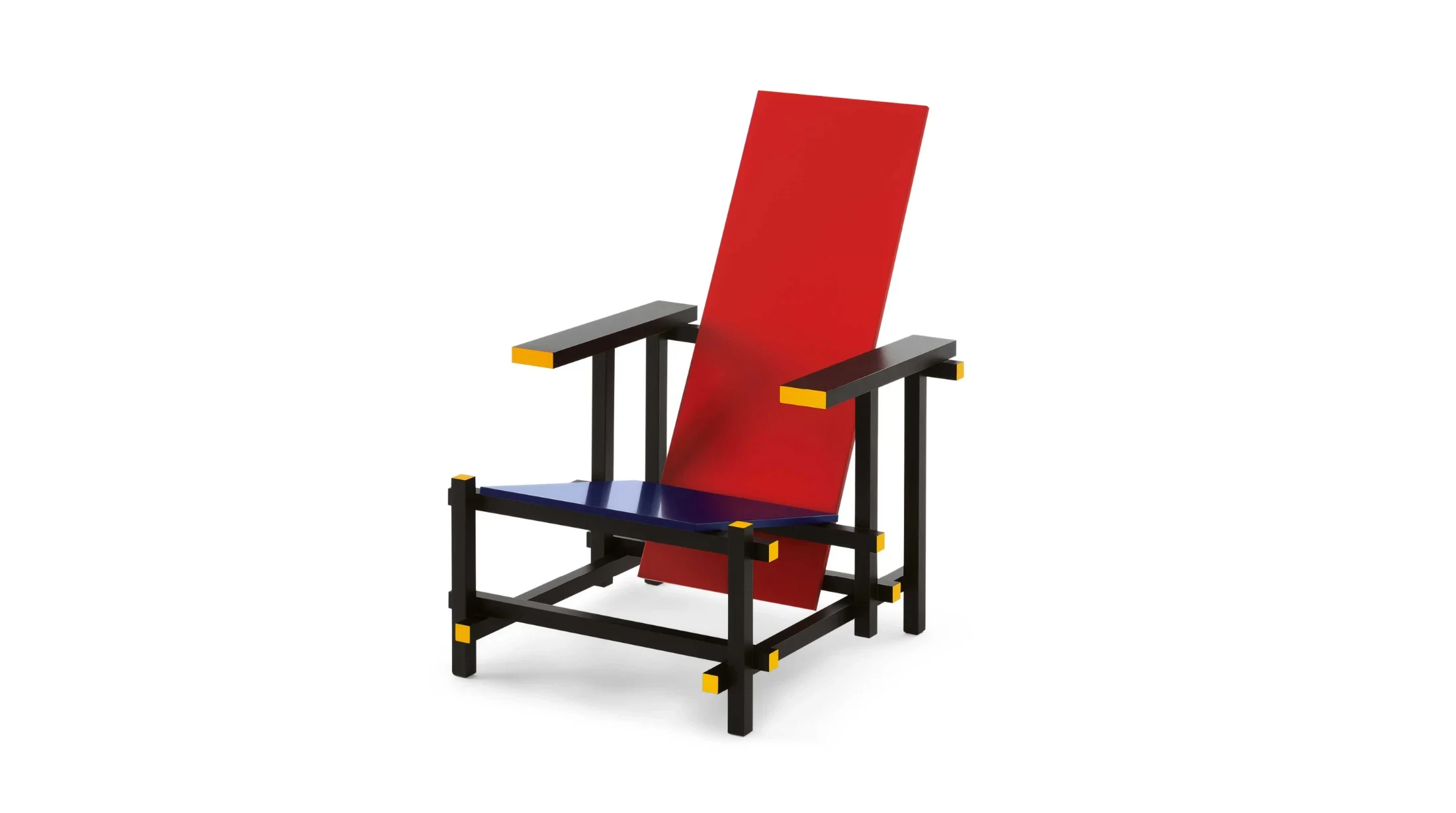
The truth is that for the longest time, the history of design, and especially furniture, was stuck in varying tones of timber, a lot of it dark and heavy. It wasn't until the 20th century that brightly-coloured furniture was even really made, let alone commonplace. One of the first iconic pieces of design history to really use colour in an interesting way was the Red and Blue chair by Gerrit Rietveld from 1923. Rietveld was part of the Dutch De Stijl movement, an art movement made famous by the geometric coloured works of Piet Mondrian. The chair's form, and its colour, conform to Rietveld's manifesto of Neoplasticism, in which the basic elements of the chair – seat, back, arms, legs – have been simplified into intersecting planes. Its colours have also been distributed this way – red for the back, blue for the seat, and black for the arms and connecting elements (with a touch of yellow on their ends). The use of primary colours on separate planes represented a turn away from nature, towards the machine age. It presents a totally modern form. "It is interesting just how little importance was given to the application or integration of colour into domestic objects prior to World War I," writes David Harrison in A Century of Colour in Design. "It was the De Stijl movement … that kickstarted the use of primary colours."

But there was one material that would inject bright, vivid colour into our homes – and particularly furniture and household objects – plastic. A wonder material, it was everything modern: new, cheap and fun. And it was colourful. The first type of plastic to become ubiquitous in our homes – Bakelite – was used in telephones, radios, kitchenware, light switches and toys, with global production at about 178,000 tonnes by 1944. Fibreglass began to be used in furniture from the 1950s with the Eames fibreglass chair. But the most important innovation for the development of plastic furniture was polypropylene, which went into production in the early 1950s. This mass-produced, colourful and cheap material was perfect for the age of consumerism and pop design.⁶ Danish designer Verner Panton's chair, eponymously called the Panton chair, released in 1967, epitomises this new era of plastic design and freedom to express yourself in full colour.

“The main purpose of my work is to provoke people into using their imagination,” Panton said. “Most people spend their lives housed in dreary, grey-beige conformity, mortally afraid of using colours.”

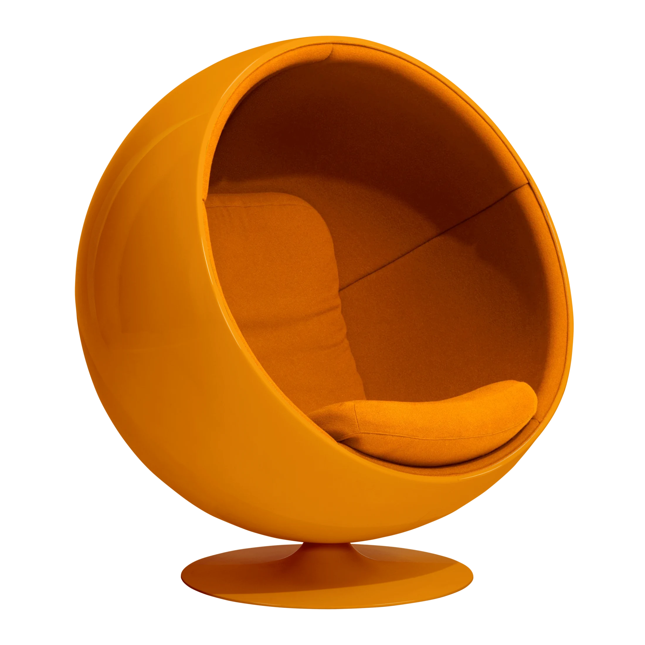
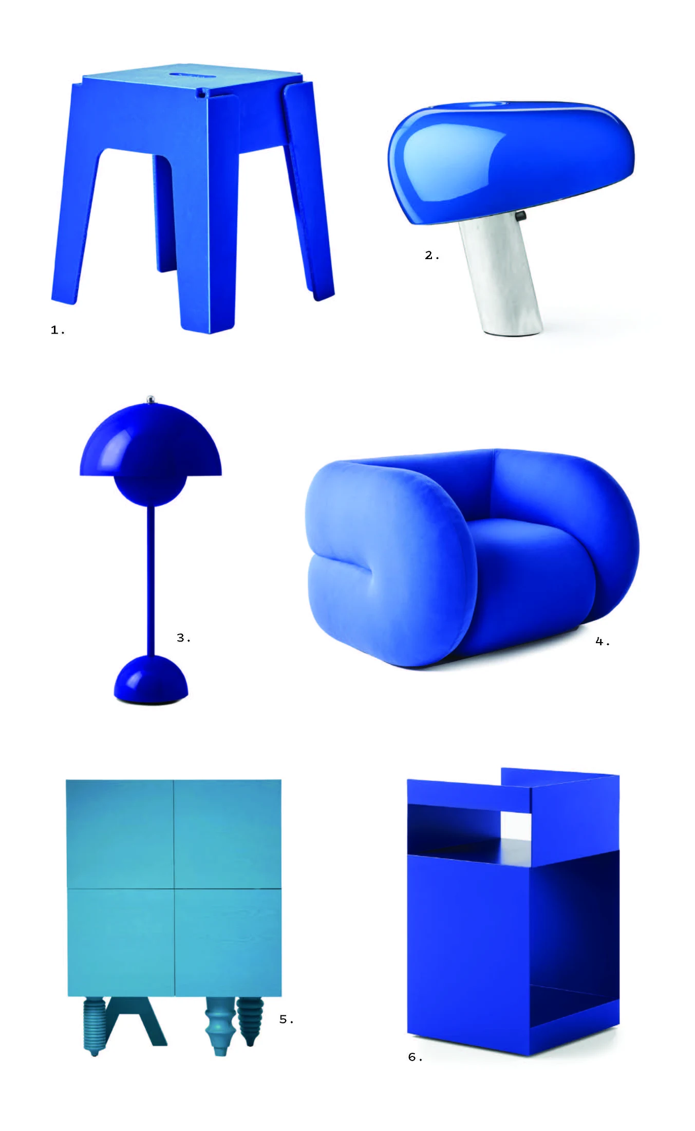
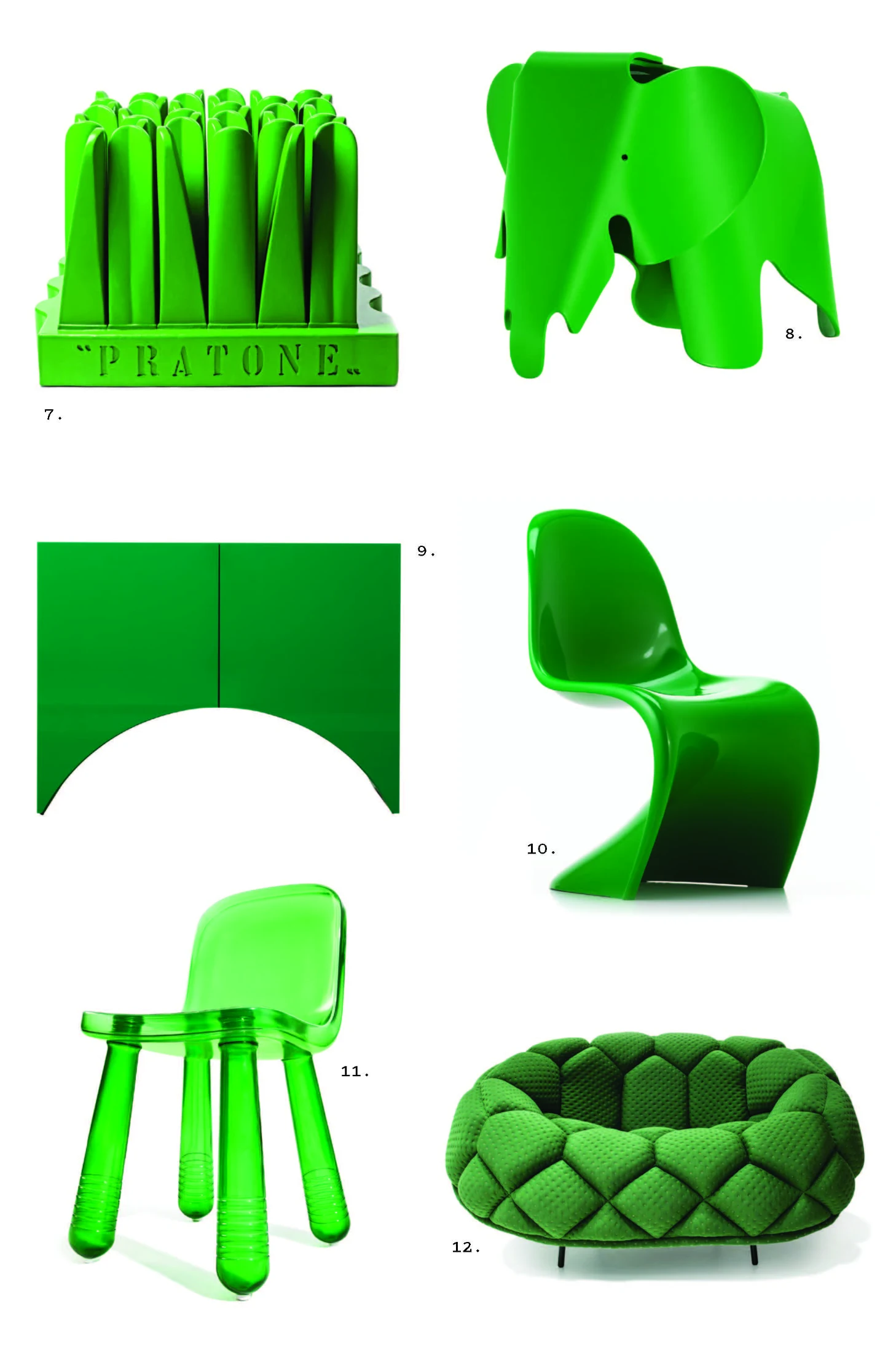
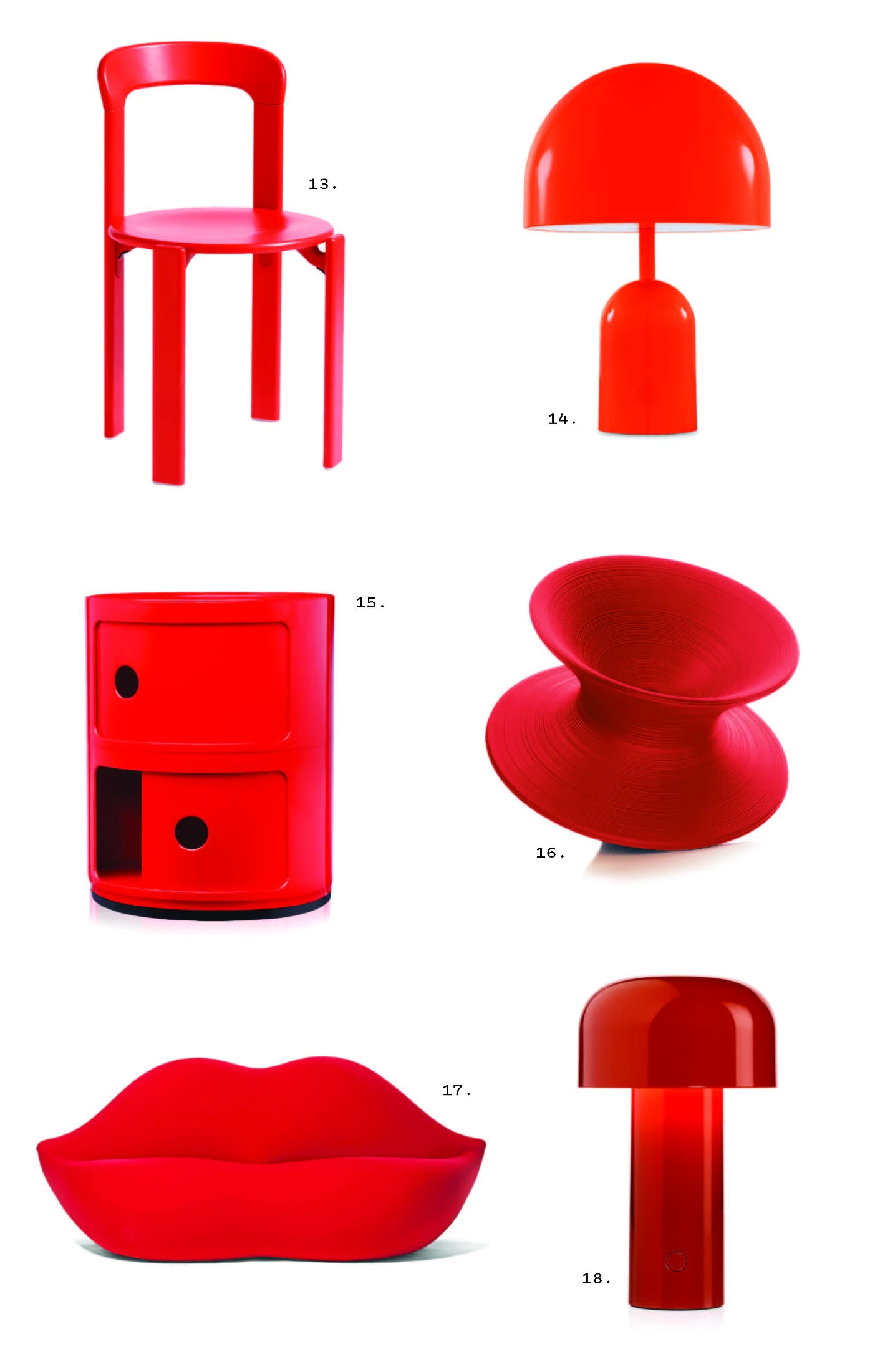
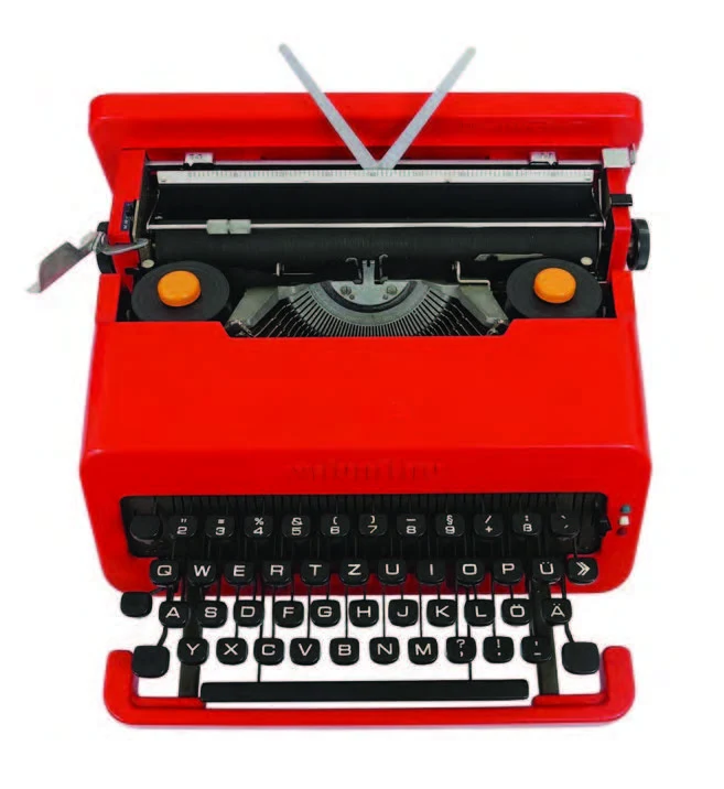
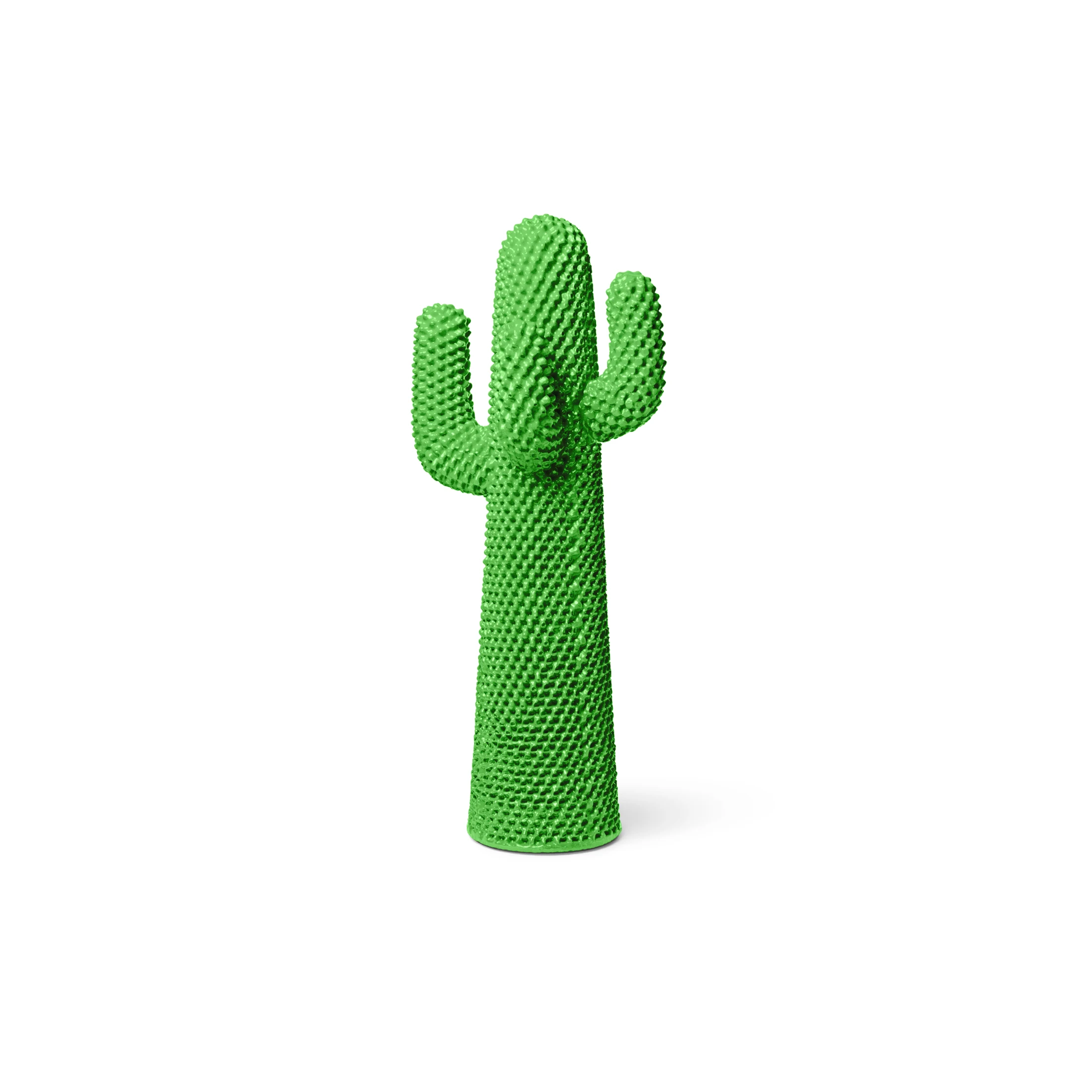
Designers of this era made full use of these new materials and technologies to inject colour into our lives, and there were no designers more dedicated to colour than the Italians. Gaetano Pesce's Up chair and ottoman, Vico Magistretti's Eclisse lamp, Anna Castelli Ferrieri's Componibili storage tables, Ettore Sottsass's Olivetti Valentine typewriter, Achille and Pier Giacomo Castiglioni's Snoopy lamp – these are icons of design writ in bold oranges, reds, blues and greens. Red in particular is notable in Italian design, a fact that Kendrah Morgan, curator of the Molto Bello: Icons of Modern Italian Design exhibition at Heide Museum, Melbourne, partially attributes to an expression of national identity. "In the exhibition, a lot of the objects are bright red, and we often associate red with Italian design," she says. "With the emergence of plastics, the range of colours increased. They became more vibrant and saturated because of new technologies around plastics and the use of dyes. This was in the 1950s and 60s when Italy was becoming a mass consumer society."

Italian design was also influenced heavily by the visual arts and by pop art. "In Italian design," says Kendrah, "those pop art hallmarks such as bold colours, repeated forms, everyday objects and imagery, irony and satire, all came out." In particular, the Valentine typewriter by Ettore Sottsass for Olivetti was iconic, the first all-plastic typewriter, designed not for boring office life, but for the writer or poet. "It is a literary, emotional object that Sottsass intended to be used, for example, by a poet out in the landscape, in a beautiful, inspirational setting," says Kendrah. The orange scroll caps were directly inspired by the nipples of a nude in a painting by pop artist Tom Wesselmann.

Italian design continued to dominate, especially in the development of coloured furniture and design, for decades, through the swinging sixties and into the orange and brown of the 1970s. By the 1980s, colour use had shifted, with post-modern pastiche heralding an era of anything goes. The Memphis Milano collective (see p36) embraced new materials and colour combinations, and Miami Vice inspired interiors in beige with teal, pink, peach or neon accents. But the era of colour stuttered out in the 1990s, when colour started to be abandoned in favour of chrome, glass and black furniture, clean lines and minimalism. It is from this point on that grey and other neutrals start to dominate in our homes, along with white, black, timber and other neutrals.

But it needn't be so. Eryca Green of Melbourne's Smith Street Bazaar is a huge lover of colour. "I deplore the current trend of varying stages of greys and beiges. I think colour can be a really emotive thing, and I personally am not afraid of it," she says. "I love the Memphis approach to colour and that irreverence." In her study, leaning against the wall, she has a Tahiti Table lamp by Memphis Milano, with its combined pink, yellow, brown and red. And on the table next to it, a Snoopy lamp by Achille Castiglione in green. "There is a black one, but the green is probably best known," she says. "That green is something I really love."

We've come a long way since 1810 then. In his Theory of Colors Goethe observed that "...people of refinement avoid vivid colours in their dress and the objects that are about them, and seem inclined to banish them altogether from their presence." And yet the era of domestic chromophobia is far from over: 'millennial grey' and 'sad beige' still dominate our homes and offer a calming refuge for many. But will they ever make our hearts sing? Some designers, like Denmark's Raw Color (see p210) and Studio RENS in the Netherlands, think not and in the case of the latter, describe themselves as "colourful to the core" with colour driving their entire design process. Iranian-born Paris-based architect and designer India Mahdavi is also an advocate of living with colour. She told Surface magazine: "My work is about joy and sunshine and how you can change the mood of a room full of people when the place has some kind of happiness to it. People need colour. If I can bring that into the environments I create, I'm happy."⁷

¹ The references to colour in ancient Greek texts are so haphazard that one 19th century politician went so far as to claim that Greeks must have been colour blind. But this is not the case – references to colour were confusing in other ancient languages too – a decade later one scholar found the same muddled references to colour in the Koran, the Bible, ancient Chinese stories and Icelandic sagas. For more detail, check out Kassia St Clair’s book The Secret Lives of Colour, which also charts the origin and history of 70 different shades from saffron to fuchsia, vermilion to mauve, and ultramarine to celadon.

² Pliny the Elder was an ancient Roman whose encyclopedic works were considered an authority on scientific matters until the Middle Ages.

³ Interestingly, Itten’s theory was one of the earliest precursors to modern colour theory in fashion and beauty, in which you may be classified as an autumn, winter, spring or summer.

⁴ Itten’s colour star, consisting of six concentric circles and twelve meridians, was published in 1921.

⁵ A notable exception is the Nesting tables by Josef Albers from 1926, in which each tabletop has a different Bauhaus colour – white, yellow, orange and blue.

⁶ Interestingly, one more ingredient helped colour to really take off as an idea in interiors, and that is colour printing in magazines and, specifically, colour advertising. The introduction of plastic, the lowering of the cost of household goods and the advent of glossy colour magazines created a perfect storm, and the response was huge.

⁷ Other contemporary designers not afraid to work with colour include US-based Karim Rashid, Netherlands-based Hella Jongerius and UK-based Bethan Laura Wood.

Writing:
Writing:
Penny Craswell
Photography:
Photography:
Back to Top
Arrow UpArrow Up
Top
Arrow UpArrow Up
The After shot of the Floorplan
Before
before
after
After
Businesses featured in this project
No items found.
Products featured in this project
No items found.
Magazine Current IssueMagazine Current Issue
Writing:
Writing:
Penny Craswell
Photography:
Photography:
Back to Top
Arrow UpArrow Up