
Magazine Current IssueMagazine Current Issue
Small Home: Petit Sept
From our Mag
February 1, 2026

Small Home: Petit Sept

A vibrant 50-square-meter Milan apartment transforms a challenging 1920s layout into a series of immersive color-coded rooms that celebrate both family flexibility and Milanese design heritage.

Design: Atelierzero
Size: 50 sqm/538 sqft
Location: Milan, Italy

Embracing the existing floor plan of a rare early 20th-century Vecchia Milano apartment, Petit Sept's series of distinct, immersive rooms bring together saturated colour, rich texture and thoughtful lighting to highlight the unique character of each space. Though distinctly individual, the collective whole is deftly harmonised by a considered selection of materials that act as "neutral connectors". Designed by architect studio Atelierzero as a sometimes-home for a family of three who split their time between cities, Petit Sept balances the practical needs of family city living with a nuanced celebration of Milanese design heritage.

Eloïse Lachicorée
Writing:
Writing:
Eloïse Lachicorée
Photography:
Photography:
Matteo Losurdo
No items found.
Magazine Current IssueMagazine Current Issue
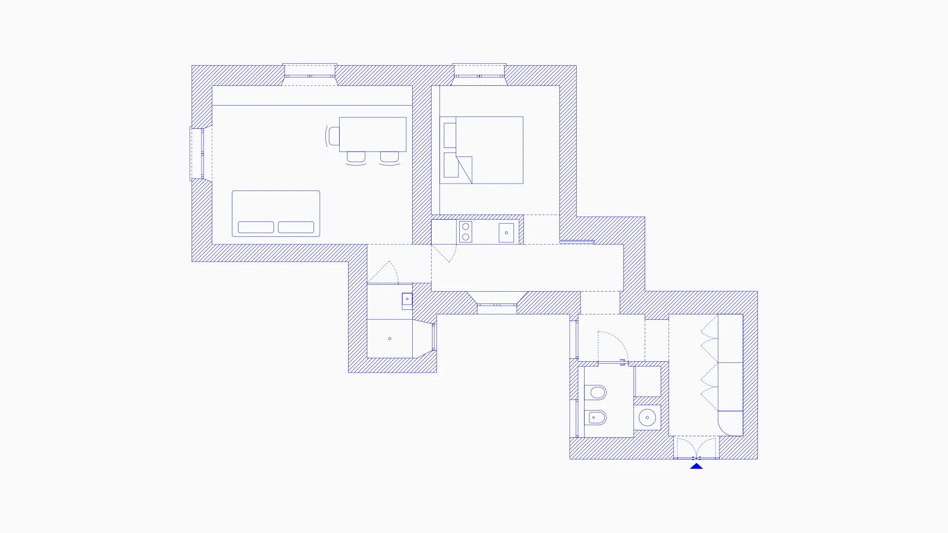
The After shot of the Floorplan
Before
before
after
After
Top
Arrow UpArrow Up

Can you tell us a bit about the building where the apartment is located and the surrounding neighbourhood?

The apartment is in a great spot, right between Milan's Central Station and the Porta Venezia district. The area is full of character and contrasts: on one side there's the lively, multicultural energy of the Central Station neighbourhood; on the other there's the trendy and inclusive vibe of Porta Venezia, known for its buzzing venues and one of the city's main shopping streets.

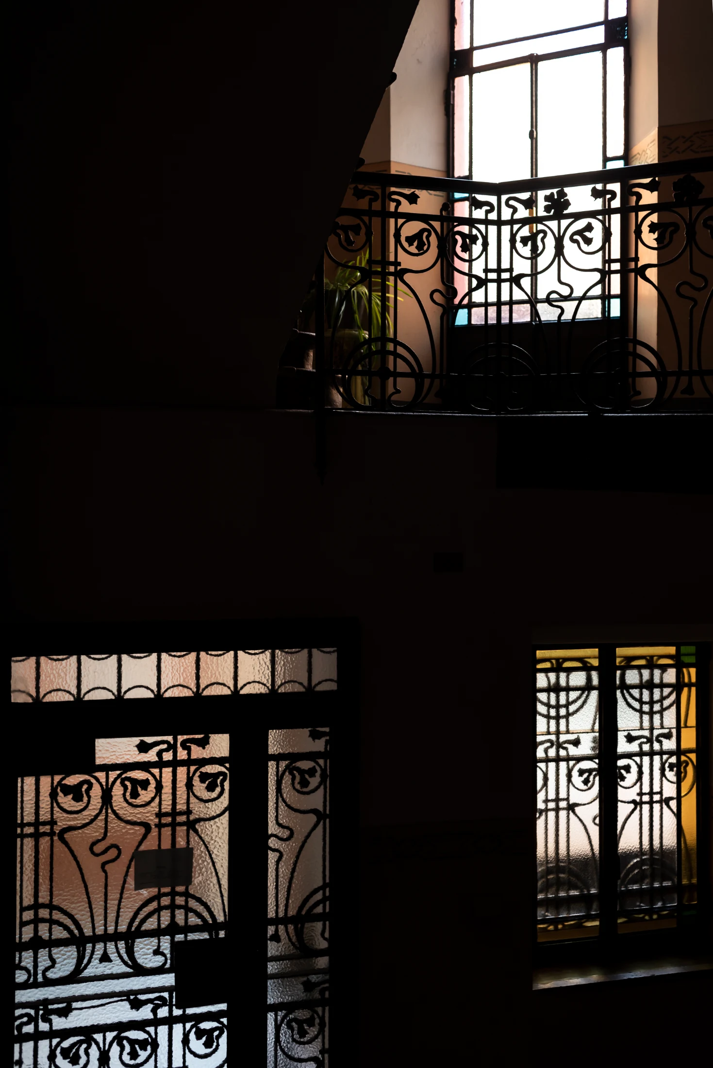
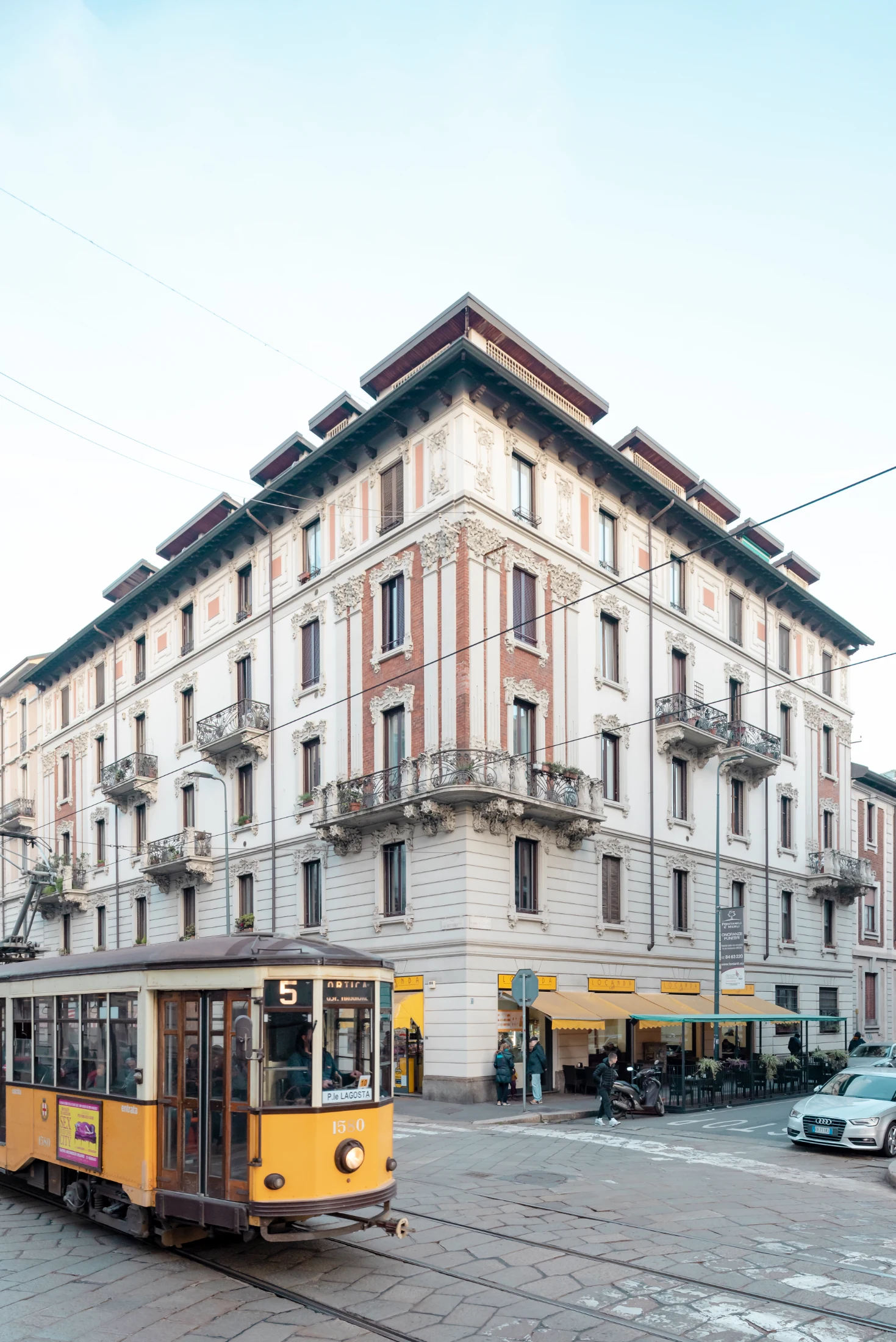
The building itself dates back to between the 1920s and 1930s and is a classic example of what we locals often call Vecchia Milano (Old Milan). Its facade reflects the elegance and proportions typical of early 20th-century architecture – a time where well-crafted, decorative buildings were widespread across the city, and not just exclusive to the wealthy. After World War II this approach to building began to fade away, making these structures increasingly rare and highly sought after for their timeless charm and architectural value.

Can you tell us a bit about who lives here?

The apartment belongs to a couple with a daughter who split their time between Milan and Aosta. She works in a creative role at cc-tapis – a contemporary rug company based here in Milan, and wanted to bring into her home the same rich textures and materials she's surrounded by in her everyday work. He's mostly based in Aosta and works for a lighting retailer, but frequently travels back and forth to Milan for work. He shares her passion for design and interiors, and together they're thoughtful, attentive clients with a strong eye for detail.

How have their lives and family dynamic shaped the design of the apartment?

Constantly moving between two cities with a child who occasionally joins them in Milan definitely shaped the design. They needed a home that felt welcoming and personal but also flexible enough to adapt to different rhythms: just one or two of them living in the apartment during the week, all three of them when their daughter is in town, and occasionally renting the apartment out when they're not in town. This meant including details like a sofa bed, smart storage spaces and a layout that could accommodate change without ever feeling temporary or impersonal. The result is a space that reflects their lifestyle: fluid, functional and full of character.
How did you come to work with your clients on this project?

Our clients on this project had been following our work on social media and were particularly drawn to a few projects where we had managed to create warm and characterful interiors through thoughtful use of colour and materials. Given current urban living trends, we often work with small- to medium-sized apartments, trying to design highly-personalised spaces that reflect both our sensibility and the personality of the people who will live there.

What was your client's vision for the space at the beginning of the project?

After months of house hunting, the clients visited this apartment and were immediately taken by the building and the neighbourhood. The flat itself, given the condition it was in, required a fair amount of imagination. Our clients also didn't hide the fact that they were initially quite hesitant about the purchase. But they knew that with the right professional support they'd be able to turn the space into something they would like.

How did this vision evolve as the project progressed?

At our first site visit, we were also a bit taken aback by the previous renovation as it was very much a product of the 90s, with some rather awkward colour combinations and questionable flooring choices. But it quickly became clear to us that the unconventional layout had great potential, offering the chance to create a really interesting sequence of interconnected spaces. From there, we worked together on shaping their vision:

a home in Milan that could reflect the city’s urban, ironic spirit, something dynamic but unpretentious and a true reflection of their free and energetic lifestyle.

Was there a collaborative element between your team and your clients in landing on the apartment's final design?

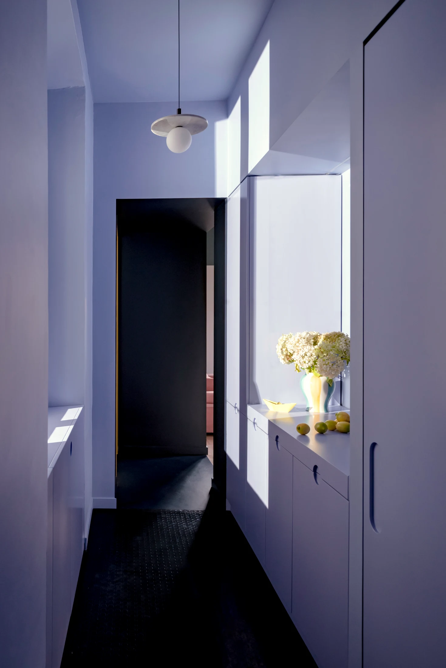
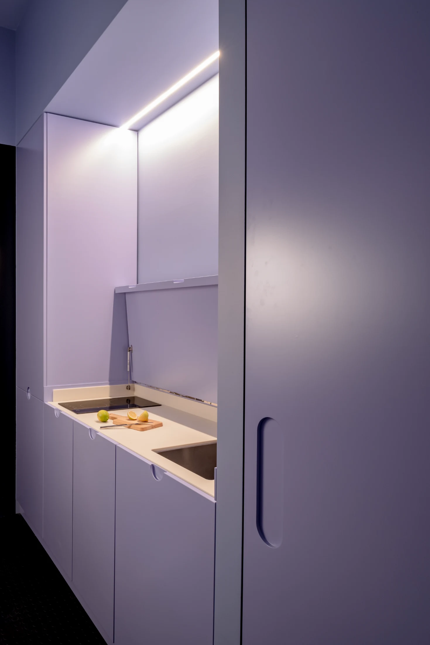
The clients gave us almost complete creative freedom, both in terms of layout and in the choice of colours, materials and finishes. Their only real request was that the kitchen shouldn't be a central feature or take up too much room. They immediately embraced our idea of tucking it into the otherwise unused corridor area. We also had fun referencing some of the more questionable colour choices from the previous renovation (like the lilac in the kitchen and the pale green in the bathroom) but bringing them back in a playful, reinterpreted way, almost like an inside joke. It felt like an ironic tribute to the apartment's past. From the very first layout and design proposal they were both enthusiastic and gave us the green light to move forward. They were truly the dream clients every architect hopes for!

What challenges did the original apartment's unique floor plan pose during the renovation?

The real challenge was accepting the fact that the bathroom, the corridor and the existing tiny kitchen all faced a dark, narrow internal air shaft. On top of that, the bathroom was extremely small and the kitchen had been awkwardly squeezed into one of the odd recesses of the floor plan.

How did you overcome these challenges?

Because of the apartment's overall structure and the position of the load-bearing walls, there was simply no way to avoid having some rooms face the internal air shaft, or being quite small in size. So, instead we decided to embrace these features. We treated each of these spaces as self-contained environments, almost like standalone boxes, that could be enjoyable and immersive on their own, even without natural light or views. From there, the project evolved into a sequence of distinct, yet connected rooms, each with its own identity but designed to speak to one another in a fluid, coherent way.

Can you share some specific details of how you did this?

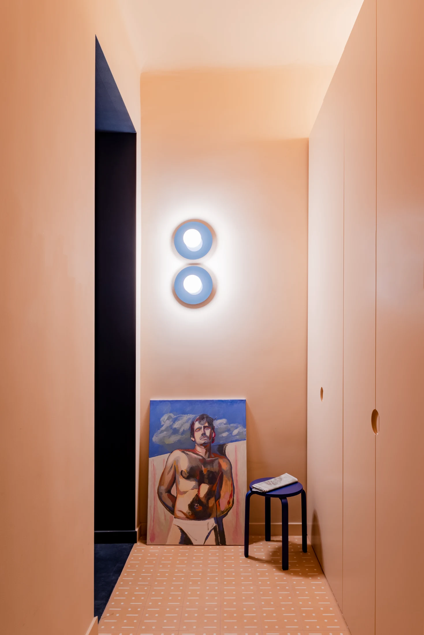
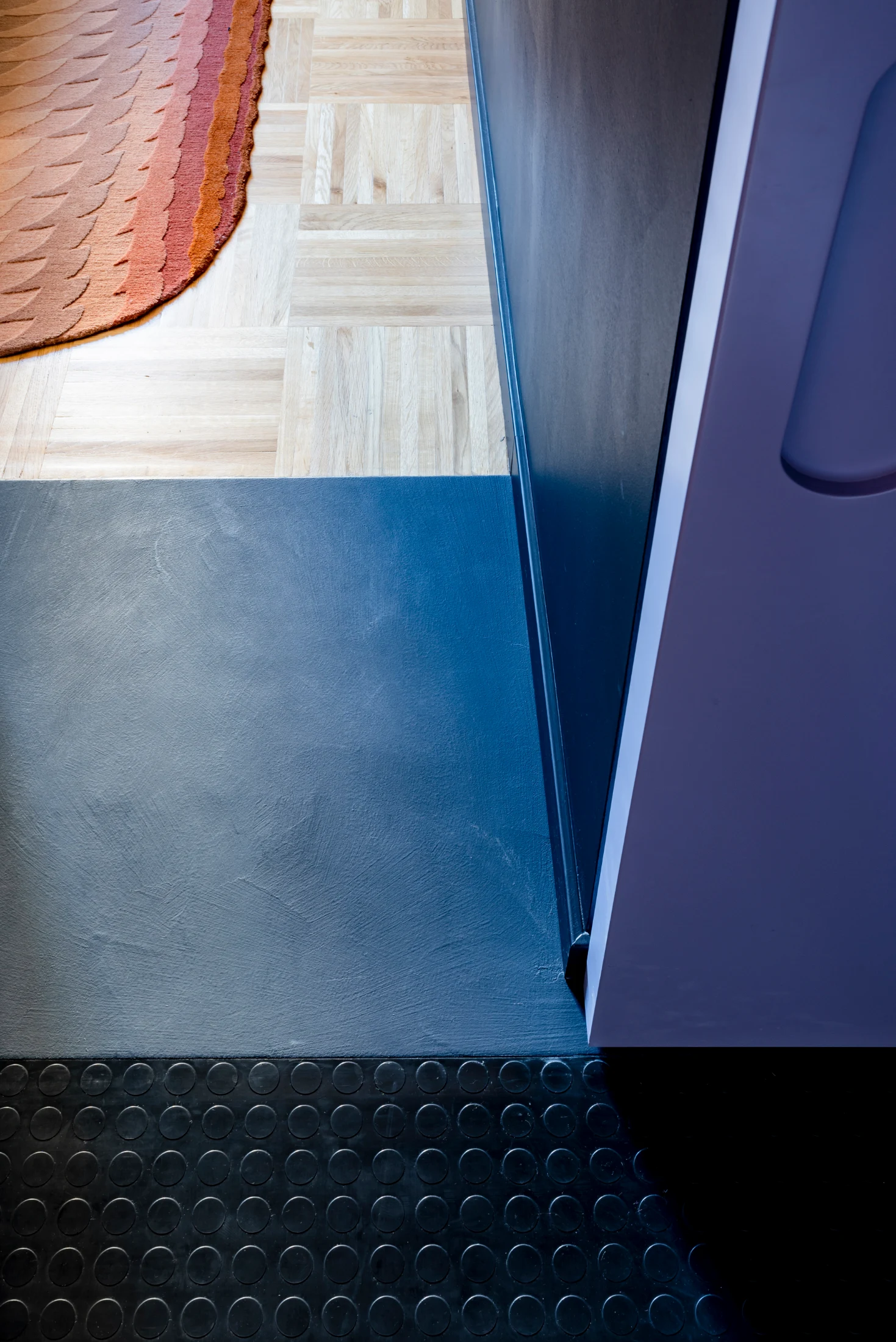
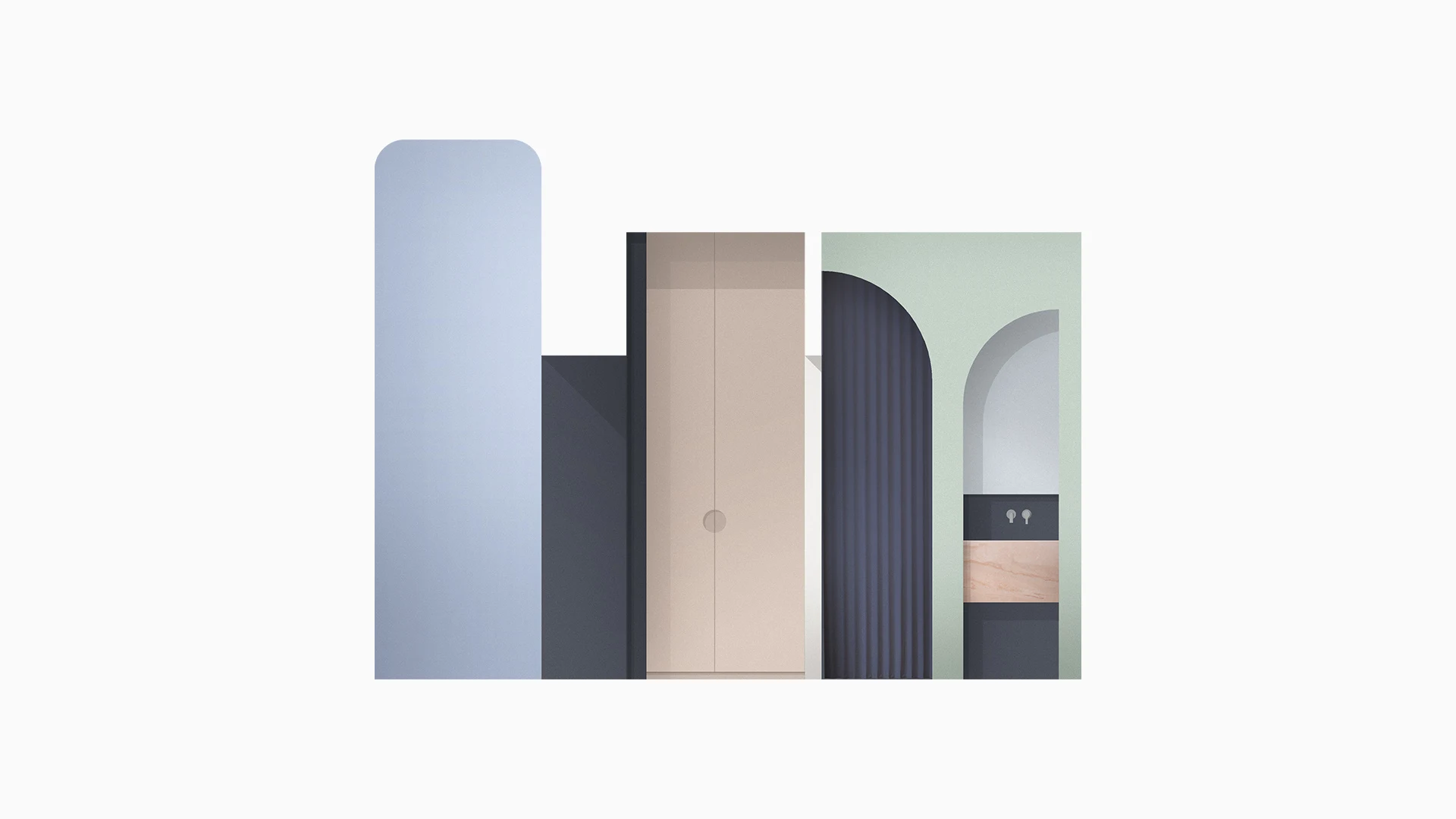
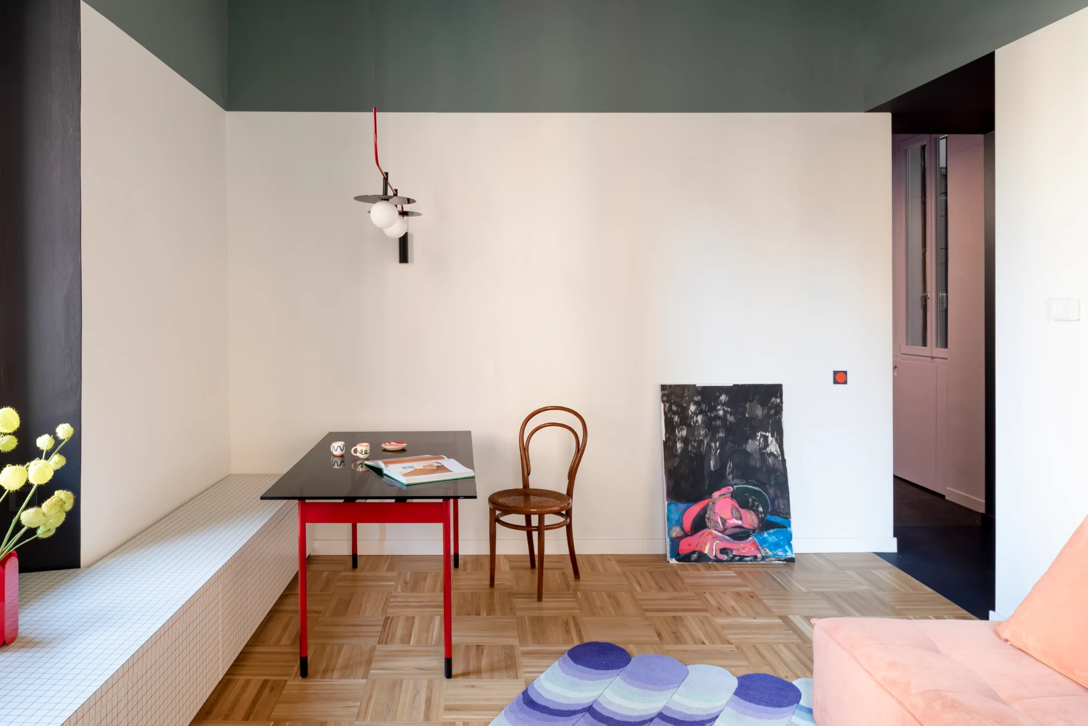
Each room is defined by a different flooring and a dominant colour that gives it its own character. Transitions between the main spaces and bathrooms are created with the dark resin floor, acting as a neutral connector between the various materials – creating a continuity without overwhelming the overall composition. At the entrance, the orange tone echoes one of the colours found in the building's shared staircase, creating a sort of transition moment between outside and inside. The floor is tiled with custom-designed cement tiles produced by Mosaic Factory in London. In the bathroom and kitchen, we used two colours that had already been chosen by the previous occupants, but we didn't combine them as they had done.

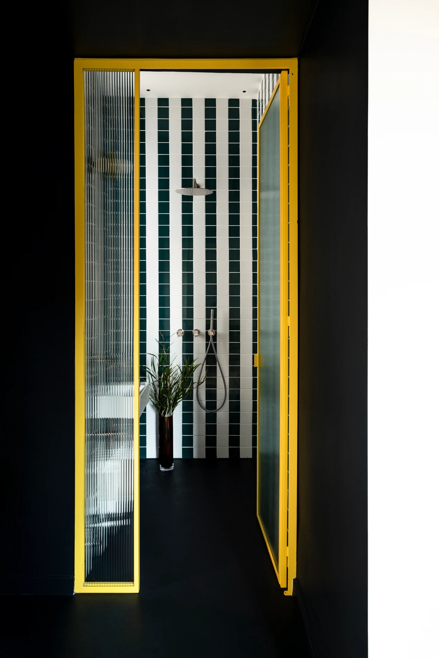
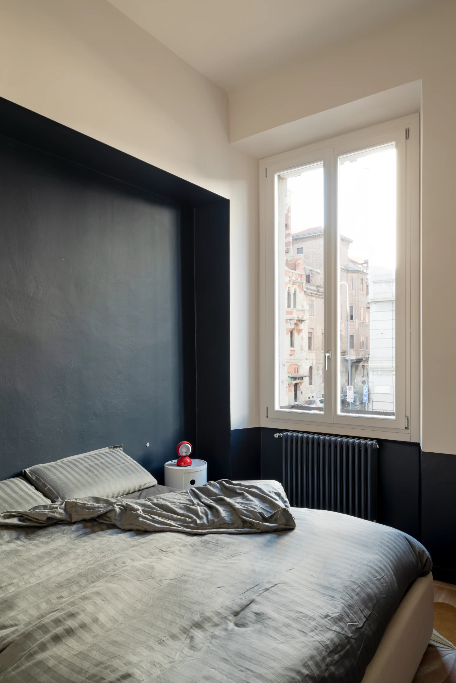
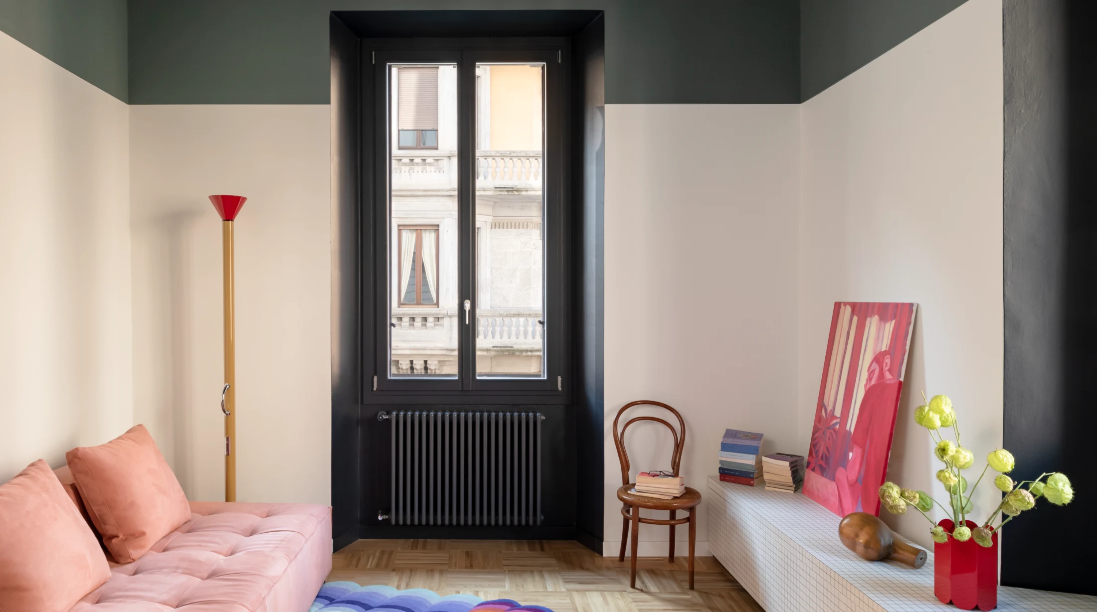
The flooring in the bathroom and the transitional areas picks up on the dark tone that was originally used in the corridor, now reinterpreted as a way to create a subtle break between the main rooms. The kitchen floor is finished in classic bubble rubber, while the shower is lined with glossy square tiles arranged in vertical stripes to add a bit of rhythm and texture. Finally, the living room and bedroom, the most traditional and street-facing spaces in the plan, were finished with parquet and defined by two bands of colour that mirror one another, creating a calm but graphic sense of balance.

Talk to us about the home's centrepiece: the lilac fitted box-like unit and its features.

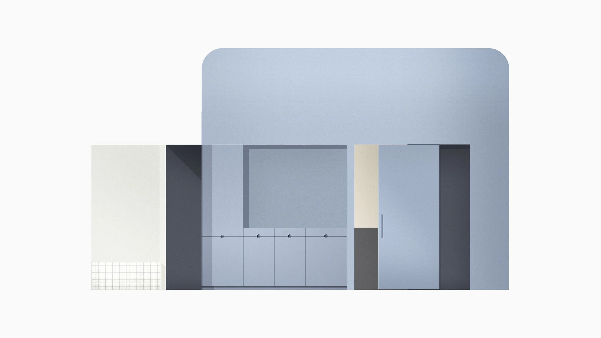
The kitchen involved one of the very few structural changes in the renovation (the others mainly focused on rationalising and reframing certain points): a corridor wall was reconfigured to carve out an alcove where the kitchen could sit. This space is part of a larger, custom-designed system that also includes the sliding door leading to the bedroom. Like the other small rooms in the apartment, the kitchen was conceived as a 'colour box' where the walls, ceiling and cabinetry are all finished in the same tone, creating a compact, immersive environment. The kitchen unit contains a tall cabinet (housing the boiler) that visually balances the sliding door on the opposite side. The kitchen's sink and work surface can be concealed with a flap door that hides the worktop completely, making the kitchen almost disappear when not in use, looking more like a sideboard than a kitchen. The unit's handles are also carved directly into the panels, with each one made of two half-circles that align into a full circle when the doors are closed.

It's surprising to see such a discreet kitchen when food and cooking are so core to Italian culture.

It's true, Italians love food, there's no doubt about that. But in Milan, we tend to lean more towards the sacred ritual of the aperitivo. We love going out, socialising and enjoying the city. Even when we host friends at home, it's rarely about elaborate dinners, it's more often a relaxed drink, a few snacks and good company. In this specific case, the clients split their time between two cities so they weren't looking for a kitchen to be the heart of the home. They wanted something functional but discreet, something that wouldn't dominate the space or feel overly tied to a domestic routine they don't necessarily live by.

Where would you say the "heart" of the home is then in Petit Sept?

I think the heart of the home isn't tied to a single room. It's more of a rhythm that runs through the entire apartment. The layout unfolds like a sequence and each space plays its own part in the story. That said, if we had to choose, we'd probably say the living room. It's where the path through the home opens up, where the colours calm down, and where the apartment breathes the most. It also has a direct street view, so in a way, it's where the home connects back to the city.

How did you and your clients arrive at the project name Petit Sept?

It's honestly a bit silly, a playful wink to both the street the apartment's on and the company she works for. It was just a fun little inside joke we couldn't resist slipping in.

Could you talk us through some of the nods to Milanese design and tradition in your design?

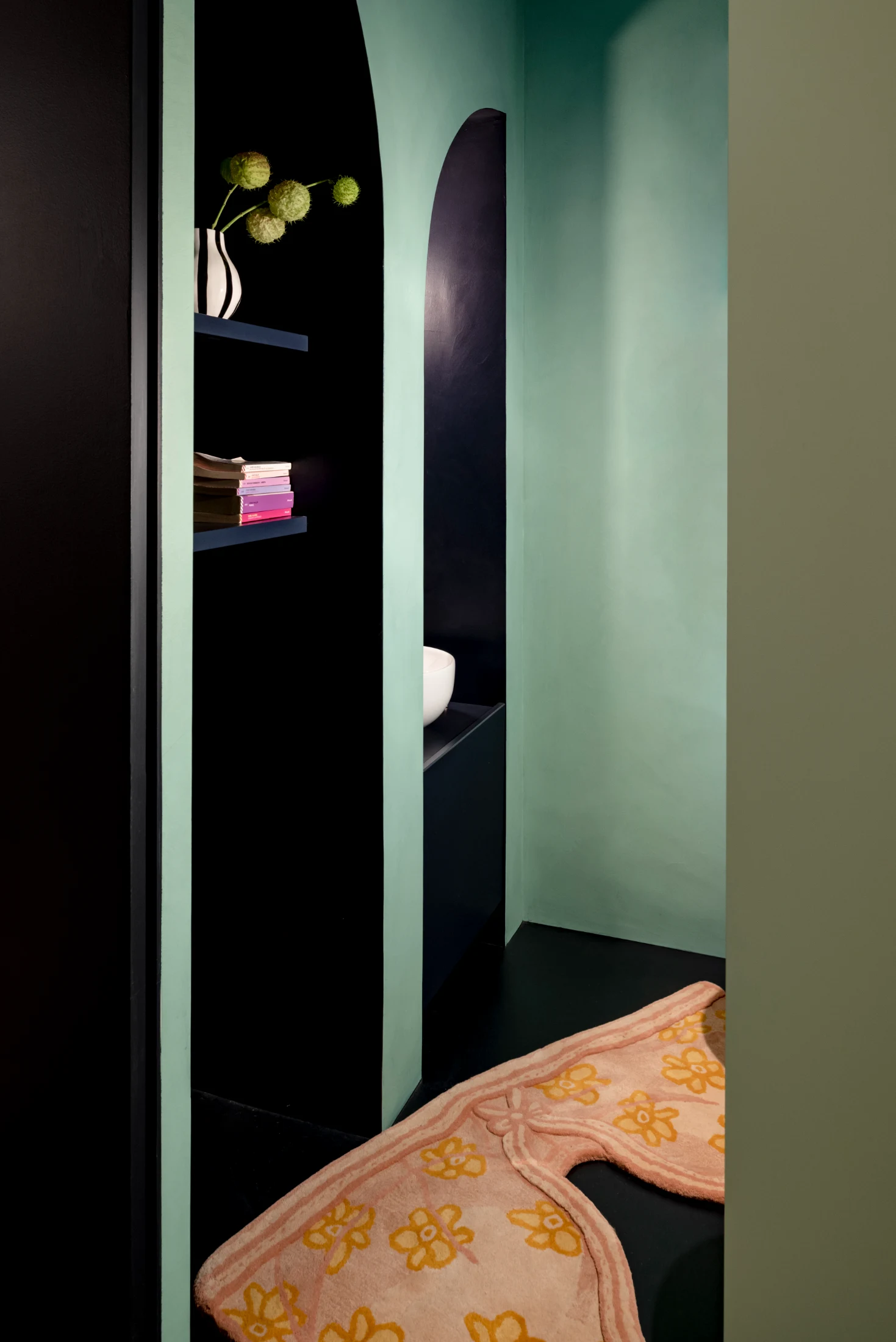
There are quite a few. We used cement tiles for the apartment's entrance, a classic feature of Vecchia Milano interiors, but reimagined the tiles with a more contemporary pattern that suited the space. The bathroom's original, simple rectangular niches were reshaped into semi-arches as a subtle reference to the tall arched doorways often found in historic Milanese homes.

The black bubble rubber flooring is a wink to Milan's design history: it references the iconic red line of the city's metro, designed in the late 50s by Franco Albini and Franca Helg. In the living room and bedroom, the parquet was laid in square panels, another quiet homage to flooring patterns typical of 20th-century Milanese apartments. Finally, the lamp chosen for the living area is by the late, beloved Ettore Sottsass. It sits in dialogue with the bench upholstery, which echoes the style of Superstudio¹, an intentional nod to the Radical Design movement that helped shape Italian design culture in the 60s and 70s.

Lighting also adds to the distinct character of each of the spaces. How were these decisions made?

The clients were excited about incorporating lighting pieces from our small design brand, De Rerum, and we worked to integrate them harmoniously into each space. At the entrance, we used two mirrored discs that reflect the communal staircase and create a soft, diffuse glow. In the kitchen, a pendant lamp with a white Carrara marble disc stands out beautifully against the lilac walls.

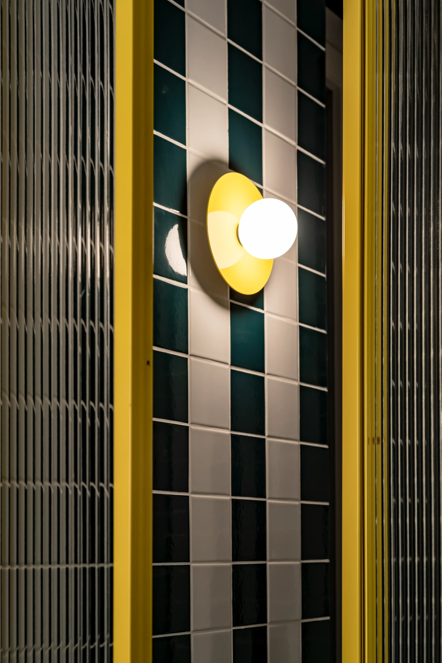
We also used a yellow-painted metal disc to echo the custom shower door nearby, and designed a bespoke lighting system for the living area, featuring two mirrored discs and a red metal structure, matching the frame of the custom dining table, also by De Rerum. These lamps are highly customisable, which allowed us to adapt them to each room, both aesthetically and functionally. They provide a warm, gentle light that feels calm and comfortable. To complement these pieces, we added a few iconic design lamps: Eclisse by Vico Magistretti as bedside lights, and the bold Callimaco floor lamp by Ettore Sottsass in the living room, reinforcing the apartment's playful and design-forward spirit.

How has Petit Sept shaped or changed your approach to other design and renovation projects?

Working within a compact space reaffirmed our belief that personality isn't carried through square metres, it just needs clarity and intention. Stories can also be told through materials, colours, light and a hint of irony.

What would you say is Petit Sept's most underrated feature?

Maybe the colour references to the previous renovation, like the lilac in the kitchen and green in the bathroom. It's a bit of a joke, but it's also a way of giving the space a sense of continuity, even through contrast!

Do you think your design has influenced the longevity of this apartment?

We hope the design will age well, not because it's neutral or safe, but because it's personal. The colours, materials and layout choices weren't about following trends, but creating something that made sense for this space, these clients and their way of living. That gives the space a kind of built-in longevity. We also chose materials that don't mind a bit of time passing: the rubber flooring, cement tiles, parquet and resin: nothing too precious, but all solid, practical and able to age gracefully. And finally, by working with the apartment's odd layout instead of going against it, we ended up with a series of spaces that feel natural, balanced and, hopefully, not in need of a rethink any time soon.

¹ Italian architecture firm founded in 1966 in Florence.

Writing:
Writing:
Eloïse Lachicorée
Photography:
Photography:
Matteo Losurdo
Back to Top
Arrow UpArrow Up
Top
Arrow UpArrow Up
The After shot of the Floorplan
Before
before
after
After
Businesses featured in this project
No items found.
Products featured in this project
No items found.
Magazine Current IssueMagazine Current Issue
Writing:
Matteo Losurdo
Writing:
Eloïse Lachicorée
Photography:
Photography:
Matteo Losurdo
Back to Top
Arrow UpArrow Up