First question: those shelves. Discuss.
The need for extensive storage was clear from the start, as the homeowners are avid readers with a significant collection. The concept for the shelving was inspired by mid-century elements, where furniture is often suspended to create a sense of weightlessness. We wanted to achieve a linear visual impact that felt architectural rather than bulky. Logistically, the setup was surprisingly straightforward, by anchoring the supports directly into the structural beams, we ensured a firm hold.
Why the mounted shelves over more traditional shelves, a partition or a screen?
Originally, we considered a low shoe cabinet for this area. However, once the skeleton of the renovation was complete, the homeowners felt the space would flow better if the shoe storage was moved to the right. This shift opened up an opportunity to use the shelving as a breathable partition. By mounting them from the ceiling, we demarcated the transition between the common living area and the workspace without closing off the room or sacrificing natural light.
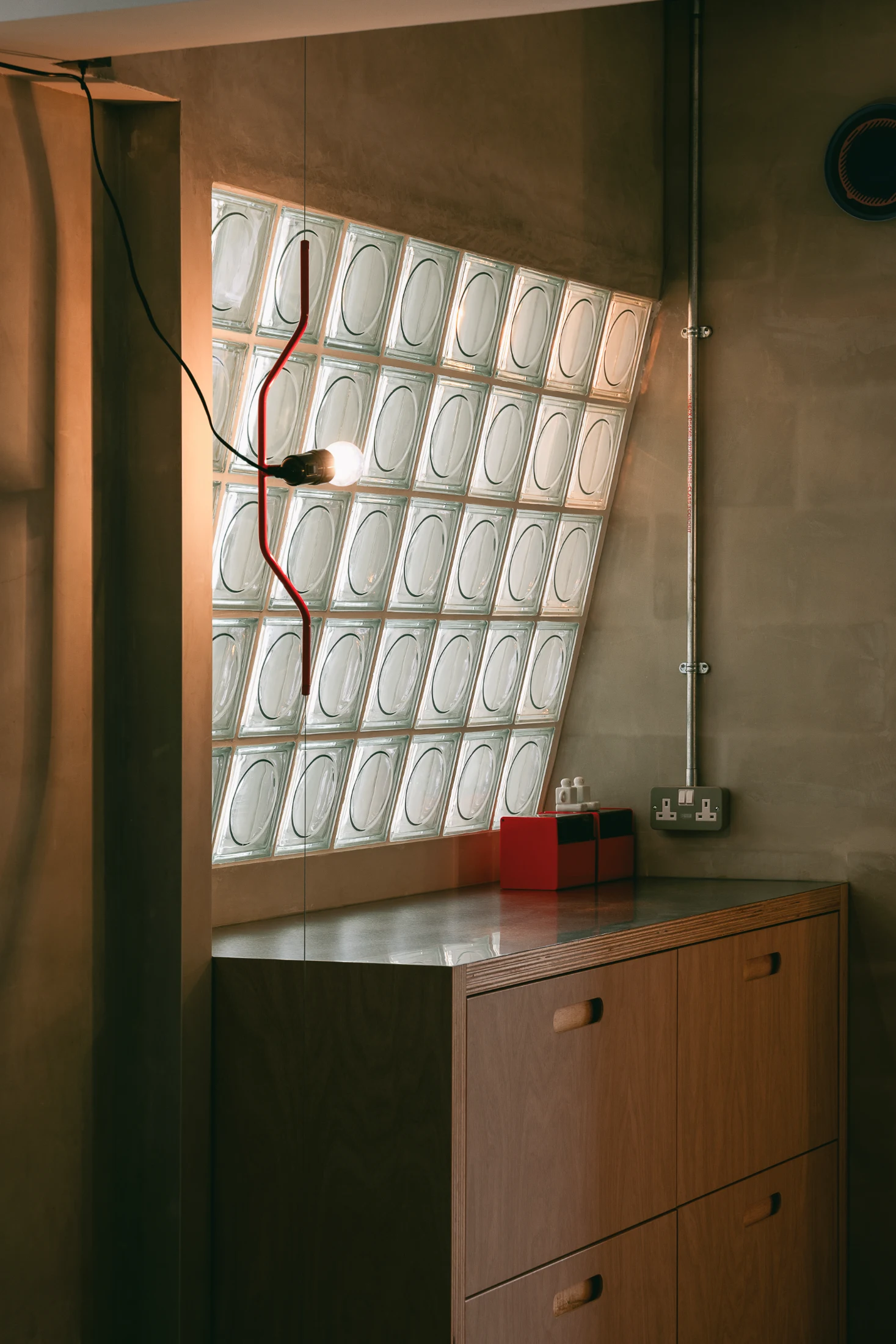
Next, that slanted glass-block wall… Why? How?
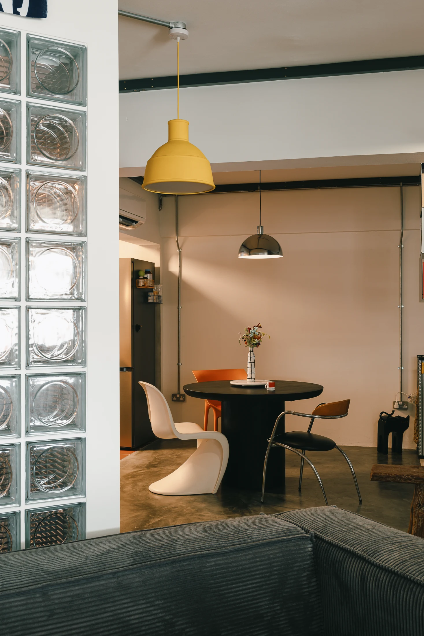
This was another nod to mid-century design, specifically inspired by a kitchen scene in the Netflix series The Brothers Sun. I was immediately captivated by the geometry and wanted to translate that into this home. Bringing it to life required a close collaboration with our tiler as we had to design an enhanced internal structure to support the weight of the blocks at that specific angle. It was a technical experiment, but seeing it work so seamlessly was incredibly rewarding.
The aluminium venetian blinds against the other glass-block wall are genius. Strong retro vibes. Can you walk us through this design decision?
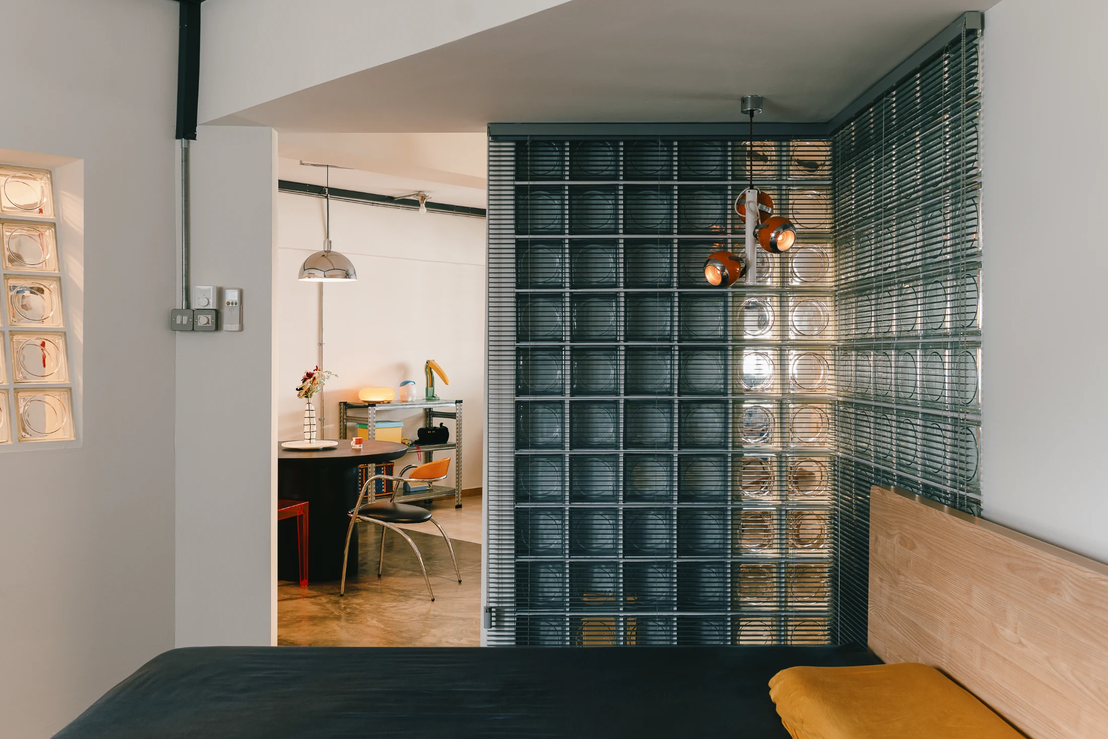
The decision was heavily influenced by Japanese mid-century interiors, where blinds and curtains are frequently paired with glass, cabinets and rooms to create layers of texture. They serve a dual purpose, providing an adjustable layer of privacy for the bedroom while adding a sharp, horizontal contrast to the soft diffusion of the glass blocks. It allows the homeowners to modulate light and 'mood' with a simple turn of the blinds.
You had a lot of angles to work with in the floor plan. Is this shape unusual for an HDB apartment?
While most HDB layouts follow a more standard rectangular grid, unusual angles like these though rare, can still be found in certain older housing estates in Singapore. The original floor plan featured several odd corners that offered a departure from the cookie-cutter norm. Rather than trying to square everything off, we chose to embrace these geometries as part of the home's unique character.
And was this a major challenge?
It was a challenge, but not a deterrent. The homeowners were actually drawn to the odd-shaped footprint from the very beginning. Our task wasn't to fix the angles, but to embrace them. The real work lay in ensuring that these unconventional geometries were translated into a layout that felt practical and intuitive for their daily routines.