
Magazine Current IssueMagazine Current Issue
Small Home: North Melbourne Apartment
From our Mag
May 1, 2026

Small Home: North Melbourne Apartment

Design: Tahj Rosmarin (CARD)
Size: 66 sqm/710 sqft
Location: Melbourne, Australia

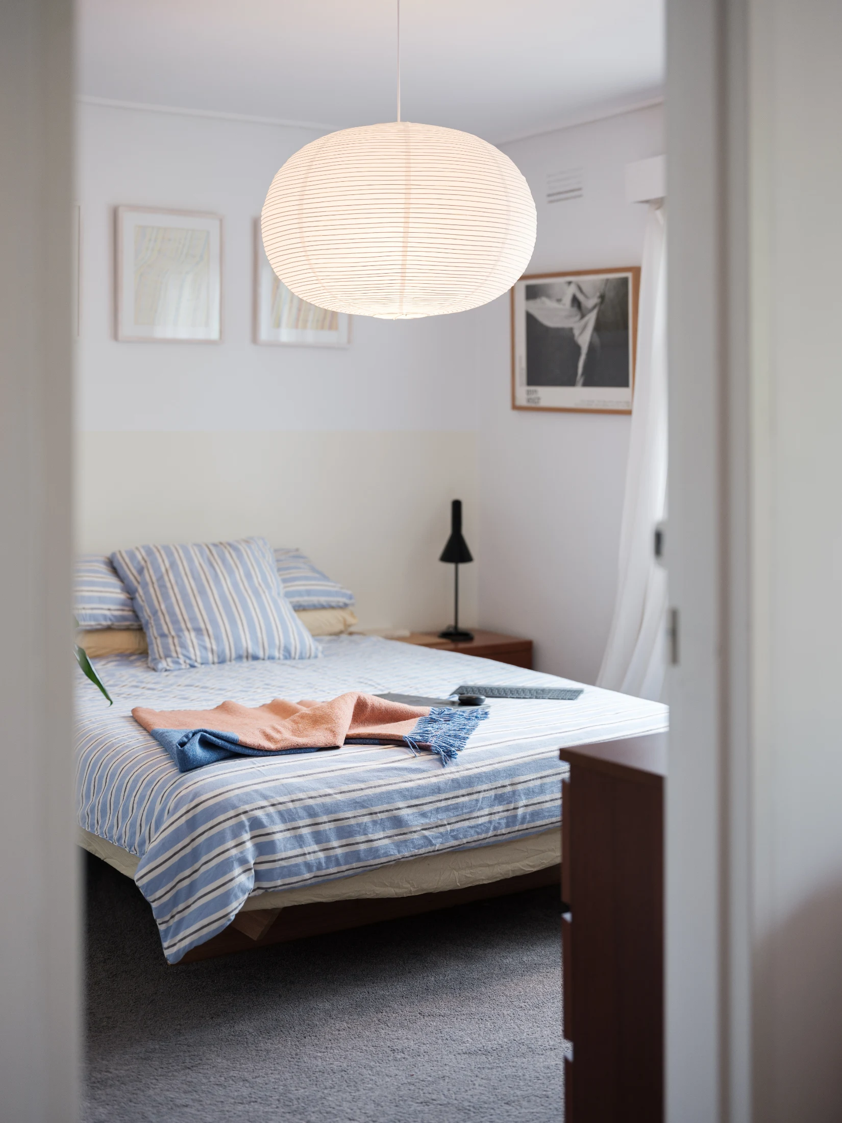
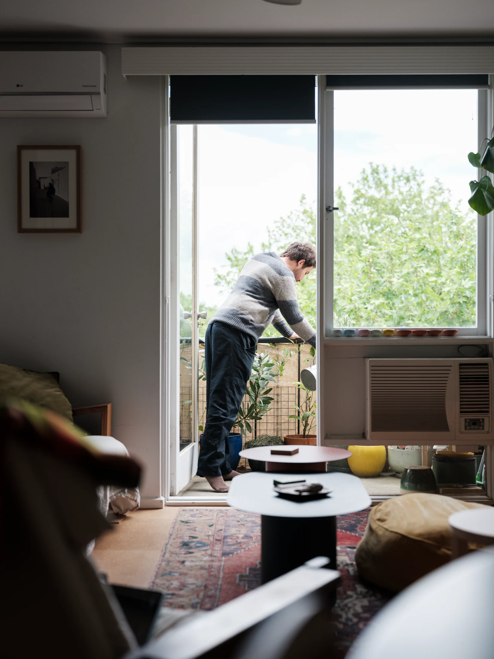
A low-intervention renovation centred on maximising natural light and views has brought a sense of treehouse calm to Tahj Rosmarin and Sioné's top-floor North Melbourne apartment. Guided by the philosophy of the practice co-founded by Tahj and Jimi Connor, CARD, Tahj and Sioné prioritised small, strategic alterations over major interventions to create more cohesion between the home's living spaces. Selecting plywood joinery for its warmth and versatility, they enhanced the existing floor plan, introducing multifunctional storage and an internal 'window' to create a bright, spacious and thoughtful home.

Eloïse Lachicorée
Writing:
Writing:
Eloïse Lachicorée
Photography:
Photography:
Nam Tran
Magazine Current IssueMagazine Current Issue
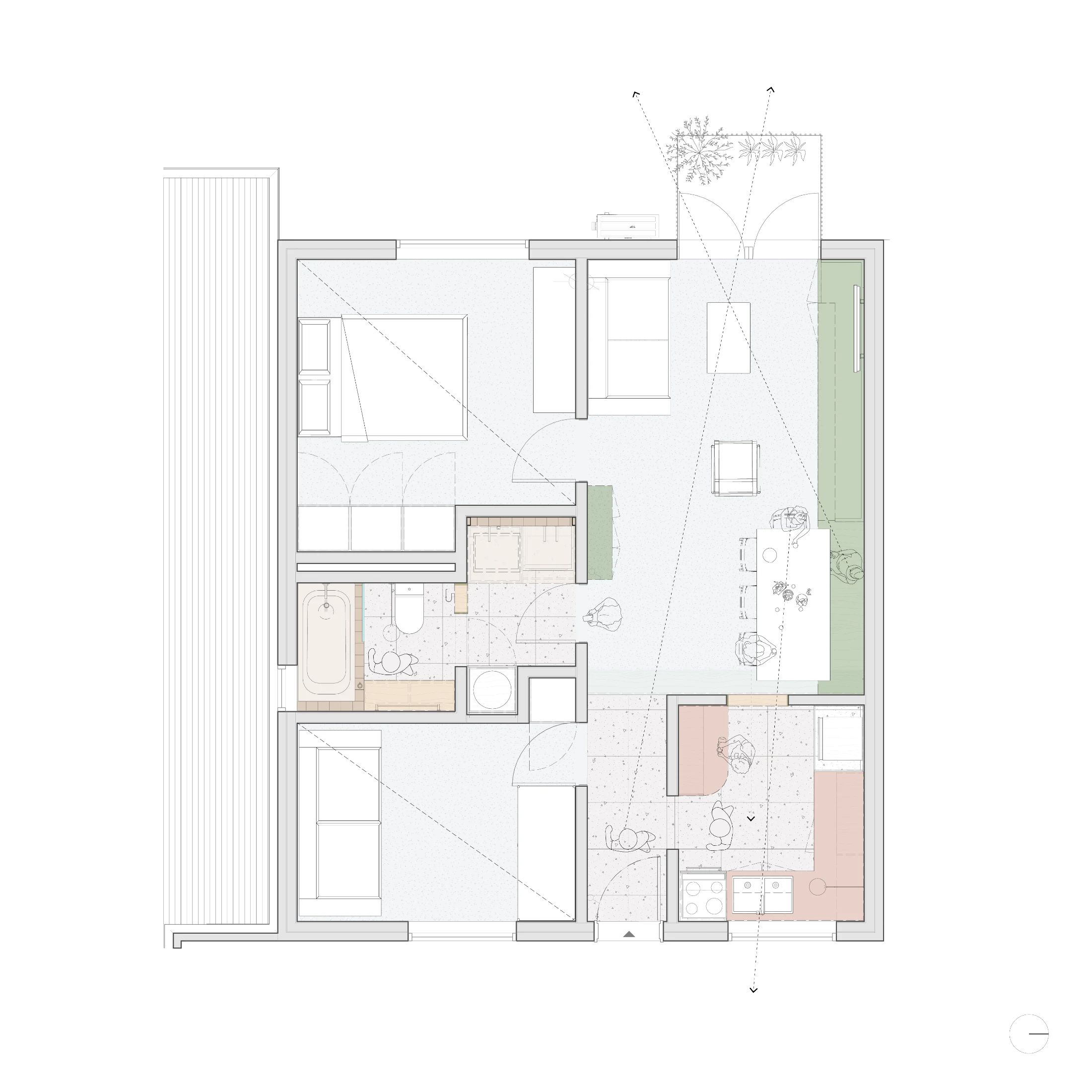
The After shot of the Floorplan
Before
before
after
After
Top
Arrow UpArrow Up

Tahj, tell us about your building and your neighbourhood…

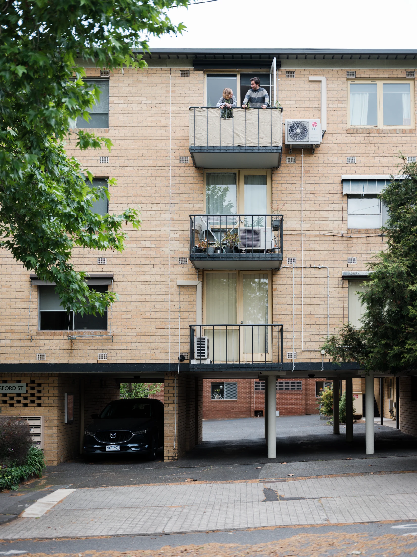
The building has a quiet utilitarian quality to its architecture, consisting of a minimal palette of cream brick, painted concrete and steel balustrading. The building was part of the last stage of the famous Hotham Gardens housing development¹ in the late 1960s.

The building is in a central part of North Melbourne – one of Melbourne's earliest suburbs and a part of the city that has maintained its quiet, local charm with large tree-lined streets and parkside setting. The apartment is walking distance from some great cafes and restaurants, as well as Royal Park.

Can you tell us a bit about yourself and your partner Sioné?

I'm an architect who runs my own practice, CARD. Before starting CARD, I also worked as an urban designer so I have a deep interest in cities and urbanism, as well as architecture. My partner Sioné has quite a stressful job, so an important part of the project was making the apartment feel calm and peaceful: a refuge from day-to-day stress.

What was the state of the original apartment and its layout?

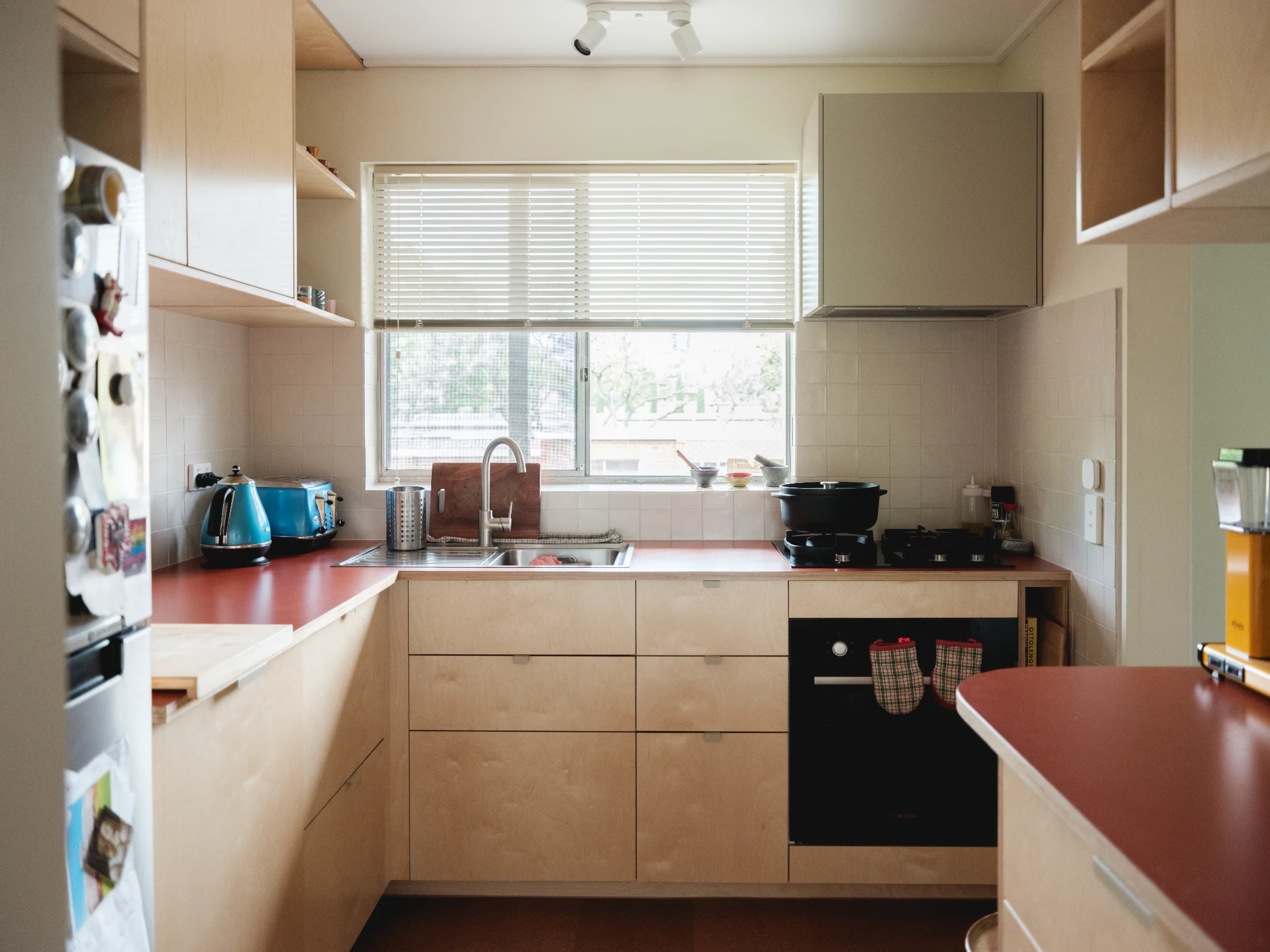
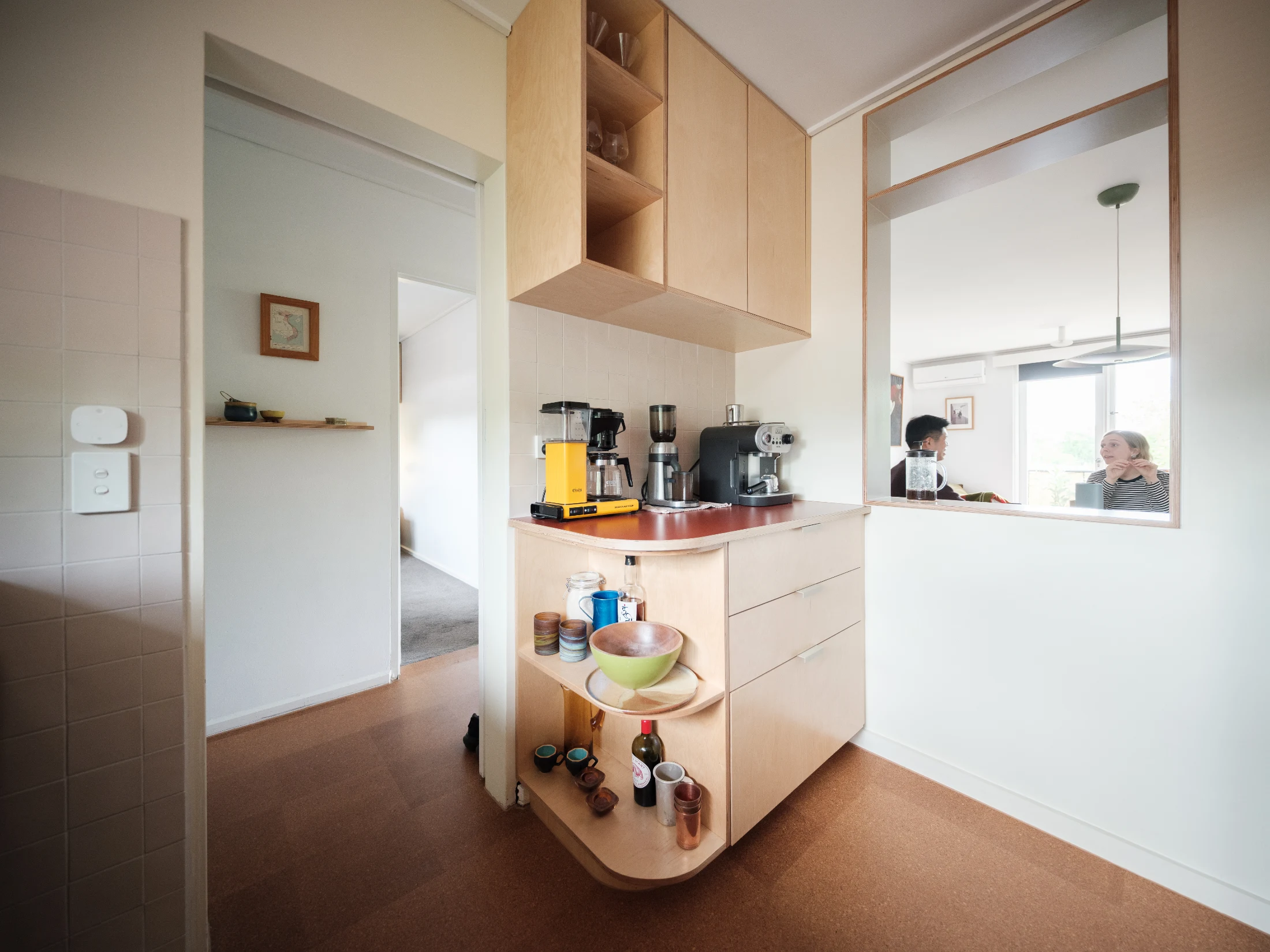
We were actually attracted to the layout of the original apartment as it had a real clarity to it, without overlapping hallways and paths of circulation. Although it worked well, each room was very distinct and separate, making each individual room feel a bit smaller than it ought to. Certain aspects felt stifling and in need of improvement. A big one was the kitchen which felt pokey and had a strange layout, meaning only one person could be in the room at a time. There was a wall between the kitchen and the living space which totally separated the two, with a small servery window that was too low to allow for any visual connection.

How did all of this influence the redesign?

We decided pretty early on that we wanted to maintain the overall structure and hierarchy of the floor plan without demolishing too much. We liked the way things were separated and how they divided the apartment into function zones – the kitchen, bedrooms and living space. However, we knew that we needed a better relationship between the spaces, with views between spaces and opportunities to borrow views of the surrounding landscape. Located in a double brick 1960s walk-up, we see this light touch design approach as being very applicable to the refurbishment of many residential buildings in Melbourne.
How long did you both live in the apartment before renovating?

We lived in it for about a year or so before starting with the kitchen.

What did you learn about how you wanted to live in the space during the year before renovating?

It was really important to live in the space before doing any work so we could have a deeper understanding of how the apartment worked – how things like the plumbing and wiring were designed, which walls were structural, etc. This really impacted the way we thought about our renovation, especially considering we would be undertaking and managing a lot of the work ourselves.

Understanding the way light entered at different times of the day and year was also critical. Each room has a window, so there is always light coming in. It also meant that the apartment could be cross ventilated easily. Being on the top floor of the building meant that it felt very private and made it feel like a treehouse. Its balcony is literally in the canopy of a large tree. From the balcony, it has really long views over North Melbourne stretching all the way to the North Melbourne football stadium.

What are some of the main changes that were made to the layout during renovation?

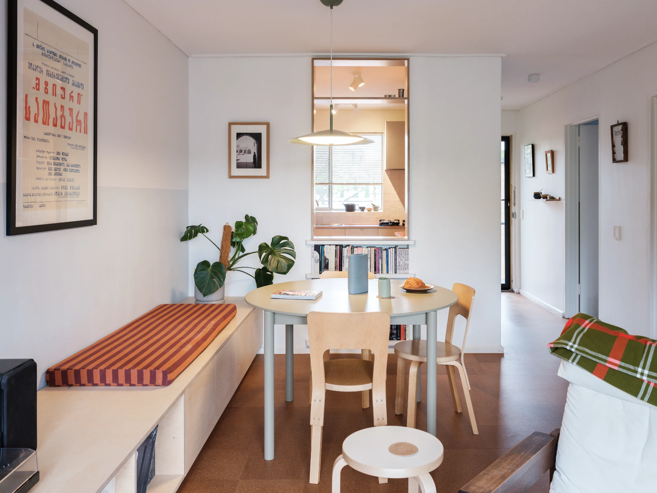
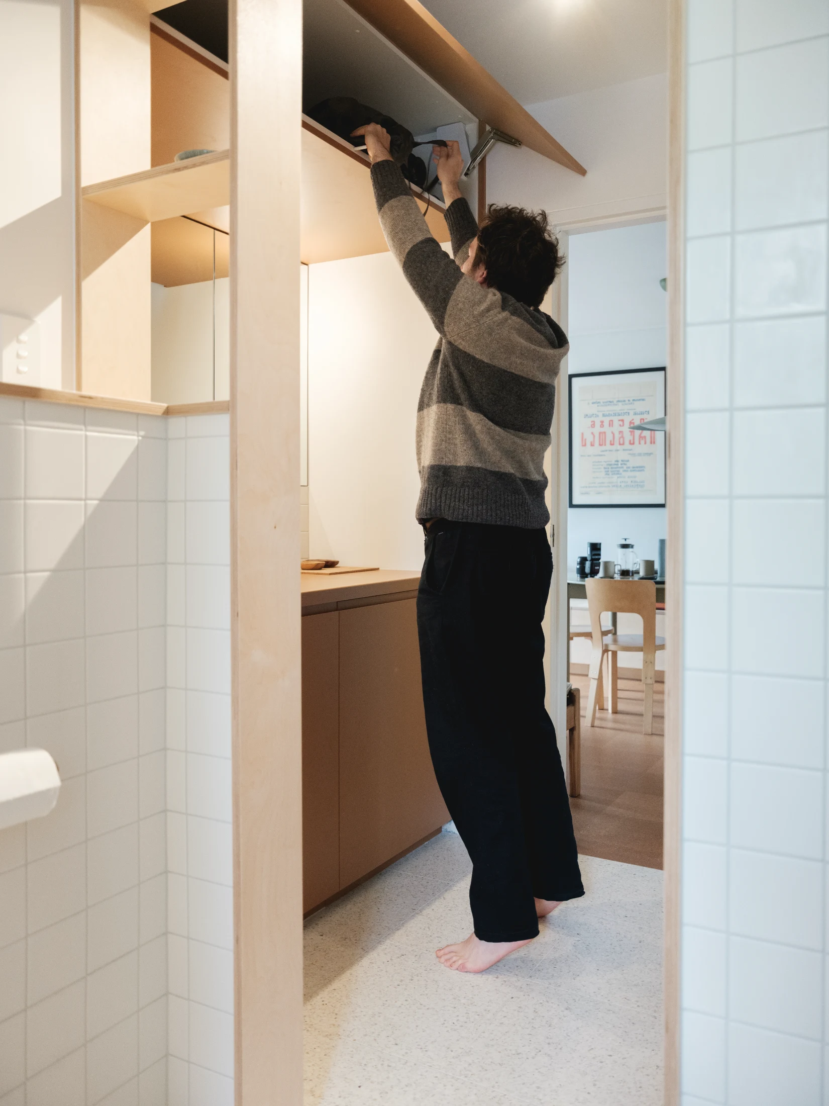
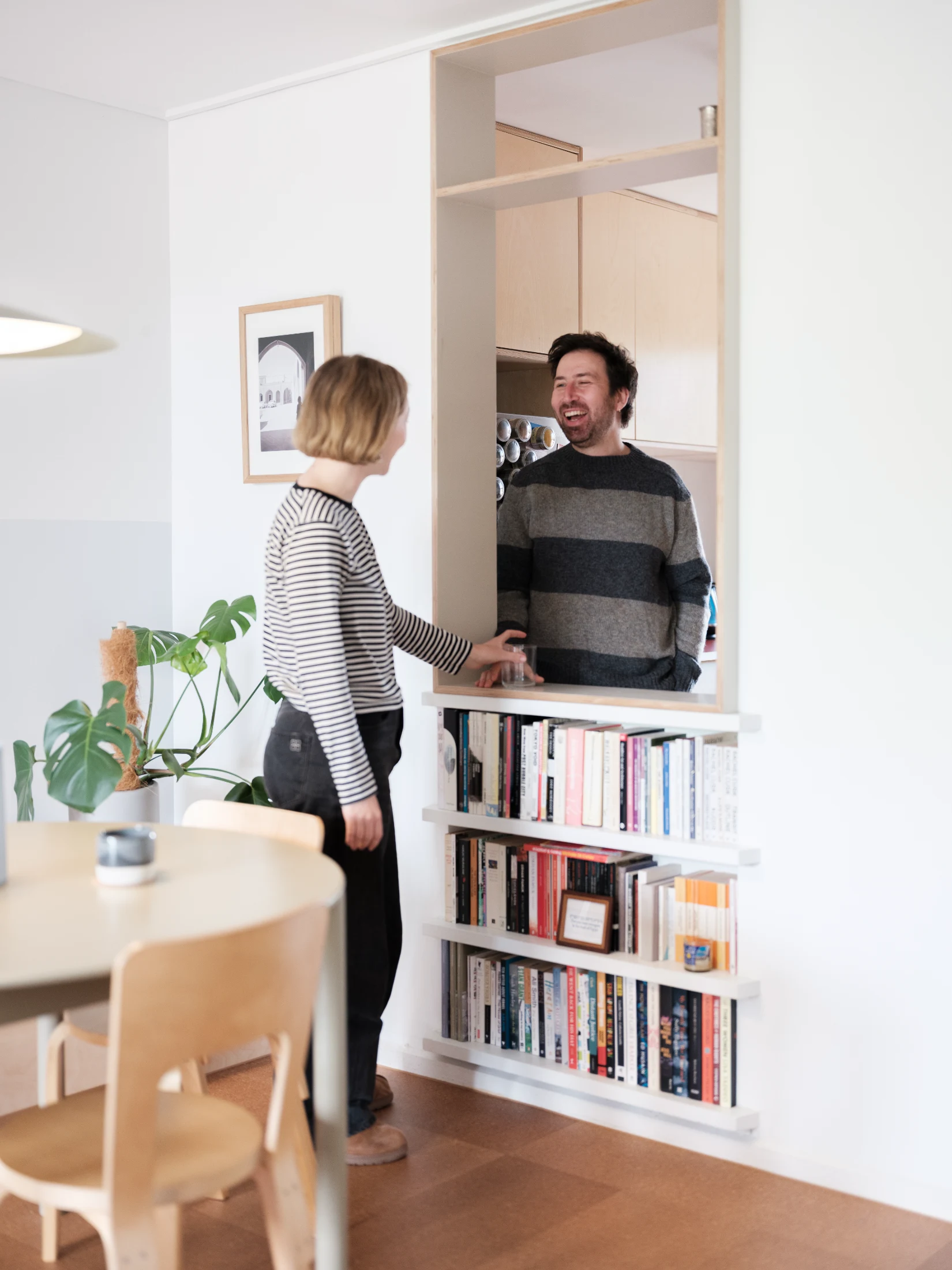
The biggest change was opening up a 'window' between the kitchen and living space. As mentioned before, we still wanted the feeling of 'rooms' within the apartment, but large openings between rooms help extend the eye while maintaining distinct zones.

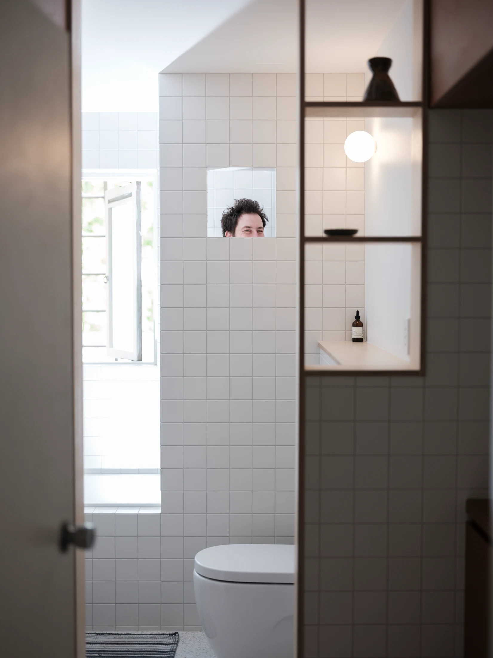
A key constraint (due to our budget) was to maintain locations for plumbing, which meant we had to be clever about how we 'rearranged' the floor plan. This was critical in the bathroom, where we actually used the old laundry plumbing for the new vanity.

How did working to a tight budget influence your approach to selecting materials and finishes?

This was a key part of the process. We knew we had to use materials that were 'off the shelf'. We also tried to keep the palette fairly neutral but introduce block colours in key parts to add identity. Painting key walls was a really cost effective way of defining different spaces and adding personality to each room. We were influenced by Le Corbusier's Apartment in Paris and his Swiss Pavilion, which use colour to zone different spaces and functions. We also selected a new cork floor which adds warmth and texture to the small space, making the kitchen and living space unified in material application, but distinct in program and utility. Introducing laminate in the kitchen also gave us opportunities to introduce blocks of colour consistent with the plywood treatment and approach.

What drew you to plywood as a material?

Plywood is a more cost-effective material than some veneers out there and is easy to install, so it felt like a pretty obvious choice. We also knew we wanted to add some warmth to the apartment, with plywood providing a warm and neutral base that helped to create an identity and unify a design ethos across the apartment. It was also a material that we could work with ourselves and order directly from local manufacturers like Plyco.

What are some of the details you incorporated to respond to the apartment's abundant natural light and west-facing aspect?

We tried to highlight views from windows in the apartment, such as the window in the bathroom and the kitchen. We kept the apartment's material palette quite bright and light to make sure light is even and bounces around.

Because the apartment faces west, meaning it gets really great afternoon light in winter - deep into the kitchen. But in summer it's pretty intense. We also have an external awning that gets pulled down on really hot days. This is crucial in managing the hot afternoon sun! We also tried to improve visibility through landscape views through the framed servery in the kitchen. This creates the illusion of a window into another room without eating into the floor plan.

Where is your favourite spot to enjoy the apartment's natural light?

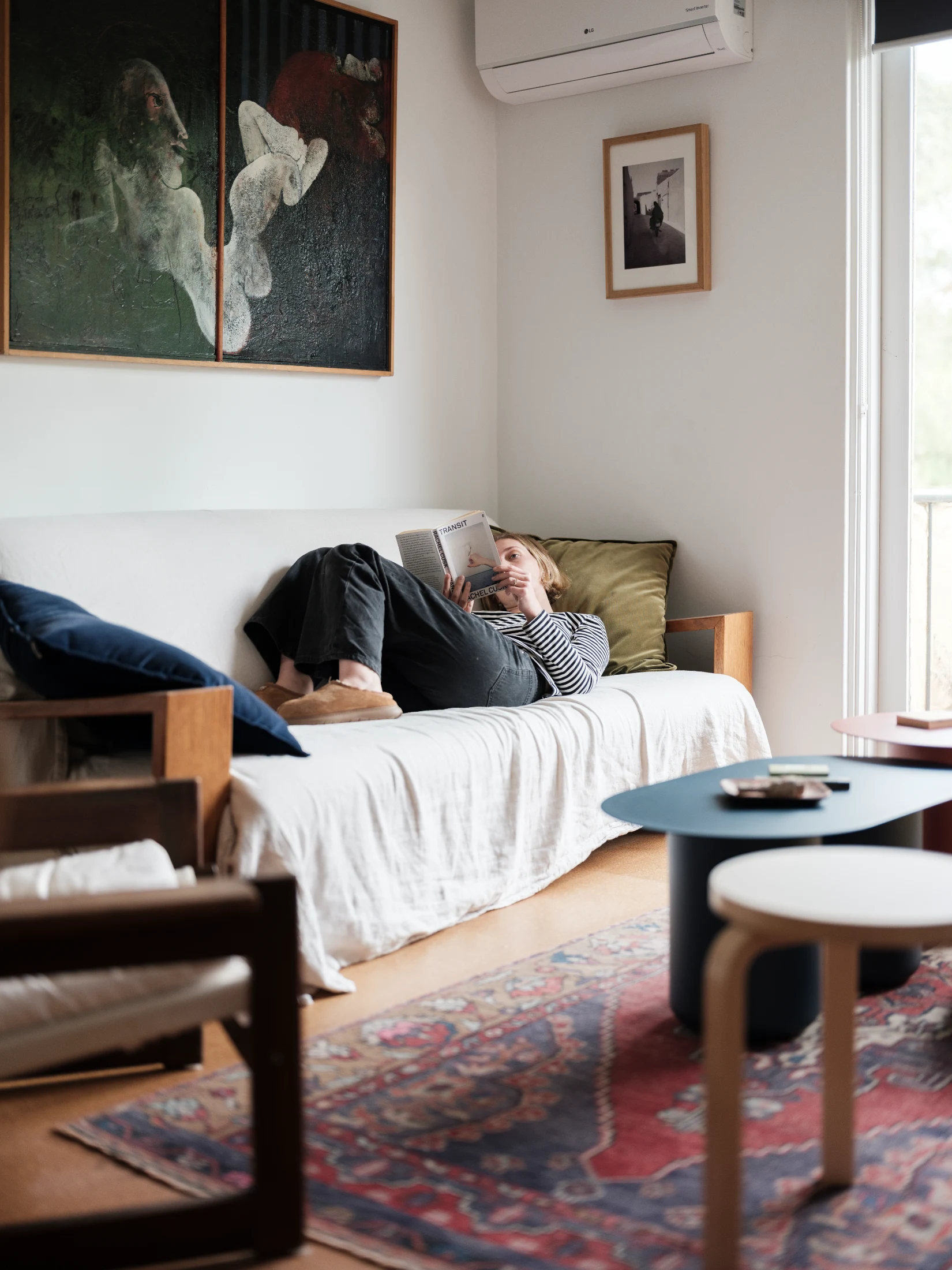
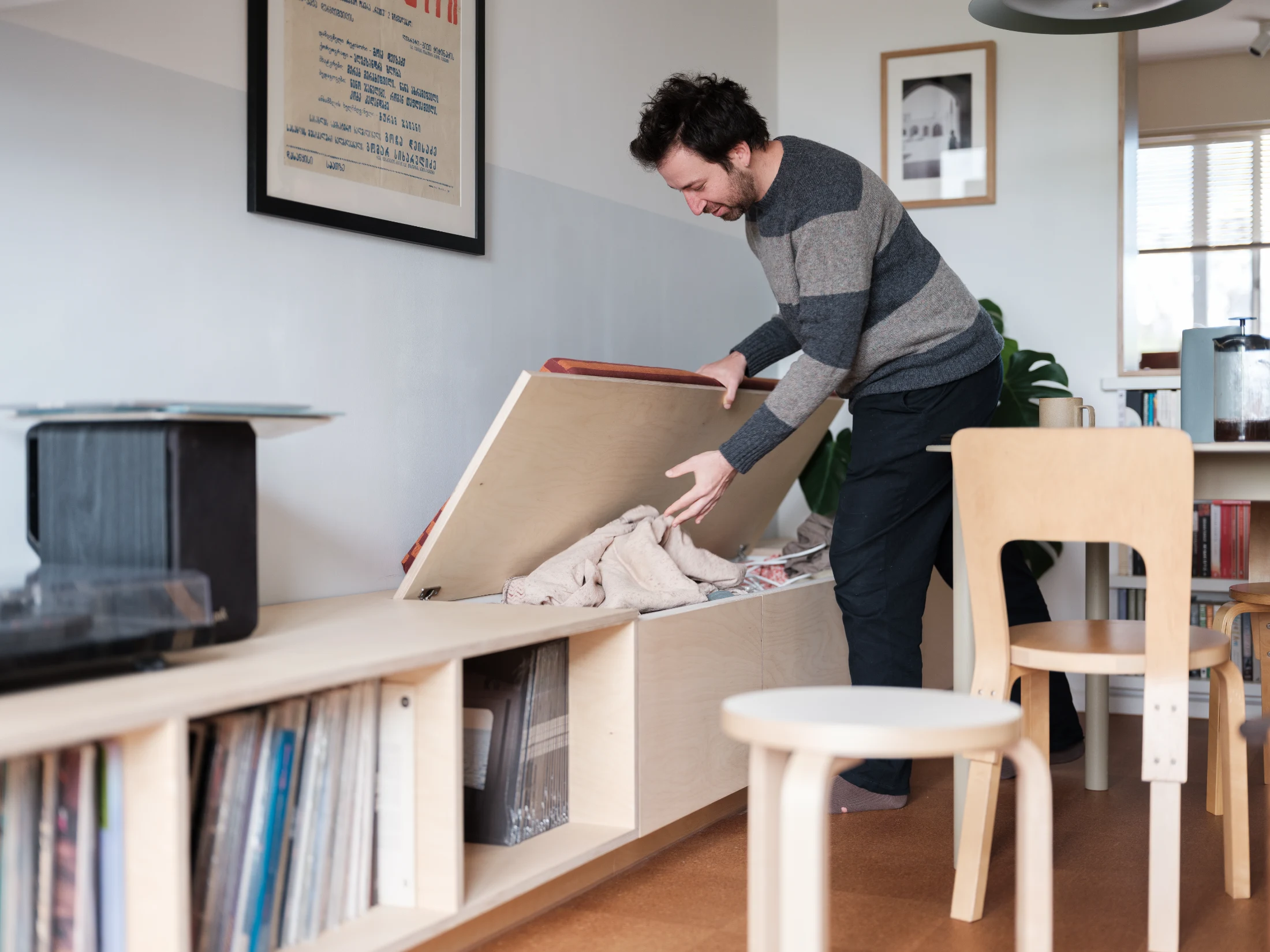
On the bench seat. The new bench seat gave us a brand new view of a significant eucalyptus tree across the street. So it's really great to lie there and look out.

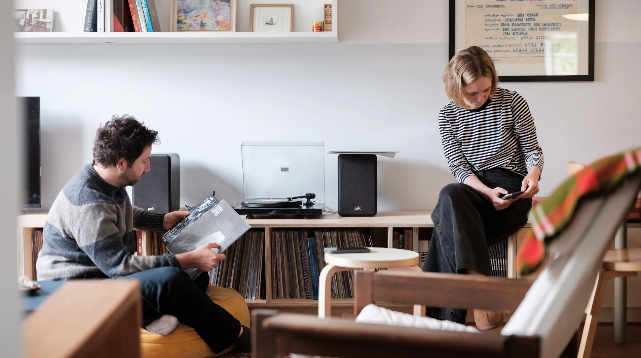
Tell us about your extensive record collection… How was this worked into the design of the built-in storage unit?

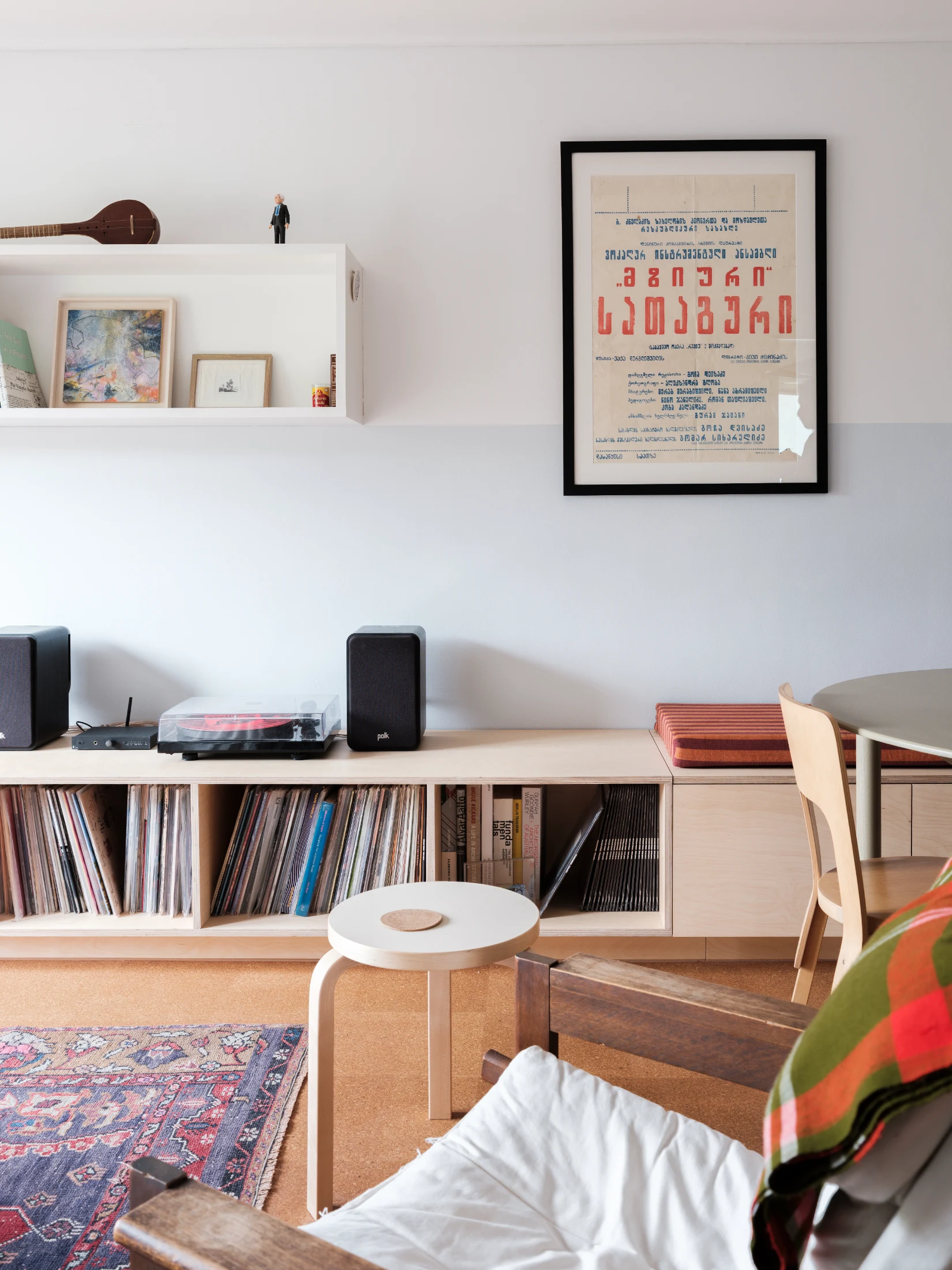
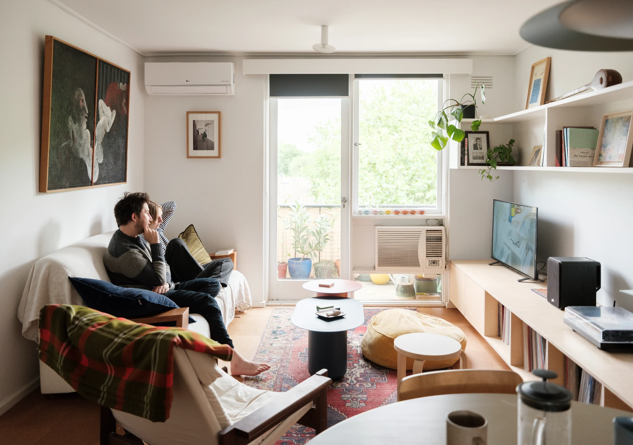
This was a big reason for the cabinet. I have over 200 records that I've collected over the past 10 years. I love music and records, so it was a big functional part of the brief to have them easily accessible without the need for crates or stand-alone storage units. Although I measured five times, it was a bit nerve-wracking sliding the first record in there as it's millimetre perfect!

As well as housing your record collection, what are some of the other features of the built-in unit?

Some of the other features include: a cupboard under the TV, hiding a power point, and extra storage for things that can be hidden away. Under the bench seat is a large storage box we use for linen and tents. It's quite long and deep so it's really useful for things that we don't use that often but need from time to time. There's also a dedicated cupboard for the modem which is hidden away completely in the cupboard. Out of sight, out of mind!

How have both of your interests and personalities worked their way into personal details found in your home?

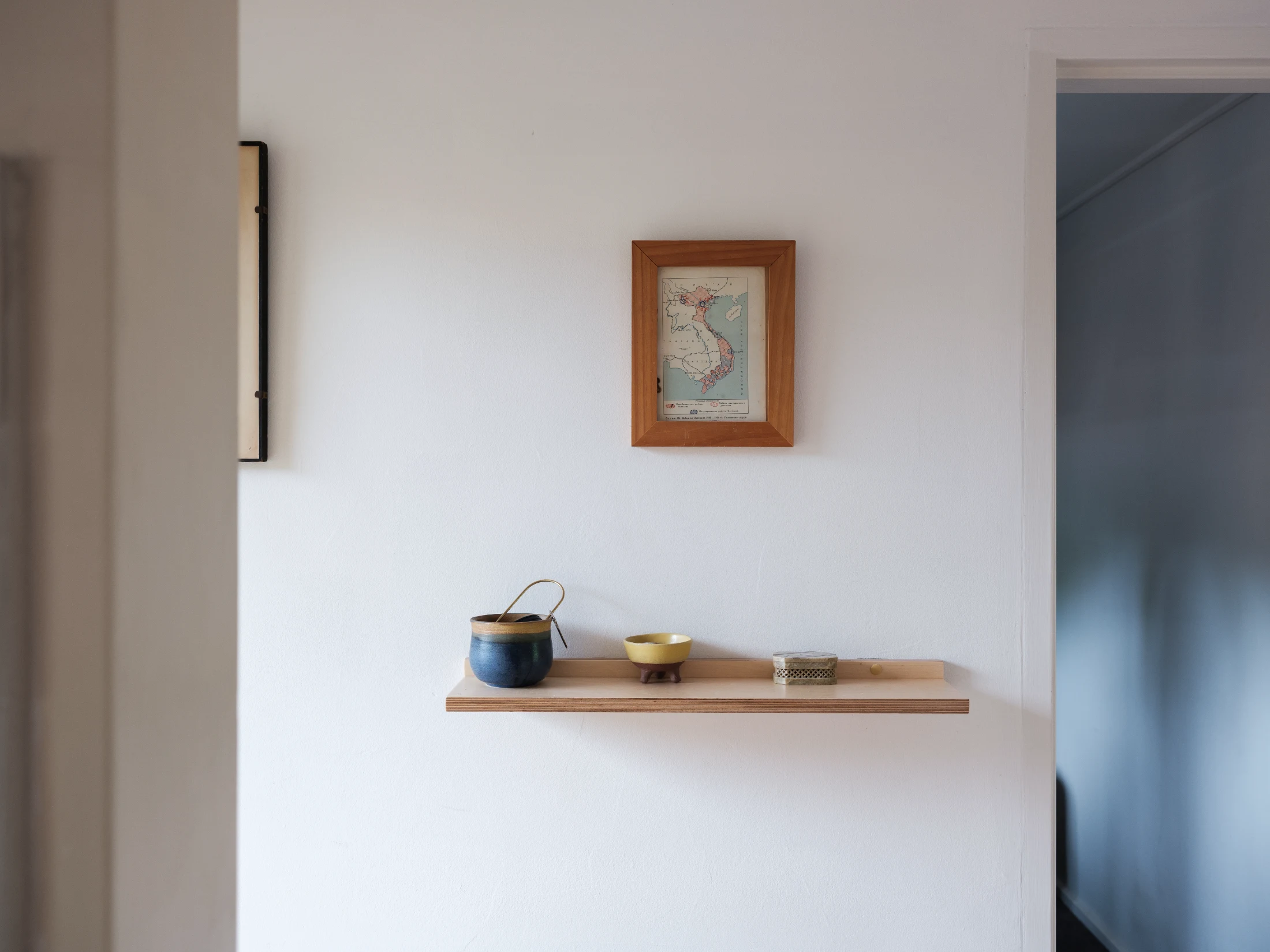
We love displaying the objects, photos and artworks we've collected on our travels and time together. This included making sure we had sufficient wall space to hang our framed photos of our trips to Iran, South America and Georgia. We also like to collect little knick-knacks, such as the Setar I bought in Iran, as well as paintings from our favourite artist (Shanti Shea An).

What were some of the non-negotiables you chose to include in the bathroom's redesign?

The bath was a big one. We love baths, so we knew we were going to incorporate one. Another one was integrating more storage and the laundry as part of the bathroom, without eating into the bathroom space. By hiding the washer and dryer, the space feels like a decent-sized bathroom, rather than having two smaller separate spaces. We wanted a big mirrored vanity to extend the feeling of space, and also give us a lot of storage space.

How is the apartment's second room used?

It's mainly a study but it's also a flexible space that we sometimes hang out in, kind of like a library. We built some plywood shelving that stores the majority of our book collections, so it has the feeling of a small library. It's also got a couch that folds out into a bed if we have guests.

How has the design of North Melbourne Apartment influenced your broader practice at CARD?

Jimi and I often think and talk about spaces being multifunctional and adaptable – whether a house or a public space. We also often use utilitarian materials in interesting ways. A big idea from the project that is also so relevant to our other work is that we prioritised small furniture interventions over extensive demolition.

What was your experience of being your own 'client' on this project? How did this experience differ when experimenting and testing new ideas?

It was interesting! It did give me the ability to try things that I haven't been able to, but I also learnt a lot about how hard it is to renovate. Not just the design process, but also the stress in having to find alternative accommodation and ensure works are done to a high standard. These are things that our clients think about daily, so it's helped put that side of things into perspective.

¹ Hotham Gardens (North Melbourne) was the Housing Commission of Victoria's first inner-city "own-your-own" flats, combining Modernist architecture, landscaped courtyards and early high-density private housing, pioneering design-led urban renewal in post-war Melbourne.

Writing:
Writing:
Eloïse Lachicorée
Photography:
Photography:
Nam Tran
Back to Top
Arrow UpArrow Up
Top
Arrow UpArrow Up
The After shot of the Floorplan
Before
before
after
After
Businesses featured in this project
No items found.
Products featured in this project
No items found.
Magazine Current IssueMagazine Current Issue
Writing:
Nam Tran
Writing:
Eloïse Lachicorée
Photography:
Photography:
Nam Tran
Back to Top
Arrow UpArrow Up