
Magazine Current IssueMagazine Current Issue
Inhabiting a House of Crimson Flames
From our Mag
August 1, 2025

Inhabiting a House of Crimson Flames

Reflections from the residents of a Milanese apartment (designed by our good friends at ATOMAA) that finds its climax in a magical flame-red column.

Loving and living within colour. Such is the experience of a couple who commissioned our friends at ATOMAA, in collaboration with architect Fabio Figaroli, to reimagine their Milanese apartment. And this is their love letter to the outcome: a home that constantly delights them with its chameleon-like charms while also feeling like it’s always been theirs.

Writing:
Andrea & Francesca
Writing:
Photography:
Photography:
No items found.
Magazine Current IssueMagazine Current Issue
The After shot of the Floorplan
Before
before
after
After
Top
Arrow UpArrow Up
One of the things that brings us the most joy in life is colour. Pure colour, regardless of the object or material it adorns, and its juxtaposition – whether intentional or accidental, harmonious or clashing – with other colours, which instantly creates a unique visual universe to immerse ourselves in. We deal with colour in our work, but this little obsession follows us into our free time as well.

We often catch ourselves pausing without reason, for a comically long time, in front of particularly striking colour combinations. It happens to us like children gazing at shelves of pencils and markers in stores, looking at a beautiful poster on the street, or debating whether the car parked in front of us is "powder blue" or "grey with a hint of blue".

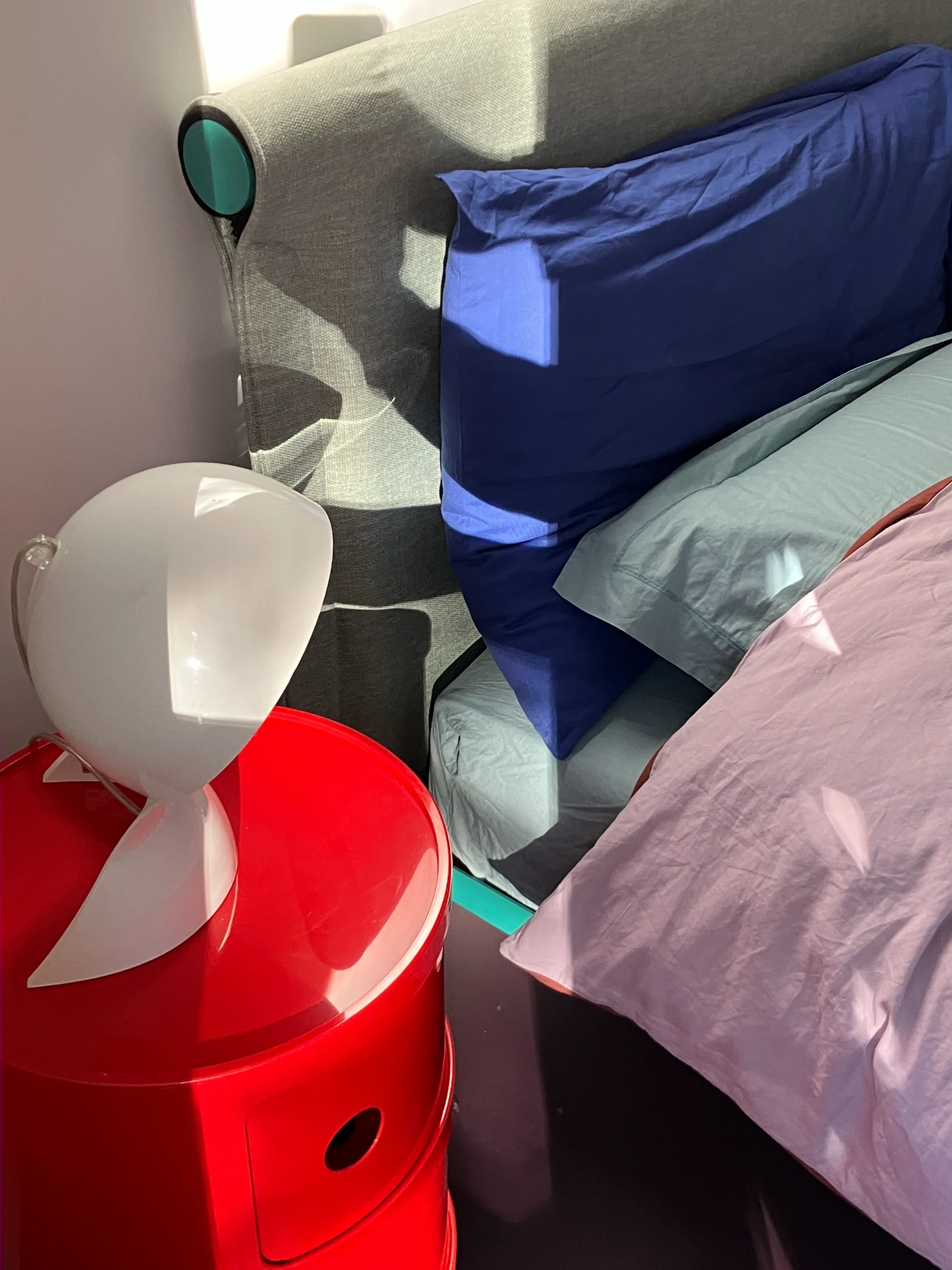
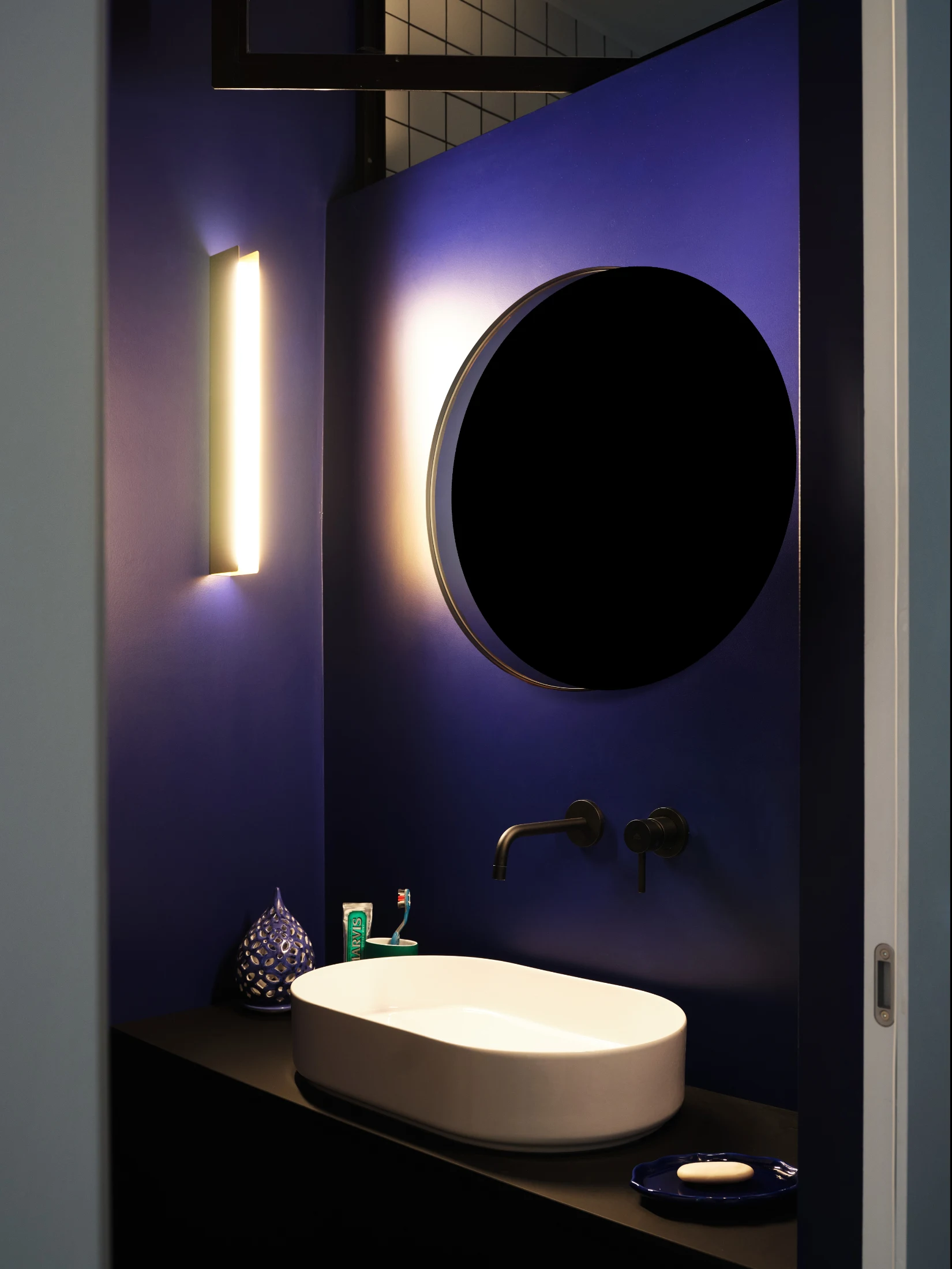
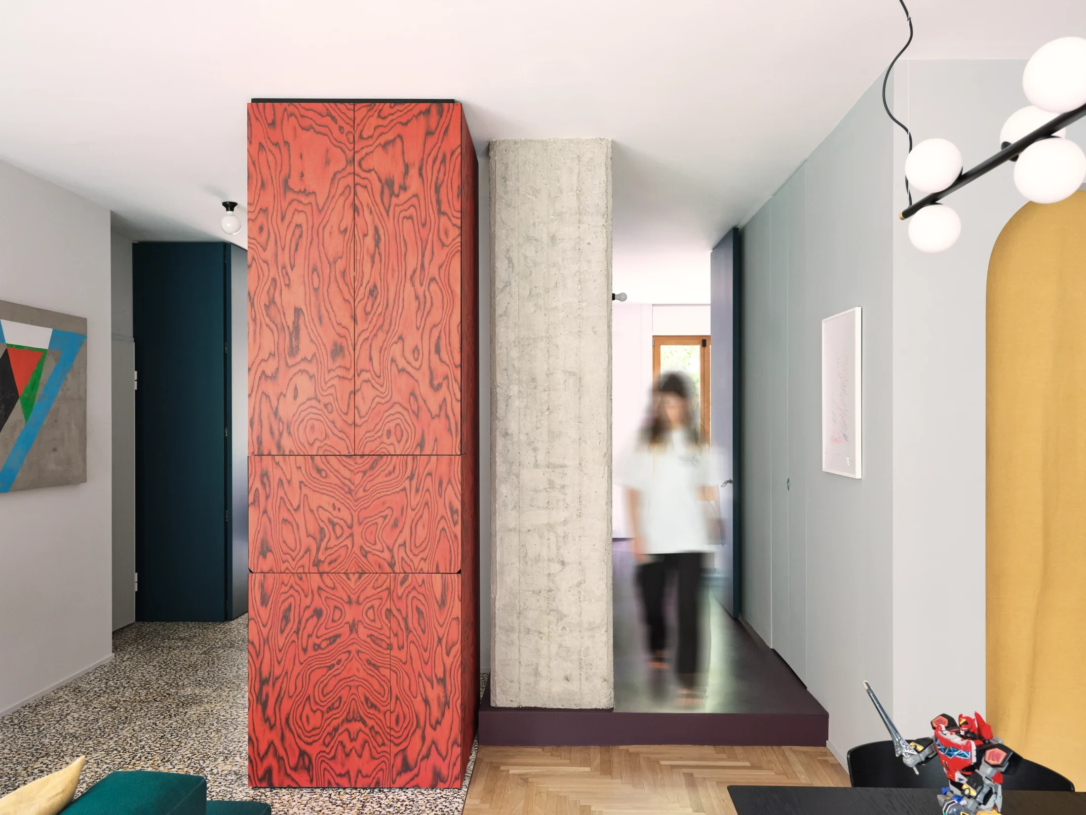
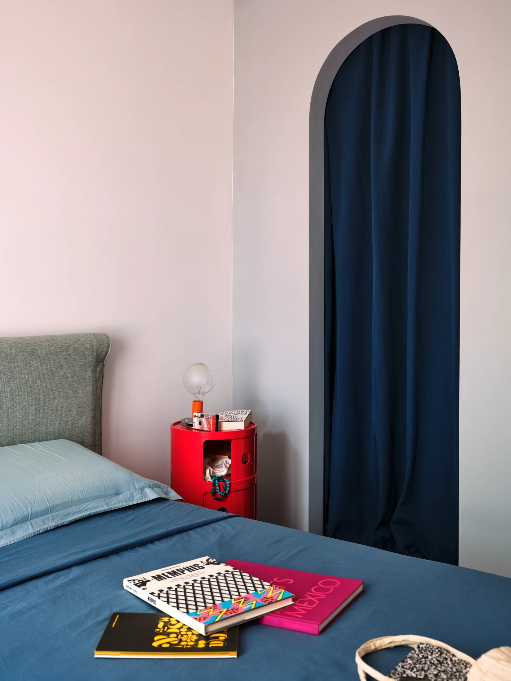
Every time we look around our new home, besides feeling grateful to Fabio, Cesare, Andrea, Umberto and their team for designing a space that is welcoming, functional, generous in space and varied in perspectives, we are delighted because together we created a place where colour is taken seriously. Every element of this house has its own chromatic identity and often expresses it with intense simplicity through a flat colour: the green of doors and cabinets, the blue of the guest bathroom, the greys of the walls of the service block, the deep purple resin flooring in the sleeping area.
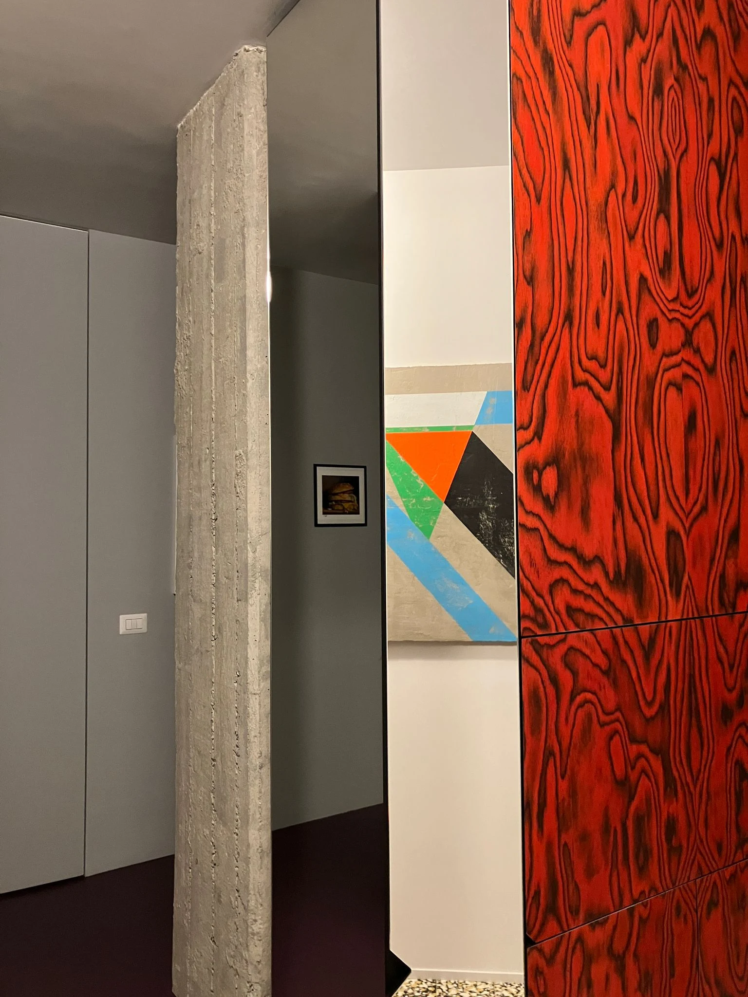
Three elements are exceptions in this sense. The central reinforced concrete pillar, which, once freed for the first time in all its beauty, revealed, like a small archaeological operation, pencil inscriptions made by workers in 1966, which we made sure to preserve. The cement tile floor of the living area, which, despite being born of an innovative technique, reflects our love for a certain traditional 'Milanese' touch (which recurs in various other details): faced with the need to choose a combination of three colours, it was immediate for all of us to think of the yellow-black-and-white linoleum by Gio Ponti.

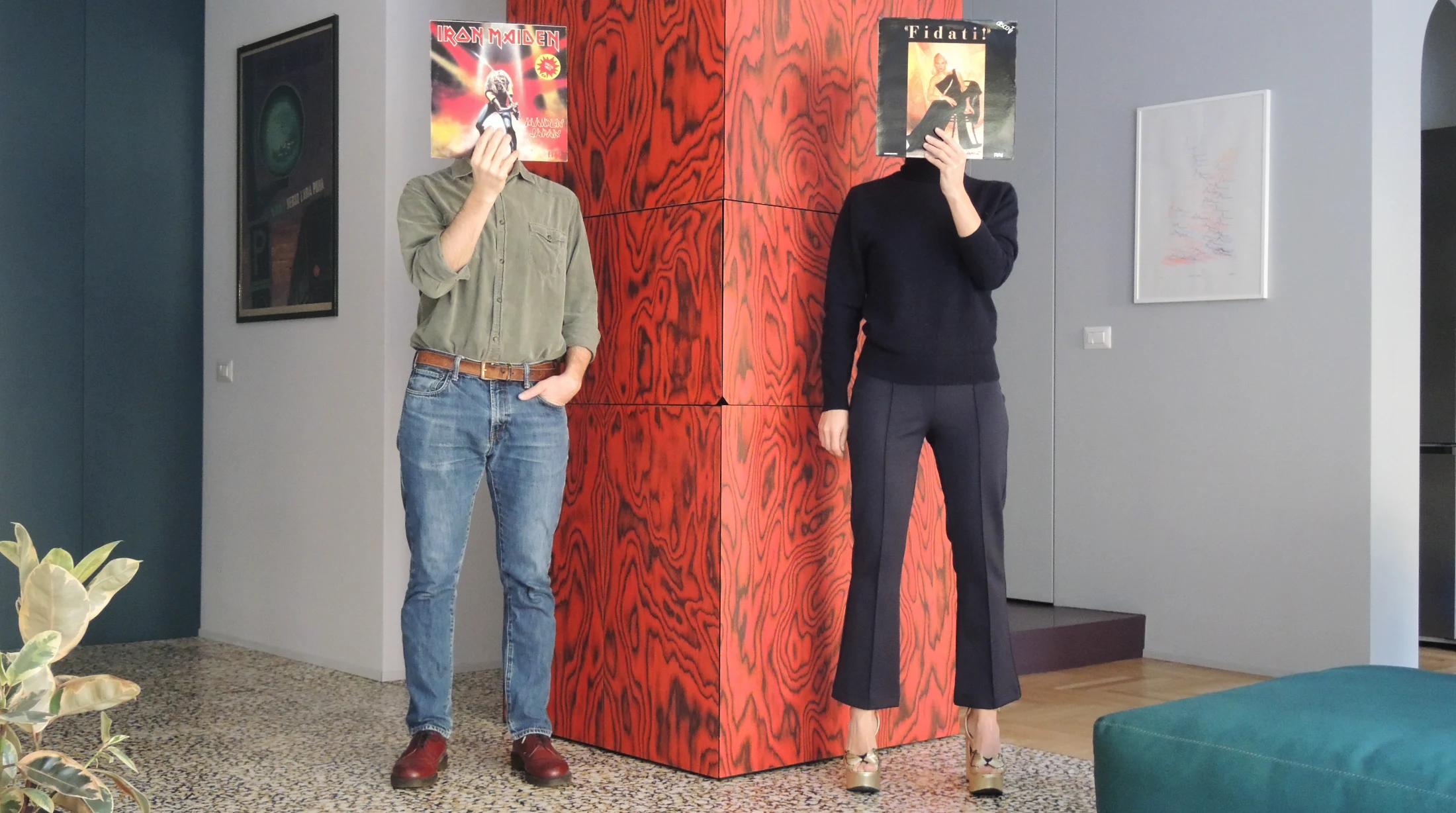
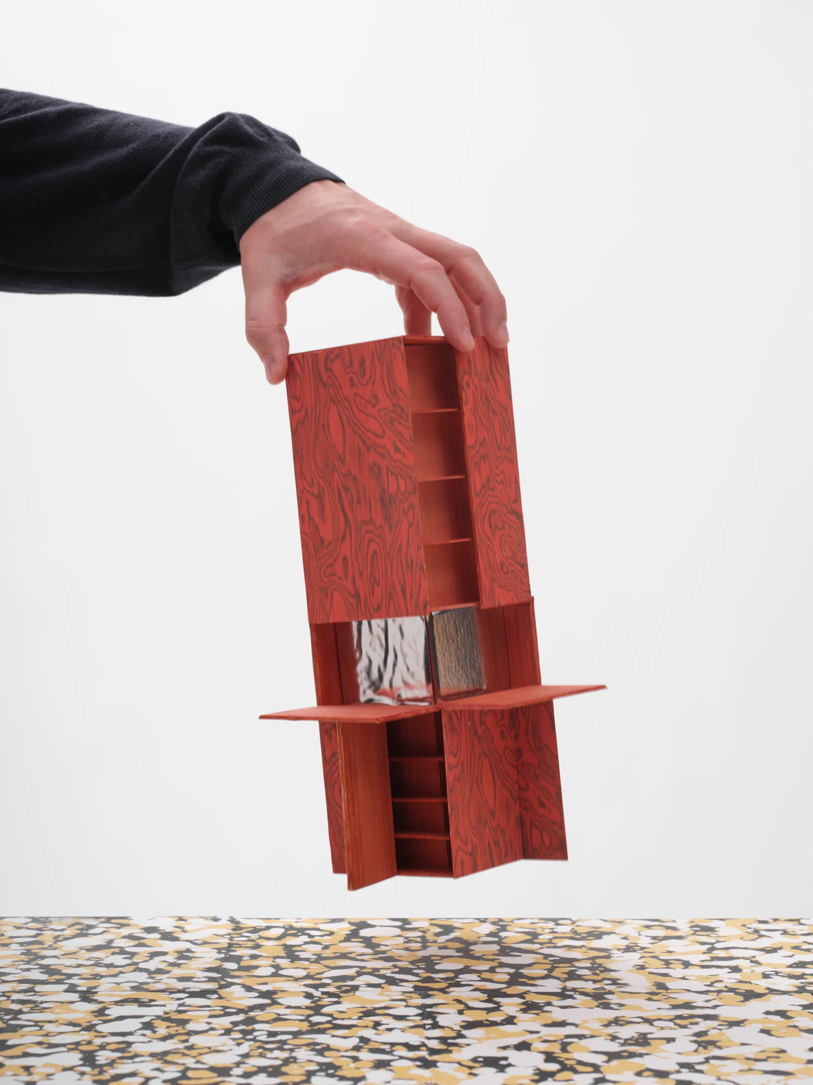
The third element that escapes the logic of flat colour is the great protagonist of the living area, the totem clad in veneer signed by Ettore Sottsass.

In this magical column, our home finds its climax, with minimalist yet ready-to-trans- form geometries, unexpected spaces and openings, and, naturally, an intense and vibrant red.

We filled it with many things we hold dear, in an intentional disarray that reveals a small universe each time one of the many doors of the totem is opened. Every day we give it a different shape, and in the evening, when its mirrored interior reflects the orange light of our seventies lamp, it almost feels like having a lit fireplace at home, in a symbolic and central position as Frank Lloyd Wright might have done.

With ATOMAA and Fabio, the game of designing, which we know well and for once enjoyed experiencing from the client's side, has given us a home that from the first night felt like the most comfortable garment we've ever worn, and one that surprises us every day with a different nuance of its beauty – a beauty that represents us deeply in a way we could never have imagined.

This piece of writing was conceived and orchestrated by ATOMAA and originally appeared on atomaa.eu. We thank ATOMAA, Fabio, Andrea and Francesca for allowing us to share it within these pages.

Writing:
Andrea & Francesca
Writing:
Photography:
Photography:
Back to Top
Arrow UpArrow Up
Top
Arrow UpArrow Up
The After shot of the Floorplan
Before
before
after
After
Businesses featured in this project
No items found.
Products featured in this project
No items found.
Magazine Current IssueMagazine Current Issue
Writing:
Writing:
Photography:
Photography:
Back to Top
Arrow UpArrow Up