Magazine Current IssueMagazine Current Issue
HAWKER
HAWKER
From our Mag
August 1, 2026

HAWKER

The hum of fans, sizzling satay and pastel melamine tableware: step into Singapore’s hawker centres. We break down the visual language of these vibrant, egalitarian spaces.

As such a young city-state, Singapore doesn’t have recourse to full-on folkloric origin myths, but it does have hawker centres.

Writing:
John Tran
Writing:
Photography:
Photography:
The After shot of the Floorplan
Before
before
after
After
Top
Arrow UpArrow Up

These agglomerations of independent food sellers have their roots in an informal economy of casual labour and have gone from being a thorn in the side of colonial and postcolonial authorities to Singapore's first entry on UNESCO's register of Intangible Cultural Heritage.

What makes a hawker centre distinct from a street vendor's stall, shopping mall food court or a restaurant?

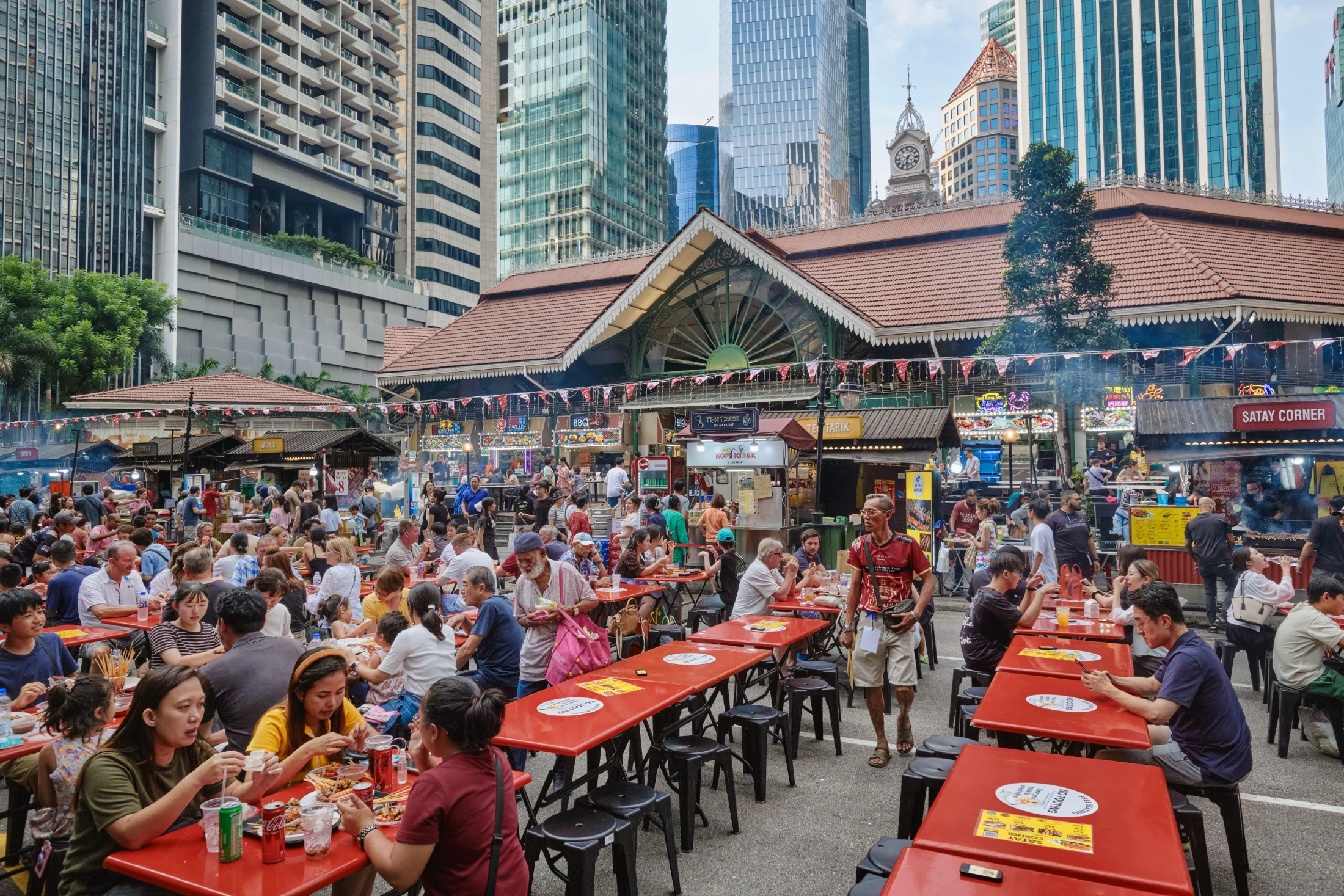
For starters, there is the semi-open nature of Singapore's community dining spaces. The first structures designed to contain free-roaming street vendors, created in the 1920s, were open-sided 'shelters', rather than walled buildings. Current-day government-run hawker centres do not, as a general rule, have air conditioning. Large fans hang from utilitarian open truss work in high ceilings, which, combined with open sides, allows for better air circulation. Small fans jutting out from supporting pillars join the fight against Singapore's near constant clamminess.

With its roots in catering for people who could not afford to eat in brick-and-mortar establishments, a defining characteristic of hawker culture has been that it should be low rent; figuratively in the sense of not being a fancy-pants dining experience, and literally. However, with Singapore currently top in the world's purchasing power parity rankings, that low-rent ethos of hawker centres, for better and worse, is changing. Newer, more user-friendly iterations follow the blueprint of open sides and fans rather than air conditioning. Low-cost eating is not necessarily the main reason behind this, as much as showcasing sustainability-driven design.

Hawker culture is a stand in for Singaporean values in that they represent "resilience, adaptability and unity"1. Sounds good, in the sense of Singapore's history of a multicultural city-state pulling itself up by its own bootstraps, but then again, near antonyms like flexibility, tradition and diversity would fit just as well. Another way of seeing hawker centres as symbolic of Singapore as a whole, is that both exist and have thrived despite themselves. As Lily Kong and Aidan Wong of Singapore Management University noted in a 2023 study of hawker culture, "The name 'hawker centre' is so familiar in Singapore that its irony is not always apparent. A hawker, according to the Oxford English Dictionary, is someone who travels about selling goods. But Singapore's hawkers have permanent stalls; they are no longer itinerant." The culture of the hawkers, originally undocumented workers who fed an Asian workforce that could not afford to eat in the same establishments as their western colleagues, is a story of food heroes.

Tableware

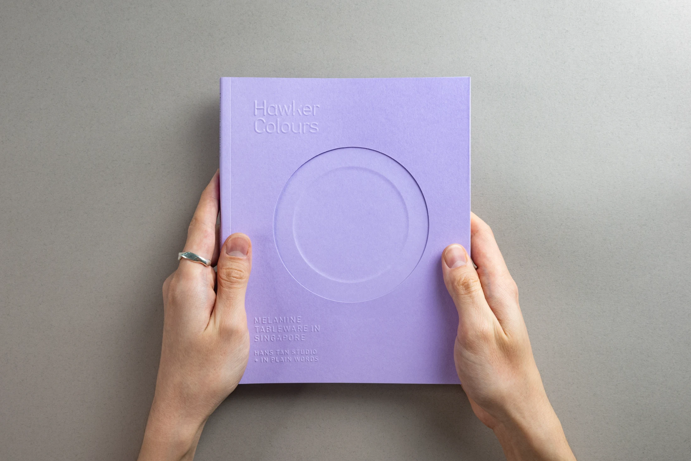
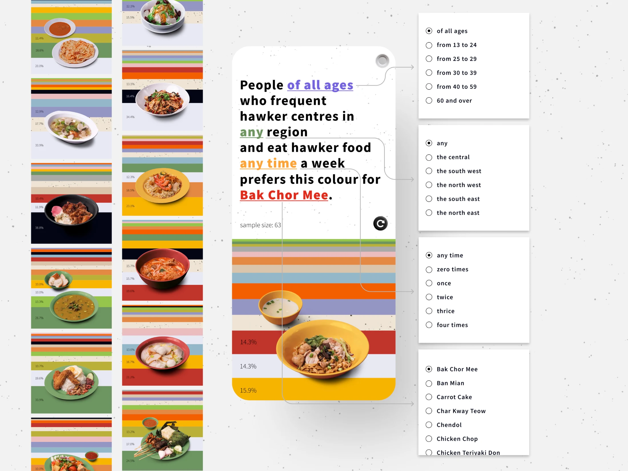
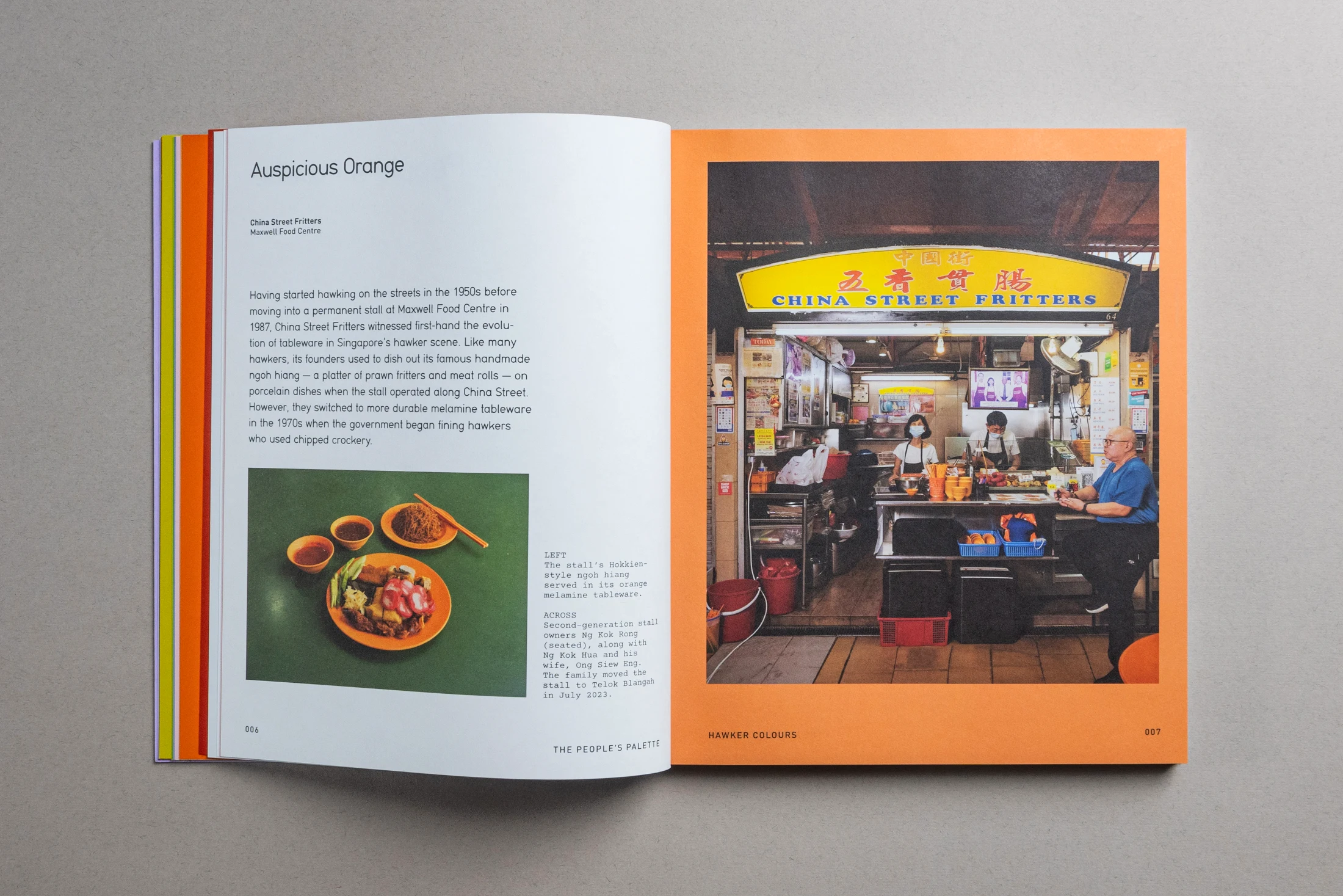
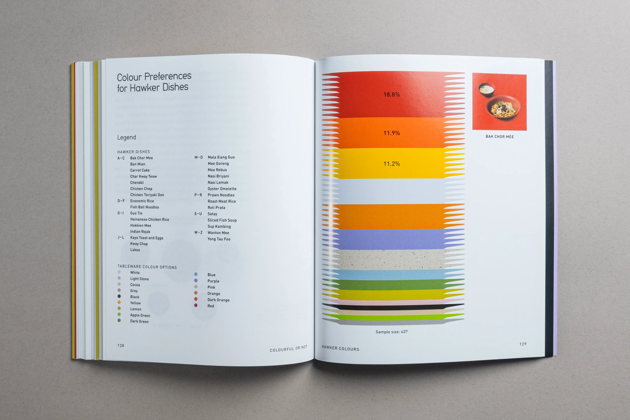
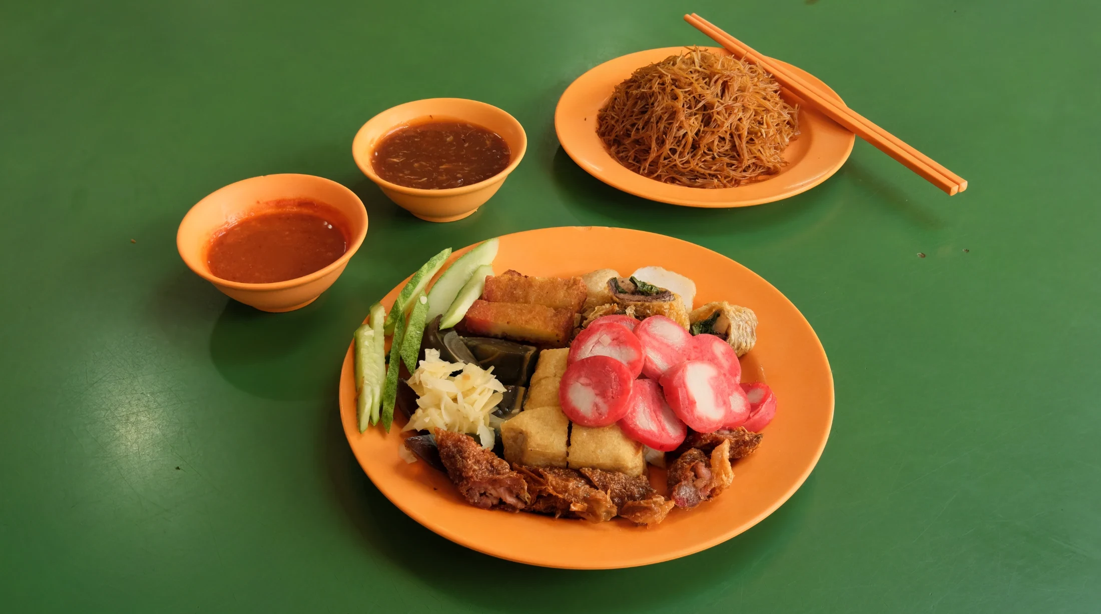
If Wes Anderson designed tableware, it would probably look something like the solid colour melamine hawker centre bowls and plates. The pastel oranges, lilacs, greens and beiges don't belong to the 21st century. The colours are muted but distinct, reminiscent of a 1950s colour palette mixed with some flower-power warmth from the 70s. The colours a hawker will use are a mixture of personal choice and practicality. Red and orange are symbolic of good luck in Chinese culture, while green, Prophet Muhammed's most beloved colour, has been popular with Muslim traders. By contrast, as mentioned in the comprehensive and affectionate survey of melamine tableware 'Hawker Colours', red plates and bowls are used at the NM Abdul Rahim stall to match their spicy mee goreng and other sambal-flavoured dishes, and to visually distinguish them from competitors. Before moving to its new location inside the 280-metre tall CapitaSpring building, the Golden Nur stall served its biryani and crispy chicken rice on dark green melamine shaped like a rectangle of banana leaf.

Hans Tan, curator of Hawker Colours, says, "It's become second nature for us to associate certain colours with certain foods. Purple and blue are not usually associated with making food look delicious, for example, but our brains have adapted to determining the default colours that have become part of our cultural heritage."

Economics and changes in regulations and working practices are also a factor in the look of hawker tableware. Melamine was a sensible replacement to porcelain as it is lighter, shatterproof and has lower thermal conductivity. Irrespective of colour, as a material it also has a 50s vibe, having its heyday in US households after the second world war as a modern successor to the less versatile Bakelite. Not necessarily cheap, it became more affordable to hawkers when production facilities opened up in Singapore from the late 60s.

With a campaign by the Singaporean government in 1986 to make a switch to disposable polystyrene tableware and plastic cutlery falling flat within two years, the distinctive material and colours of Hawker melamine remain, for now. In part this may be because the median age of hawkers is around 60, and "old hawkers, and even the second generation, do not change their tableware colours". However, the two drivers of better hygiene and efficiency, combined with less interest of the so-called 'strawberry generation'2 in the hawker life, may mean a less colourful future ahead. Newer hawker centres, operated by private companies, have adopted centralised dishwashing, where dirty dishes are collected en masse and washed by an independent contractor. This means more standardised crockery, with differences in colour being used for utilitarian reasons, like distinguishing between halal, non-halal and vegetarian meals, for example.

Signs

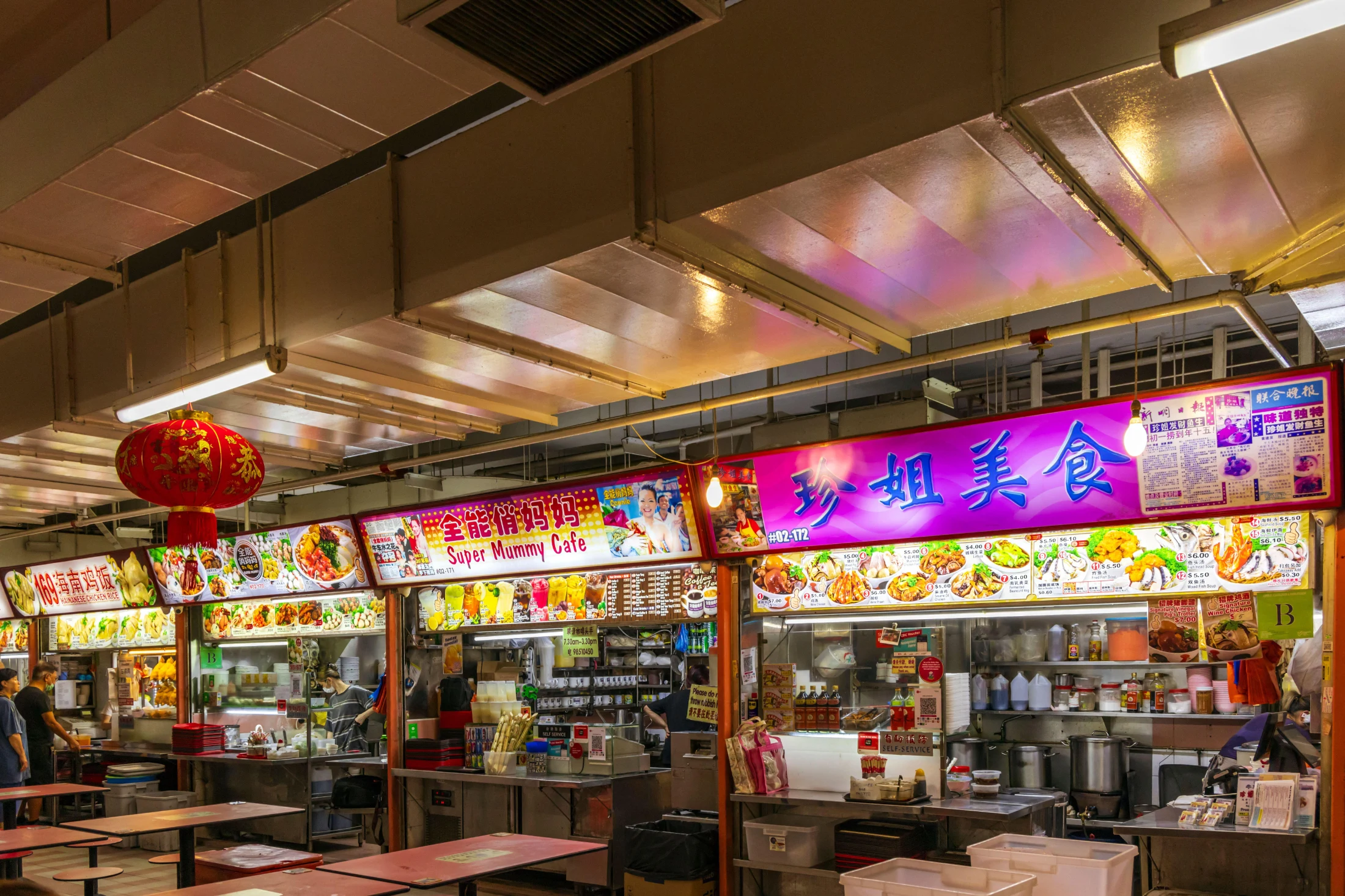
Hawker stall signs tend towards the brash and bold. While there are regulations governing size and placement of signs, the design is up to the owners. Bright contrasting colours excite the eye, and tell prospective diners who and/or what is going to fill their bellies. This is communicated through varying configurations of food images, the name (and therefore ethnicity) of the owner, the language used, and the names of the dishes sold. The combination of the curator-like regularity of the sign dimensions and positioning, and the visual free-for-all of the content is deeply satisfying. Modern, minimalist designs look suspect in this unselfconscious melee for attention, but in any case, the most overriding sign of quality for many customers is the size of the queue in front of the stall.

As communal spaces overseen by the state, another form of signage frequently seen in hawker centres is public information posters. These can range from the hard-to-argue-with "Return your tray and keep tables clean", to the mildly moralising "Every diner deserves a clean table" to the outright penal "Clear your table to avoid a fine".

While old-school hawker signs and public advisory campaign posters have a completely different form and function, they both have a certain guilelessness in their visual language. Neither are designed for the sake of design, and they share a kind of awkwardness. As hawker centres become more market-savvy this is pushing both types of sign towards more deliberate stylishness.

Architecture

The varied design of hawker centres reflects the fact that Singapore is a hybrid culture. The oldest structure is Lau Pa Sat, originally designed by James MacRitchie in 1894 as a wet market. Its striking octagonal shape and original Victorian decorative cast ironwork made in Glasgow have made it an iconic building in hawker culture. After several renovations, the latest in 2020, its upmarket looks get praise from travelling bloggers and influencers, but for some locals it's an overpriced tourist trap.

Indonesian vernacular is reflected in the design of the Bedok Food Centre, originally erected in 1971 and rebuilt in 2005. Two angled and steeply pointed roofs on opposite sides of a maroon-coloured circular building are a call back to the sweeping curved roofs of rumah gadang long houses with their twin spires that symbolise buffalo horns. This architectural flair contrasts strongly with the flat, white and relatively featureless design of the nearby 2014 Bedong Interchange Hawker Centre, which seats 1000 people.

The design of a centre opened in 2016 is based on the translation of the Malay name of the area where it is located, Bukit Panjang, meaning 'long hill'. Coloured in a striking grass green, the undulating roof of the Bukit Panjang Hawker Centre and Market is meant to resemble rolling hills. Walls of the ultra-modern structure are studded with squares of living greenery – a nod to former Prime Minister Lee Kuan Yew's founding vision of Singapore as a garden city, more recently rebranded to "city in nature". Articles from The Straits Times in 2015 reported that the design won a "Green Mark Platinum rating, the highest level of certification for energy- and water-efficiency standards for a building in Singapore", while on the inside, happily for punters, but maybe less so for the hawkers, the centre "will not only boast lower food prices but also longer operating hours."

The Punggol Coast Hawker Centre opened in July 2025. For its operator, Kopitiam Investment Pte Ltd, what distinguishes it from other hawker centres is that "AI-powered video analytics provide real-time insights, ranging from footfall traffic mapping and service queue management to comprehensive safety monitoring across the hawker centre." Groups of stalls are clustered into hut-like structures of different pastel 'hawker colours', though the actual melamine tableware is not as colourful, with black being predominant. Many of the individual stall signs are reassuringly gaudy, but they are swallowed up by the greigeness of the food hall. The direction of travel for hawker culture is more efficiency and ever higher levels of sanitisation; but like a ship that is repeatedly fixed up with its original parts replaced, over time can we still say it's the same ship?

1 As Edwin Tong, Minister for Culture, Community and Youth (2020–25) put it in a 2020 video commemorating the enshrinement of Singapore's Hawker Culture in the UNESCO Representative List of the Intangible Cultural Heritage of Humanity.

2 This Asian equivalent of 'snowflake' suggests youth that are "easily bruised, self-absorbed and lazy", according to Chew Han Ei and Vincent Chua's 2022 article in Singapore's newspaper The Straits Times titled 'Singapore Youth: In Defence of "Strawberries."' The term was originally coined by businesswoman Christina Ongg as a reference to people born into the prosperous, post-war Taiwan region in the 1960s and 1970s who were apparently pampered by their parents but it later evolved to characterise those born after the 1980s.

Writing:
John Tran
Writing:
Photography:
Photography:
Back to Top
Arrow UpArrow Up
Top
Arrow UpArrow Up
The After shot of the Floorplan
Before
before
after
After
Businesses featured in this project
No items found.
Products featured in this project
No items found.
Magazine Current IssueMagazine Current Issue
Writing:
Writing:
Photography:
Photography:
Back to Top
Arrow UpArrow Up