Magazine Current IssueMagazine Current Issue
Colour Cheat Sheet
Colour Cheat Sheet
From our Mag
August 1, 2025

Colour Cheat Sheet

Warning: colour expert Rachel Lacy, doesn’t like white walls. Not one bit. Rachel shares her expertise on working with colour in small spaces and her feelings about white plates.

If the walls of your home (like mine and many others) are painted a shade of white, brace yourself. What you're about to read contains some hard truths and strong opinions, albeit alongside some generous hand-holding if you want to embrace colour more wholeheartedly within the walls of your home. I learnt a huge amount during my very fun conversation with Haymes Paint Colour Lead, Rachel Lacy. I learned that the white walls in my home were not my own but were simply 'inherited'. A question waiting to be answered if you will. And I learnt a lot about colour in small spaces too. Spoiler alert: the answer is not always white.

Elizabeth Price
Writing:
Writing:
Elizabeth Price
Photography:
Photography:
No items found.
Magazine Current IssueMagazine Current Issue
The After shot of the Floorplan
Before
before
after
After
Top
Arrow UpArrow Up

"I think there's a myth – and it's definitely a myth – that painting a small space white makes it appear bigger. There's not a single logical principle that you can apply to that idea. It's still a small space. It's just white."

In fact, Rachel thinks painting a small space white can even have the opposite to the intended effect – by drawing even more attention to its smallness.

"One doesn't have to go all the way to a jewel tone (or whatever language one wants to use for a highly saturated colour), but I just wouldn't start with white. It's not going to do what you think it's going to do."

OK, so stretching ourselves beyond the safe and familiar territory of white is worthwhile. Noted. What else should we think about when working with colour and painting our small spaces and homes, Rachel?

1. The new neutrals

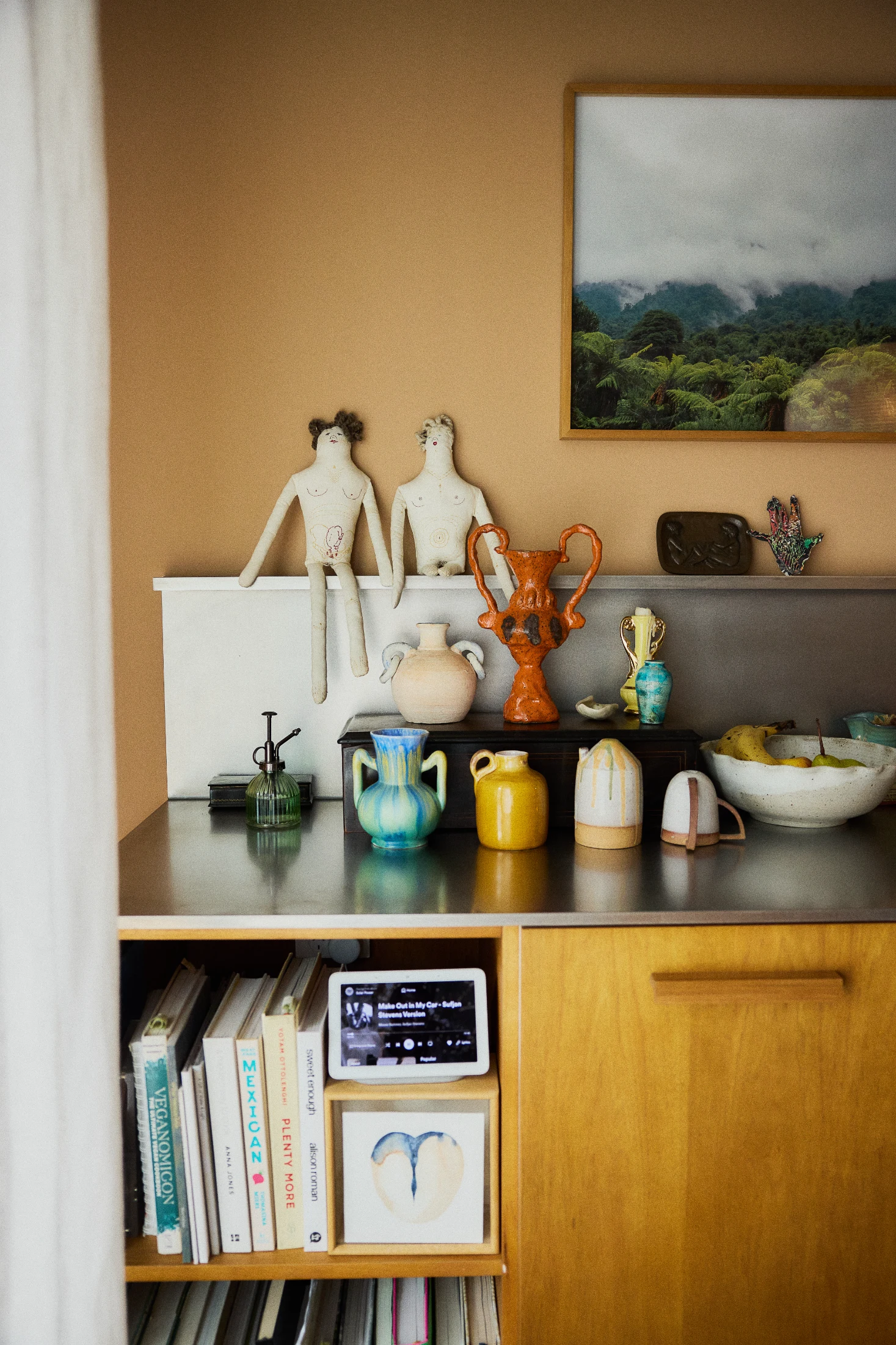
Keeping a palette neutral is fine. Just remember that it doesn't need to be white. Pale greens, soft terracottas and blues are a great alternative and will behave better, especially if your space suffers from low light (more on this below). If a lot of your space is in shadow (as is often the case with small homes and apartments) a white space actually becomes a grey space.

But if you're deciding to add colour, it doesn't have to be all or nothing. There's so much between highly saturated colours and whites that you can do beautiful things with. These days those sagey greens are pretty much a neutral. (When I was a kid, neutrals were beige and versions of beige). And you can do a lot with something like that – it's sort of hard to go wrong and the room will always feel better if it's that sagey green or a beautiful soft slightly muddy blue. It's just more interesting.

2. Consider how and when you use the space.

If you're a working parent, like I've always been, then you are mostly in your bedroom at night. And I like the dark seductiveness of a darker bedroom. Thinking about the light in the room and the activity in the room helps to determine the depth of colour that you want to go to.

If you're home during the day throughout the week, a darker colour could just get a little bit heavy day in day out. But if you, like me and many others, are really only home in the evening and the weekends, you get a different level of exposure. I think that our life does travel in these chunks.

3. Take ownership of your space

Having the freedom to paint your space is really important. I think it's difficult when people can't do that. But even when I lived in rentals, we still painted them. We just painted it when we left to return it to its original colour. Most paint companies now do a single coat white paint that covers most colours easily. And it really is worth it because it makes it your space. We've all lived places that are not ideal – that aren't quite what we want – and we make do. But when you get to live in the place that you love and you've made it what you want it to be, it will give you a kick every day.

Paint is one of the cheapest, most cost-effective ways to transform your space. It's pretty egalitarian. If you don't want to pay for painting, you can do it yourself. It's not complicated. People like to make painting sound complicated, but it's really not. It's actually reasonably hard to screw up.

4. Don’t panic about the pressure of perfect
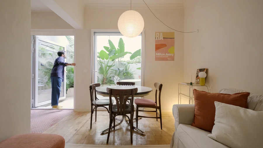
A lot of people panic and fall back to white due to the worry that they’ll get it wrong or get sick of the outcome if they go with a colour, but when people can take the time to test and carefully consider (pointers below) the route they want to take with colour, the reward is just so enormous.

And it doesn’t have to be a forever thing. So you don't have to think, ‘my God, what I want to do at 30 still has to be relevant for how I want to live at 60’... because there is a lot of time in your life between those two periods to repaint your space!

5. Sample pots, sample pots, sample pots

Sample pots are by far the best way to go in order to try colours in different spaces – and in different areas of a space – to see where the lights hits. You can see how you like it – how you like living with it – and that does take time. Making the effort with test pots is so crucial because a lot of paint shop collateral is printed, which means it's not the actual paint. So painting a section of a surface is still the best way to test it in your room.

6. Keep the palette simple

If you're planning a paint job, the only caveat is that a lot of colours don't work hugely well in small spaces. So if you've got a small space it's important to keep your palette quite simple. Monochromatic schemes work really well. If you've got architectural details you want to highlight, you can just use a full strength, or double strength of the same colour. And what that does is it just gives the room a little bit of movement without introducing a lot of different elements.

There's also a trend where you use a single colour (now called 'colour drenching' – but honestly, it's been around forever). Obviously, you use different products because you'll use a different product on your door and on your walls than you will on your ceiling. But you use the same colour and paint all the elements in that colour. It's incredibly easy to do. It can also take some of the anxiety away about thinking about what colours go well together.

7. Zone your space with colour

Zoning with colour in a small space is a brilliant idea. It just takes a bit of courage because often there isn't an easy place to cut or divide a wall in a small apartment, but you also don't have to do it in a straight line. Something I love is working on the diagonal. The diagonal on a room is your longest view, so painting in a colour that recedes, then extends the longest view in the room. Pinterest will just give you so many examples of how to do that. The absence of a direct delineation or an architectural element that makes that easy doesn't mean you can't do it.

8. Don’t fight the light

Le Corbusier said don't fight the light. When thinking about your colour scheme, think about how you can accentuate what the light's doing in your space. This might mean painting lighter where the light is and darker where it's darker. Do what the light does. Colour is really impacted by light sources because colour is light. So, it's going to look different under different light sources, which is why test pots are such a good idea. So if a space is dark, maybe don't fight it within colour. Just get imaginative with lights

As small houses and apartments tend to be parts of bigger houses or buildings, there's a pretty good chance a fair amount of them are going to be in shadow. And if you're dealing with shadow, white's just going to look grey. Titanium dioxide is used to make paint white. It's also in sunscreen and it gives paint its opacity and its whiteness. It used to be incredibly cheap but now it's expensive and the further you grind it, the bluer it goes. So you'll find that a lot of whites now have a slightly blue-grey undertone. As a result, a white room in the evening will be very grey in the corners. It's weird to me. Everyone paints their houses white, but their Instagram feeds are full of coloured houses.

9. Consistency makes it feel cohesive

If you're keen to work with multiple colours, think about the strength of colour and the weight of colour you're using. You don't want to go from a deeply saturated room to a pale room. If you're going to go with a warm grey then you could have a beautiful sagey warm green and then a blue, but keep them of a similar weight so that there's this sort of gentle movement through the spaces and a sense of consistency so it's not like 'Whoa! Whoa! Whoa!'. You just want to make sure that when you have your palette, that even if they're in different parts of your home and they're not next to each other, that you keep colour in your mind's eye. So, you want it to have a cohesive feel. You want the colours to feel that they could all be next to each other, even if they aren't.

10. Don’t discount brown

Browns have such a bad reputation, which is such a shame because they're so easy to live with. Those beautiful warm umbers that Le Corbusier had in his palette are so beautiful and versatile. You can put anything against them. But everyone has this kind of 70s-brown bee in their bonnet. There's a huge amount of that rich red earthy terracotta around, which I completely love, and the fact that Laminex recently put out that 'Kalamata' range is testament to the general acceptance that browns are beautiful colours and they have been for a really long time.

11. Consider "chameleon colours"

I think you have to be very brave and confident to use bright saturated colours as opposed to the more muted tones. The colours that sit on the edge of each colour group are always the most beautiful to me. I love those colours that are blue to one person and grey to another or green to one and blue to another. They just slightly shift. I think those slightly muddy off-centre colours are the easiest colours to use and the most forgiving and they look different under different light too. They are fractionally harder to choose because you really need to use that sample pot, paint it up, sit with it for a while and see what it's like in the changing light of day and under your artificial lights, but it will be worth it.

12. Harness recessive colours

If you think of Yves Klein's 'International Klein Blue' made with the ultramarine pigment, that colour recedes. For Le Corbusier, if there was a hallway, he might paint one wall with ultramarine blue and he might paint a stair balustrade with umber because umber makes objects disappear. So, thinking about how you use colour generally: cooler colours recede and warmer colours advance. So, red, for example, is a terrible colour to use on the floor because it comes up at you. It's a good colour if you've got an incredibly long room or a hallway and you want the end wall to have the sense of advancing towards you. That's loosely how they work. So if you want objects or walls or balustrades or elements to sit back and to become less visible, umber and soft browns are a really good choice.

13. Play with colour without paint

There's a tonne of fun you can have with colour that doesn't involve painting walls. Joinery, furniture, tiles, vases – and even plates – they don't have to be white. (God help us!).

Writing:
Writing:
Elizabeth Price
Photography:
Photography:
Back to Top
Arrow UpArrow Up
Top
Arrow UpArrow Up
The After shot of the Floorplan
Before
before
after
After
Businesses featured in this project
No items found.
Products featured in this project
No items found.
Magazine Current IssueMagazine Current Issue
Writing:
Writing:
Elizabeth Price
Photography:
Photography:
Back to Top
Arrow UpArrow Up