
Magazine Current IssueMagazine Current Issue
Small Home: 401e Apartment
From our Mag
November 1, 2024

Small Home: 401e Apartment

Design: Knock Knock Studio

Size: 47sqm / 506sqft

Location: Sengkang, Singapore

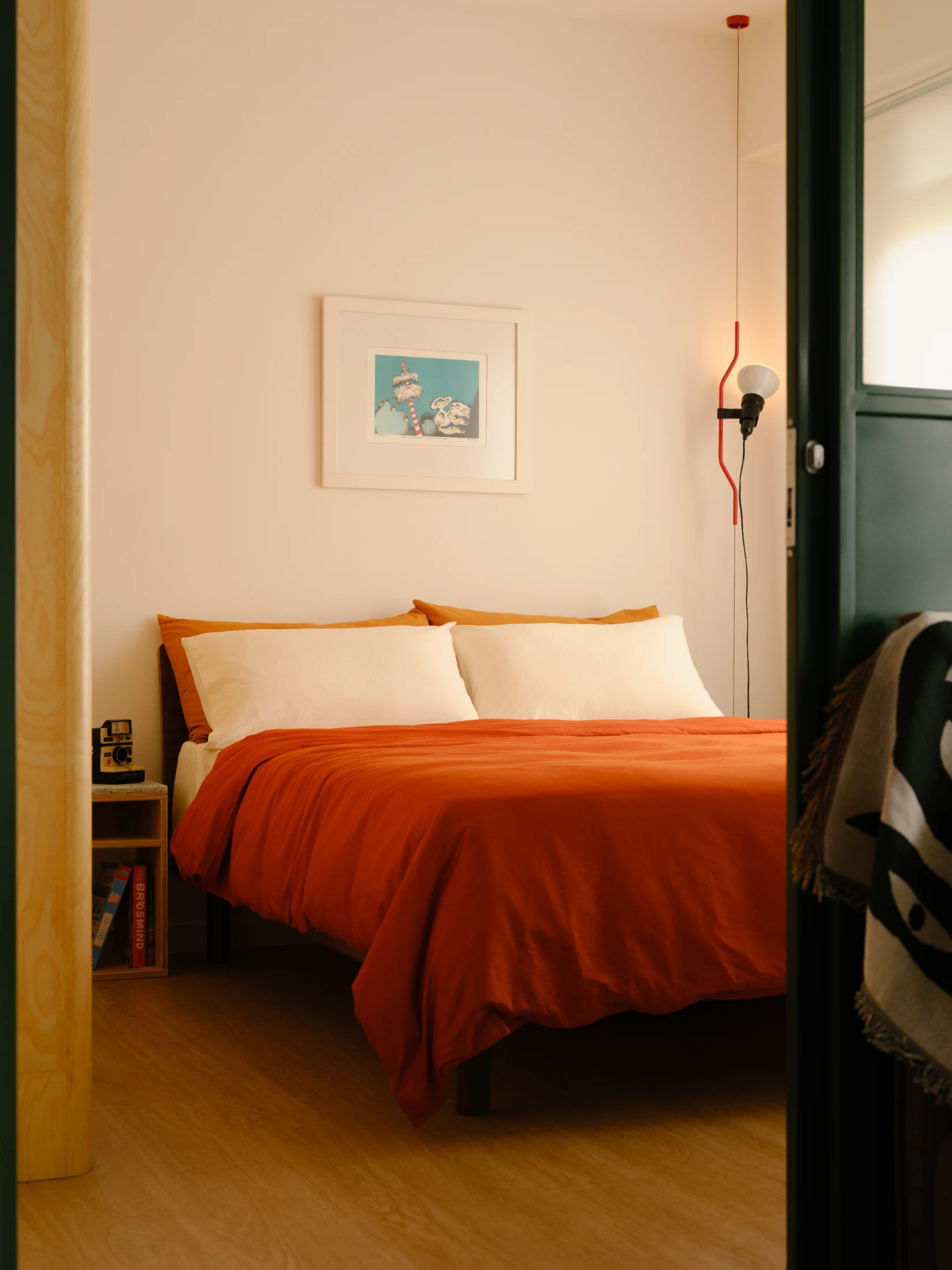
When they first met, Jackie and Tobbie placed a tiny Swiss army knife in the hand of interior designer Jade Cham of Knock Knock Studio. The couple believed it to be the ideal metaphor for their reimagined one-bedroom home: compact, highly-functional and well-designed. From there a creative collaboration was born; with Jade and Jackie realising this vision together. The result is a bright and playful home that celebrates Jackie and Tobbie's careers and passions (Jackie is an illustrator and Tobbie a jiu-jitsu trainer) as well as their shared love of nature.

Elizabeth Price
Writing:
Writing:
Elizabeth Price
Photography:
Photography:
Marcus Lim
No items found.
Magazine Current IssueMagazine Current Issue
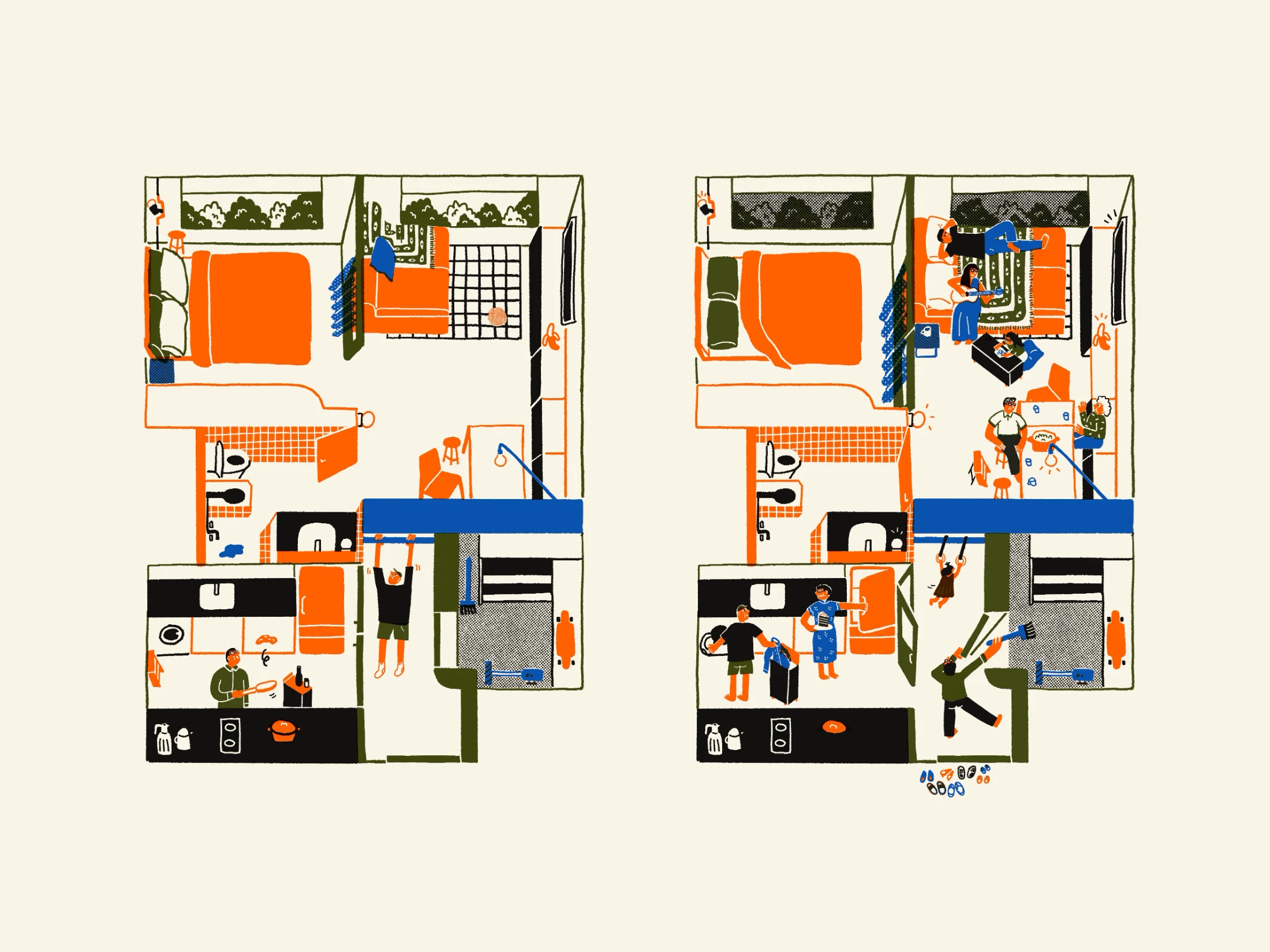
The After shot of the Floorplan
Before
before
after
After
Top
Arrow UpArrow Up

Most non-designers would find the idea of designing their own home a bit daunting, how was the experience for you, Jackie?

It wasn't so bad! Perhaps because I was designing a smaller space, the challenges and decisions that came along with it felt quite manageable. If our home was bigger, I would not have jumped into it so easily. A home is really personal, and while I had always wanted to design my own space, I also knew I needed the expertise of an interior designer who could provide build experience and help manage the renovation process. That's where the team at Knock Knock were crucial. They literally took my sketches and turned them into reality!

Your line of work surely helps? Did you think of the design as just a big 3D canvas/artwork?

I think it's probably just a natural way of thinking for me. We didn't just want to focus on making things pretty though. We always started with the foundation of function: How would we use the space? What was our daily routine like? We even detailed it down to notes like "need a place to store Tobbie's dirty [jiu-jitsu gear] before laundry day". That provided the bones of the space, and we just designed around that. It helped that I am used to photoshopping things for work too, so I could quickly take a photo of something and place it in the space to see if it went well together.

How long did the whole process take from concept/brief to completion?

As individuals, Jade and I work pretty fast, but when we came together, it was like a hurricane of creativity. The concept was done in less than a week and minor tweaks were made along the way. We were constantly sketching ideas, sometimes on napkins, on WhatsApp and even on our walls. The actual renovation took about three months.
How did you know this particular place had the right potential?

We actually didn't spend much time picking the apartment. The unit is a public housing project by the Housing Development Board of Singapore and the layouts are standard across the board, but we liked that this one didn't have any buildings obstructing the view. To be honest, it took us a while to see its potential, because it did feel really small in the beginning. We kept worrying about whether there was enough space, but funnily enough, after we found Never Too Small, we got really excited about making it our own.

What parallels did you find between the creative process of designing your home and your usual craft as an illustrator?

My creative studio 8EyedSpud is a two-woman team, and my co-founder and I work together on every single project. It's a super collaborative process, and I enjoy bouncing ideas off other creatives, especially if they are on the same wavelength, as concepts get pushed further (and faster). Working with someone from a different field when designing our home was really refreshing and just as exciting. I think because Jade and I have a common language and are very visual people, it was really easy to communicate and share ideas. Most of the time we just sketched things out – it saved us from a lot of lengthy discussions.

Colour and your use of it throughout your home is so confident. Did the mix of colours evolve naturally, or did you always have a palette in mind?

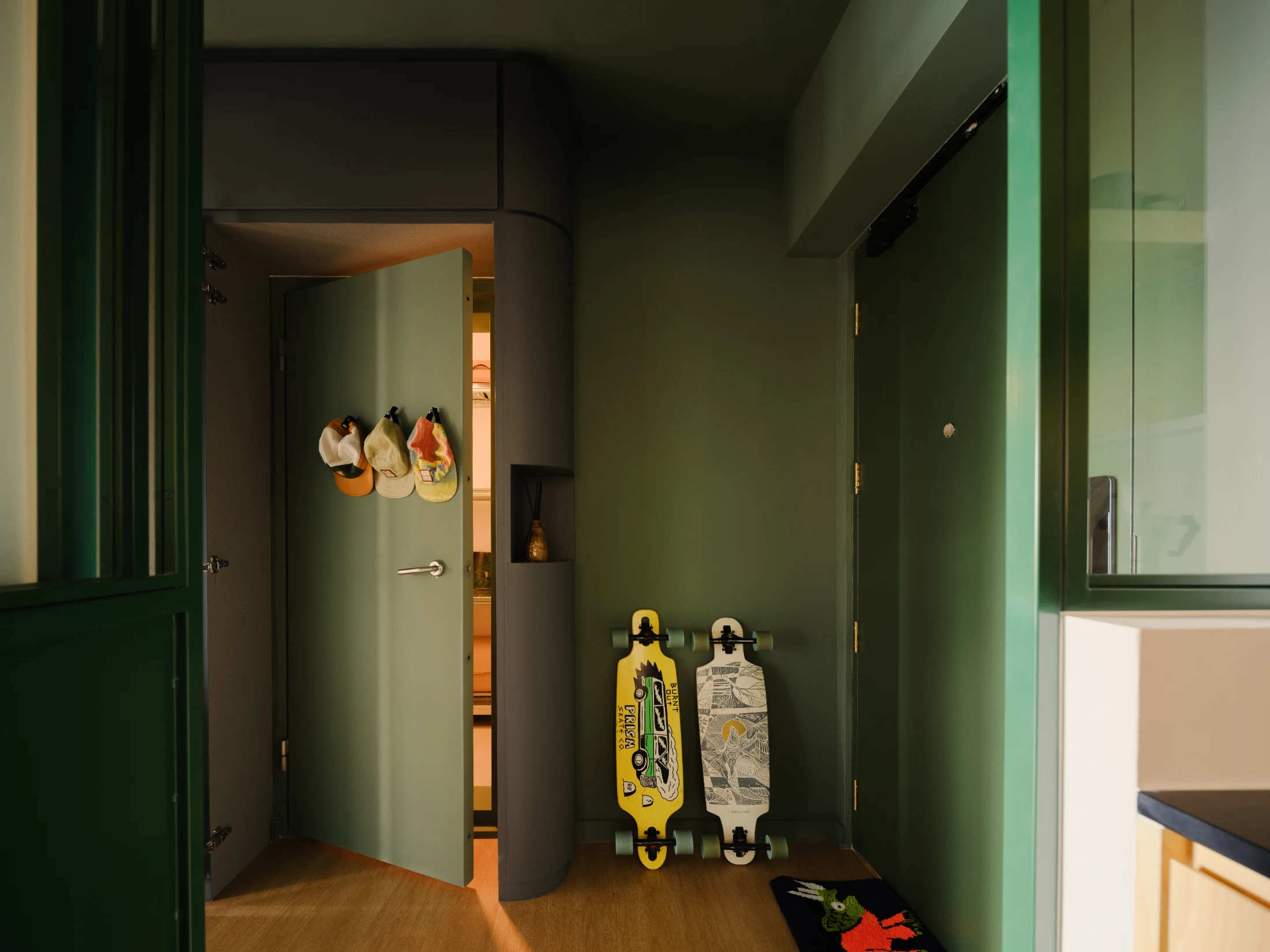
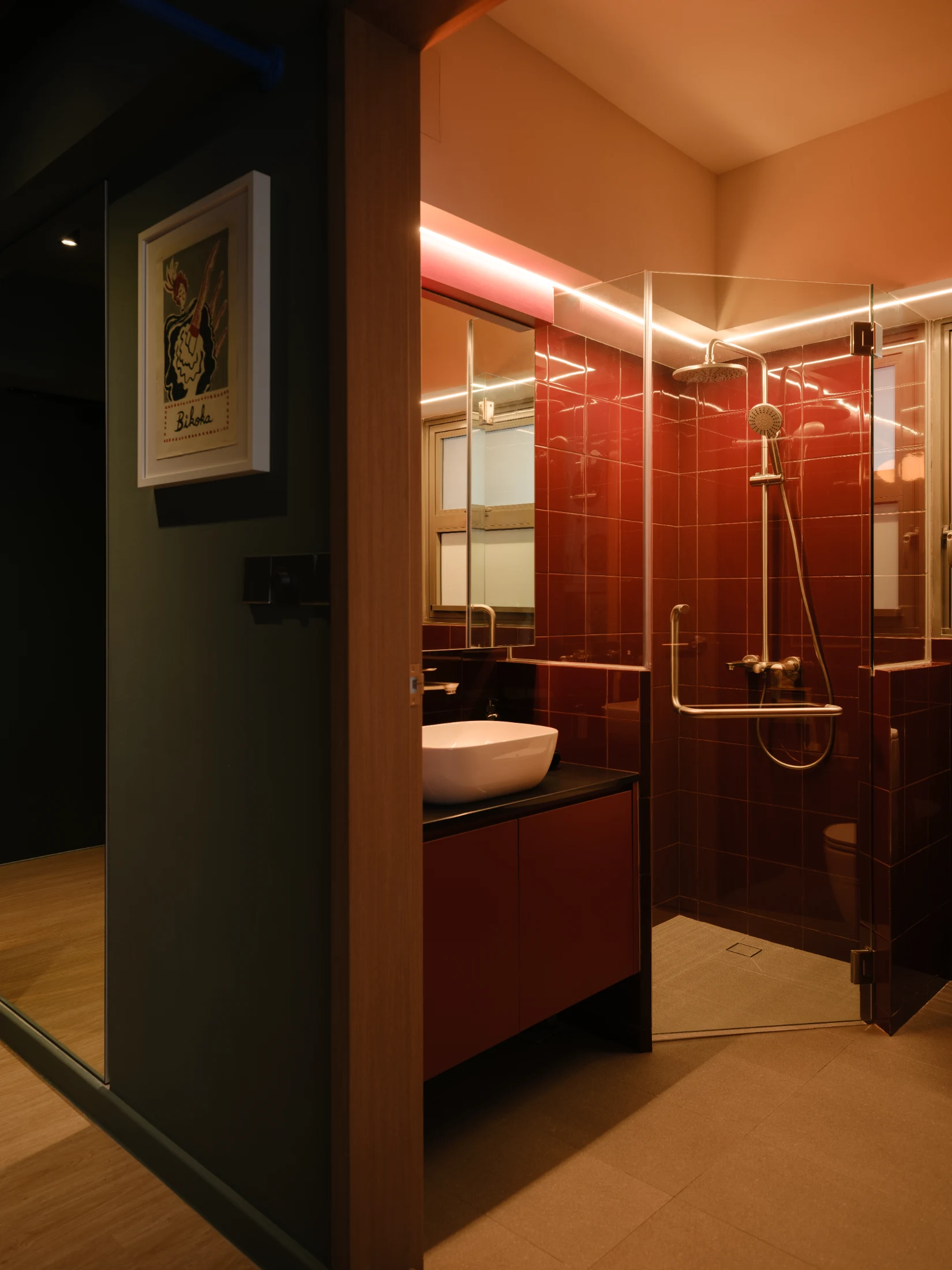
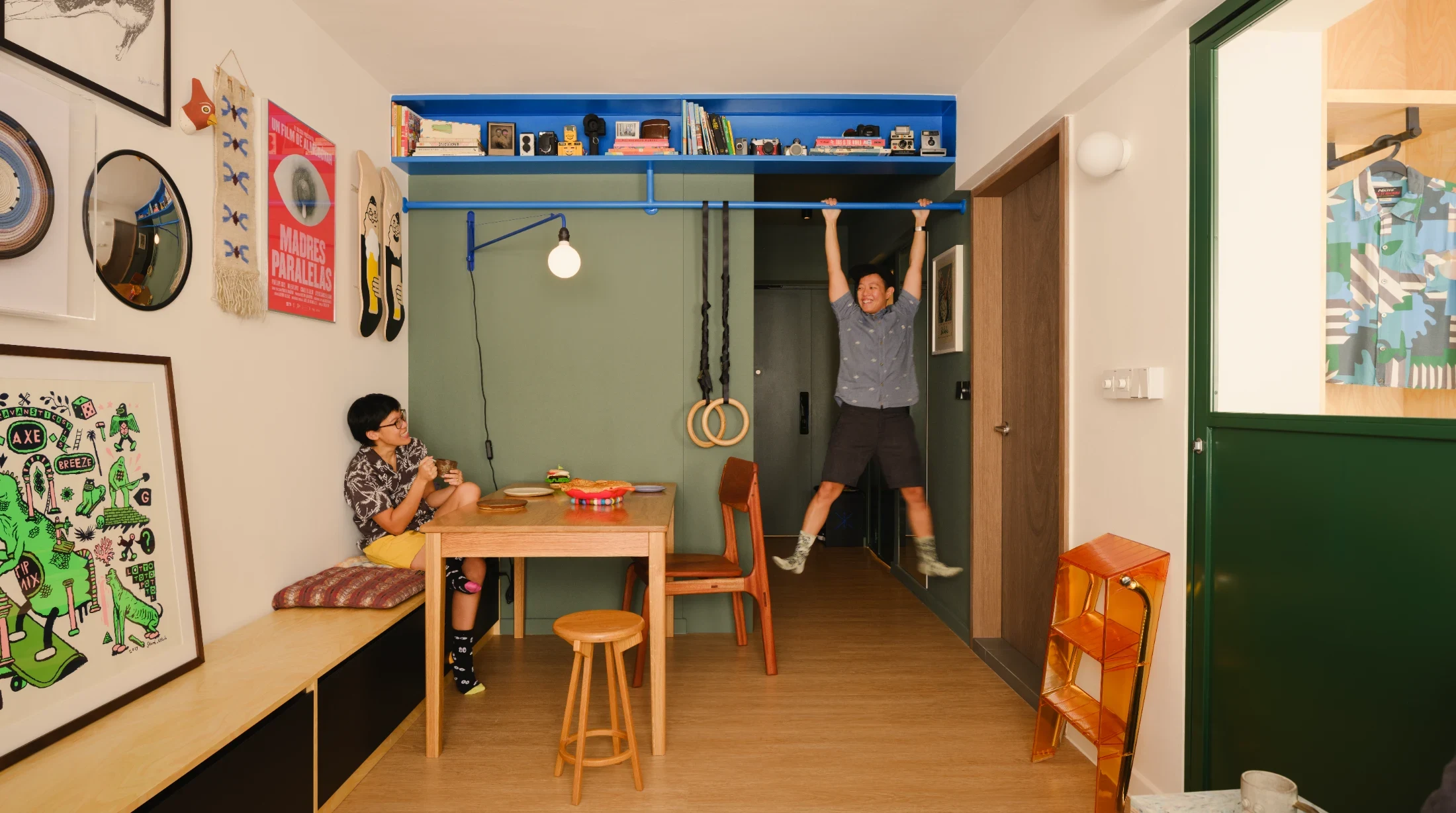
Green, black and warm wood had always been part of the original colour palette from the get-go. Along the way, the cobalt blue found its way into the mix and we really liked it as an accent colour so we kept it. I wanted the living spaces to be more neutral, but was open to having stronger pops of colour in the kitchen and the bathroom. We also knew that our stuff would add more character, so we didn't want the 'canvas' to get too busy.

The greens are very calming. How and why did you decide on those particular shades?

Tobbie and I have a green Stanley flask and lunch box that we take with us on outdoor adventures. The darker shade of green on the flask is similar to the ones on our metal sliding doors, while the lighter shade is pretty close to the one we selected for our wall. When we were travelling in Hawaii, our Airbnb host had the exact same flask and we brought it along with us everywhere we went. I guess it reminds me of being outdoors. I like being outside and surrounded by nature, so this felt like a way to bring some of that into our home.

How many greens did you trial before finding the perfect green?

Surprisingly not that many! Just two or three. I don't like having too many options because it gives me decision paralysis. We took some swatches to our place and some samples of the other materials we chose for the house and landed on this shade of green.

Your joyful drawing of your home: when did it come to be? Was that part of the brief or something that came later?

The drawing came about after we first hosted friends and family at our new place. Before that happened, we were a little worried about how we could host people within such a small space, but once we experienced the space transforming to accommodate seven guests, I was inspired to commemorate that with a drawing! Most of the drawings that I do for fun focus on everyday things I see around me, and I thought the best way to capture everything that went on in this tiny space was to make a new kind of mash-up by drawing it in a floor plan. It is also a little family portrait that includes my parents and my brother, sister-in-law, and nieces.

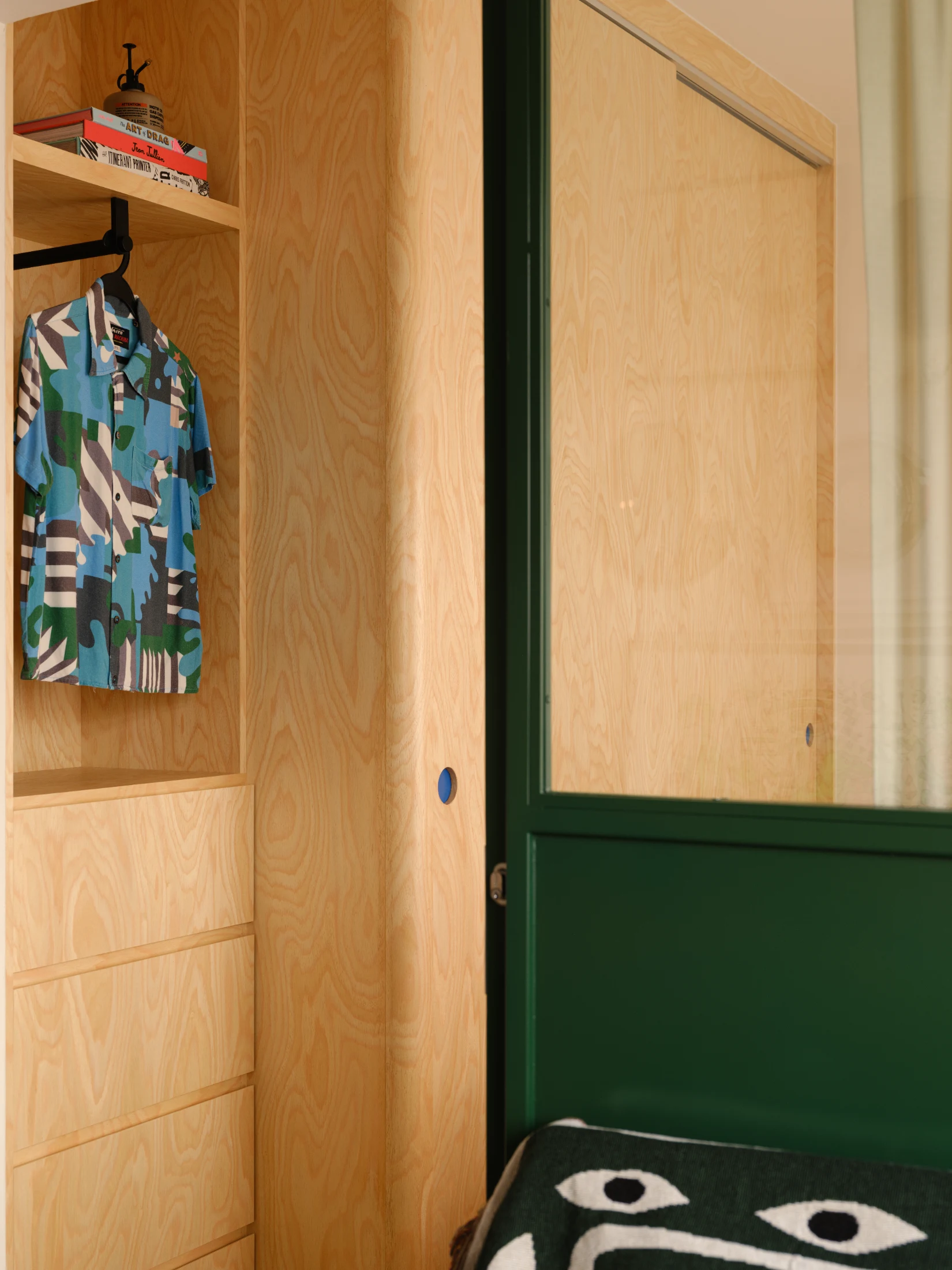
Interventions like switching out timber doors in favour of metal and glass doors that allow light to be shared between spaces are simple and yet must have a transformative effect on how you experience your home. Were these opportunities easy to spot and how have they impacted your experience of your home?

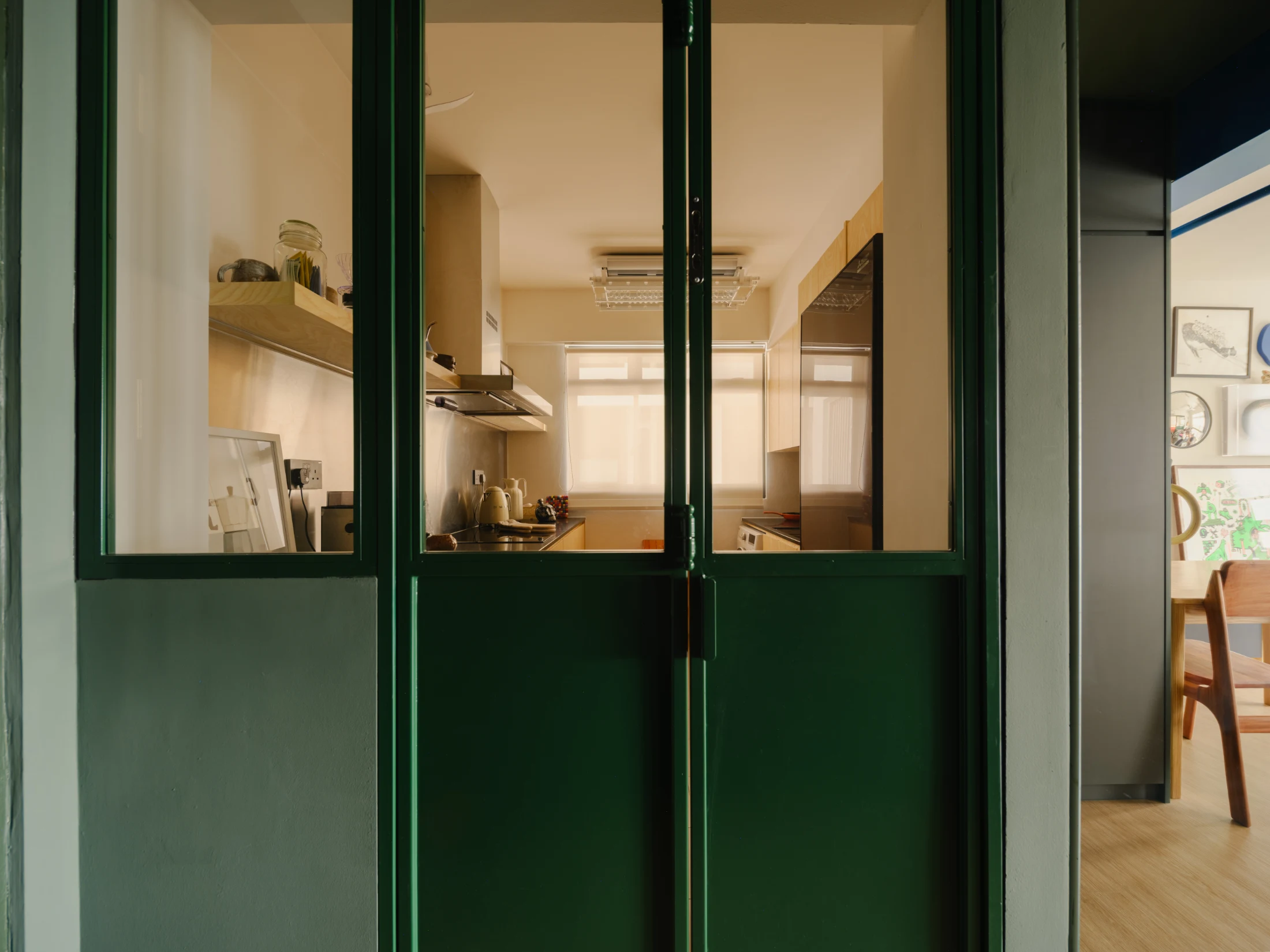
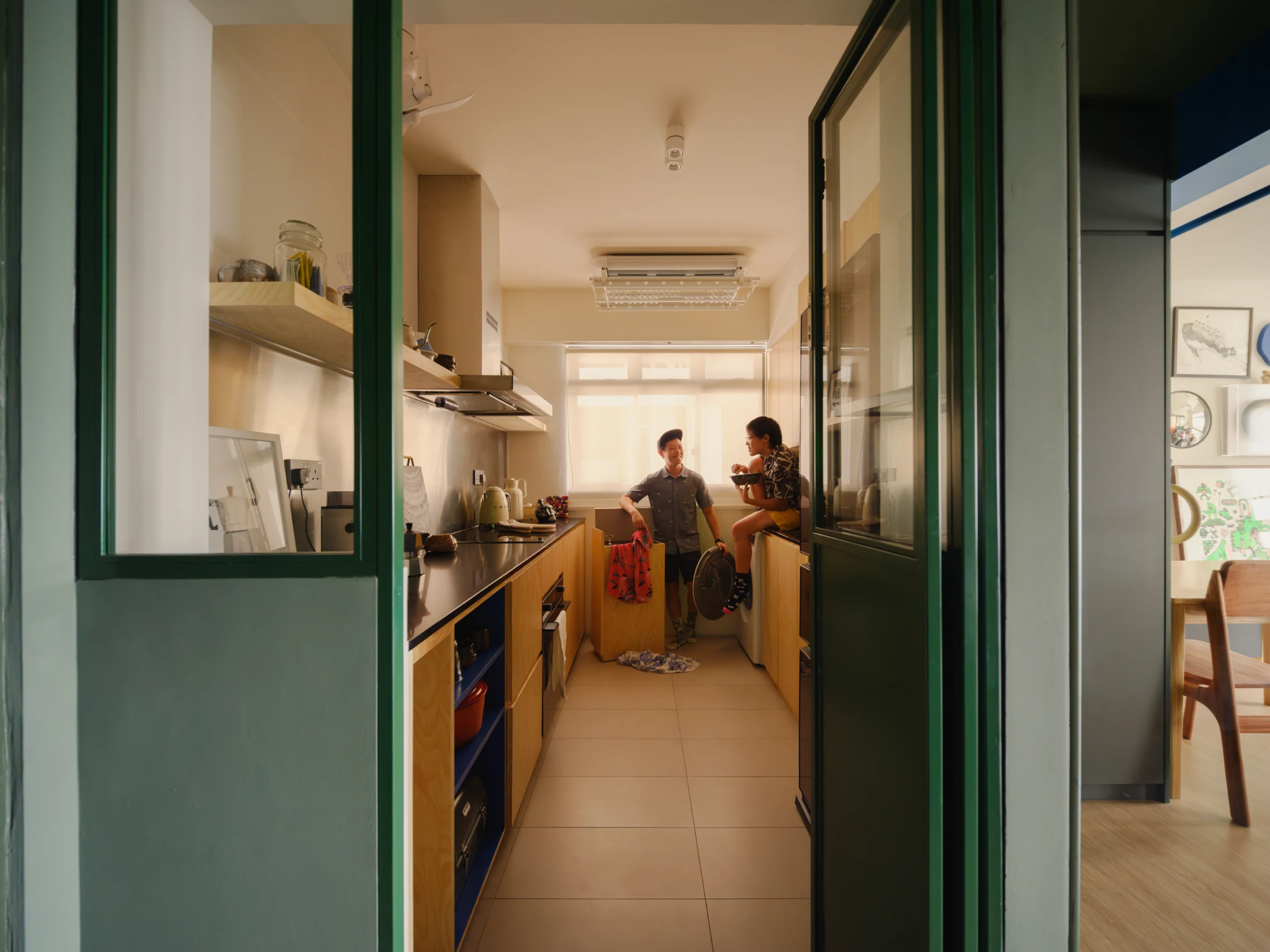
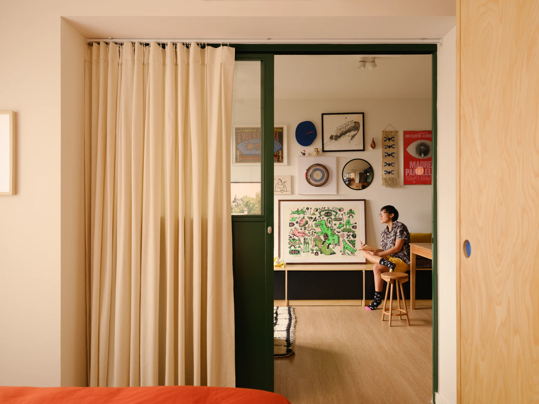
We originally thought about removing the [bedroom] door and keeping the space open, but at the end of the day I'm really just a practical person. I wanted the bedroom to feel private and cosy, especially if we were going to have people over. While I've always wanted an open kitchen, cooking in a small space meant that smells would just be everywhere (including the bedroom). Jade suggested the bi-fold door in the same metal and glass combination as the bedroom door and it felt like a happy middle ground. We could keep the spaces separate while still introducing a sense of openness when we wanted to.

You designed and made a lot of furniture for the apartment. Is this something you've done much of before?

Before I was an illustrator at 8EyedSpud, I ran a letterpress printing studio in my parents' backyard. Because the business was so young, I didn't have a lot of cash to buy furniture for the studio. Whatever I wanted or needed, I made. I went around picking up wood planks that people discarded and turned them into shelves for large sheets of paper, an ottoman, and a bunch of display stands. It ended up becoming more fun than buying furniture! I really enjoy the process of making things by hand, so that really came in handy (pun intended).

Tell us about the chair you and Tobbie made together and how that came to be…

Tobbie really isn't into woodworking, but under the guise of a "fun date idea", I got her to come along to a furniture-making workshop with me. It worked! We got to spend time together and bring home a dining chair we made. Win-win!

If you had to choose ONE favourite furniture baby, which would it be and why? (We won't tell the others…)

This is so hard! But if a fire broke out and we had to save just one, it would definitely be the chair we made together. The rest can always be bought again, but I'm not sure if I could convince Tobbie to do another woodworking class again.

Your gallery wall is one of our favourite gallery walls ever. The best ones are always so personal. Can you take us on a little tour of what's on there and also the process of how it all came together? Was it a gradual process or did everything already exist and it was simply a matter of arranging it?

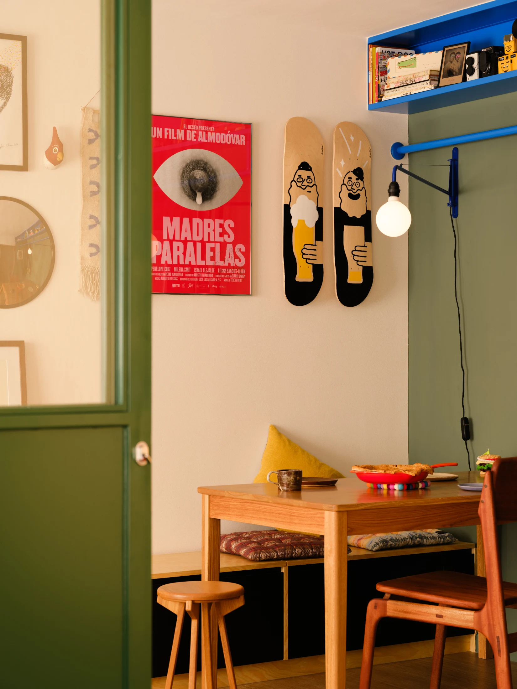
I don't buy a lot of things in general, even when I travel, but my weakness is prints and artwork by other illustrators around the world. I have a collection that I amassed over the years but never had them displayed in one space. When we got the space, it wasn't even a question that the collection would be displayed on the wall. The hardest part was just choosing which pieces made the cut.

I took photos and measurements of every piece and collaged them on a photo of the space to visualise the wall. I wanted a mix of flat and three-dimensional objects, mixing up the textures and scales to give the wall more depth. To make sure it would actually work in the space, I then cut out all the actual dimensions on newspaper and put them up on the wall for a month before I bit the bullet and committed to hanging them up.

What's your favourite detail in your home and why?

Easy. The blue pull-up bar. I love that it doesn't scream "HELLO I AM A PULL-UP BAR". In fact it doesn't even look like gym equipment at all. I've had door-mounted pull-up bars in the past and they always look so cringey in the space. This one isn't just useful but ends up adding lots of character to the space.

Writing:
Writing:
Elizabeth Price
Photography:
Photography:
Marcus Lim
Back to Top
Arrow UpArrow Up
Top
Arrow UpArrow Up
The After shot of the Floorplan
Before
before
after
After
Businesses featured in this project
No items found.
Products featured in this project
No items found.
Magazine Current IssueMagazine Current Issue
Writing:
Marcus Lim
Writing:
Elizabeth Price
Photography:
Photography:
Marcus Lim
Back to Top
Arrow UpArrow Up