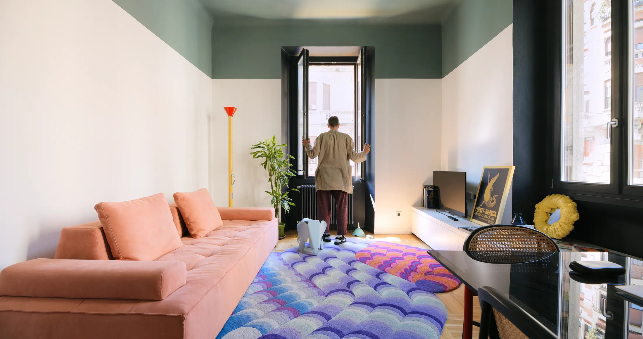


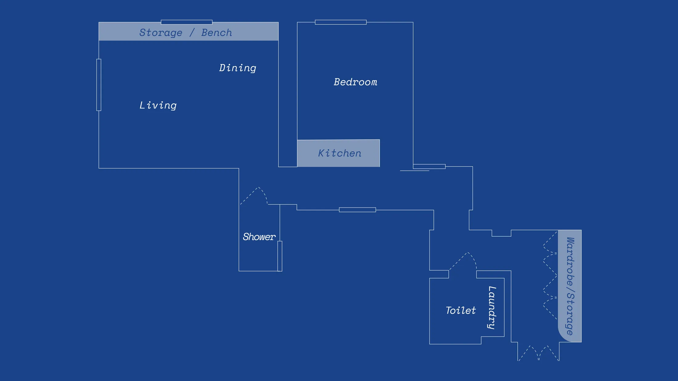
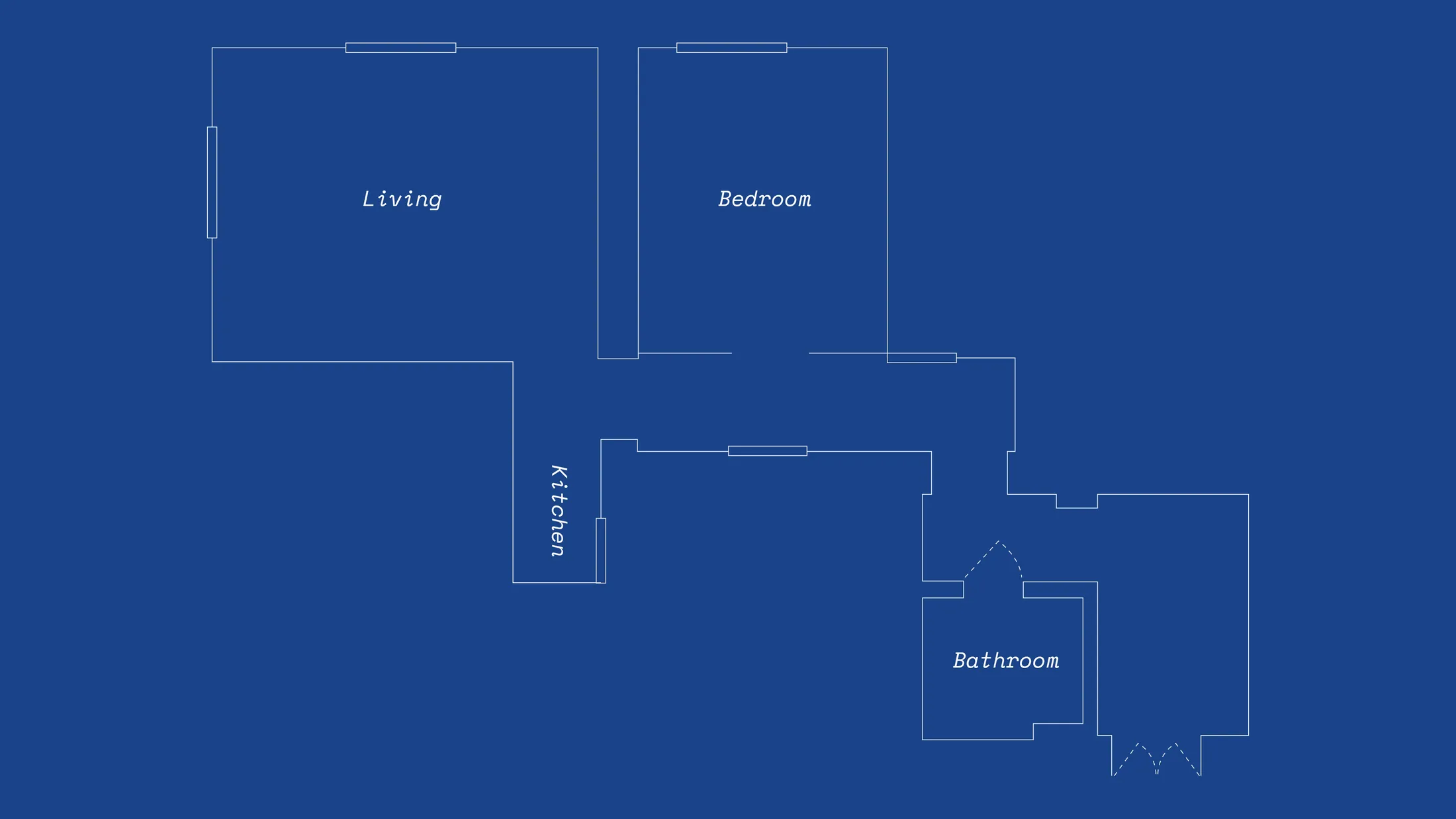
Located between Milan’s Central Station and the Porta Venezia district, this 50sqm apartment sits within a classic 1930s “Vecchia Milano” building. When Andrea Giovanni Rossi and the team at Atelierzero took on the project, the irregular plan and recent low-quality renovation limited major structural changes. Instead, the redesign focused on colour, texture, and materiality, treating the home as a sequence of connected micro-spaces. Each area is defined by its own palette, flooring, and atmosphere, turning constraints into a layered, urban interior that feels considered rather than compromised. Below, we break down five key design decisions that shape how the apartment looks, feels, and functions.
1. Storage That Starts at the Door
2. A Hidden Kitchen That Disappears into the Corridor
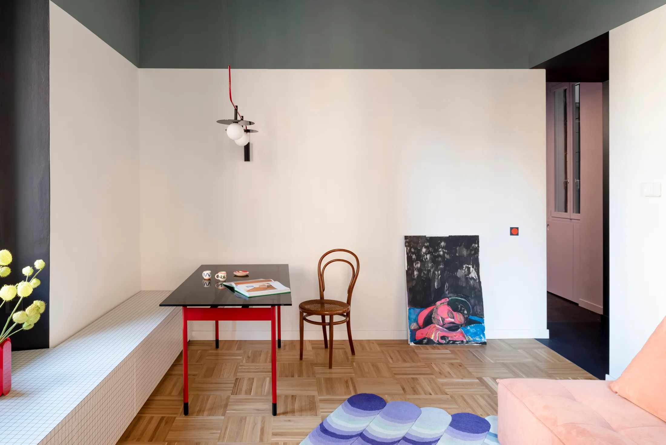
3. Low Bench That Anchors Daily Life
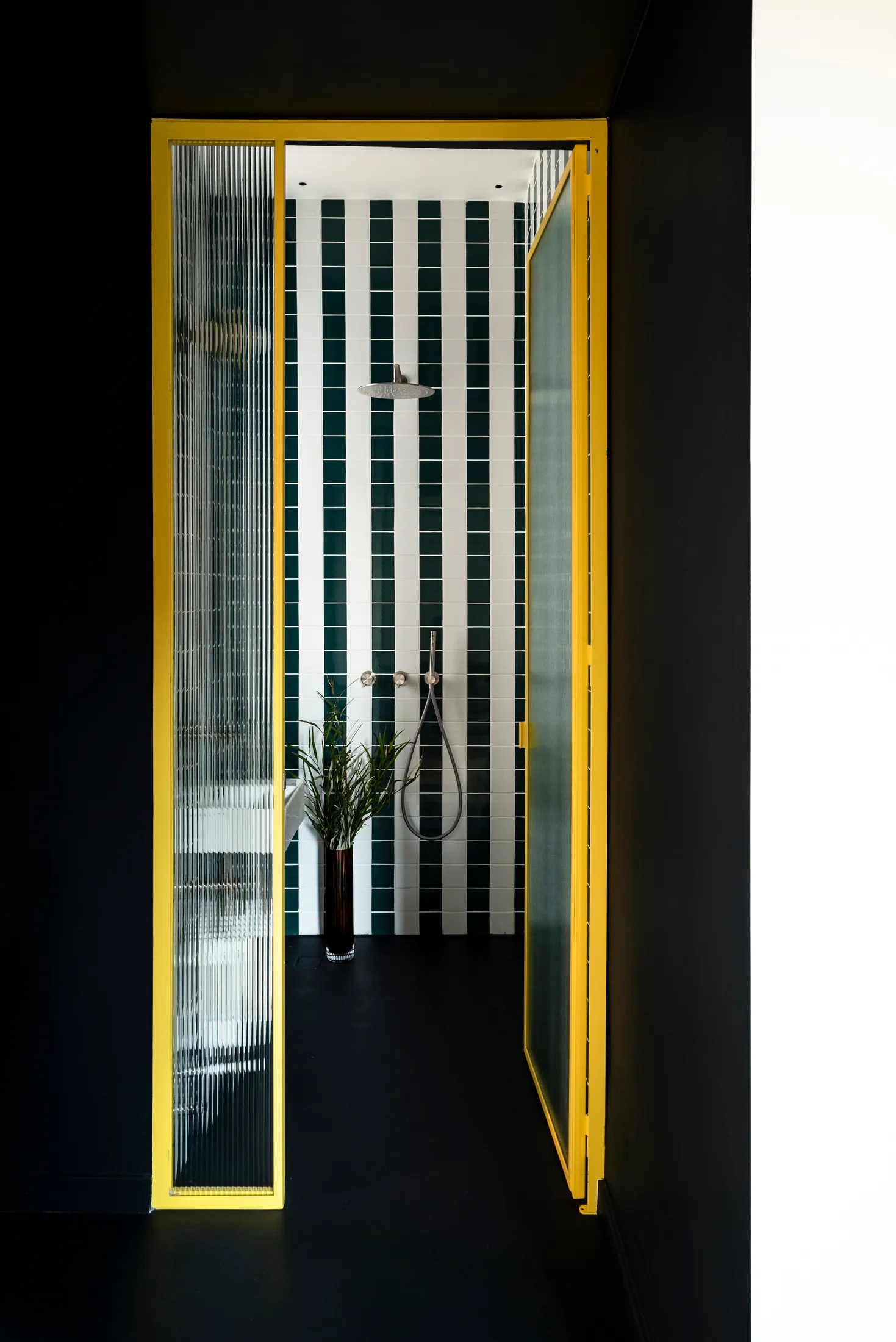
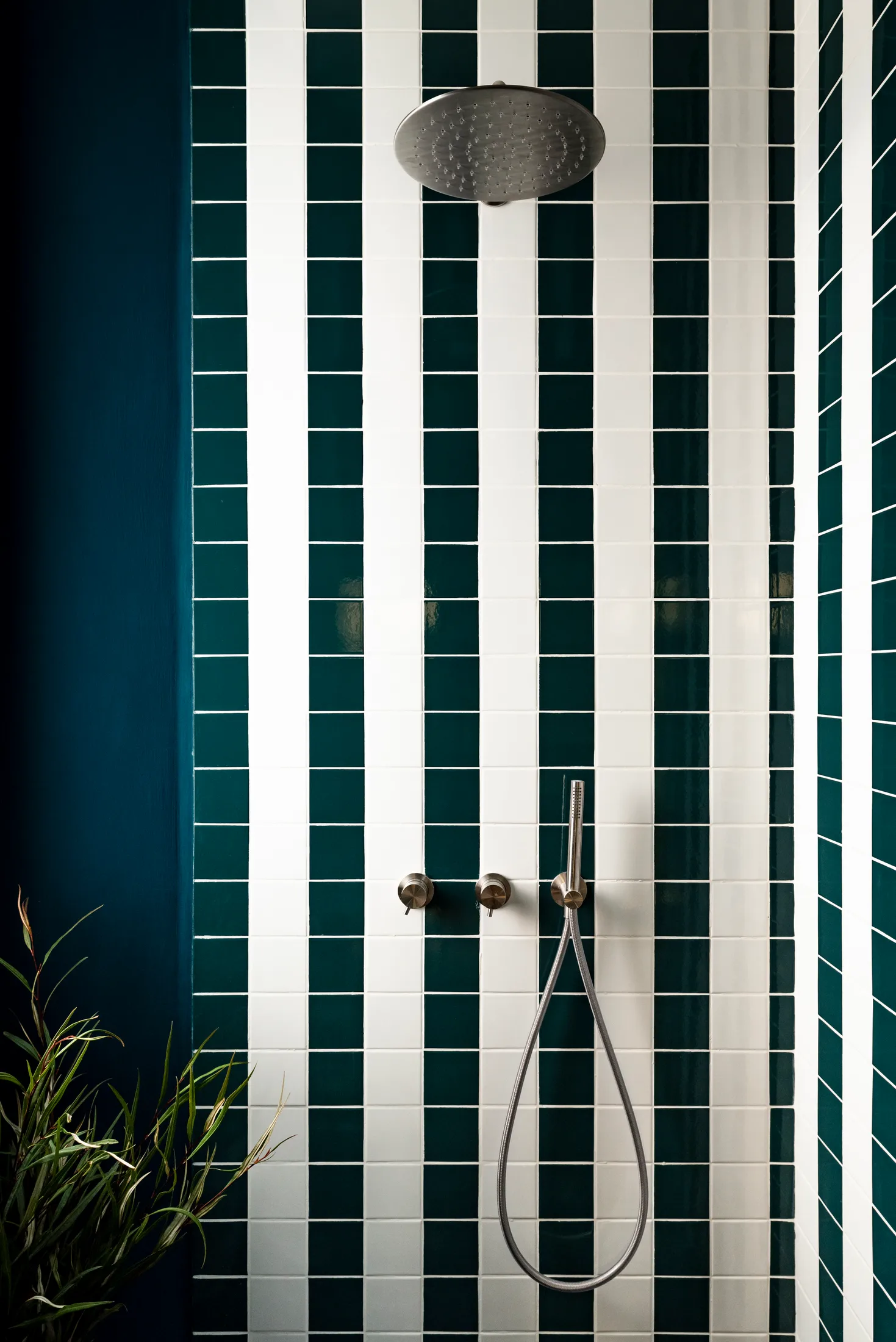
4. A Bathroom That Reads Like an Artwork
5. Custom Lighting and Switches That Make Interaction Part of the Design
1. Storage That Starts at the Door
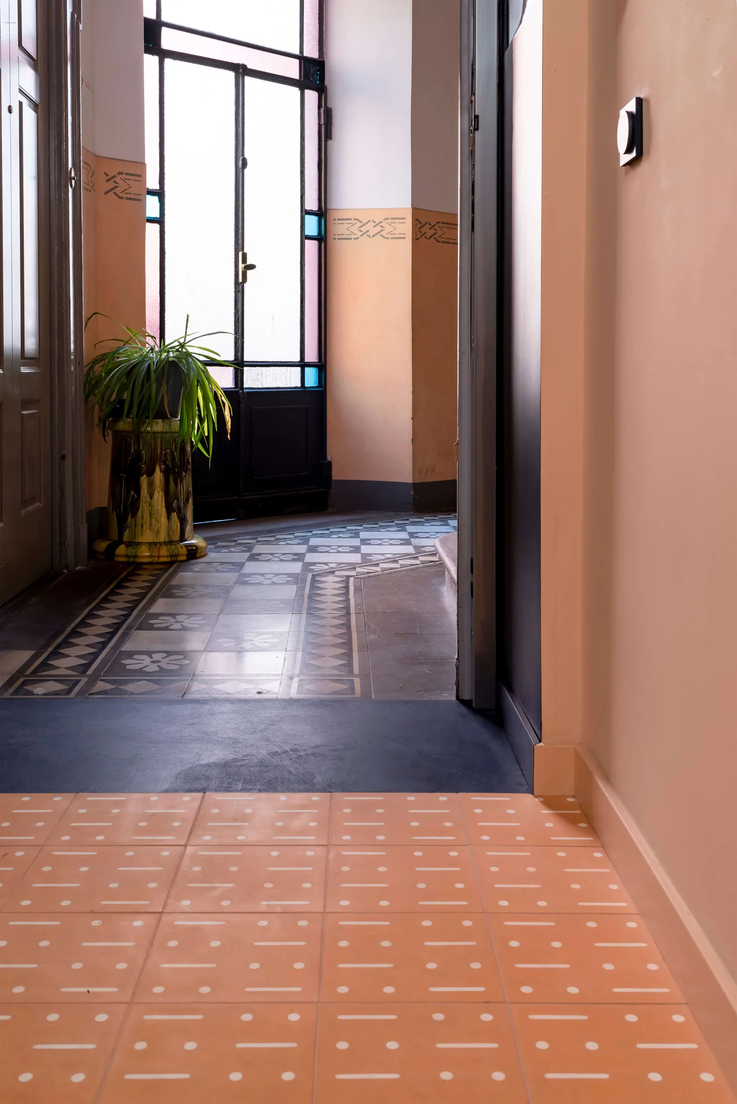
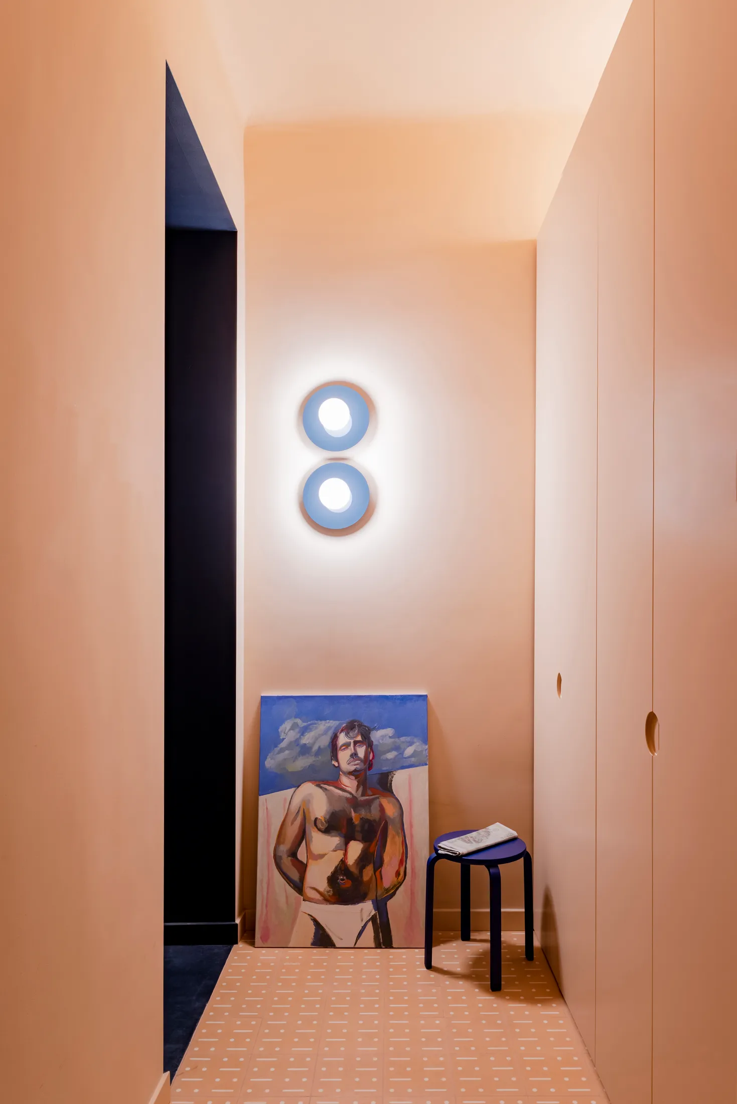
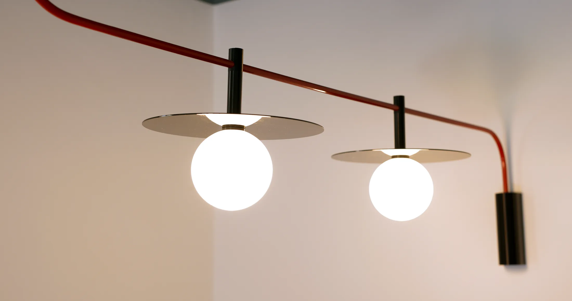
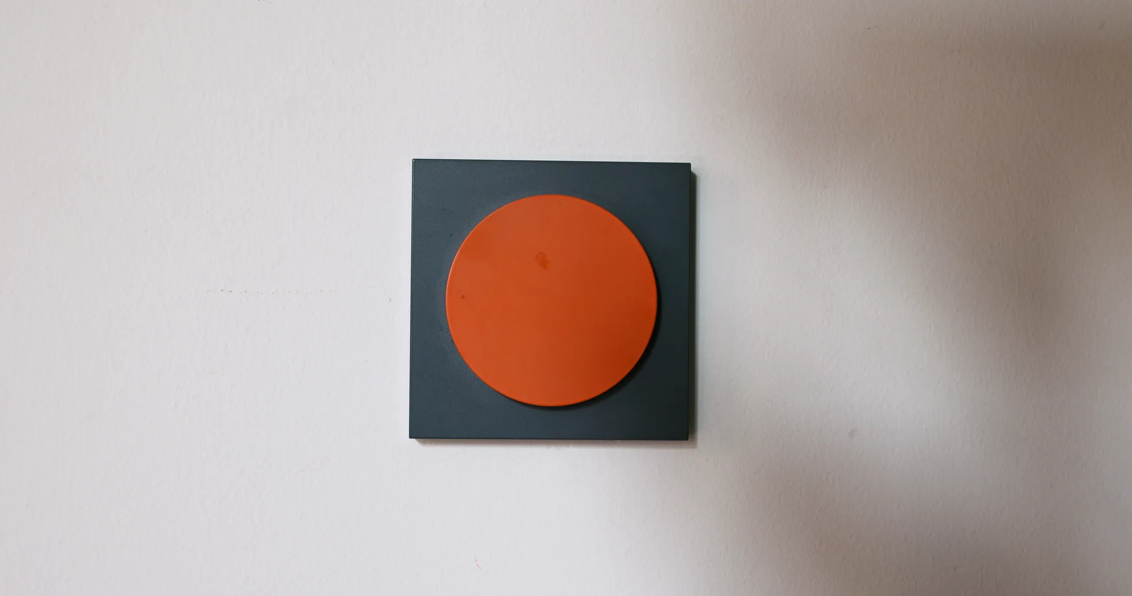
Rather than treating the entrance as a leftover space, Atelierzero turned it into a bold, immersive threshold. Wrapped in a warm orange tone that echoes colours from the shared stairwell, the entry reads as a defined room rather than a corridor. Mosaic Factory cement tiles, custom-designed for the project, give the floor texture and graphic presence, while a full-height, custom-made wardrobe absorbs coats, shoes, and everyday clutter. A pair of Il Disco steel wall lamps designed by Atelierzero under their brand De Rerum, along with a concealed LED strip above the wardrobe that washes light upward, add warmth and a soft, ambient glow.