Magazine Current IssueMagazine Current Issue
Master of Light
Master of Light
From our Mag
February 1, 2025

Master of Light

A democratic spirit, left-wing politics and a form-follows-function ethos. Not all is as you might imagine in the shared history of Danish lighting design icon Louis Poulsen and Poul Henningsen.

Founded in Denmark by Ludvig Raymond Poulsen in 1874, the Louis Poulsen brand originally focused on wine importation of all things. Pivoting into lighting and electrical supplies with the arrival of electricity in the 1890s proved to be a savvy move, given the iconic Danish lighting company this year marks its 150th anniversary. To commemorate the occasion, Phaidon has released Louis Poulsen: First House of Light, a book that celebrates the brand's determinedly democratic spirit as much as its iconic designs. While the company collaborated with design luminaries such as Arne Jacobsen and Verner Panton, it was Danish designer, architect, writer, and cultural critic, Poul Henningsen who was the greatest driver of this democratic spirit with his left-wing politics and form-follows-function ethos. We had the pleasure of interviewing the book's author TF Chan about Henningsen, 'the original master of light' and his part in Louis Poulsen's story.

Writing:
Elizabeth Price
Writing:
Photography:
Photography:
Louis Paulsen
No items found.
Magazine Current IssueMagazine Current Issue
The After shot of the Floorplan
Before
before
after
After
Top
Arrow UpArrow Up

Poul Henningsen talked about seeking to "improve the hygiene, economy and beauty of light". What did he mean by this?

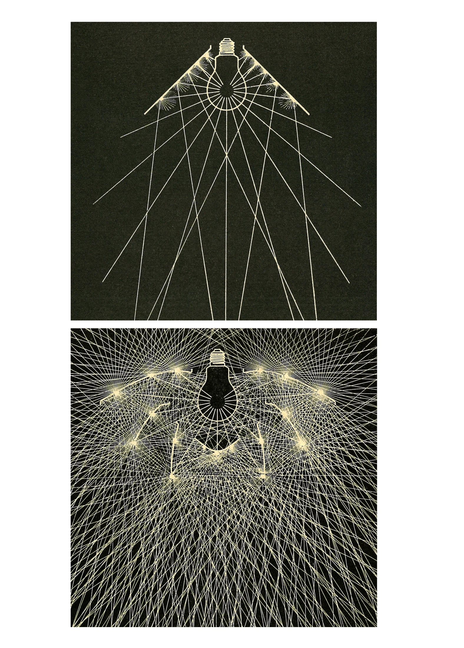
By hygiene, PH referred not to cleanliness, but rather physical and psychological health. He was devising his philosophy of light at a time when incandescent bulbs had just arrived in many homes, and being much brighter than traditional candles and kerosene lamps, they also created more glare, and thus caused fatigue. In fact, he wrote in 1926 that electric light was 'seen by civilised people as a necessary evil'. He thus believed that light fittings had to shield the incandescent bulb from direct view, and distribute the light so no area would be too bright.

By economy, he meant directing light to surfaces where it was needed: in living rooms, for instance, he advocated for a moderate strengthening of the light that shines downwards, and a corresponding weakening of the light that shines upwards.

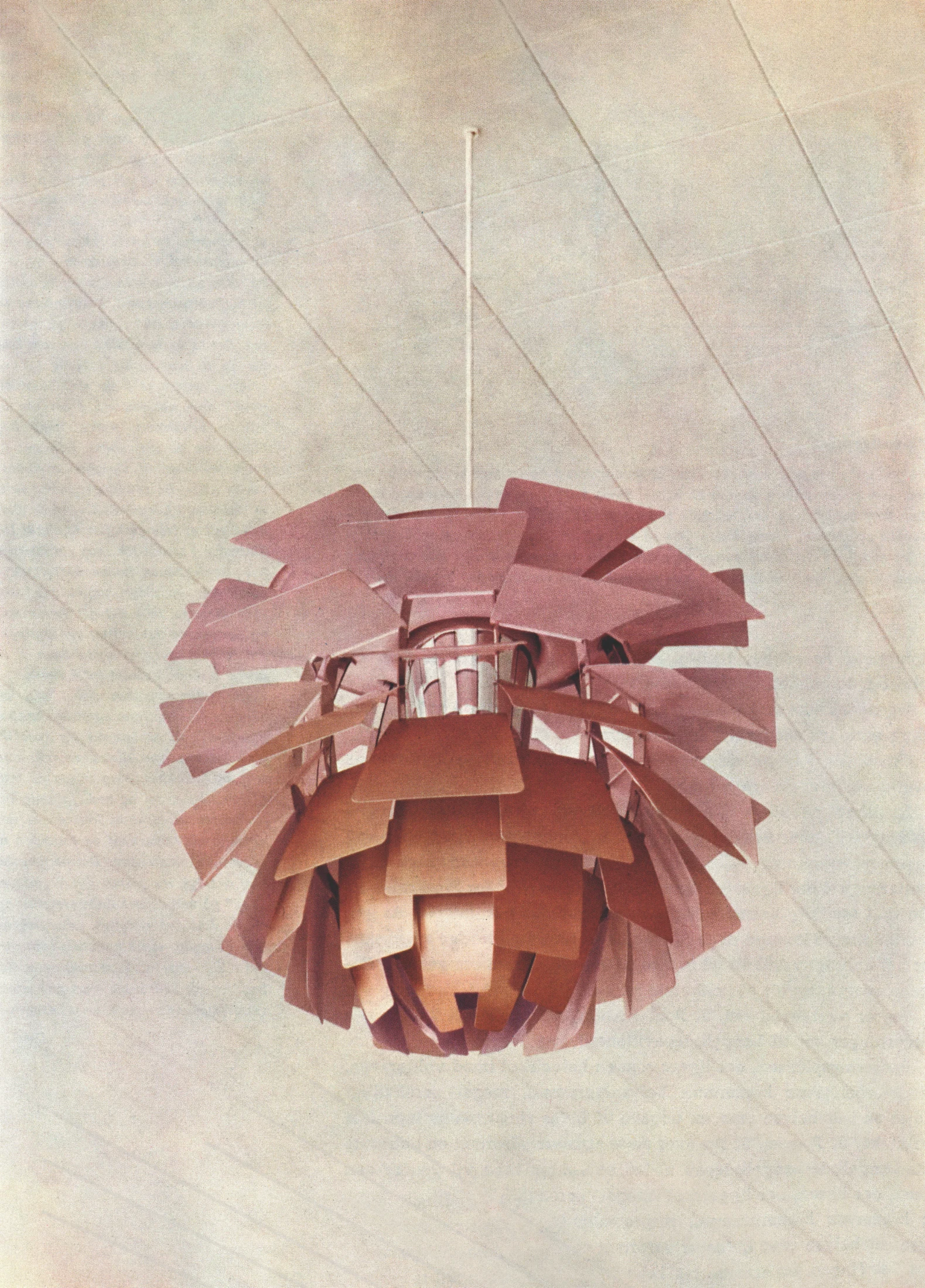
As for beauty, he observed that newly electrified homes often had cold, grey and boring artificial light, as domestic light fittings had not yet caught up with electric lighting. By filtering and reflecting light through various materials, one could create a warmer, more convivial light, with the correct softness of shadow.

Can you expand on economy in particular and how it influenced Henningsen's early designs?

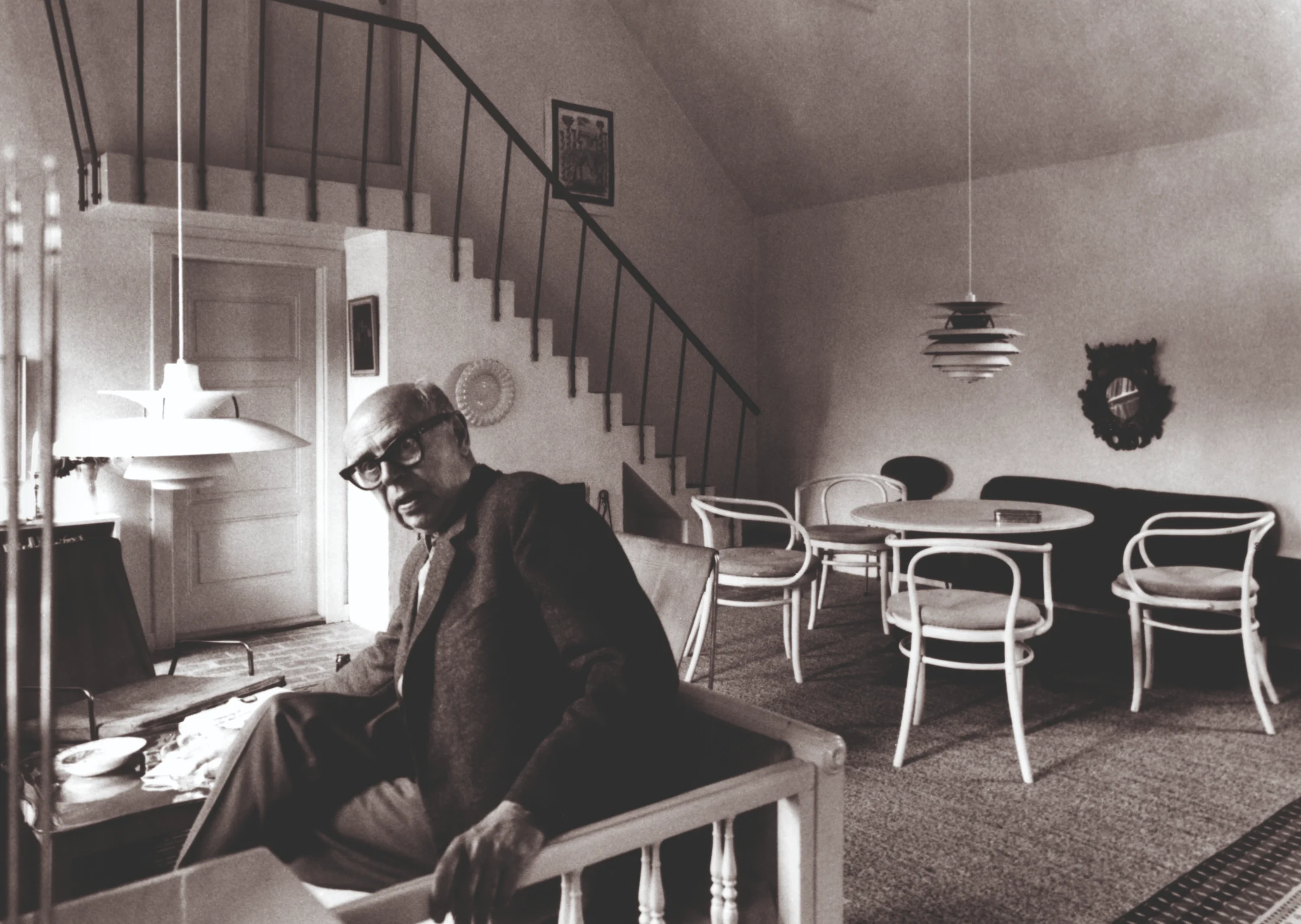
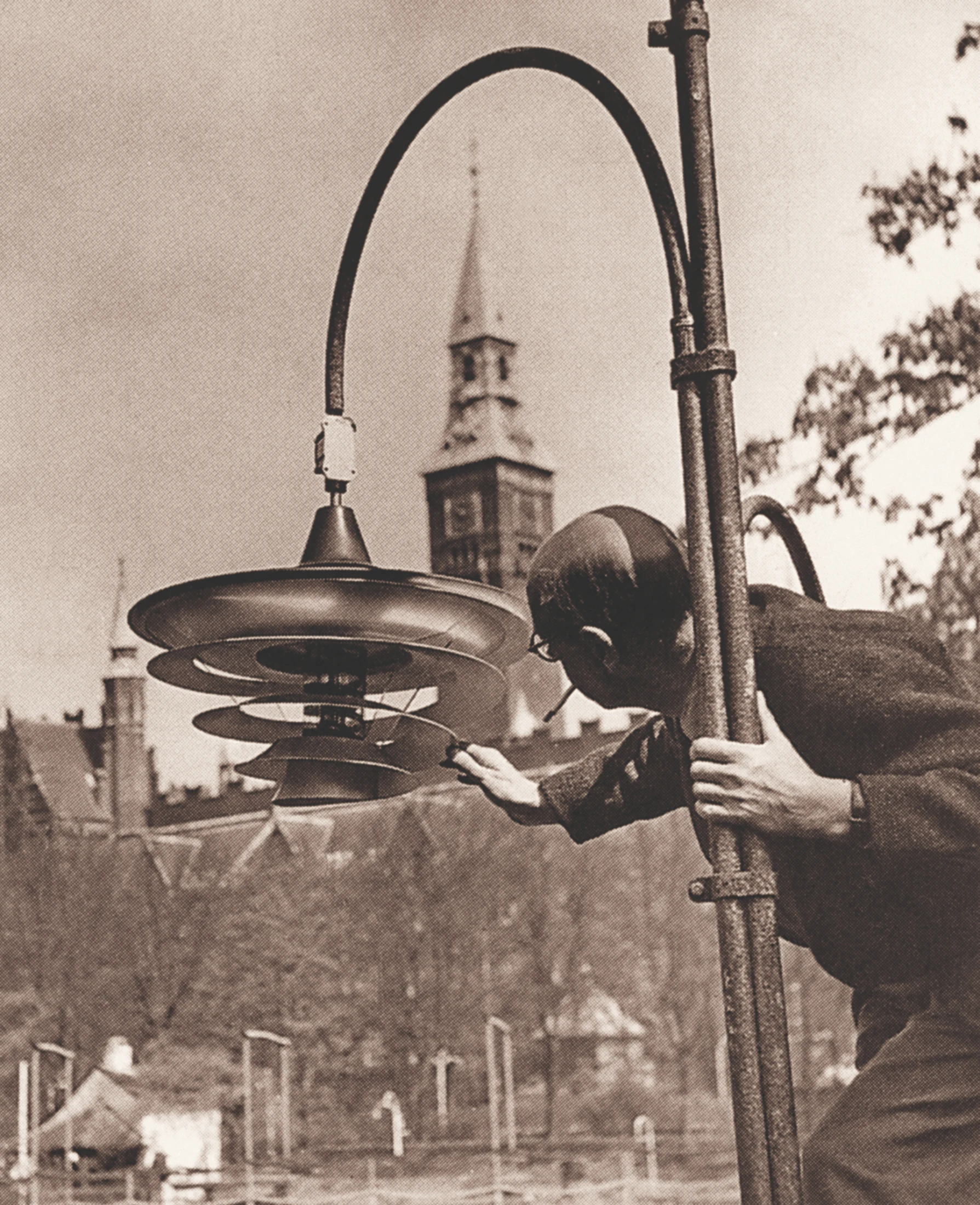
Hennigsen's first products for Louis Poulsen are from the late 1920s, some three decades since electricity was first introduced to Denmark, so prices were coming down, but regular households still had to be mindful of electricity use: and so it was important for economic reasons (as well as aesthetic reasons) that light would be directed to the surfaces that needed it most. This was a function that most lighting in the 1920s had yet to fulfil, as they commonly featured fabric lamp shades (occasionally with fringes) which mostly served decorative purposes, or glass orbs, which would emit light at the same strength in all directions. The three-shade PH system put electricity to better use by directing light downwards, emitting a more diffused, ambient light on the sides.

Can you describe some of the methods Henningsen played with in filtering light and controlling its temperature?

Henningsen believed that a naked light source would irritate the eye, so his lighting designs always ensured that light rays would be reflected, and sometimes filtered within the shades before they emerged into the environment. Most of the glass used within his shades was opal glass, which had matte undersides achieved via sandblasting (this ensured that only 12 percent of the light would penetrate the shades, the rest would be reflected the same way light was reflected in an opaque shade). When he used clear glass, as was the case with the PH Septima, this was overlaid with frosted glass to better diffuse light and minimise glare.

Warm materials such as copper, brass, and gold (used for plating) helped moderate the intrinsic coldness of the incandescent lightbulb and create a warmer, more convivial light.

We can point to two of Henningsen's most famous designs, both from 1958, as examples of how he controlled the temperature of light. Within the PH 5 lamp, he inserted two internal shades (only visible from a low angle), which were coloured in red and blue. These corresponded to the parts of the colour spectrum where the eye is less sensitive, and accordingly subdued the light in the yellow-green region where the eye is more sensitive.

For the PH Artichoke lamp, which was initially designed for Langelinie Pavilion (an upscale restaurant that had just opened on Copenhagen's harbour), he specified a reflective layer of pale pink paint on the inside of each copper leaf, so as to achieve a rosier glow that would complement the skin tone of the restaurant's guests.

This design decision responded to a requirement from Langelinie's architects, Nils and Eva Koppel, that the lighting should be 'festive and emanate a warm glow', but has since taken on a life of its own. Indeed, it is why Louis Poulsen's 150th anniversary collection sees its iconic mid century pieces released with pale rose shades (and brass hardware), and why the First House of Light book cover, by Copenhagen-based Studio Claus Due, is pale pink.

The ray direction drawings that Henningsen would spend days on: can you tell us a little about these? Was this a typical practice for someone in his line of work?

Ray direction drawings were certainly instrumental to the success of the PH lamp, which was pioneering for its form-follows-function approach. They showed a cross section of Henningsen's three-shade design and demonstrated how the rays from the light source (situated at the centre) would be reflected within the shades before being directed outwards, and played an important role in helping his audience understand the design. Following the success of the three-shade system it became relatively common that lighting designers and manufacturers would use ray direction drawings to explain their products, but I can't say for certain how many others would have been creating these drawings in the mid-1920s when Henningsen was emerging on the scene.

Most of us think of the Louis Poulsen brand as 'designer' rather than democratic so I'm fascinated by PH's democratic spirit and how this manifested in the PH 5 Lamp becoming "a staple in Danish homes and one of the best-selling lamps in the world". What was it about Henningsen's designs and methods that made all of this possible?

While Henningsen certainly didn't shy away from creating elaborate statement pieces (the PH Artichoke comes to mind, as does his 1942 Spiral lamp for the main hall of Aarhus University), he was also determined to create lighting for the wider public, which reflected his left-wing political opinions and his strongly-held belief in creating good light for the people. It is worth keeping in mind that he was designing street lamps even before he worked with Louis Poulsen (the Slotsholmen lamp, from 1921). And the three-shade system, which quickly found domestic popularity, was initially developed for a public space, namely an indoor area in Copenhagen called the Forum.

Three-shade lamps in varying configurations, including chandeliers that had three shades around each of many light sources, made their way into department stores, banks, museums, and even less glamorous spaces such as factory floors, hospitals, orphanages and greenhouses (of the functional sort, as opposed to those in botanical gardens). This was made possible by the lamps' effectiveness and relative affordability, which put them well ahead to other lighting from that time.

It is true that Louis Poulsen lighting is nowadays considered to be a 'designer' good in terms of market positioning and price point, but I believe the brand continues to maintain democratic values, and indeed this is explained in a chapter of First House of Light titled 'A Spirit of Democracy', which concludes with a description of Louis Poulsen's philanthropic initiatives, collaborations with contemporary rising talents, and projects that advance human well-being.

How does Henningsen's decades-long collaboration with Louis Poulsen relate to the brand's more contemporary collaborations with rising talent?

It's impossible to imagine the Louis Poulsen brand without Poul Henningsen, and the latter's fame among design cognoscenti is such that we assume he was always well-established and ahead of the pack. But I wouldn't lose sight of the fact that when Poul Henningsen started working with Louis Poulsen, he was just 30 years old and had just started his own design practice. Louis Poulsen took a risk of sorts by collaborating with him, just as it has continued to work with rising talents in the past two decades – the likes of Louise Campbell, Christian Flindt and Øivind Slaatto were relatively recent design school graduates, and Slaatto in particular was not approached to work with the company, but rather took the initiative to submit his portfolio. It is easy to collaborate with an already renowned talent. It takes greater foresight and confidence to invest in the next generation and be part of their journey towards professional success, and in my view, this foresight and confidence has been an important throughline in Louis Poulsen's history.

In First House of Light, you cite Arne Jacobsen's AJ Lamp and Verner Panton's Panthella Lamp as highly recognisable and iconic designs, and yet it's the PH 5 Lamp that remains the most iconic, you say. What do you attribute its enduring relevance to?

What made the PH 5 lamp stand out among earlier Henningsen products is there is no glare, regardless of the light source being used (earlier PH lamps were glare-free as long as the light source was situated within a particular spot in the shade, which meant they usually had to be installed professionally). Unlike earlier PH lamps, which were often in brass and glass, the shades of the PH 5 are made in aluminium, so they are easier to manufacture, which in turn translates to lower prices. This versatility and affordability would certainly have appealed to customers and contributed to its immediate popularity.

But just as important are the circumstances in which the PH 5 arrived on the market: by 1958, the year it was released, Poul Henningsen was indisputably the most famous lighting designer in his country as well as a notable public figure, and the Danish economy was in a period of unprecedented growth. A legacy of this initial popularity is that there are many Danes today who grew up with a PH 5 lamp in their home, or perhaps inherited one from a loved one, which gives the lamp an heirloom-like quality and in turn inspires them to eventually pass it on to the next generation.

I would also not gloss over the fact that the PH 5 is an uncomplicated, well-made lamp that works exceptionally well and is suited to a wide range of environments. These are relatively simple qualities, but certainly not easy to attain within one design.

What can contemporary design houses learn from the Louis Poulsen example and legacy?

The Louis Poulsen brand has been around for 150 years, and has produced its own lighting for a century now – so the level of recognition it enjoys (especially in Denmark) and the success it has had is not easy to emulate. At one point, one in five Danish households had a PH 5 lamp, and it's difficult to imagine any contemporary design product being so widely adopted in our era of abundance.

At the same time there are certainly lessons that can be gleaned from Louis Poulsen's story, namely: that a form-follows-function approach results in products that stand the test of time, that taking a gamble on emerging talent can yield handsome returns, that those who insist on quality will always find kindred spirits, and just as importantly, that generosity towards society will be reciprocated with enduring customer loyalty.

Louis Poulsen: First House of Light by TF Chan is published by Phaidon. Visit Phaidon.com

Writing:
Elizabeth Price
Writing:
Photography:
Photography:
Louis Paulsen
Back to Top
Arrow UpArrow Up
Top
Arrow UpArrow Up
The After shot of the Floorplan
Before
before
after
After
Businesses featured in this project
No items found.
Products featured in this project
No items found.
Magazine Current IssueMagazine Current Issue
Writing:
Louis Paulsen
Writing:
Photography:
Photography:
Louis Paulsen
Back to Top
Arrow UpArrow Up