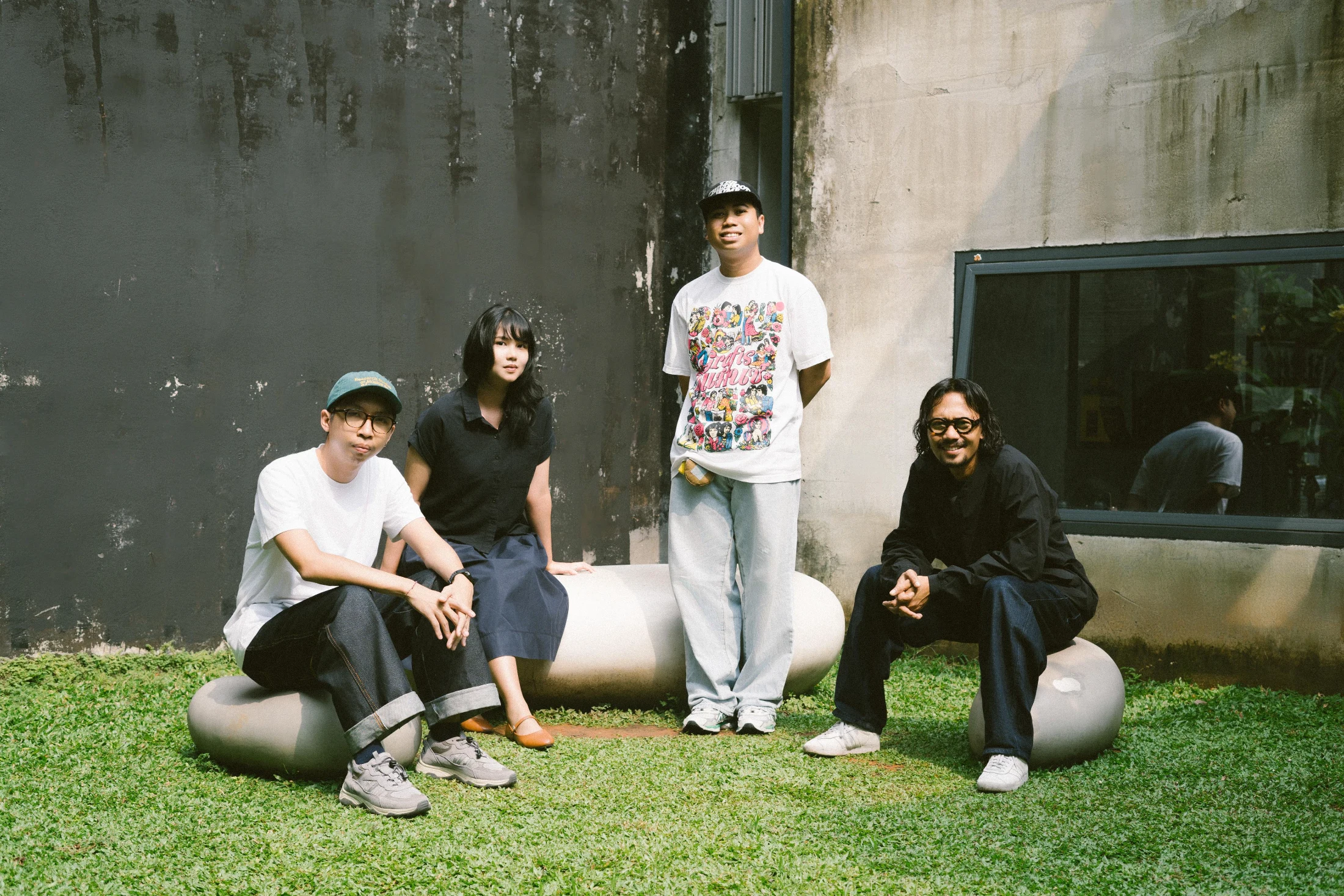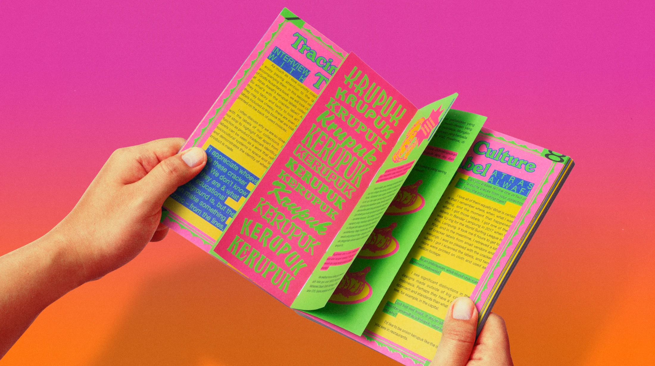



From a personal project in college to a large-scale archive, what was the moment you realised the collection could be more?
Jaka: I was drawn to the kitschy, unusual designs, but also their scarcity – realising that so much of Indonesia's design history was disappearing. So in 2019 I began uploading my finds to Instagram.
Said: The turning point came when Jaka and I met in 2020. We shared a vision to make the archive more accessible and impactful, and to spotlight a part of Indonesia's visual culture that rarely appears in formal design histories. We then teamed up with Kamengski, a multidisciplinary brand and design studio, which pushed us to expand the team.
Jaka: We chose the name Nusantara, another word for Indonesia, because we never wanted the archive confined to one region. In Indonesia, there is less awareness of the importance of archiving. That is why I knew I had to do this – to show that despite not having art schools or institutions at the time, the country still had a really rich and lavish design culture.
Why the 1950s to 2000s? What's significant about these design eras?
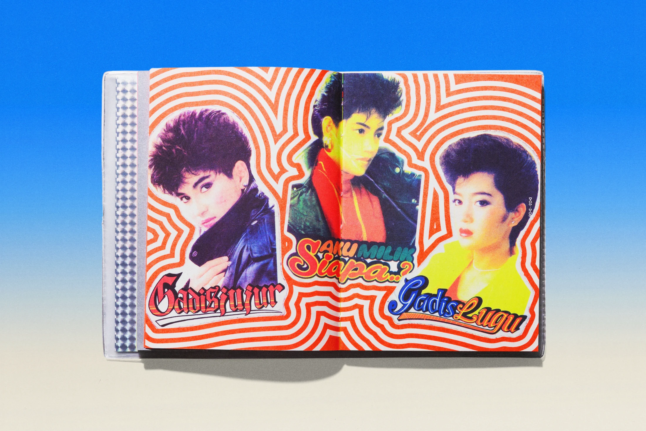
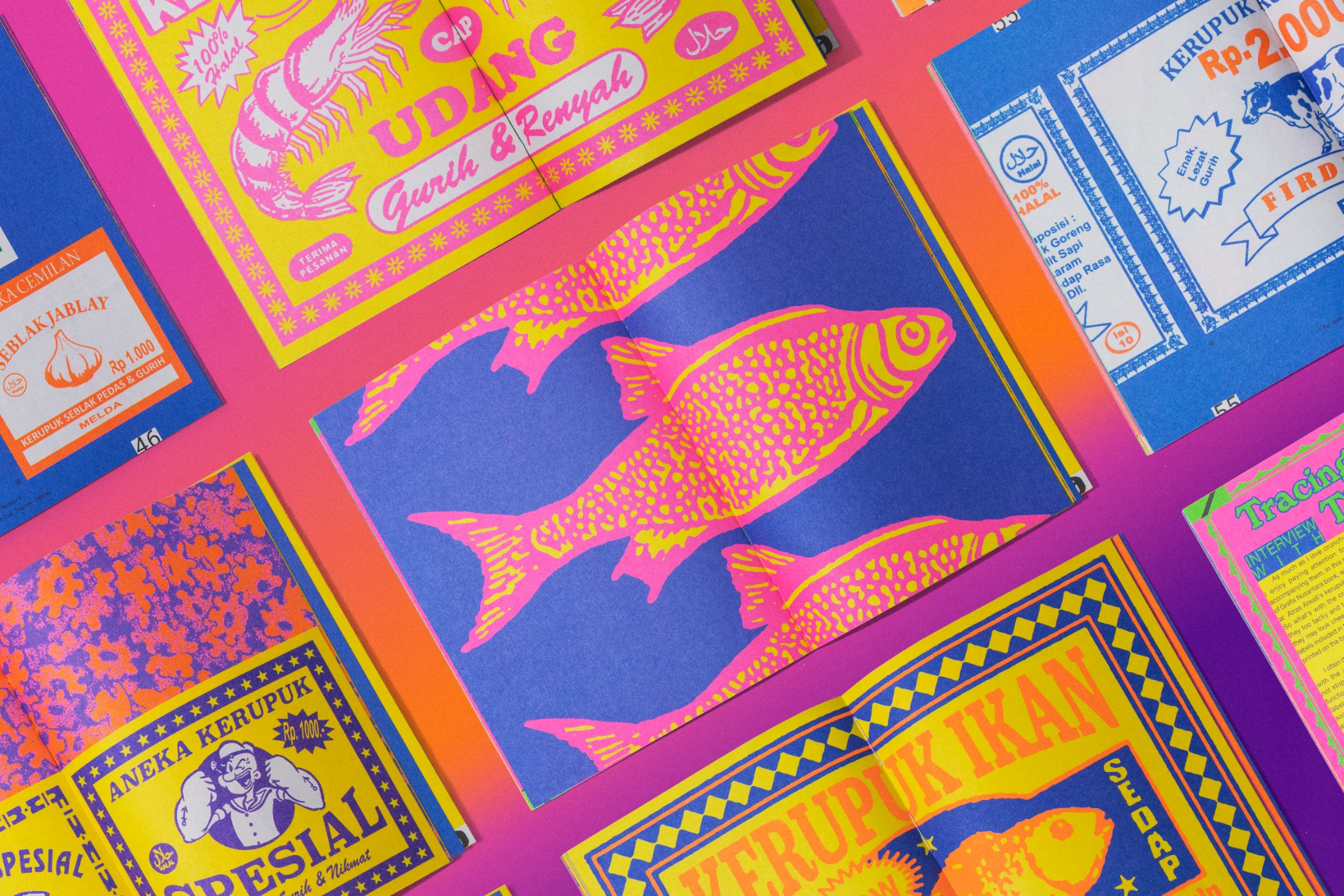
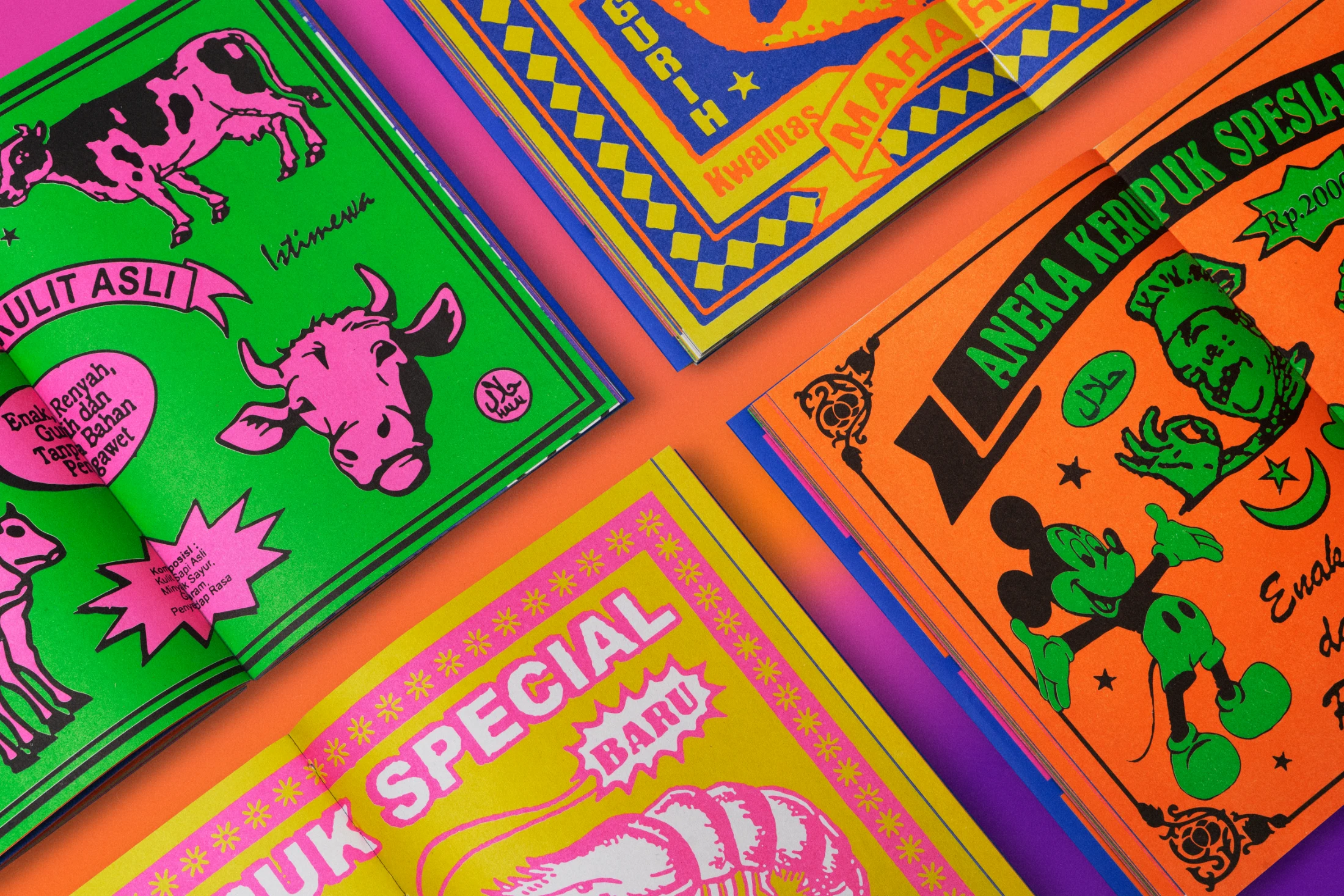
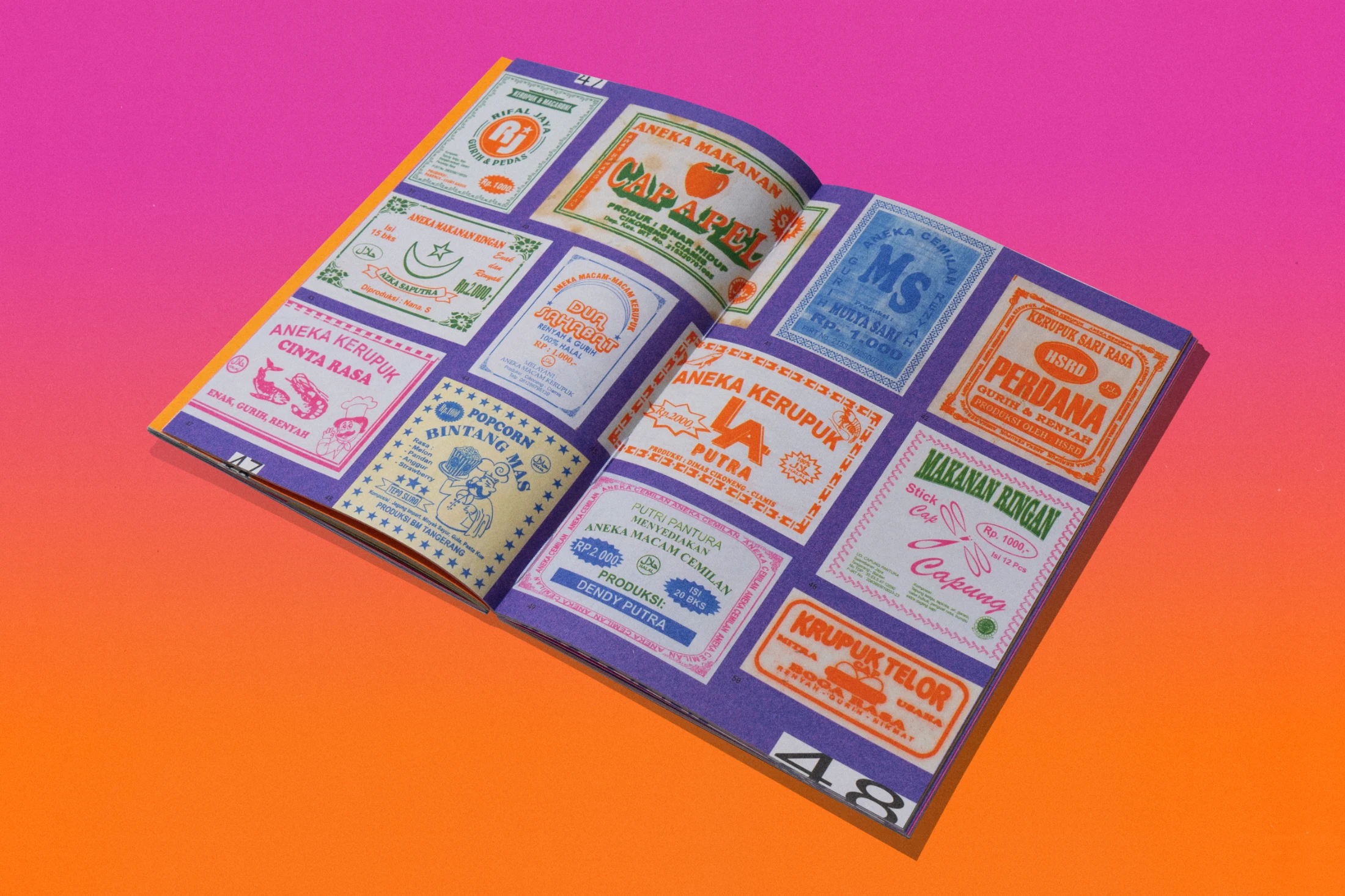
Claudia: It was a time before digital design took over, so every piece carried a human touch, from hand-lettered logos to quirky layout choices. Those decades were marked by a blend of manual illustration, bold typography, and bright, sometimes clashing colours, influenced by local visual traditions as well as imported printing techniques.
What do these labels reveal about Indonesian culture and creativity?
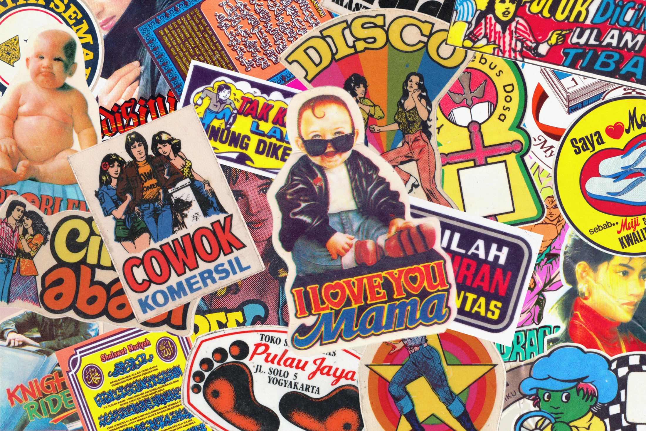
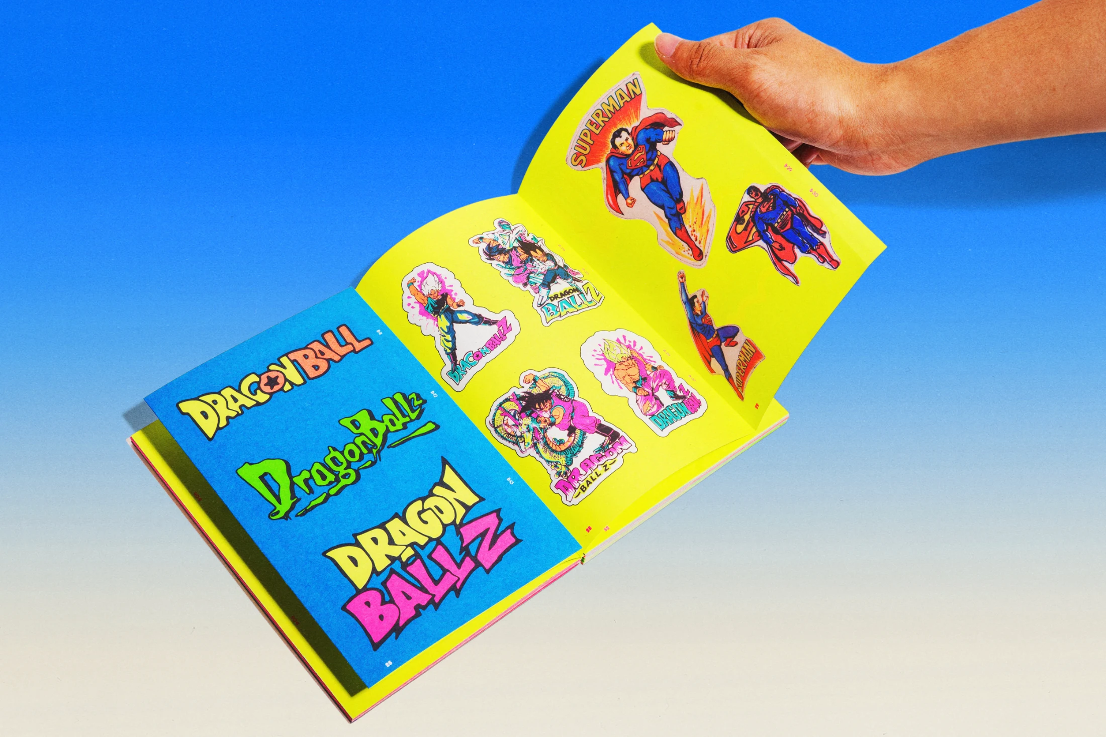
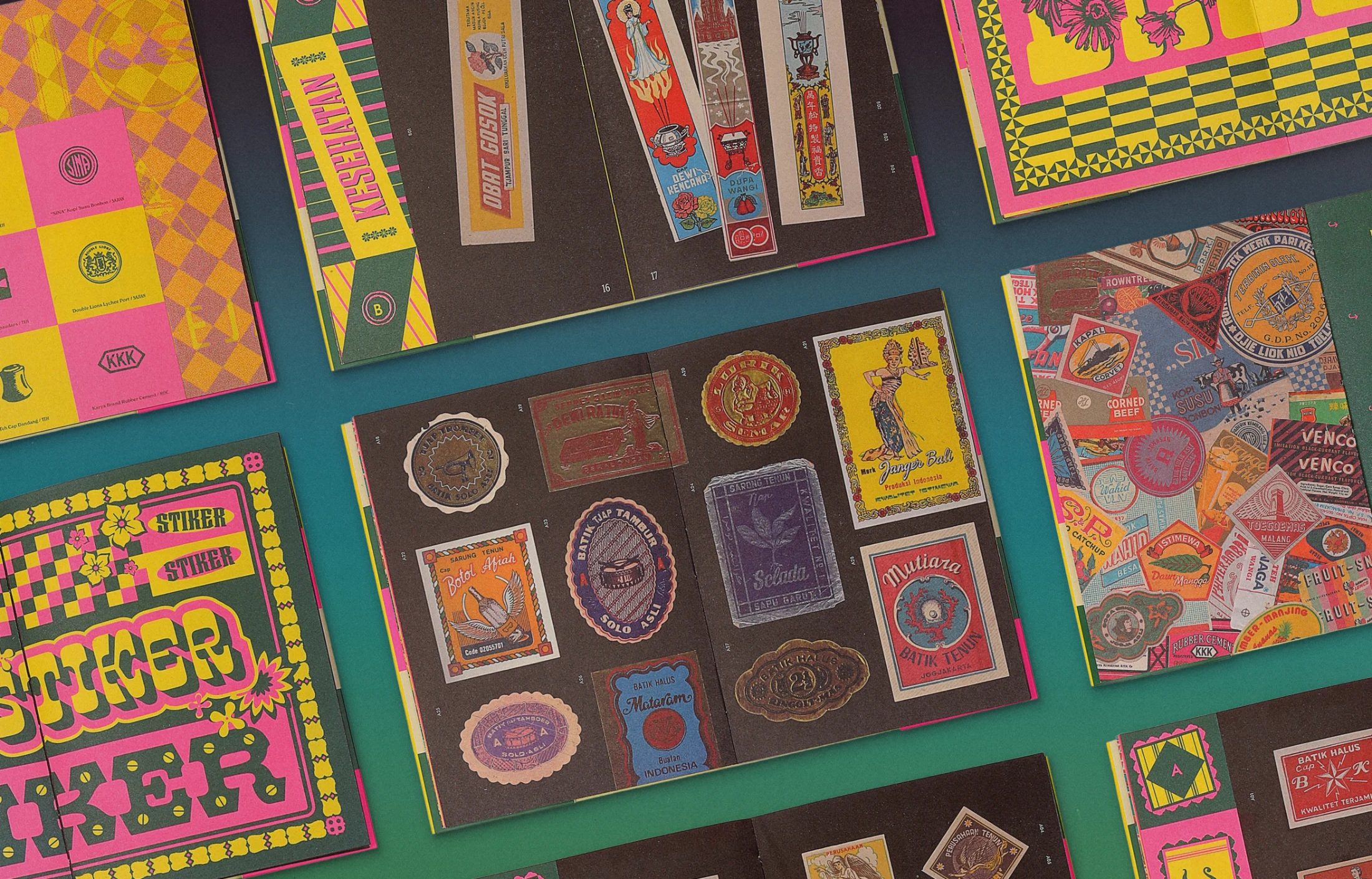
Said: Quite a lot actually. You can also see how globalisation seeped in, from Japanese anime, to Western films and comics on 1990s stickers, to older labels borrowing from Art Nouveau. But there are also distinctly regional touches, like religious motifs alongside playful cartoon characters, or slogans that capture local humour.
Claudia: We find it fascinating how literal the brand names were. A kerupuk¹ brand might just be Kerupuk Jaya (Glorious Crackers), or a syrup label Cap Buah Segar (Fresh Fruit Brand). Some were named after everyday objects, like Kretek Djamboe (Guava Cigarettes). There was no polished branding; the goal was quick recognition and to stand out amongst busy pasar (market) stalls.